


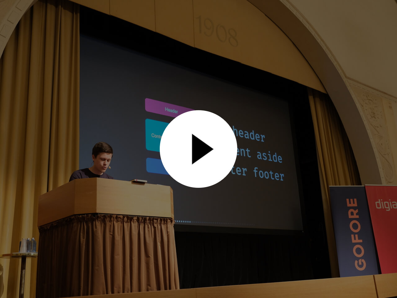
Atomic layout is an implementational paradigm that delegates spacial distribution between layout composites to the dedicated layer. That helps to create declarative, immutable, and maintainable layouts using CSS Grid.
import React from 'react'
import { Composition } from 'atomic-layout'
// Define layout areas as a string
const areasMobile = `
thumbnail
header
footer
`
// Responsive areas? Built-in!
const areasTablet = `
thumbnail header
thumbnail footer
`
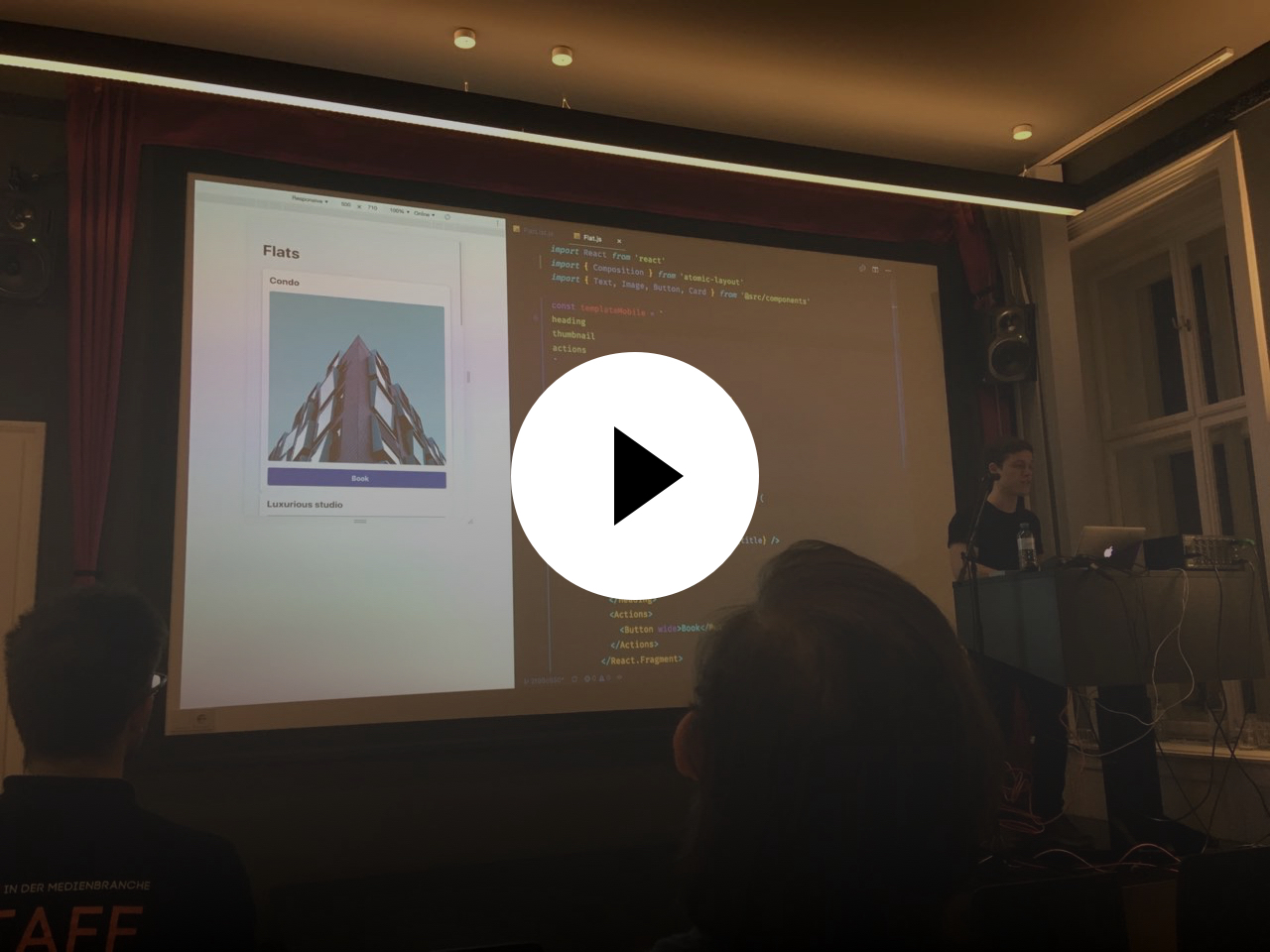
const Card = ({ title, imageUrl, actions }) => (
<Composition areas={areasMobile} areasMd={areasTablet} gutter={20}>
{/* Get React components based on provided areas */}
{({ Thumbnail, Header, Footer }) => (
<React.Fragment>
<Thumbnail>
{/* Render anything, including another Composition */}
<img src={imageUrl} alt={title} />
</Thumbnail>
{/* Preserve semantics with polymorphic prop */}
<Header as="h3">{title}</Header>
{/* Responsive props: just suffix with a breakpoint name */}
<Footer padding={10} paddingMd={20}>
{actions}
</Footer>
</React.Fragment>
)}
</Composition>
)
export default CardAtomic layout uses Bootstrap 4 breakpoints by default. You can define custom breakpoints to match your very requirements.
Think of how we create layouts today. Most likely we define a set of reusable units (atoms) to combine them into functional compositions. But how do we handle spacing that should describe the position of our units? Usually, we manage CSS properties of those units to make sure the spacing is just right. Not only that results into writing redundant CSS, but it also makes our atoms contextual and, thus, non-maintainable.
Atomic layout solves this problem by exposing a dedicated layer responsible for spacial distribution in a layout, or any of its parts. That allows to reuse atom components in any layout possible without mutating them.
npm install atomic-layoutMake sure to have React (16.0+) and styled-components (4.0+) installed.
See the Official documentation.
Here are some shortcuts to get you started:
|
Find out the main aspects of a layout's maintainability and why spacing plays a large role in it. Learn how to wield layout composition as an actual React component–a missing glue for your elements and design systems. |

|
Read through the extensive interview about how Atomic layout came to be, how it's different from other solutions, and which practices it encourages. |
|
Watch Artem discussing the biggest obstacle to achieve maintainable layouts, and showcases a way to combine existing technologies to build clean UI implementations using Atomic layout. |
See the Support table for CSS Grid. For Internet Explorer support please see this issue.
Thank you for deciding to contribute! Your involvement makes a significant impact on the library and its future.
Please read the Contribution guidelines, and browse through the issues labeled help wanted or good first issue. Those are a good place to start. Feature suggestions or bug reports, discussion, and pull requests are always welcome!