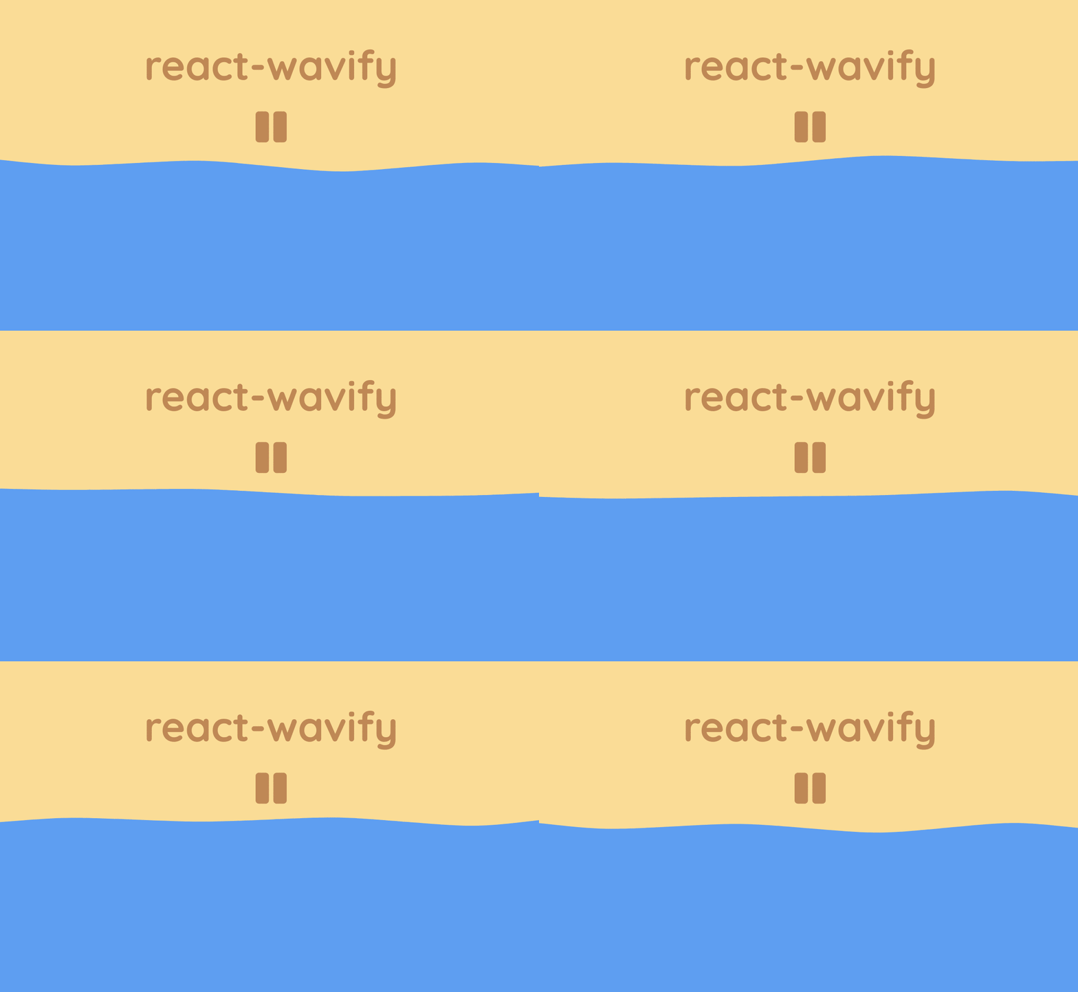
A simple React component which creates an animated wave.
This component is heavily adapted from Mikołaj Stolarski's awesome Codepen and is functionally similar to Benjamin Grauwin's Wavify plug-in.
Yarn
yarn add react-wavify
npm
npm install react-wavify
import React from 'react'
import Wave from 'react-wavify'

const App = () => (
  <Wave fill='#f79902'
        paused={false}
        style={{ display: 'flex' }}
        options={{
          height: 20,
          amplitude: 20,
          speed: 0.15,
          points: 3
        }}
  />
)
Simply add the Wave component to the React application using JSX.
The wave's width will scale to fit the parent container.
The fill property can be set to anything that a SVG path can accept (usually gradients or colors). Default: #FFF
The paused property controls the play state of the animation. Default: false
If set to true the wave animation will pause.
The component supports a variety of options to affect how the wave is rendered.
Any omitted options will be set to the default value.
height- Height of the wave relative to the SVG element. Default:20amplitude- Amplitude of the rendered wave. Default:20speed- Speed that the wave animation plays at. Default:0.15points- Amount of points used to form the wave. Can not be less than1. Default:3
Any other props such as id, className or style will be passed through to the root of the component.
Other props such as opacity or stroke will be passed to the SVG path element.
Any other elements can be passed inside the SVG component itself.
Inner <defs> elements can be used to add gradients, clipping paths, or masks.
<Wave fill="url(#gradient)">
  <defs>
    <linearGradient id="gradient" gradientTransform="rotate(90)">
      <stop offset="10%"  stopColor="#d4af37" />
      <stop offset="90%" stopColor="#f00" />
    </linearGradient>
  </defs>
</Wave><Wave fill="#e62315" mask="url(#mask)" options={{ points: 20, speed: 0.2, amplitude: 40 }}>
{/* Example adapted from https://developer.mozilla.org/en-US/docs/Web/SVG/Element/mask */}
<mask id="mask">
<path d="M10,35 A20,20,0,0,1,50,35 A20,20,0,0,1,90,35 Q90,65,50,95 Q10,65,10,35 Z" fill="white" />
</mask>
</Wave><Wave mask="url(#mask)" fill="#1277b0" >
<defs>
<linearGradient id="gradient" gradientTransform="rotate(90)">
<stop offset="0" stopColor="white" />
<stop offset="0.5" stopColor="black" />
</linearGradient>
<mask id="mask">
<rect x="0" y="0" width="2000" height="200" fill="url(#gradient)" />
</mask>
</defs>
</Wave>


