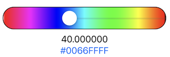
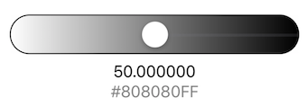
ColorSlider is a SwiftUI view that displays a color slider. It is used to dynamically select a color from a range of colors or grayscale.
The main elements are ColorSlider.swift and ColorObject.swift, see the demo in ContenView.swift for how to use it in your code.
The key to using this ColorSlider in your code is to create a ColorObject such as:
@ObservedObject var colorObject = ColorObject()
and pass it to the ColorSlider as shown in ContenView.swift,
ColorSlider(colorObject: colorObject, width: 300, height: 40)
As the slider knob is changed, the current color selected can be obtain from the ColorObject using:
colorObject.color
The following can be set to customise the ColorObject and thus the ColorSlider:
- nColors, the number of colors to display in the slider, default 100.
- saturation, the desired saturation value, default 1.
- brightness, the desired brightness value, default 1.
- isDraggable, to allow the slider to be dragged around the screen, default true
- bandSize, to set the thichness of the color bands in the slider, default 1.
ColorSlider will display a slider gradient of colors, from white to black.
For convenience, to display a gray scale slider, initialise the ColorObject as:
@ObservedObject var colorObject = ColorObject(grayScale: true)
For convenience, to display a static slider, initialise the ColorObject as:
@ObservedObject var colorObject = ColorObject(isDraggable: false)
For a vertical slider just add:
.rotationEffect(.degrees(90))
The color slider on the left is with the default settings.
The color slider on the right has nColors=10, and a color bandSize=10


