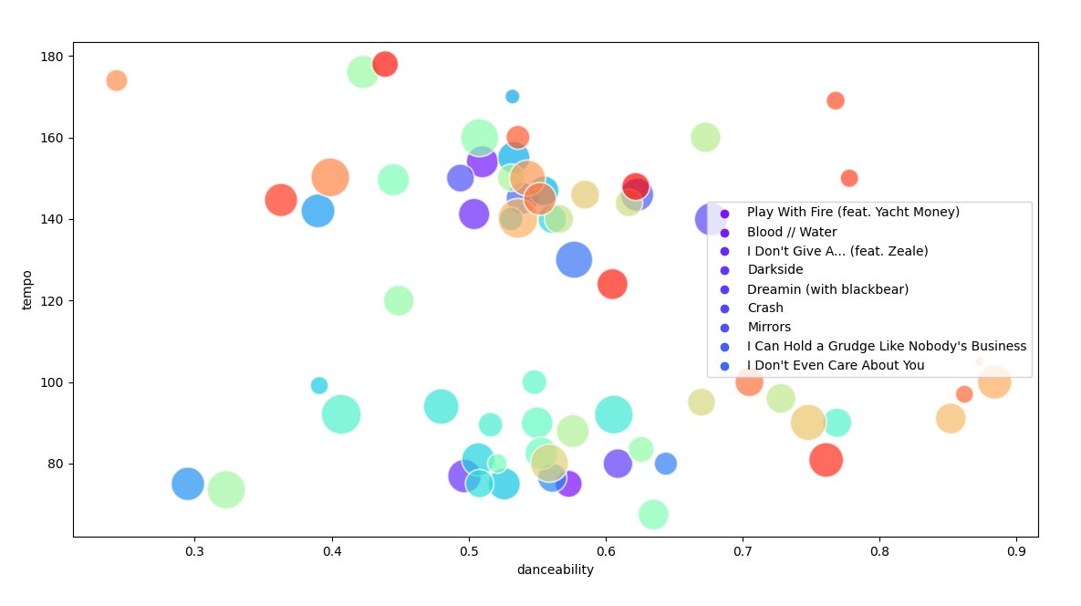
Create a graph with audio features from your playlist's tracks using matplotlib and seaborn
This is a simple test script with which you can generate a graph of two song features (of your choice) from your playlist's tracks. As it is a test for using Spotify's API features, you will need to have a client ID and set up a few things, described here: https://developer.spotify.com/documentation/general/guides/app-settings/
Local set up
- Set the IDs
In secrets.py, set client_id and client_secret to the values you see in your Spotify dashboard (https://developer.spotify.com/dashboard/applications).
Set up the redirect_uri to that you have chosen for your application as well.
- Get the URI of the playlist you want to use
Using the Spotify Desktop: go to the playlist you want to use and, in share options, choose "copy Spotify URI". This is the playlist_id you will use in secrets.py.
Running the script
1. Install all dependencies from requirements.txt
2. Run generateURL.py to generate the URL
When you go the URL generated, you will see a page to authorize the app's access to your data. Allow it and you will be redirected to the page you have chosen for your redirect_uri.
Pay attention
to the URL you see in your browser, that will be something like this: <redirect_uri>?code=<long key here>. Copy the key you see after "code". You
will use it to run the script.
3. Set user_code on secrets.py to the code you copied on step 2.
4. Run generateGraph.py and see your results!
Observations:
- The graph generated does not show info about all songs yet
(I have to work on it)
