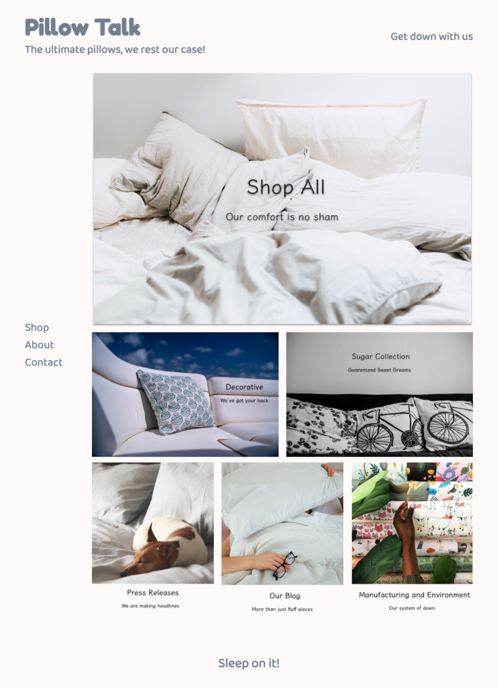
A big and normal struggle is to take a mockup and turn it into a website.
Let's do it together.
This site is inspired by: Hullo https://hullopillow.com
cd build- open
index.htmlandmain.cssin your text editor - open
index.htmlin the browser, check that background color is set.
Our website will be going through an awkward phase. It won't look good with just HTML, but as long as we have a good structure and plan we will get it looking great!
@import url('https://fonts.googleapis.com/css2?family=Baloo+2&family=Fredoka+One&display=swap');/*********************************
* Build Helpers
*********************************/
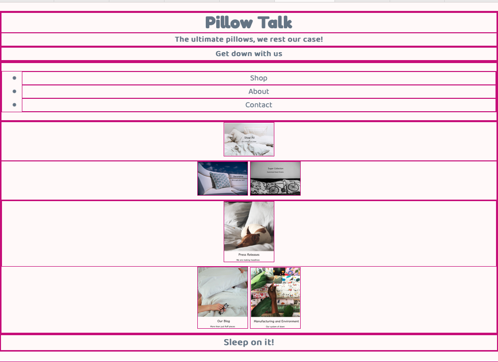
/* give each element a border */
* {
border: 1px solid mediumvioletred5;
}
/* shrink images for placement */
img {
width: 100px;
}/*********************************
* General
*********************************/
body {
background-color: snow;
color: slategrey;
margin: 20px 0;
font-family: 'Baloo 2', cursive;
text-align: center;
}
h1, h2, h3, h4, h5, h6 {
margin: 0;
}
h2 {
font-size: 1em;
}
h1 {
font-family: 'Fredoka One', cursive;
}In the body
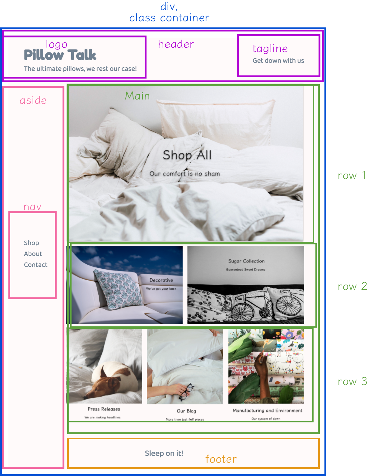
headerdivwith a class ofcontainerin that divasidemainfooter
<!DOCTYPE html>
<html lang="en" dir="ltr">
  <head>
    <meta charset="utf-8">
    <title>Pillow Talk</title>
    <link rel="shortcut icon" href="./assets/imgs/favicon.ico">
    <link rel="stylesheet" href="main.css">
  </head>
  <body>
    <header>

    </header>
    <div class="container">
      <aside class="">

      </aside>
      <main>

      </main>
    </div>
    <footer></footer>
  </body>
</html>insdie header tag
<header>
  <div>
    <h1>Pillow Talk</h1>
    <h2>The ultimate pillows, we rest our case!</h2>
  </div>
  <div>
    <h2>Get down with us</h2>
  </div>
</header><aside>
<nav>
<ul>
<li>Shop</li>
<li>About</li>
<li>Contact</li>
</ul>
</nav>
</aside>Outside and below the closing div with the class of container
<footer>
<h3> Sleep on it!</h3>
</footer><main>
<div class="top-row">
</div>
<div class="middle-row">
</div>
<div class="bottom-row">
</div>
</main>Remember, these divs have a height and width of 0 when there is nothing inside of them. So we might just see more top/bottom borders appear.
In the interest of time, rather than having cards with text, we are just going to have images that have all the components.
-
Photo by NATHAN MULLET on Unsplash
-
Photo by Priscilla Du Preez on Unsplash
-
Photo by Lindsay Davison on Unsplash
-
Photo by Isabella and Louisa Fischer on Unsplash
<div class="top-row">
<img src="assets/imgs/all.png" alt="shop all">
</div>The image is probably too big, let's shrink it for now
in main.css
img {
width: 100px;
}<div class="middle-row">
<img src="assets/imgs/decorative.png" alt="shop decorative">
<img src="./assets/imgs/sugar-collection.png" alt="shop sugar collection">
</div><div class="bottom-row">
<img src="./assets/imgs/press.png" alt="press">
<img src="assets/imgs/blog.png" alt="blog">
<img src="assets/imgs/m&e.png" alt="manufacturing and environment">
</div><!DOCTYPE html>
<html lang="en" dir="ltr">
<head>
<meta charset="utf-8">
<title>Pillow Talk</title>
<link rel="shortcut icon" href="./assets/imgs/favicon.ico">
<link rel="stylesheet" href="main.css">
</head>
<body>
<header>
<div>
<h1>Pillow Talk</h1>
<h2>The ultimate pillows, we rest our case!</h2>
</div>
<div>
<h2>Get down with us</h2>
</div>
</header>
<div class="container">
<aside>
  <nav>
    <ul>
      <li>Shop</li>
      <li>About</li>
      <li>Contact</li>
    </ul>
  </nav>
</aside>
<main>
<div class="top-row">
<img src="assets/imgs/all.png" alt="shop all">
</div>
<div class="middle-row">
<img src="assets/imgs/decorative.png" alt="shop decorative">
<img src="./assets/imgs/sugar-collection.png" alt="shop sugar collection">
</div>
<div class="bottom-row">
<img src="./assets/imgs/press.png" alt="press">
<img src="assets/imgs/blog.png" alt="blog">
<img src="assets/imgs/m&e.png" alt="manufacturing and environment">
</div>
</main>
</div>
<footer>
  <h3> Sleep on it!</h3>
</footer>
</body>
</html>


