This solution was made by @pwsera during the CSS for JS Developers course.
Access the initial files at the main branch here and try your own solution!
In this workshop, our goal is to finish building an e-commerce store using flexbox properties and styled-components.
This project uses Create React App. To get started, run the following terminal commands:
npm installnpm run start
You can then visit the app in-browser; it defaults to http://localhost:3000.
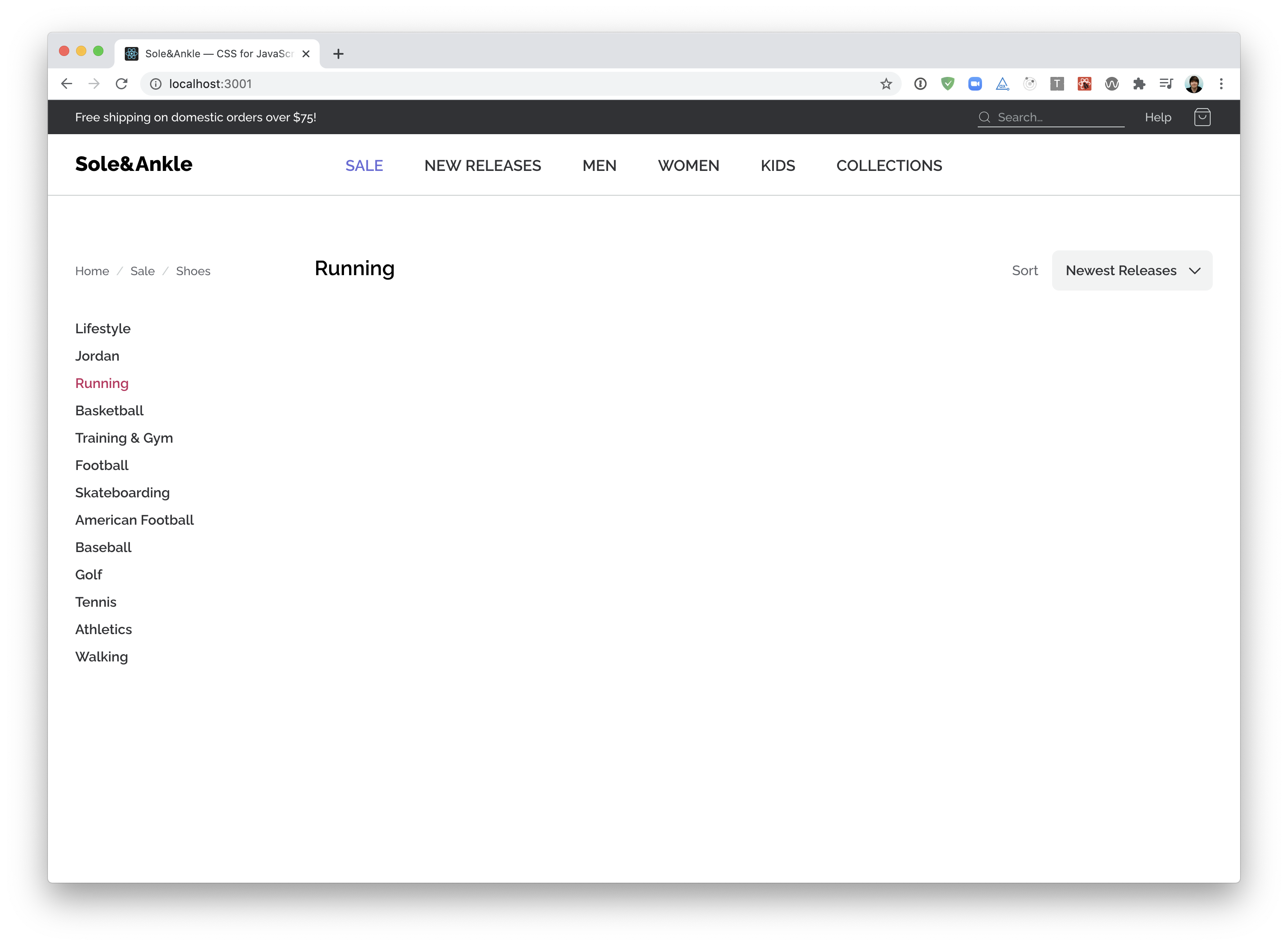
Let's build the “Superheader” a thin grey strip that runs along the top of the page:
Use Flexbox to correctly align the elements within src/components/SuperHeader.
Continuing on down, let's tackle the main header:
Next up, we want to tackle the "framing" around the shoe grid — the sidebar and title/filter.
NOTE: To make life a bit easier, you may wish to comment out the <ShoeGrid> component. We'll work on integrating it in the next exercise.
This exercise features two mini-challenges. The second one is a chance to revisit some of the lessons learned in previous modules, and isn't as specific to Flexbox.
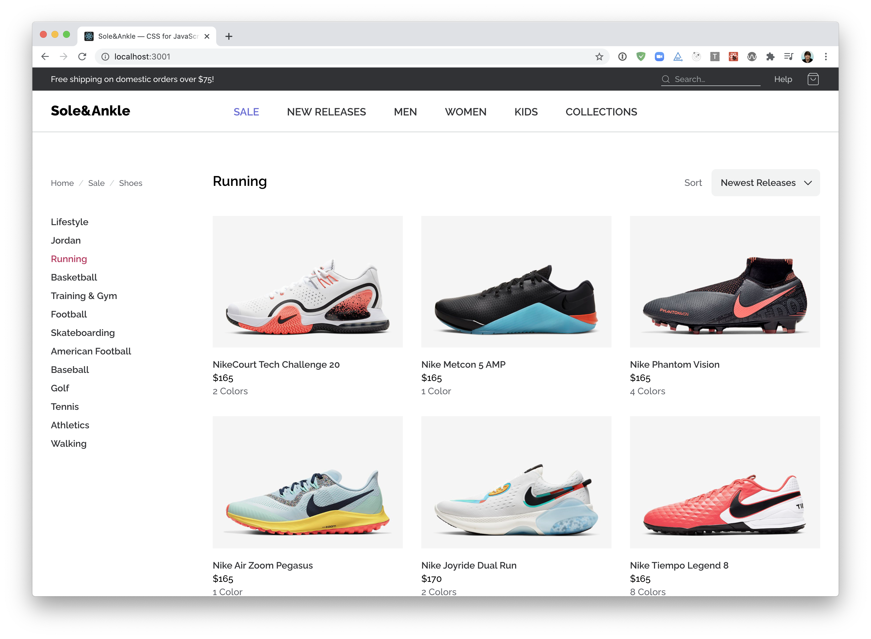
Time to tackle the main feature of this application, the shoes!
Here's a screenshot of the final result:
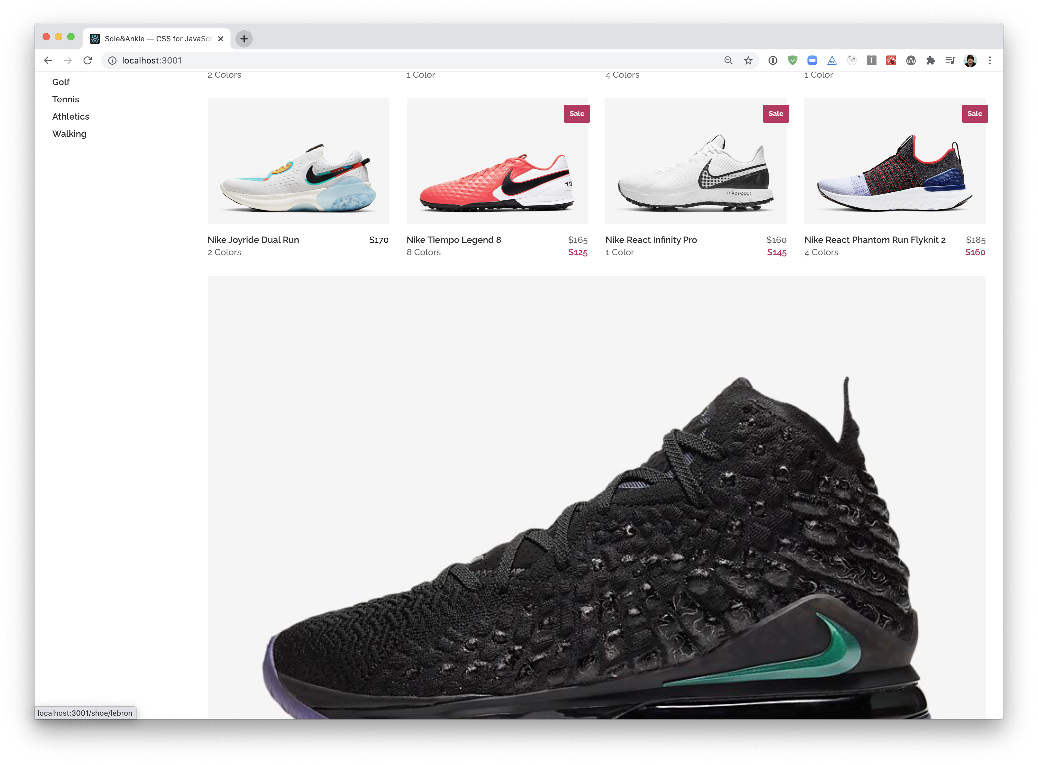
This is a tricky problem to solve with Flexbox—CSS Grid is a better tool for this job! Nevertheless, it can be done using Flexbox, with one caveat: the last row may be oversized:
In a future module, we'll revisit this and see how CSS Grid can help us out :)
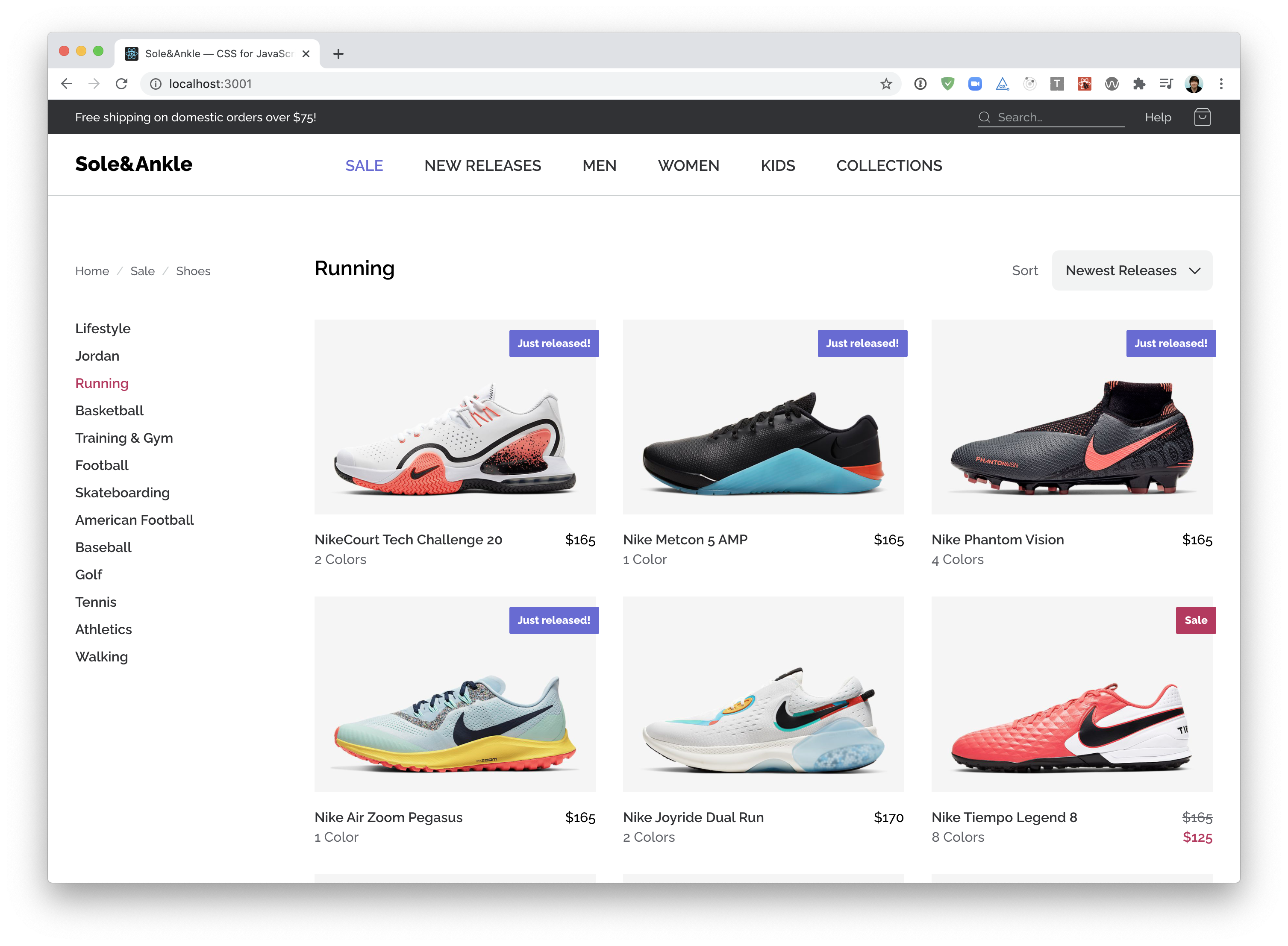
Our sneaker store is in pretty good shape, but there's a couple small bits of polish missing: the "New Release" / "Sale" flag, and the sale price detail.
NOTE: This exercise has minimal flexbox implications, and is mainly about revisiting lessons learned in the previous modules (including positioned layout and styled-components). Feel free to skip it if you'd prefer!
Our sneaker store can flex to support different screen sizes, but there isn't a proper mobile or tablet view. Don't fret — we will revisit this workshop in a future module!
In the meantime, take a moment to congratulate yourself for making it through the Flexbox module!!


