In this workshop, we're going to optimize and improve an existing application.
Using the tricks we learned about typography and images in this module, we'll improve the performance, accessibility, and user experience for Unsprinkle, a photo-sharing application.
If you run into problems running a local development server, check out our Troubleshooting Guide on the course platform.
This guide addresses the common Digital Envelope Routine error you may have seen.
This project is using a variable font, but it's quite hefty! Using Google Fonts, swap it out for an optimized version.
Bonus points for self-hosting the optimized font!
For a photo-heavy site like this one, we can significantly improve the user experience by optimizing the images that appear.
The images in the photo grid and the hero should implement the following optimizations:
- Serve larger images to users who use high-DPI displays.
- Serve modern
.avifimages instead of.jpgimages to users on supported browsers.
All of the images have already been created for you. They follow a consistent naming pattern:
- photo-name.jpg
- photo-name.avif
- photo-name@2x.jpg
- photo-name@2x.avif
- photo-name@3x.jpg
- photo-name@3x.avif
For the hero, you can hardcode these values. For the photo grid, you'll need to use some JavaScript to update the photo names. You can use the replace method:
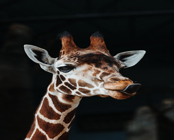
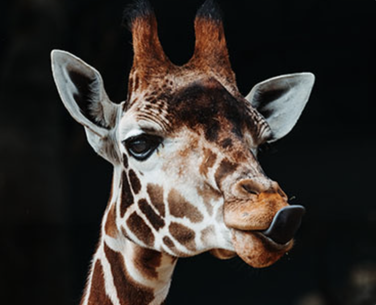
src.replace('.jpg', '@2x.avif');One last thing: the images are a little distorted right now. This happens because our images are all the same size, but they don't share the same aspect ratio.
Here's what the giraffe picture looks like by default:
…And here's what it should look like after your modifications:
There are several images in this application, and none of them have been given the required "alt" attribute.
Update all images so that they have appropriate alternative text.
There are 11 images in total, including 2 in the Hero.js component. Be sure to consider the context (if you weren't able to see the page, what would you want to know about them?).
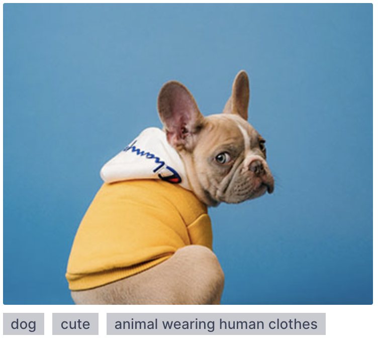
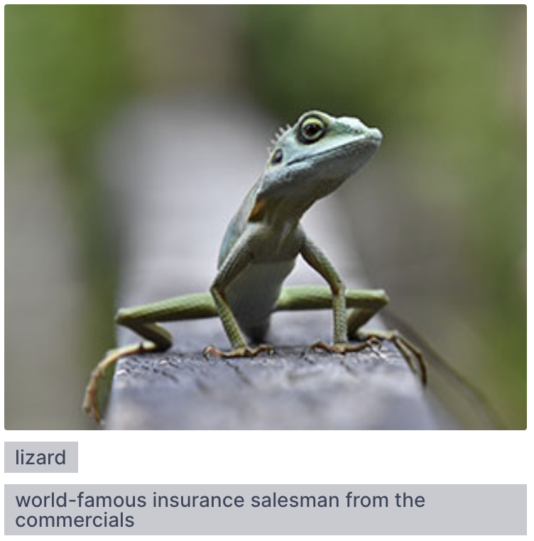
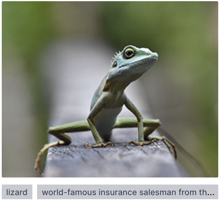
Each photo has associated tags, shown in small grey boxes below the image:
Some of these items have very long tags:
Update the CSS so that the tags always fit on 1 line. If there is too much text, the final tag should have an ellipsis (…).
This is a challenging exercise. You'll need to tweak some of the existing CSS (Hint: Flexbox might not be the right layout mode for this)
