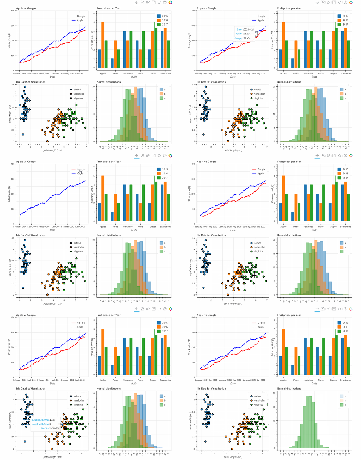
- 11.05.2019: **Major update Pandas Bokeh 0.2 released!**Pandas Bokeh provides a Bokeh plotting backend for Pandas, GeoPandas and Pyspark (new in Pandas Bokeh 0.2!) DataFrames, similar to the already existing Visualization feature of Pandas. Importing the library adds a complementary plotting method plot_bokeh() on DataFrames and Series.
With Pandas Bokeh, creating stunning, interactive, HTML-based visualization is as easy as calling:
df.plot_bokeh()For more information have a look at the Examples below or at notebooks on the Github Repository of this project.
You can install Pandas Bokeh from PyPI via pip:
pip install pandas-bokeh
Pandas Bokeh is supported on Python 2.7, as well as Python 3.4 and above.
The current release is 0.2 (2019-02-19). For more details, see Release Notes.
The Pandas-Bokeh library should be imported after Pandas, GeoPandas and/or Pyspark. After the import, one should define the plotting output, which can be:
-
pandas_bokeh.output_notebook(): Embeds the Plots in the cell outputs of the notebook. Ideal when working in Jupyter Notebooks.
-
pandas_bokeh.output_file(filename): Exports the plot to the provided filename as an HTML.
For more details about the plotting outputs, see the reference here or the Bokeh documentation.
Notebook output (see also bokeh.io.output_notebook)
import pandas as pd
import pandas_bokeh
pandas_bokeh.output_notebook()*New in Pandas Bokeh 0.2: Zeppelin Notebook Support
File output to "Interactive Plot.html" (see also bokeh.io.output_file)
import pandas as pd
import pandas_bokeh
pandas_bokeh.output_file("Interactive Plot.html")Supported plottypes are at the moment:
-
Pandas & Pyspark (New in Relase 0.2)
Also, check out the complementary chapter Outputs, Formatting & Layouts about:
- Output options (how to get HTML representation of Bokeh plots)
- Number formats in Pandas Bokeh (modify Hovertool number format, suppress scientific notation on axes)
- Dashboard layouts (How to layout multiple plots in rows, columns and grids)
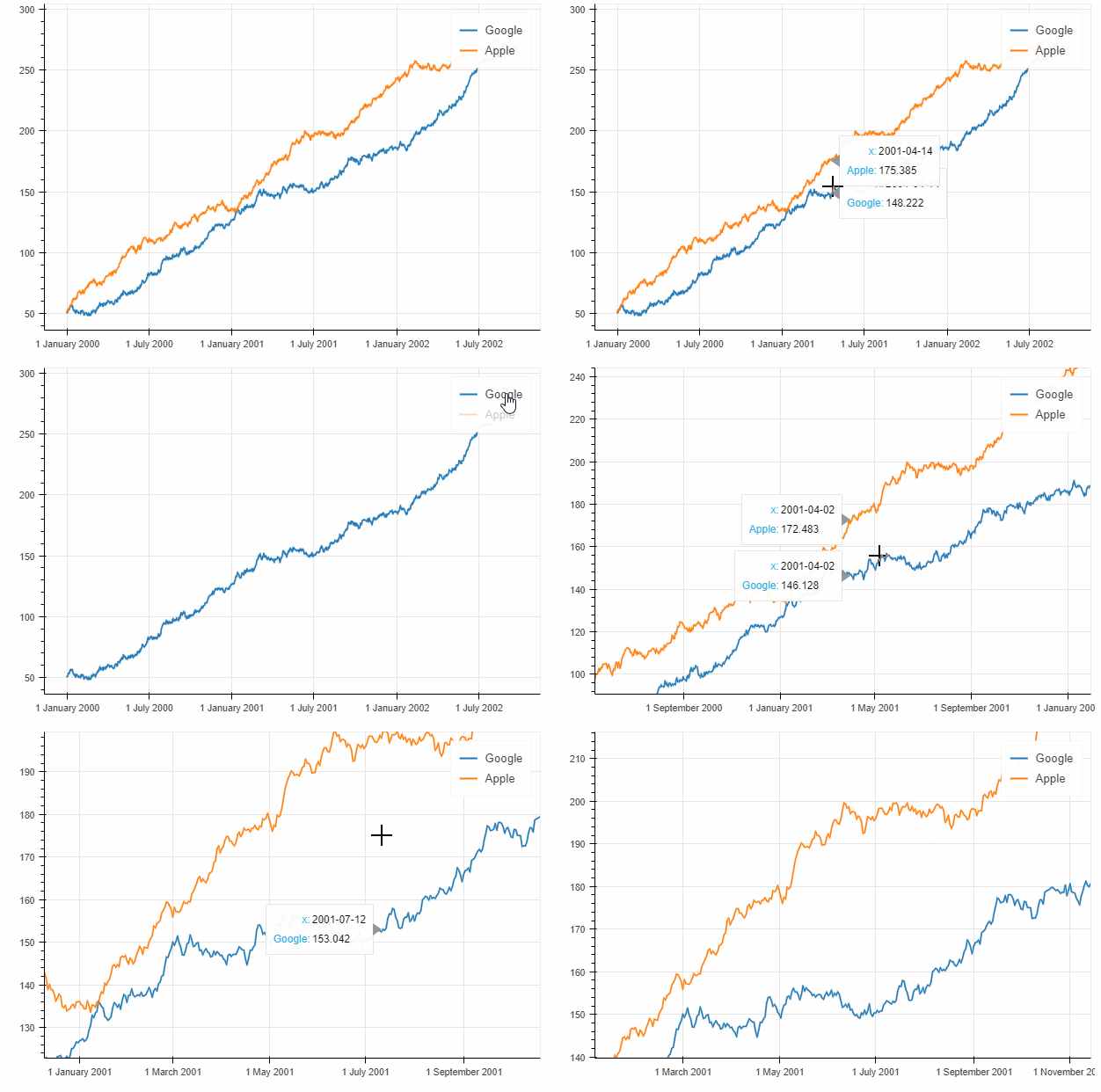
This simple lineplot in Pandas Bokeh already contains various interactive elements:
- a pannable and zoomable (zoom in plotarea and zoom on axis) plot
- by clicking on the legend elements, one can hide and show the individual lines
- a Hovertool for the plotted lines
Consider the following simple example:
import numpy as np

np.random.seed(42)
df = pd.DataFrame({"Google": np.random.randn(1000)+0.2,
                   "Apple": np.random.randn(1000)+0.17},
                   index=pd.date_range('1/1/2000', periods=1000))
df = df.cumsum()
df = df + 50
df.plot_bokeh(kind="line")       #equivalent to df.plot_bokeh.line()
Note, that similar to the regular pandas.DataFrame.plot method, there are also additional accessors to directly access the different plotting types like:
df.plot_bokeh(kind="line", ...)→df.plot_bokeh.line(...)df.plot_bokeh(kind="bar", ...)→df.plot_bokeh.bar(...)df.plot_bokeh(kind="hist", ...)→df.plot_bokeh.hist(...)- ...
There are various optional parameters to tune the plots, for example:
-
kind: Which kind of plot should be produced. Currently supported are: "line", "point", "scatter", "bar" and "histogram". In the near future many more will be implemented as horizontal barplot, boxplots, pie-charts, etc.
-
x: Name of the column to use for the horizontal x-axis. If the x parameter is not specified, the index is used for the x-values of the plot. Alternative, also an array of values can be passed that has the same number of elements as the DataFrame.
-
y: Name of column or list of names of columns to use for the vertical y-axis.
-
figsize: Choose width & height of the plot
-
title: Sets title of the plot
-
xlim/ylim: Set visibler range of plot for x- and y-axis (also works for datetime x-axis)
-
xlabel/ylabel: Set x- and y-labels
-
logx/logy: Set log-scale on x-/y-axis
-
xticks/yticks: Explicitly set the ticks on the axes
-
color: Defines a single color for a plot.
-
colormap: Can be used to specify multiple colors to plot. Can be either a list of colors or the name of a Bokeh color palette
-
hovertool: If True a Hovertool is active, else if False no Hovertool is drawn.
-
hovertool_string: If specified, this string will be used for the hovertool (@{column} will be replaced by the value of the column for the element the mouse hovers over, see also Bokeh documentation and here)
-
toolbar_location: Specify the position of the toolbar location (None, "above", "below", "left" or "right"). Default: "right"
-
zooming: Enables/Disables zooming. Default: True
-
panning: Enables/Disables panning. Default: True
-
kwargs**: Optional keyword arguments of bokeh.plotting.figure.line
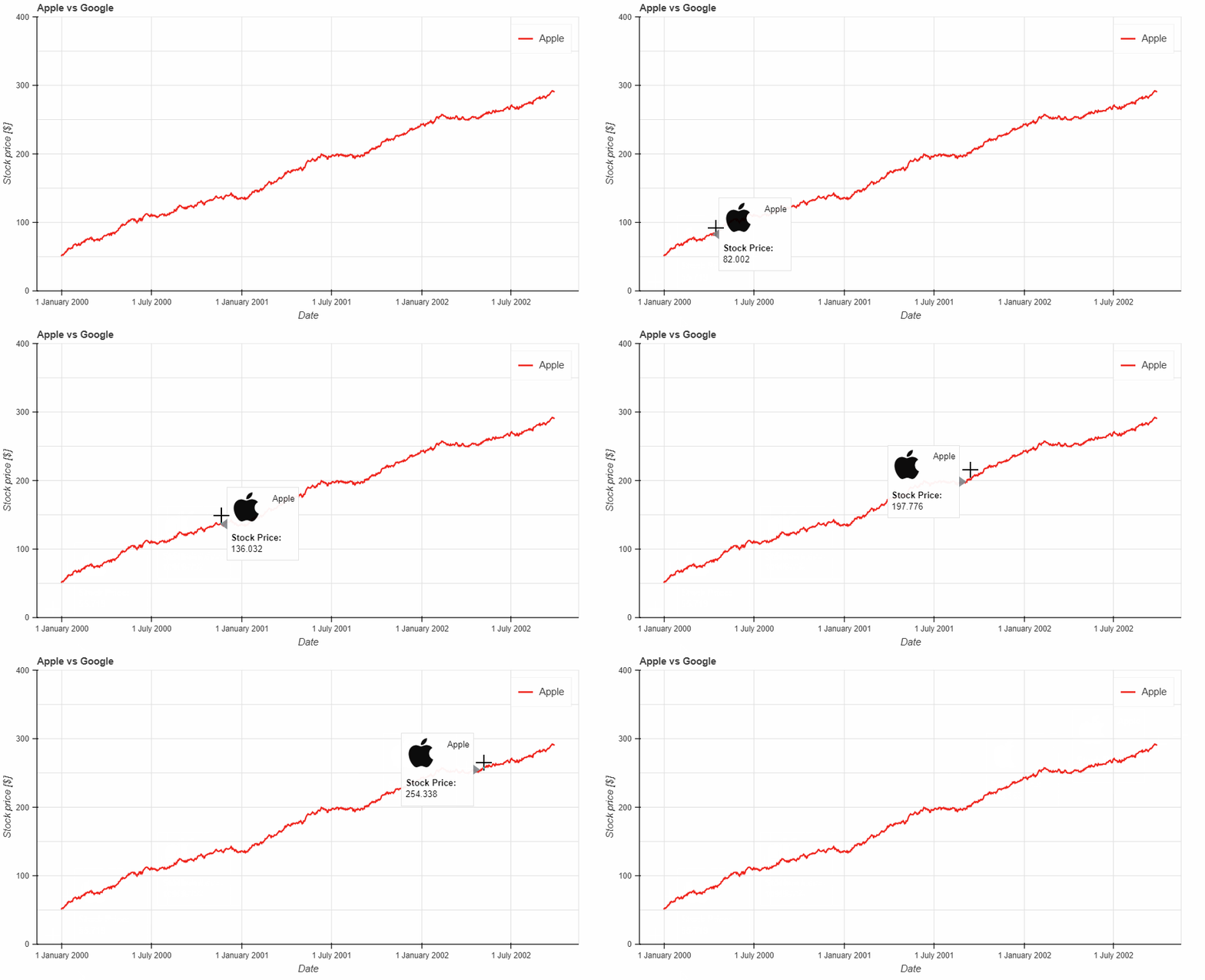
Try them out to get a feeling for the effects. Let us consider now:
df.plot_bokeh.line(
    figsize=(800, 450),
    y="Apple",
    title="Apple vs Google",
    xlabel="Date",
    ylabel="Stock price [$]",
    yticks=[0, 100, 200, 300, 400],
    ylim=(0, 400),
    toolbar_location=None,
    colormap=["red", "blue"],
    hovertool_string="""<img
                        src="https://upload.wikimedia.org/wikipedia/commons/thumb/f/fa/Apple_logo_black.svg/170px-Apple_logo_black.svg.png"
                        height="42" alt="@imgs" width="42"
                        style="float: left; margin: 0px 15px 15px 0px;"
                        border="2"></img> Apple

                        <h4> Stock Price: </h4> @{Apple}""",
    panning=False,
zooming=False)For lineplots, as for many other plot-kinds, there are some special keyword arguments that only work for this plotting type. For lineplots, these are:
-
plot_data_points: Plot also the data points on the lines
-
plot_data_points_size: Determines the size of the data points
-
marker: Defines the point type (Default: "circle"). Possible values are: 'circle', 'square', 'triangle', 'asterisk', 'circle_x', 'square_x', 'inverted_triangle', 'x', 'circle_cross', 'square_cross', 'diamond', 'cross'
-
kwargs**: Optional keyword arguments of bokeh.plotting.figure.line
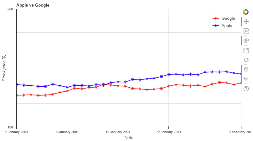
Let us use this information to have another version of the same plot:
df.plot_bokeh.line(
    figsize=(800, 450),
    title="Apple vs Google",
    xlabel="Date",
    ylabel="Stock price [$]",
    yticks=[0, 100, 200, 300, 400],
    ylim=(100, 200),
    xlim=("2001-01-01", "2001-02-01"),
    colormap=["red", "blue"],
    plot_data_points=True,
    plot_data_points_size=10,
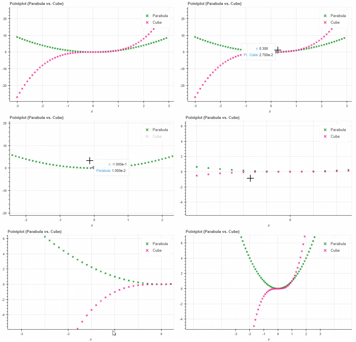
marker="asterisk")If you just wish to draw the date points for curves, the pointplot option is the right choice. It also accepts the kwargs of bokeh.plotting.figure.scatter like marker or size:
import numpy as np

x = np.arange(-3, 3, 0.1)
y2 = x**2
y3 = x**3
df = pd.DataFrame({"x": x, "Parabula": y2, "Cube": y3})
df.plot_bokeh.point(
    x="x",
    xticks=range(-3, 4),
    size=5,
    colormap=["#009933", "#ff3399"],
    title="Pointplot (Parabula vs. Cube)",
marker="x")A basic scatterplot can be created using the kind="scatter" option. For scatterplots, the x and y parameters have to be specified and the following optional keyword argument is allowed:
-
category: Determines the category column to use for coloring the scatter points
-
kwargs**: Optional keyword arguments of bokeh.plotting.figure.scatter
Note, that the pandas.DataFrame.plot_bokeh() method return per default a Bokeh figure, which can be embedded in Dashboard layouts with other figures and Bokeh objects (for more details about (sub)plot layouts and embedding the resulting Bokeh plots as HTML click here).
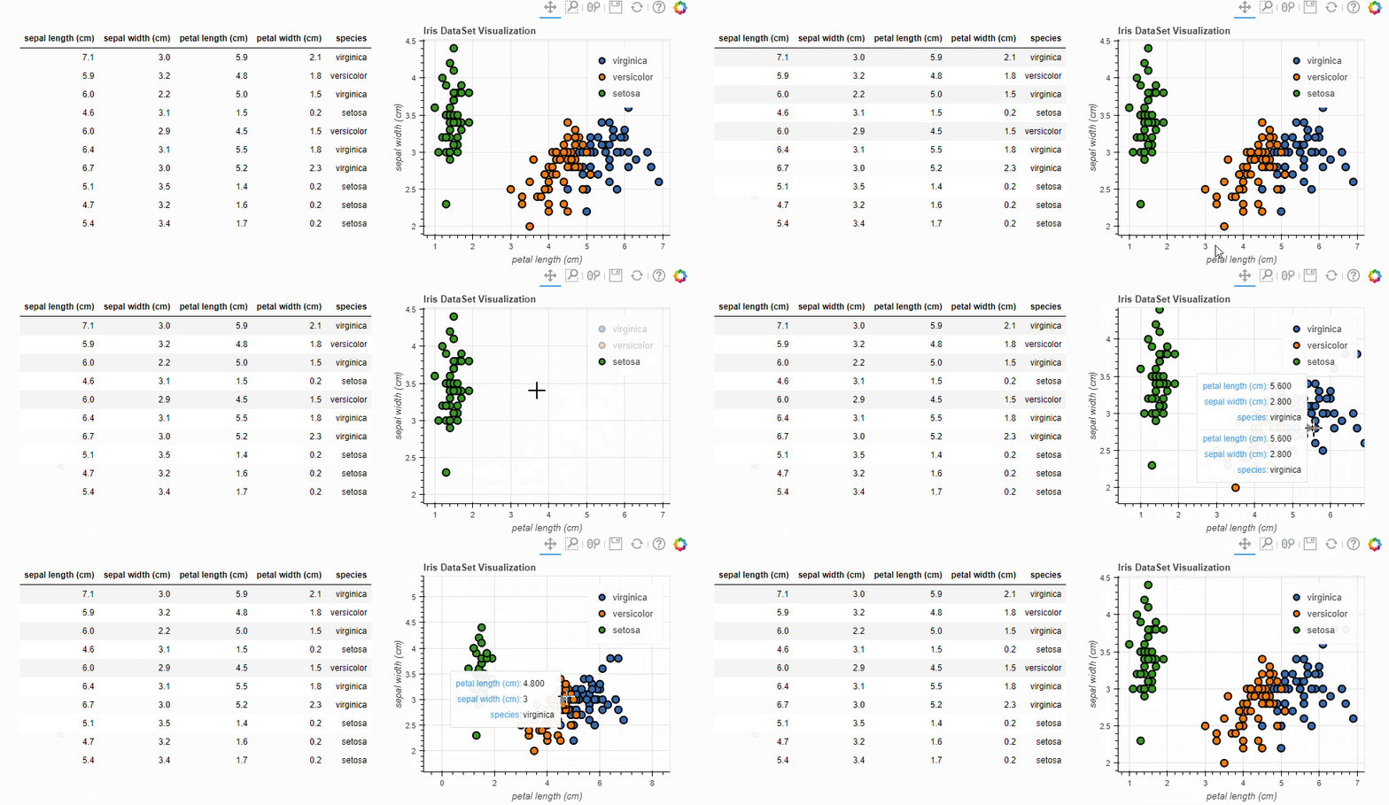
In the example below, we use the building grid layout support of Pandas Bokeh to display both the DataFrame (embedded in a Div) and the resulting scatterplot:
#Load Iris Dataset from Scikit Learn:
from sklearn.datasets import load_iris
iris = load_iris()
df = pd.DataFrame(iris["data"])
df.columns = iris["feature_names"]
df["species"] = iris["target"]
df["species"] = df["species"].map(dict(zip(range(3), iris["target_names"])))
df = df.sample(frac=1)

#Create Div with DataFrame:
from bokeh.models import Div
div_df = Div(text=df.head(10).to_html(index=False), width=550)

#Create Scatterplot:
p_scatter = df.plot_bokeh.scatter(
    x="petal length (cm)",
    y="sepal width (cm)",
    category="species",
    title="Iris DataSet Visualization",
    show_figure=False)

#Combine Div and Scatterplot via grid layout:
pandas_bokeh.plot_grid([[div_df, p_scatter]], plot_width=400, plot_height=350)
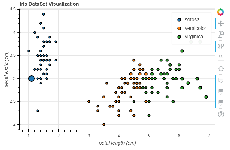
A possible optional keyword parameters that can be passed to bokeh.plotting.figure.scatter is size. Below, we use the sepal length of the Iris data as reference for the size:
#Change one value to clearly see the effect of the size keyword
df.loc[13, "sepal length (cm)"] = 15

#Make scatterplot:
p_scatter = df.plot_bokeh.scatter(
    x="petal length (cm)",
    y="sepal width (cm)",
    category="species",
    title="Iris DataSet Visualization",
    size="sepal length (cm)")
In this example you can see, that the additional dimension sepal length cannot be used to clearly differentiate between the virginica and versicolor species.
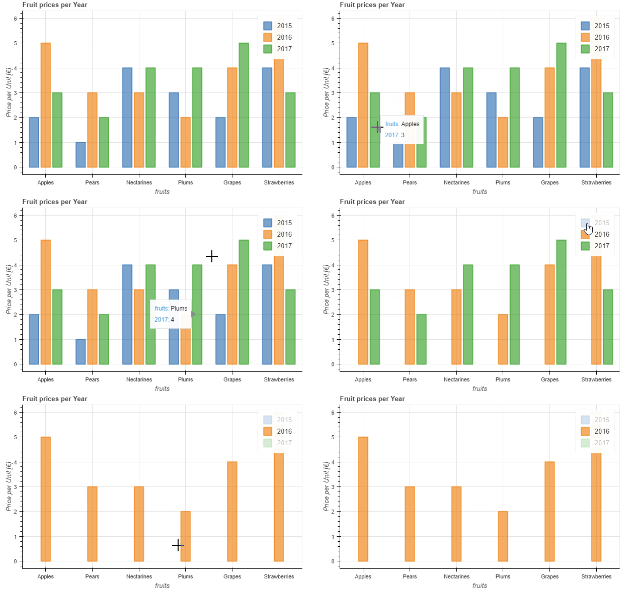
The barplot API has no special keyword arguments, but accepts optional kwargs of bokeh.plotting.figure.vbar like alpha. It uses per default the index for the bar categories (however, also columns can be used as x-axis category using the x argument).
data = {
    'fruits':
    ['Apples', 'Pears', 'Nectarines', 'Plums', 'Grapes', 'Strawberries'],
    '2015': [2, 1, 4, 3, 2, 4],
    '2016': [5, 3, 3, 2, 4, 6],
    '2017': [3, 2, 4, 4, 5, 3]
}
df = pd.DataFrame(data).set_index("fruits")

p_bar = df.plot_bokeh.bar(
    ylabel="Price per Unit [€]",
    title="Fruit prices per Year",
    alpha=0.6)
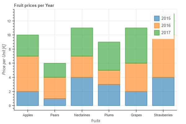
Using the stacked keyword argument you also maked stacked barplots:
p_stacked_bar = df.plot_bokeh.bar(
    ylabel="Price per Unit [€]",
    title="Fruit prices per Year",
    stacked=True,
    alpha=0.6)
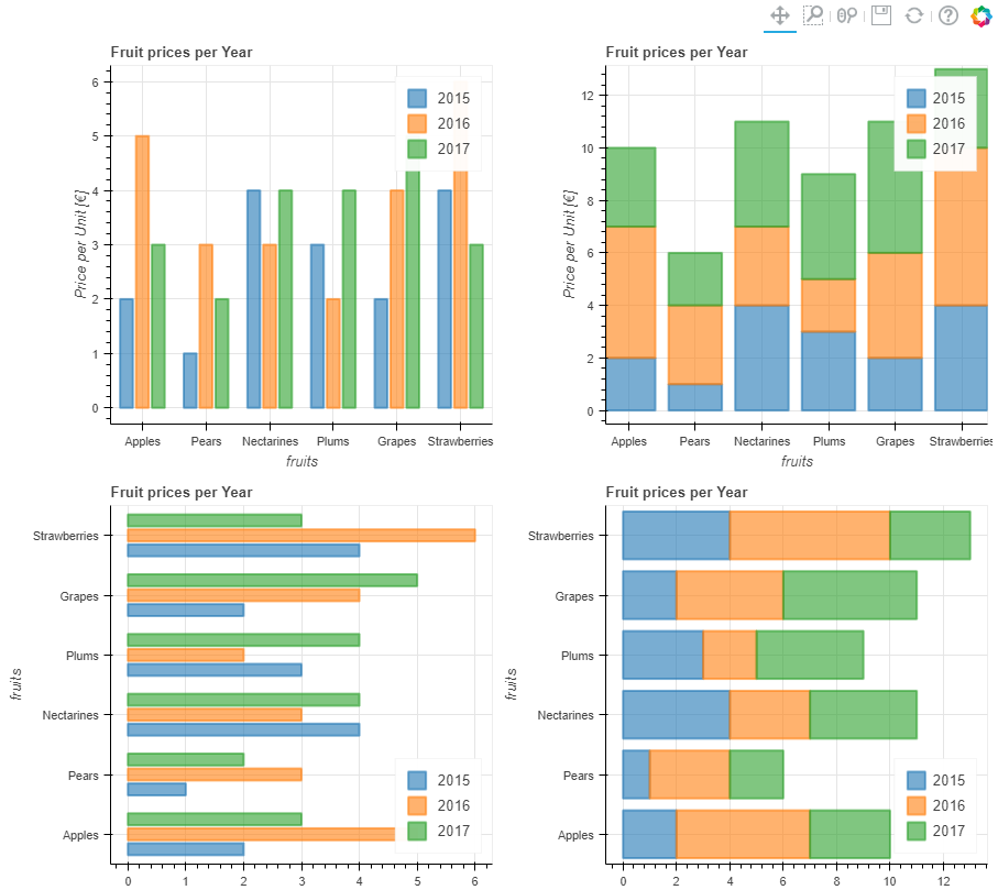
Also horizontal versions of the above barplot are supported with the keyword kind="barh" or the accessor plot_bokeh.barh. You can still specify a column of the DataFrame as the bar category via the x argument if you do not wish to use the index.
#Reset index, such that "fruits" is now a column of the DataFrame:
df.reset_index(inplace=True)

#Create horizontal bar (via kind keyword):
p_hbar = df.plot_bokeh(
    kind="barh",
    x="fruits",
    xlabel="Price per Unit [€]",
    title="Fruit prices per Year",
    alpha=0.6,
    legend = "bottom_right",
    show_figure=False)

#Create stacked horizontal bar (via barh accessor):
p_stacked_hbar = df.plot_bokeh.barh(
    x="fruits",
    stacked=True,
    xlabel="Price per Unit [€]",
    title="Fruit prices per Year",
    alpha=0.6,
    legend = "bottom_right",
    show_figure=False)

#Plot all barplot examples in a grid:
pandas_bokeh.plot_grid([[p_bar, p_stacked_bar],
                        [p_hbar, p_stacked_hbar]],
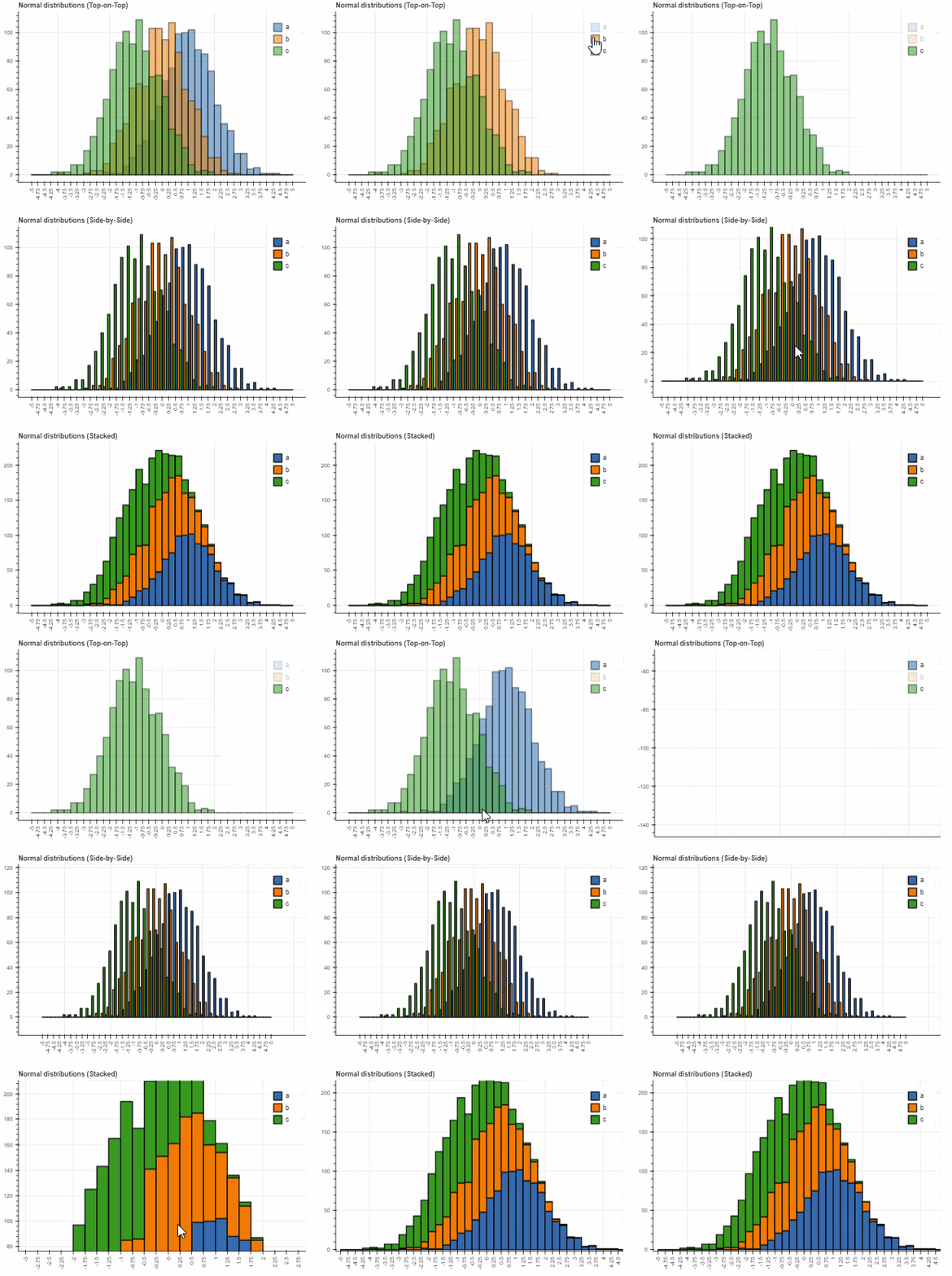
plot_width=450)For drawing histograms (kind="hist"), Pandas Bokeh has a lot of customization features. Optional keyword arguments for histogram plots are:
-
bins: Determines bins to use for the histogram. If bins is an int, it defines the number of equal-width bins in the given range (10, by default). If bins is a sequence, it defines the bin edges, including the rightmost edge, allowing for non-uniform bin widths. If bins is a string, it defines the method used to calculate the optimal bin width, as defined by histogram_bin_edges.
-
histogram_type: Either "sidebyside", "topontop" or "stacked". Default: "topontop"
-
stacked: Boolean that overrides the histogram_type as "stacked" if given. Default: False
-
kwargs**: Optional keyword arguments of bokeh.plotting.figure.quad
Below examples of the different histogram types:
import numpy as np

df_hist = pd.DataFrame({
    'a': np.random.randn(1000) + 1,
    'b': np.random.randn(1000),
    'c': np.random.randn(1000) - 1
    },
    columns=['a', 'b', 'c'])

#Top-on-Top Histogram (Default):
df_hist.plot_bokeh.hist(
    bins=np.linspace(-5, 5, 41),
    vertical_xlabel=True,
    hovertool=False,
    title="Normal distributions (Top-on-Top)",
    line_color="black")

#Side-by-Side Histogram (multiple bars share bin side-by-side) also accessible via
#kind="hist":
df_hist.plot_bokeh(
    kind="hist",
    bins=np.linspace(-5, 5, 41),
    histogram_type="sidebyside",
    vertical_xlabel=True,
    hovertool=False,
    title="Normal distributions (Side-by-Side)",
    line_color="black")

#Stacked histogram:
df_hist.plot_bokeh.hist(
    bins=np.linspace(-5, 5, 41),
    histogram_type="stacked",
    vertical_xlabel=True,
    hovertool=False,
    title="Normal distributions (Stacked)",
    line_color="black")
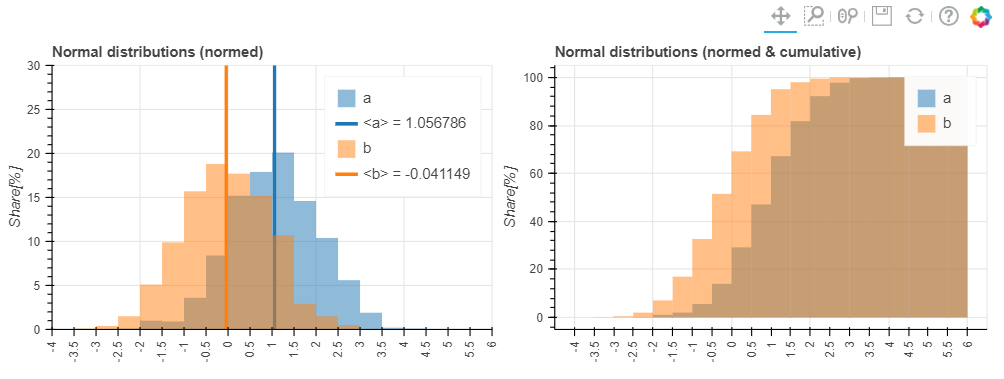
Further, advanced keyword arguments for histograms are:
- weights: A column of the DataFrame that is used as weight for the histogramm aggregation (see also numpy.histogram)
- normed: If True, histogram values are normed to 1 (sum of histogram values=1). It is also possible to pass an integer, e.g. normed=100 would result in a histogram with percentage y-axis (sum of histogram values=100). Default: False
- cumulative: If True, a cumulative histogram is shown. Default: False
- show_average: If True, the average of the histogram is also shown. Default: False
Their usage is shown in these examples:
p_hist = df_hist.plot_bokeh.hist(
    y=["a", "b"],
    bins=np.arange(-4, 6.5, 0.5),
    normed=100,
    vertical_xlabel=True,
    ylabel="Share[%]",
    title="Normal distributions (normed)",
    show_average=True,
    xlim=(-4, 6),
    ylim=(0, 30),
    show_figure=False)

p_hist_cum = df_hist.plot_bokeh.hist(
    y=["a", "b"],
    bins=np.arange(-4, 6.5, 0.5),
    normed=100,
    cumulative=True,
    vertical_xlabel=True,
    ylabel="Share[%]",
    title="Normal distributions (normed & cumulative)",
    show_figure=False)

pandas_bokeh.plot_grid([[p_hist, p_hist_cum]], plot_width=450, plot_height=300)
Areaplot (kind="area") can be either drawn on top of each other or stacked. The important parameters are:
-
stacked: If True, the areaplots are stacked. If False, plots are drawn on top of each other. Default: False
-
kwargs**: Optional keyword arguments of bokeh.plotting.figure.patch
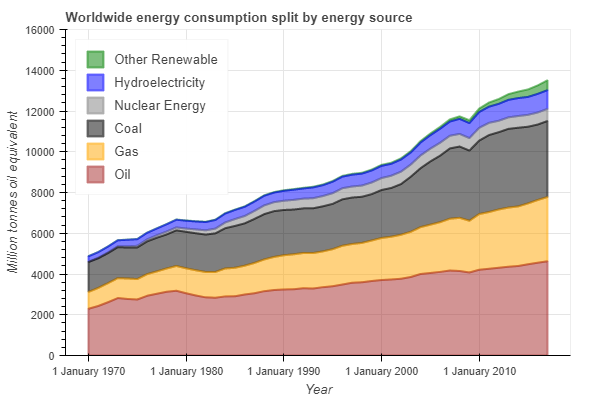
Let us consider the energy consumption split by source that can be downloaded as DataFrame via:
df_energy = pd.read_csv(r"https://raw.githubusercontent.com/PatrikHlobil/Pandas-Bokeh/master/Documentation/Testdata/energy/energy.csv",
parse_dates=["Year"])
df_energy.head()| Year | Oil | Gas | Coal | Nuclear Energy | Hydroelectricity | Other Renewable |
|---|---|---|---|---|---|---|
| 1970-01-01 | 2291.5 | 826.7 | 1467.3 | 17.7 | 265.8 | 5.8 |
| 1971-01-01 | 2427.7 | 884.8 | 1459.2 | 24.9 | 276.4 | 6.3 |
| 1972-01-01 | 2613.9 | 933.7 | 1475.7 | 34.1 | 288.9 | 6.8 |
| 1973-01-01 | 2818.1 | 978.0 | 1519.6 | 45.9 | 292.5 | 7.3 |
| 1974-01-01 | 2777.3 | 1001.9 | 1520.9 | 59.6 | 321.1 | 7.7 |
Creating the Areaplot can be achieved via:
df_energy.plot_bokeh.area(
    x="Year",
    stacked=True,
    legend="top_left",
    colormap=["brown", "orange", "black", "grey", "blue", "green"],
    title="Worldwide energy consumption split by energy source",
    ylabel="Million tonnes oil equivalent",
    ylim=(0, 16000))
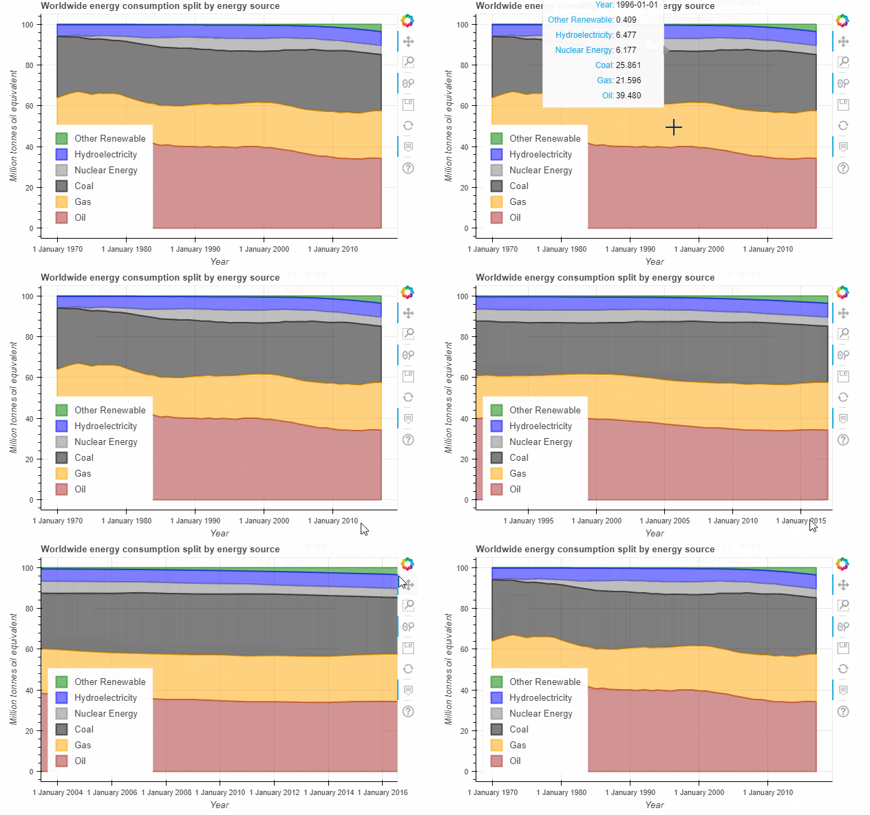
Note that the energy consumption of fossile energy is still increasing and renewable energy sources are still small in comparison 😢!!! However, when we norm the plot using the normed keyword, there is a clear trend towards renewable energies in the last decade:
df_energy.plot_bokeh.area(
    x="Year",
    stacked=True,
    normed=100,
    legend="bottom_left",
    colormap=["brown", "orange", "black", "grey", "blue", "green"],
    title="Worldwide energy consumption split by energy source",
ylabel="Million tonnes oil equivalent")For Pieplots, let us consider a dataset showing the results of all Bundestags elections in Germany since 2002:
df_pie = pd.read_csv(r"https://raw.githubusercontent.com/PatrikHlobil/Pandas-Bokeh/master/Documentation/Testdata/Bundestagswahl/Bundestagswahl.csv")
df_pie| Partei | 2002 | 2005 | 2009 | 2013 | 2017 |
|---|---|---|---|---|---|
| CDU/CSU | 38.5 | 35.2 | 33.8 | 41.5 | 32.9 |
| SPD | 38.5 | 34.2 | 23.0 | 25.7 | 20.5 |
| FDP | 7.4 | 9.8 | 14.6 | 4.8 | 10.7 |
| Grünen | 8.6 | 8.1 | 10.7 | 8.4 | 8.9 |
| Linke/PDS | 4.0 | 8.7 | 11.9 | 8.6 | 9.2 |
| AfD | 0.0 | 0.0 | 0.0 | 0.0 | 12.6 |
| Sonstige | 3.0 | 4.0 | 6.0 | 11.0 | 5.0 |
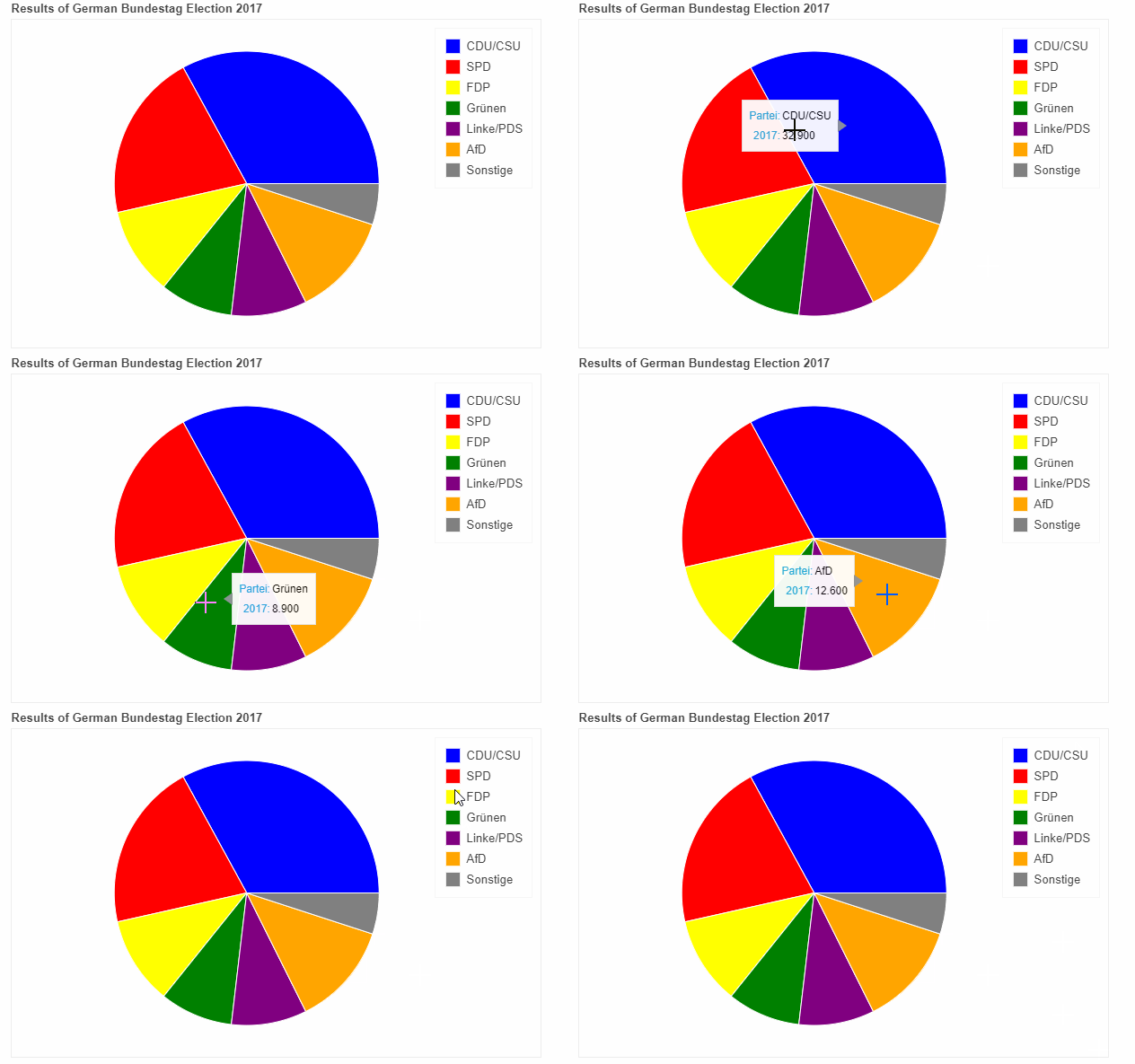
We can create a Pieplot of the last election in 2017 by specifying the "Partei" (german for party) column as the x column and the "2017" column as the y column for values:
df_pie.plot_bokeh.pie(
    x="Partei",
    y="2017",
    colormap=["blue", "red", "yellow", "green", "purple", "orange", "grey"],
    title="Results of German Bundestag Election 2017",
    )
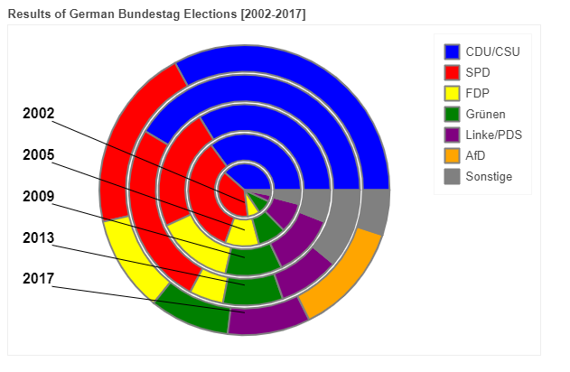
When you pass several columns to the y parameter (not providing the y-parameter assumes you plot all columns), multiple nested pieplots will be shown in one plot:
df_pie.plot_bokeh.pie(
    x="Partei",
    colormap=["blue", "red", "yellow", "green", "purple", "orange", "grey"],
    title="Results of German Bundestag Elections [2002-2017]",
line_color="grey")The mapplot method of Pandas Bokeh allows for plotting geographic points stored in a Pandas DataFrame on an interactive map. For more advanced Geoplots for line and polygon shapes have a look at the Geoplots examples for the GeoPandas API of Pandas Bokeh.
For mapplots, only (latitude, longitude) pairs in geographic projection (WGS84) can be plotted on a map. The basic API has the following 2 base parameters:
- x: name of the longitude column of the DataFrame
- y: name of the latitude column of the DataFrame
The other optional keyword arguments are discussed in the section about the GeoPandas API, e.g. category for coloring the points.
Below an example of plotting all cities for more than 1 million inhabitants:
df_mapplot = pd.read_csv(r"https://raw.githubusercontent.com/PatrikHlobil/Pandas-Bokeh/master/Documentation/Testdata/populated%20places/populated_places.csv")
df_mapplot.head()| name | pop_max | latitude | longitude | size |
|---|---|---|---|---|
| Mesa | 1085394 | 33.423915 | -111.736084 | 1.085394 |
| Sharjah | 1103027 | 25.371383 | 55.406478 | 1.103027 |
| Changwon | 1081499 | 35.219102 | 128.583562 | 1.081499 |
| Sheffield | 1292900 | 53.366677 | -1.499997 | 1.292900 |
| Abbottabad | 1183647 | 34.149503 | 73.199501 | 1.183647 |
df_mapplot["size"] = df_mapplot["pop_max"] / 1000000
df_mapplot.plot_bokeh.map(
    x="longitude",
    y="latitude",
    hovertool_string="""<h2> @{name} </h2>

                        <h3> Population: @{pop_max} </h3>""",
    tile_provider="STAMEN_TERRAIN_RETINA",
    size="size",
    figsize=(900, 600),
    title="World cities with more than 1.000.000 inhabitants")
Pandas Bokeh also allows for interactive plotting of Maps using GeoPandas by providing a geopandas.GeoDataFrame.plot_bokeh() method. It allows to plot the following geodata on a map :
- Points/MultiPoints
- Lines/MultiLines
- Polygons/MultiPolygons
Note: t is not possible to mix up the objects types, i.e. a GeoDataFrame with Points and Lines is for example not allowed.
Les us start with a simple example using the "World Borders Dataset" . Let us first import all neccessary libraries and read the shapefile:
import geopandas as gpd
import pandas as pd
import pandas_bokeh
pandas_bokeh.output_notebook()

#Read in GeoJSON from URL:
df_states = gpd.read_file(r"https://raw.githubusercontent.com/PatrikHlobil/Pandas-Bokeh/master/Documentation/Testdata/states/states.geojson")
df_states.head()| STATE_NAME | REGION | POPESTIMATE2010 | POPESTIMATE2011 | POPESTIMATE2012 | POPESTIMATE2013 | POPESTIMATE2014 | POPESTIMATE2015 | POPESTIMATE2016 | POPESTIMATE2017 | geometry |
|---|---|---|---|---|---|---|---|---|---|---|
| Hawaii | 4 | 1363817 | 1378323 | 1392772 | 1408038 | 1417710 | 1426320 | 1428683 | 1427538 | (POLYGON ((-160.0738033454681 22.0041773479577... |
| Washington | 4 | 6741386 | 6819155 | 6890899 | 6963410 | 7046931 | 7152818 | 7280934 | 7405743 | (POLYGON ((-122.4020153103835 48.2252163723779... |
| Montana | 4 | 990507 | 996866 | 1003522 | 1011921 | 1019931 | 1028317 | 1038656 | 1050493 | POLYGON ((-111.4754253002074 44.70216236909688... |
| Maine | 1 | 1327568 | 1327968 | 1328101 | 1327975 | 1328903 | 1327787 | 1330232 | 1335907 | (POLYGON ((-69.77727626137293 44.0741483685119... |
| North Dakota | 2 | 674518 | 684830 | 701380 | 722908 | 738658 | 754859 | 755548 | 755393 | POLYGON ((-98.73043728833767 45.93827137024809... |
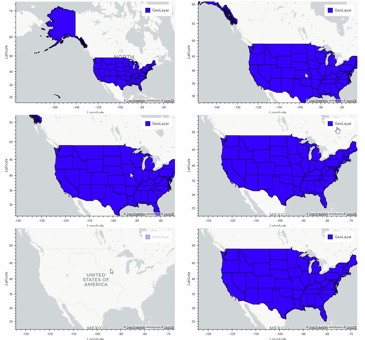
Plotting the data on a map is as simple as calling:
df_states.plot_bokeh(simplify_shapes=10000)We also passed the optional parameter simplify_shapes (~meter) to improve plotting performance (for a reference see shapely.object.simplify). The above geolayer thus has an accuracy of about 10km.
Many keyword arguments like xlabel, ylabel, xlim, ylim, title, colormap, hovertool, zooming, panning, ... for costumizing the plot are also available for the geoplotting API and can be uses as in the examples shown above. There are however also many other options especially for plotting geodata:
- hovertool_columns: Specify column names, for which values should be shown in hovertool
- hovertool_string: If specified, this string will be used for the hovertool (@{column} will be replaced by the value of the column for the element the mouse hovers over, see also Bokeh documentation)
- colormap_uselog: If set True, the colormapper is using a logscale. Default: False
- colormap_range: Specify the value range of the colormapper via (min, max) tuple
- tile_provider: Define build-in tile provider for background maps. Possible values: None, 'CARTODBPOSITRON', 'CARTODBPOSITRON_RETINA', 'STAMEN_TERRAIN', 'STAMEN_TERRAIN_RETINA', 'STAMEN_TONER', 'STAMEN_TONER_BACKGROUND', 'STAMEN_TONER_LABELS'. Default: CARTODBPOSITRON_RETINA
- tile_provider_url: An arbitraty tile_provider_url of the form '/{Z}/{X}/{Y}*.png' can be passed to be used as background map.
- tile_attribution: String (also HTML accepted) for showing attribution for tile source in the lower right corner
- tile_alpha: Sets the alpha value of the background tile between [0, 1]. Default: 1
One of the most common usage of map plots are choropleth maps, where the color of a the objects is determined by the property of the object itself. There are 3 ways of drawing choropleth maps using Pandas Bokeh, which are described below.
This is the simplest way. Just provide the category keyword for the selection of the property column:
- category: Specifies the column of the GeoDataFrame that should be used to draw a choropleth map
- show_colorbar: Whether or not to show a colorbar for categorical plots. Default: True
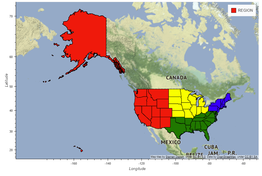
Let us now draw the regions as a choropleth plot using the category keyword (at the moment, only numerical columns are supported for choropleth plots):
df_states.plot_bokeh(
    figsize=(900, 600),
    simplify_shapes=5000,
    category="REGION",
    show_colorbar=False,
    colormap=["blue", "yellow", "green", "red"],
    hovertool_columns=["STATE_NAME", "REGION"],
    tile_provider="STAMEN_TERRAIN_RETINA")
When hovering over the states, the state-name and the region are shown as specified in the hovertool_columns argument.
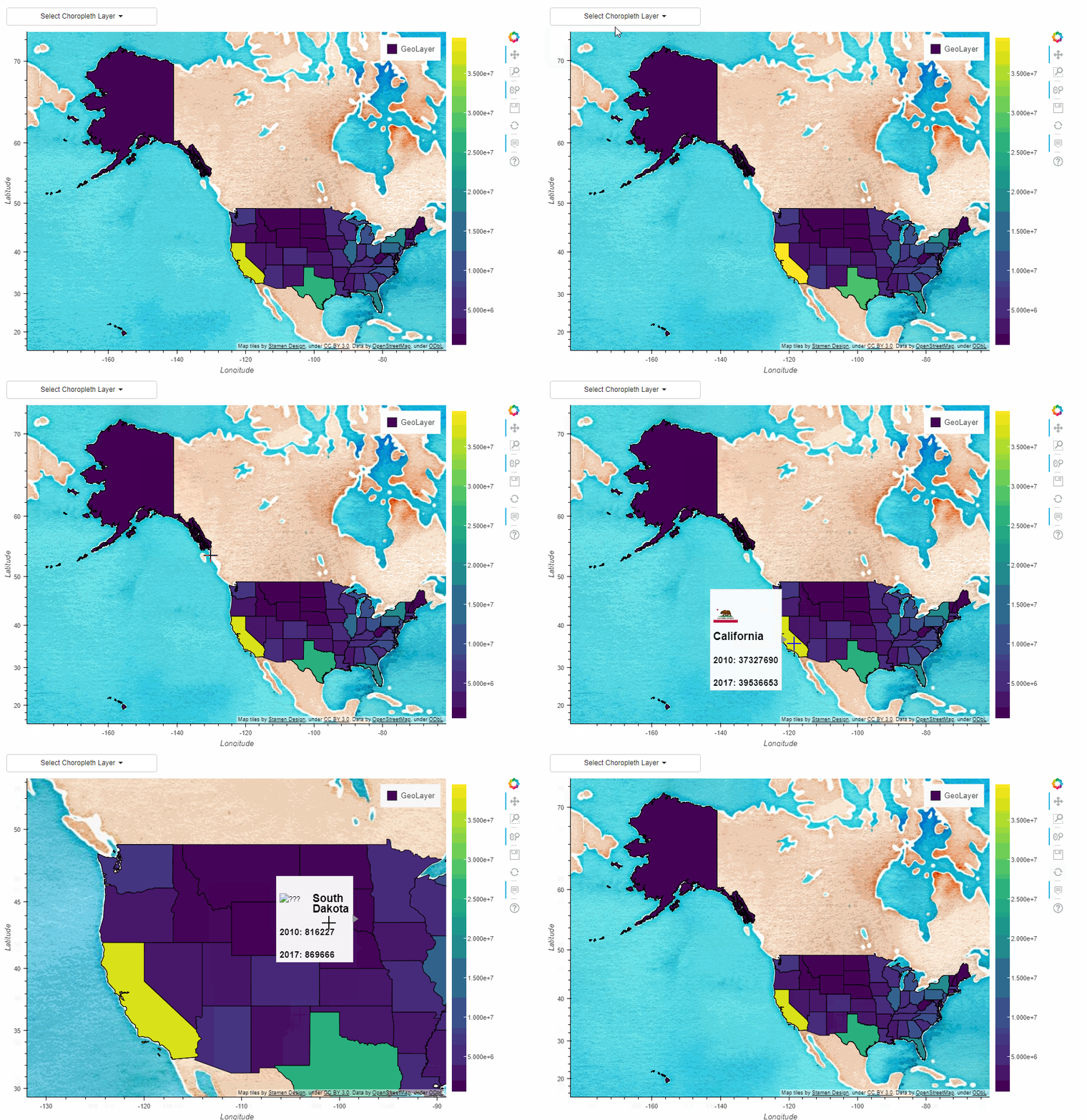
By passing a list of column names of the GeoDataFrame as the dropdown keyword argument, a dropdown menu is shown above the map. This dropdown menu can be used to select the choropleth layer by the user. :
df_states["STATE_NAME_SMALL"] = df_states["STATE_NAME"].str.lower()

df_states.plot_bokeh(
    figsize=(900, 600),
    simplify_shapes=5000,
    dropdown=["POPESTIMATE2010", "POPESTIMATE2017"],
    colormap="Viridis",
    hovertool_string="""
                        <img
                        src="https://www.states101.com/img/flags/gif/small/@STATE_NAME_SMALL.gif"
                        height="42" alt="@imgs" width="42"
                        style="float: left; margin: 0px 15px 15px 0px;"
                        border="2"></img>

                        <h2>  @STATE_NAME </h2>
                        <h3> 2010: @POPESTIMATE2010 </h3>
                        <h3> 2017: @POPESTIMATE2017 </h3>""",
    tile_provider_url=r"http://c.tile.stamen.com/watercolor/{Z}/{X}/{Y}.jpg",
    tile_attribution='Map tiles by <a href="http://stamen.com">Stamen Design</a>, under <a href="http://creativecommons.org/licenses/by/3.0">CC BY 3.0</a>. Data by <a href="http://openstreetmap.org">OpenStreetMap</a>, under <a href="http://www.openstreetmap.org/copyright">ODbL</a>.'
    )
Using hovertool_string, one can pass a string that can contain arbitrary HTML elements (including divs, images, ...) that is shown when hovering over the geographies (@{column} will be replaced by the value of the column for the element the mouse hovers over, see also Bokeh documentation).
Here, we also used an OSM tile server with watercolor style via tile_provider_url and added the attribution via tile_attribution.
Another option for interactive choropleth maps is the slider implementation of Pandas Bokeh. The possible keyword arguments are here:
- slider: By passing a list of column names of the GeoDataFrame, a slider can be used to . This dropdown menu can be used to select the choropleth layer by the user.
- slider_range: Pass a range (or numpy.arange) of numbers object to relate the sliders values with the slider columns. By passing range(0,10), the slider will have values [0, 1, 2, ..., 9], when passing numpy.arange(3,5,0.5), the slider will have values [3, 3.5, 4, 4.5]. Default: range(0, len(slider))
- slider_name: Specifies the title of the slider. Default is an empty string.
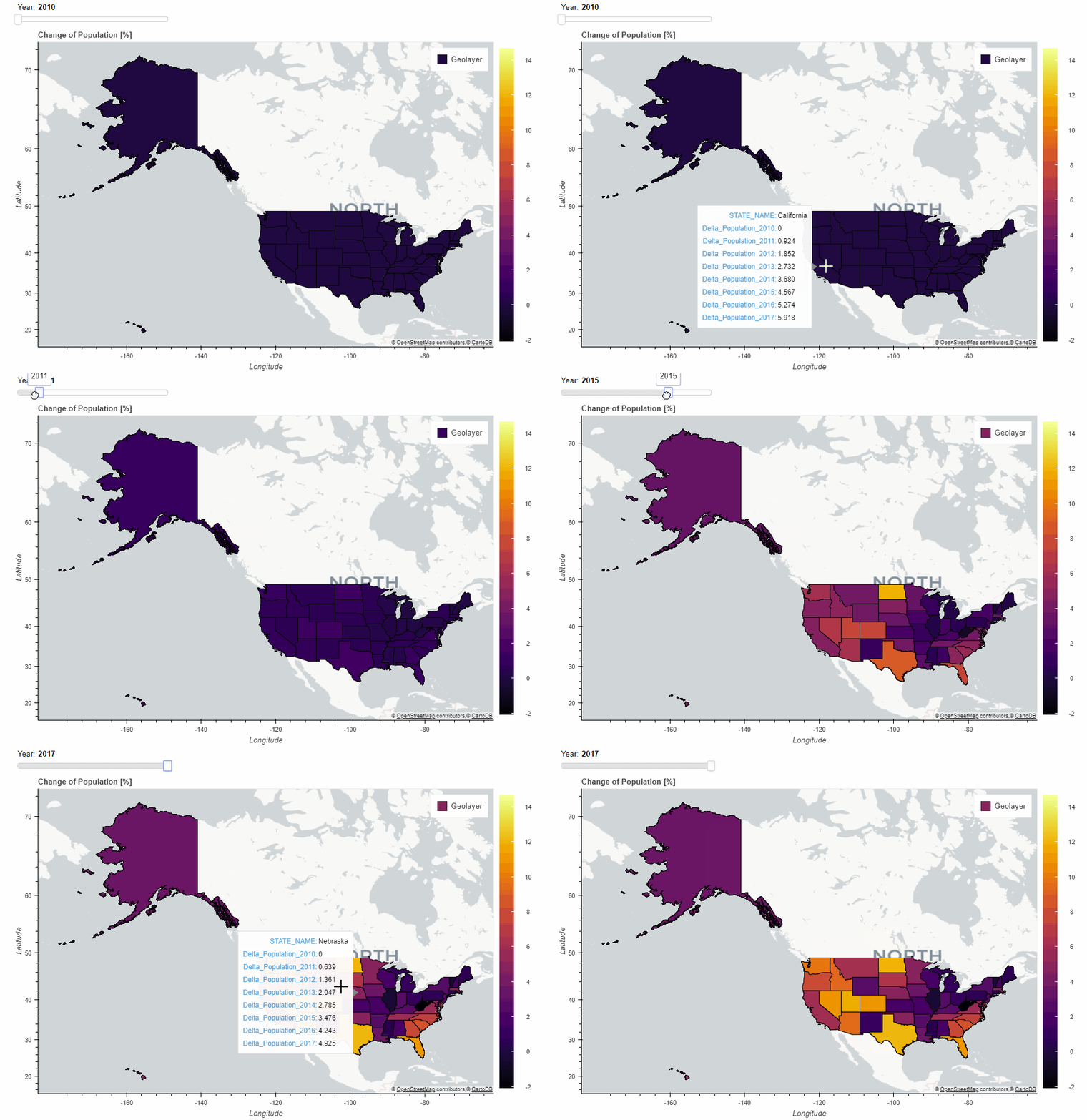
This can be used to display the change in population relative to the year 2010:
#Calculate change of population relative to 2010:
for i in range(8):
    df_states["Delta_Population_201%d"%i] = ((df_states["POPESTIMATE201%d"%i] / df_states["POPESTIMATE2010"]) -1 ) * 100

#Specify slider columns:
slider_columns = ["Delta_Population_201%d"%i for i in range(8)]

#Specify slider-range (Maps "Delta_Population_2010" -> 2010,
#                           "Delta_Population_2011" -> 2011, ...):
slider_range = range(2010, 2018)

#Make slider plot:
df_states.plot_bokeh(
    figsize=(900, 600),
    simplify_shapes=5000,
    slider=slider_columns,
    slider_range=slider_range,
    slider_name="Year",
    colormap="Inferno",
    hovertool_columns=["STATE_NAME"] + slider_columns,
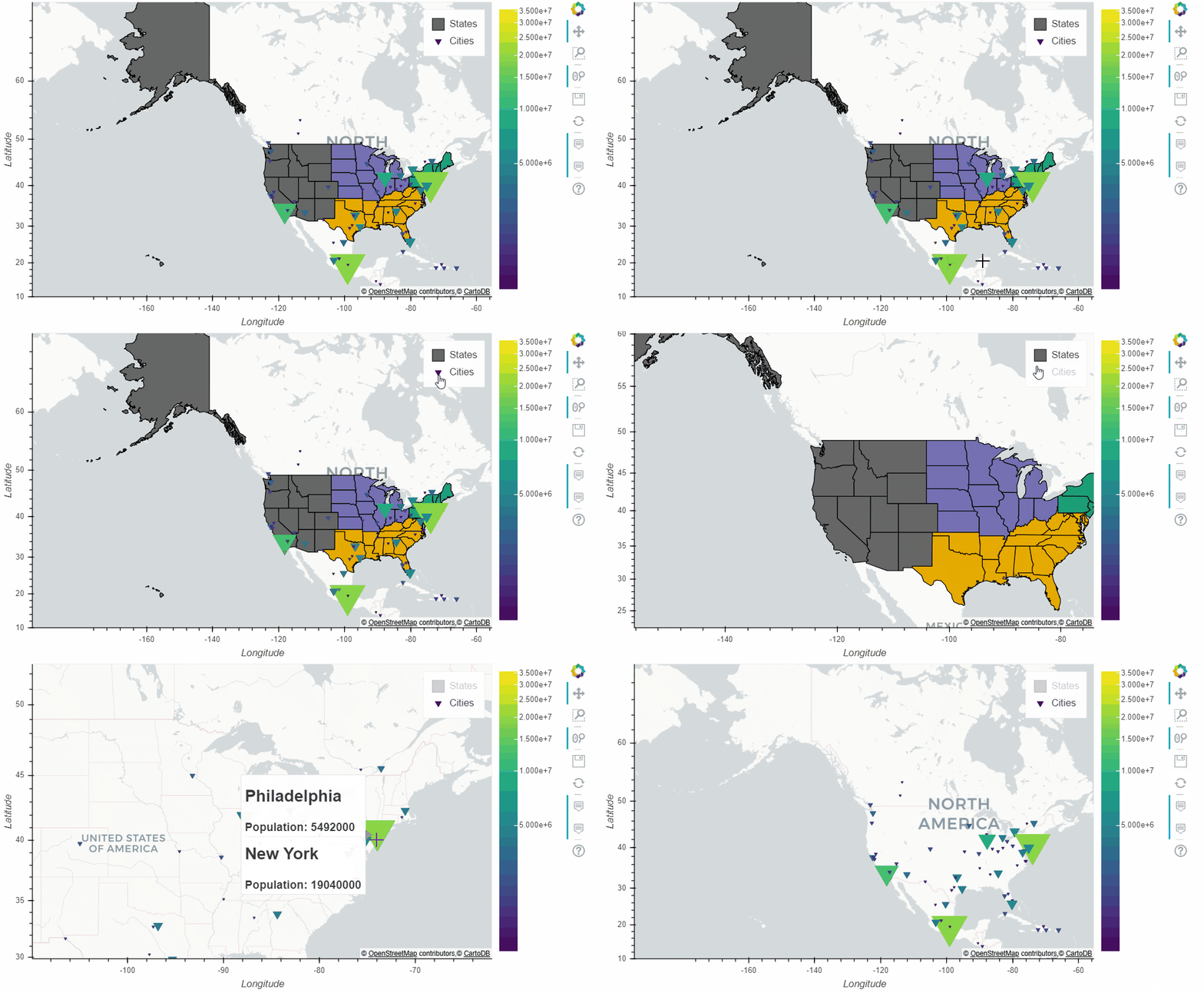
title="Change of Population [%]")If you wish to display multiple geolayers, you can pass the Bokeh figure of a Pandas Bokeh plot via the figure keyword to the next plot_bokeh() call:
import geopandas as gpd
import pandas_bokeh
pandas_bokeh.output_notebook()

# Read in GeoJSONs from URL:
df_states = gpd.read_file(r"https://raw.githubusercontent.com/PatrikHlobil/Pandas-Bokeh/master/Documentation/Testdata/states/states.geojson")
df_cities = gpd.read_file(
    r"https://raw.githubusercontent.com/PatrikHlobil/Pandas-Bokeh/master/Documentation/Testdata/populated%20places/ne_10m_populated_places_simple_bigcities.geojson"
)
df_cities["size"] = df_cities.pop_max / 400000

#Plot shapes of US states (pass figure options to this initial plot):
figure = df_states.plot_bokeh(
    figsize=(800, 450),
    simplify_shapes=10000,
    show_figure=False,
    xlim=[-170, -80],
    ylim=[10, 70],
    category="REGION",
    colormap="Dark2",
    legend="States",
    show_colorbar=False,
)

#Plot cities as points on top of the US states layer by passing the figure:
df_cities.plot_bokeh(
    figure=figure,         # <== pass figure here!
    category="pop_max",
    colormap="Viridis",
    colormap_uselog=True,
    size="size",
    hovertool_string="""<h1>@name</h1>
                        <h3>Population: @pop_max </h3>""",
    marker="inverted_triangle",
    legend="Cities",
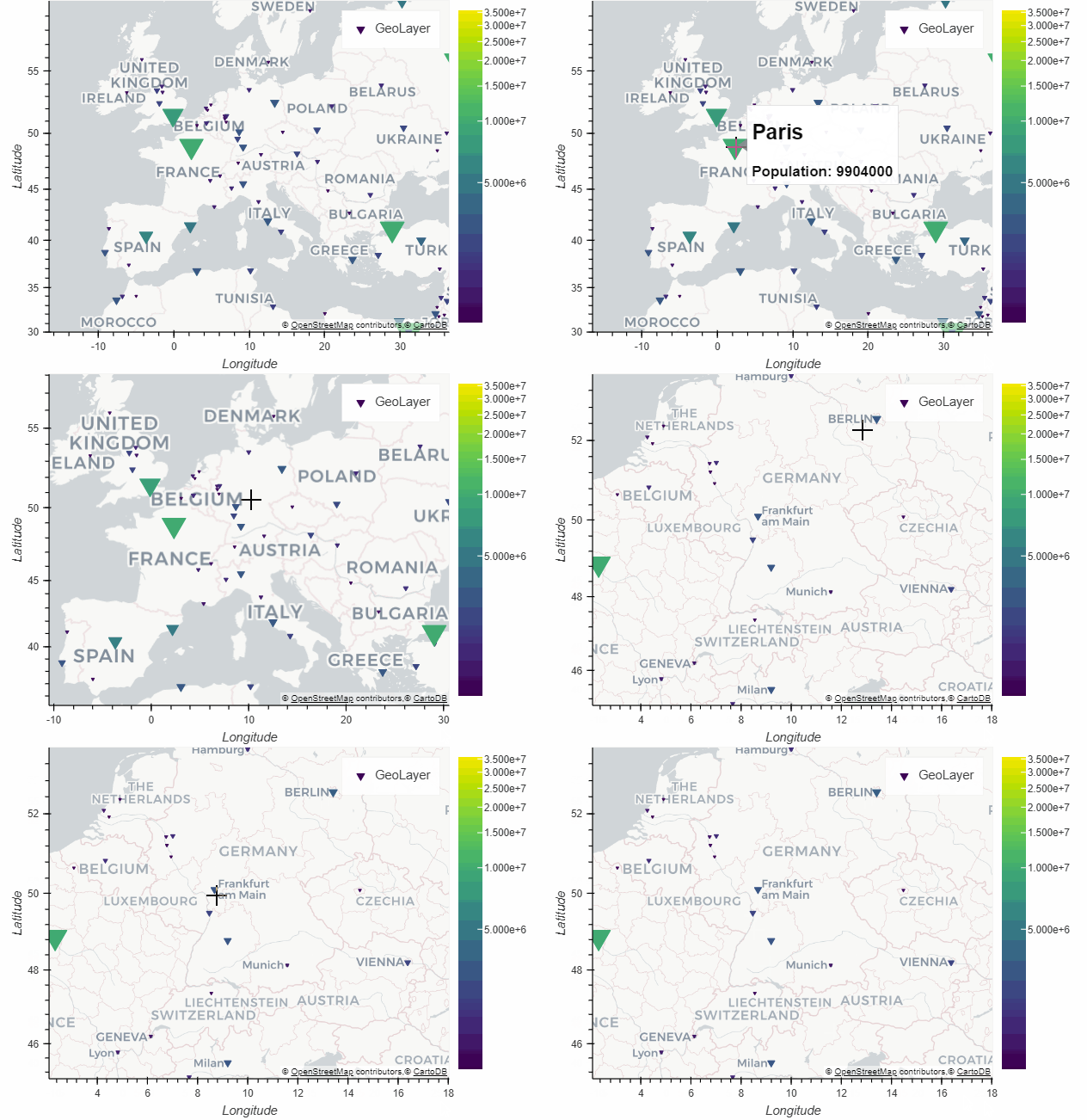
)Below, you can see an example that use Pandas Bokeh to plot point data on a map. The plot shows all cities with a population larger than 1.000.000. For point plots, you can select the marker as keyword argument (since it is passed to bokeh.plotting.figure.scatter). Here an overview of all available marker types:
gdf = gpd.read_file(r"https://raw.githubusercontent.com/PatrikHlobil/Pandas-Bokeh/master/Documentation/Testdata/populated%20places/ne_10m_populated_places_simple_bigcities.geojson")
gdf["size"] = gdf.pop_max / 400000

gdf.plot_bokeh(
    category="pop_max",
    colormap="Viridis",
    colormap_uselog=True,
    size="size",
    hovertool_string="""<h1>@name</h1>
                        <h3>Population: @pop_max </h3>""",
    xlim=[-15, 35],
    ylim=[30,60],
    marker="inverted_triangle");
In a similar way, also GeoDataFrames with (multi)line shapes can be drawn using Pandas Bokeh.
If you want to display the numerical labels on your colorbar with an alternative to the scientific format, you
can pass in a one of the bokeh number string formats
or an instance of one of the bokeh.models.formatters to the colorbar_tick_format argument
in the geoplot
An example of using the string format argument:
df_states = gpd.read_file(r"https://raw.githubusercontent.com/PatrikHlobil/Pandas-Bokeh/master/Documentation/Testdata/states/states.geojson")

df_states["STATE_NAME_SMALL"] = df_states["STATE_NAME"].str.lower()

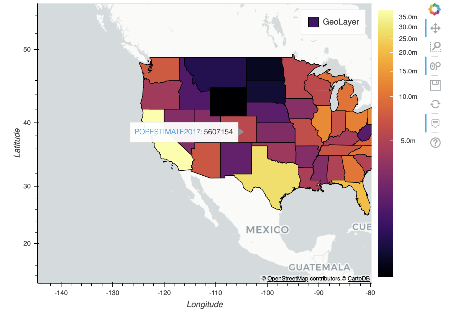
# pass in a string format to colorbar_tick_format to display the ticks as 10m rather than 1e7
df_states.plot_bokeh(
    figsize=(900, 600),
    category="POPESTIMATE2017",
    simplify_shapes=5000,
    colormap="Inferno",
    colormap_uselog=True,
    colorbar_tick_format="0.0a")
An example of using the bokeh PrintfTickFormatter:
df_states = gpd.read_file(r"https://raw.githubusercontent.com/PatrikHlobil/Pandas-Bokeh/master/Documentation/Testdata/states/states.geojson")

df_states["STATE_NAME_SMALL"] = df_states["STATE_NAME"].str.lower()

for i in range(8):
    df_states["Delta_Population_201%d"%i] = ((df_states["POPESTIMATE201%d"%i] / df_states["POPESTIMATE2010"]) -1 ) * 100

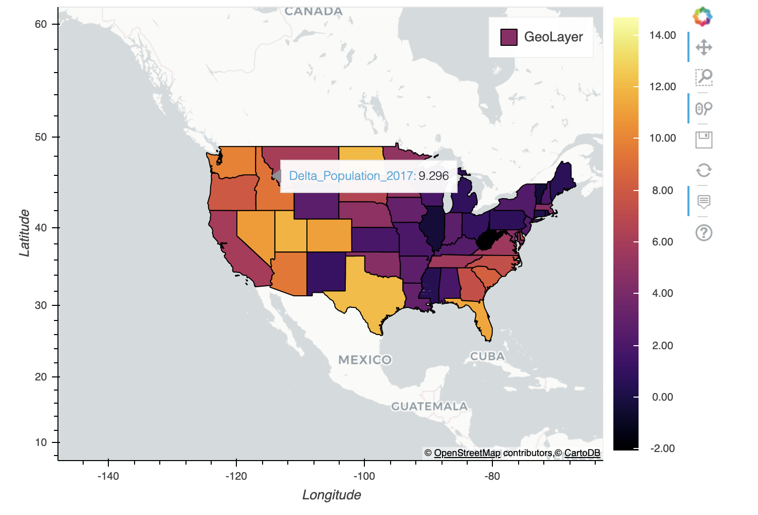
# pass in a PrintfTickFormatter instance colorbar_tick_format to display the ticks with 2 decimal places
df_states.plot_bokeh(
    figsize=(900, 600),
    category="Delta_Population_2017",
    simplify_shapes=5000,
    colormap="Inferno",
colorbar_tick_format=PrintfTickFormatter(format="%4.2f"))The pandas.DataFrame.plot_bokeh API has the following additional keyword arguments:
- show_figure: If True, the resulting figure is shown (either in the notebook or exported and shown as HTML file, see Basics. If False, None is returned. Default: True
- return_html: If True, the method call returns an HTML string that contains all Bokeh CSS&JS resources and the figure embedded in a div. This HTML representation of the plot can be used for embedding the plot in an HTML document. Default: False
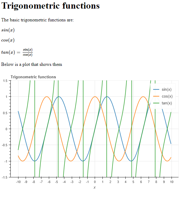
If you have a Bokeh figure or layout, you can also use the pandas_bokeh.embedded_html function to generate an embeddable HTML representation of the plot. This can be included into any valid HTML (note that this is not possible directly with the HTML generated by the pandas_bokeh.output_file output option, because it includes an HTML header). Let us consider the following simple example:
#Import Pandas and Pandas-Bokeh (if you do not specify an output option, the standard is
#output_file):
import pandas as pd
import pandas_bokeh

#Create DataFrame to Plot:
import numpy as np
x = np.arange(-10, 10, 0.1)
sin = np.sin(x)
cos = np.cos(x)
tan = np.tan(x)
df = pd.DataFrame({"x": x, "sin(x)": sin, "cos(x)": cos, "tan(x)": tan})

#Make Bokeh plot from DataFrame using Pandas Bokeh. Do not show the plot, but export
#it to an embeddable HTML string:
html_plot = df.plot_bokeh(
    kind="line",
    x="x",
    y=["sin(x)", "cos(x)", "tan(x)"],
    xticks=range(-20, 20),
    title="Trigonometric functions",
    show_figure=False,
    return_html=True,
    ylim=(-1.5, 1.5))

#Write some HTML and embed the HTML plot below it. For production use, please use
#Templates and the awesome Jinja library.
html = r"""
<script type="text/x-mathjax-config">
  MathJax.Hub.Config({tex2jax: {inlineMath: [['$','$'], ['\\(','\\)']]}});
</script>
<script type="text/javascript"
  src="http://cdn.mathjax.org/mathjax/latest/MathJax.js?config=TeX-AMS-MML_HTMLorMML">
</script>

<h1> Trigonometric functions </h1>

<p> The basic trigonometric functions are:</p>

<p>$ sin(x) $</p>
<p>$ cos(x) $</p>
<p>$ tan(x) = \frac{sin(x)}{cos(x)}$</p>

<p>Below is a plot that shows them</p>

""" + html_plot

#Export the HTML string to an external HTML file and show it:
with open("test.html" , "w") as f:
    f.write(html)

import webbrowser
webbrowser.open("test.html")
This code will open up a webbrowser and show the following page. As you can see, the interactive Bokeh plot is embedded nicely into the HTML layout. The return_html option is ideal for the use in a templating engine like Jinja.
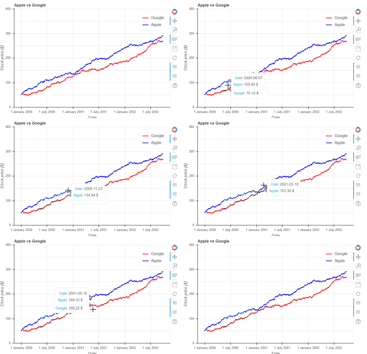
To change the formats of numbers in the hovertool, use the number_format keyword argument. For a documentation about the format to pass, have a look at the Bokeh documentation.Let us consider some examples for the number 3.141592653589793:
| Format | Output |
|---|---|
| 0 | 3 |
| 0.000 | 3.141 |
| 0.00 $ | 3.14 $ |
This number format will be applied to all numeric columns of the hovertool. If you want to make a very custom or complicated hovertool, you should probably use the hovertool_string keyword argument, see e.g. this example. Below, we use the number_format parameter to specify the "Stock Price" format to 2 decimal digits and an additional $ sign.
import numpy as np

#Lineplot:
np.random.seed(42)
df = pd.DataFrame({
    "Google": np.random.randn(1000) + 0.2,
    "Apple": np.random.randn(1000) + 0.17
},
                  index=pd.date_range('1/1/2000', periods=1000))
df = df.cumsum()
df = df + 50
df.plot_bokeh(
    kind="line",
    title="Apple vs Google",
    xlabel="Date",
    ylabel="Stock price [$]",
    yticks=[0, 100, 200, 300, 400],
    ylim=(0, 400),
    colormap=["red", "blue"],
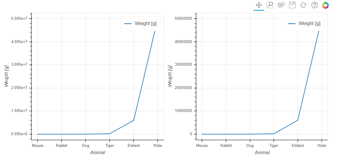
number_format="1.00 $")If you want to suppress the scientific notation for axes, you can use the disable_scientific_axes parameter, which accepts one of "x", "y", "xy":
df = pd.DataFrame({"Animal": ["Mouse", "Rabbit", "Dog", "Tiger", "Elefant", "Wale"],
                   "Weight [g]": [19, 3000, 40000, 200000, 6000000, 50000000]})
p_scientific = df.plot_bokeh(x="Animal", y="Weight [g]", show_figure=False)
p_non_scientific = df.plot_bokeh(x="Animal", y="Weight [g]", disable_scientific_axes="y", show_figure=False,)
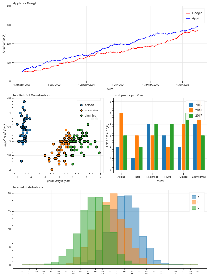
pandas_bokeh.plot_grid([[p_scientific, p_non_scientific]], plot_width = 450)As shown in the Scatterplot Example, combining plots with plots or other HTML elements is straighforward in Pandas Bokeh due to the layout capabilities of Bokeh. The easiest way to generate a dashboard layout is using the pandas_bokeh.plot_grid method (which is an extension of bokeh.layouts.gridplot):
import pandas as pd
import numpy as np
import pandas_bokeh
pandas_bokeh.output_notebook()

#Barplot:
data = {
    'fruits':
    ['Apples', 'Pears', 'Nectarines', 'Plums', 'Grapes', 'Strawberries'],
    '2015': [2, 1, 4, 3, 2, 4],
    '2016': [5, 3, 3, 2, 4, 6],
    '2017': [3, 2, 4, 4, 5, 3]
}
df = pd.DataFrame(data).set_index("fruits")
p_bar = df.plot_bokeh(
    kind="bar",
    ylabel="Price per Unit [€]",
    title="Fruit prices per Year",
    show_figure=False)

#Lineplot:
np.random.seed(42)
df = pd.DataFrame({
    "Google": np.random.randn(1000) + 0.2,
    "Apple": np.random.randn(1000) + 0.17
},
                  index=pd.date_range('1/1/2000', periods=1000))
df = df.cumsum()
df = df + 50
p_line = df.plot_bokeh(
    kind="line",
    title="Apple vs Google",
    xlabel="Date",
    ylabel="Stock price [$]",
    yticks=[0, 100, 200, 300, 400],
    ylim=(0, 400),
    colormap=["red", "blue"],
    show_figure=False)

#Scatterplot:
from sklearn.datasets import load_iris
iris = load_iris()
df = pd.DataFrame(iris["data"])
df.columns = iris["feature_names"]
df["species"] = iris["target"]
df["species"] = df["species"].map(dict(zip(range(3), iris["target_names"])))
p_scatter = df.plot_bokeh(
    kind="scatter",
    x="petal length (cm)",
    y="sepal width (cm)",
    category="species",
    title="Iris DataSet Visus
    alization",
    show_figure=False)

#Histogram:
df_hist = pd.DataFrame({
    'a': np.random.randn(1000) + 1,
    'b': np.random.randn(1000),
    'c': np.random.randn(1000) - 1
},
                       columns=['a', 'b', 'c'])

p_hist = df_hist.plot_bokeh(
    kind="hist",
    bins=np.arange(-6, 6.5, 0.5),
    vertical_xlabel=True,
    normed=100,
    hovertool=False,
    title="Normal distributions",
    show_figure=False)

#Make Dashboard with Grid Layout:
pandas_bokeh.plot_grid([[p_line, p_bar],
                        [p_scatter, p_hist]], plot_width=450)
Using a combination of row and column elements (see also Bokeh Layouts) allow for a very easy general arrangement of elements. An alternative layout to the one above is:
p_line.plot_width = 900
p_hist.plot_width = 900

layout = pandas_bokeh.column(p_line,
                pandas_bokeh.row(p_scatter, p_bar),
                p_hist)

pandas_bokeh.show(layout)
In this early version, the following plot types are supported:
- line
- point
- scatter
- bar
- histogram
In the near future many more will be implemented as horizontal barplot, boxplots,pie-charts, etc.
Pandas Bokeh is a high-level API for Bokeh. Nevertheless there are many options for customizing the plots, for example:
- figsize: Choose width & height of the plot
- title: Sets title of the plot
- xlim/ylim: Set visibler range of plot for x- and y-axis (also works for datetime x-axis)
- xlabel/ylabel: Set x- and y-labels
- logx/logy: Set log-scale on x-/y-axis
- xticks/yticks: Explicitly set the ticks on the axes
- colormap: Defines the colors to plot. Can be either a list of colors or the name of a Bokeh color palette
- hovertool: If True a Hovertool is active, else if False no Hovertool is drawn.
Plots like scatterplot or histogram also have many more additional customization options.
Changes:
- Fixed Error when importing Pandas Bokeh in Python 2.7
- Small refactoring and Black code formatting
Changes:
- WebGL now as plotting backend as default
- Code Refactoring & many bugfixes
- Added panning/zooming keyword options
- Toolbar now visible per default
- Kwargs names are checked in columns of DataFrame/Series and kept if there is a match, such that additional keyword arguments can be used to specify for example line_width or alpha value of plots
- Improved Functionalities (row, column) for Pandas Bokeh Layouts
- Added <hovertool_string> for providing an HTML string to the hovertool
- Many additional customization arguments
- Additional plot types:
- areaplots (with stacked and normed kwargs)
- horizontal & stacked barplots
- piecharts
- mapplot
- Added accessors similar to the pandas.DataFrame.plot API:
df.plot_bokeh(kind="line", ...)→df.plot_bokeh.line(...)df.plot_bokeh(kind="bar", ...)→df.plot_bokeh.bar(...)df.plot_bokeh(kind="hist", ...)→df.plot_bokeh.hist(...)- ...
- Smarter x-axis formatting for barplots when using datetimes
- Histogram parameter also accepts integers (to specify number of bins)
- Added support for categorical x-axis for all plot types (line, scatter, area, ...)
- Smarter autodetection of x- and y-labels
- Added <tile_attribution> & <tile_alpha> parameter for background tiles of geoplots
- Support for xlim & ylim in WGS84 (Latitude/Longitude) for geoplots
- Greatly Improved performance for Polygon Geoplots
- Refactoring of mapplot API (calls GeoPandas API of Pandas Bokeh), such that all options of GeoPandas.GeoDataFrame.plot_bokeh are available.
- Allow passing a Pandas_Bokeh figure to overlay geoplots (not fully supported for category/dropdown/slider yet)
- Bug Fix for new Pandas 0.24 release
- Implementation of first tests
- PySpark support
- Zeppelin Notebooks support
- Added "disable_scientific_axes" option for Plots
- Bugfixes
- Implementation of number_format keyword for line, scatterplots
- Official support also for Python 3.4 & 3.5
