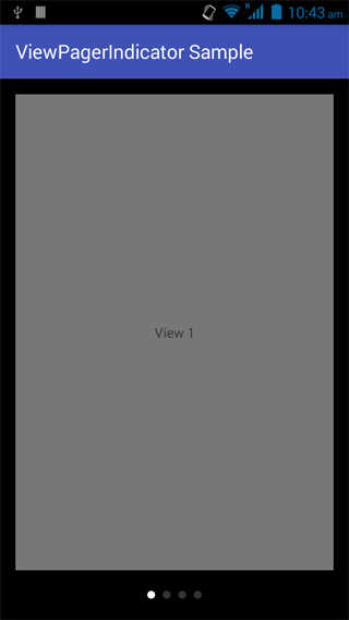
ViewPagerIndicator
Is a simple page indicator for android ViewPager2.
It is based upon AndroidX so you must use androidx.viewpager2.widget.ViewPager2


How do I get set up?
Get it via Gradle
implementation 'it.xabaras.android:viewpagerindicator:2.0'or Maven
<dependency>
  <groupId>it.xabaras.android</groupId>
  <artifactId>viewpagerindicator</artifactId>
  <version>2.0</version>
  <type>pom</type>
</dependency>
Or download the latest AAR and add it to your project's libraries.
N.B. Since version 2.0 you will have ViewPagerIndicator2 class which is based on ViewPager2 from AndroidX
Usage
You just have to add ViewPagerIndicator to your xml layout the usual way
<it.xabaras.android.viewpagerindicator.widget.ViewPagerIndicator2
        android:id="@+id/viewPagerIndicator"
        android:layout_width="match_parent"
        android:layout_height="wrap_content"
        android:orientation="horizontal" />
and bind it to your ViewPager in your code
viewPagerIndicator.initWithViewPager(viewPager)where viewPager is an instance of androidx.viewpager2.widget.ViewPager2 whose adapter has been already set.
Usage 1.x
You just have to add ViewPagerIndicator to your xml layout the usual way
<it.xabaras.android.viewpagerindicator.widget.ViewPagerIndicator
        android:id="@+id/viewPagerIndicator"
        android:layout_width="match_parent"
        android:layout_height="wrap_content" />
and bind it to your android.support.v4.view.ViewPager in your code
viewPagerIndicator.initWithViewPager(viewPager);where viewPager is an instance of android.support.v4.view.ViewPager whose adapter has been set.
Styling
You can customize the appearance of the ViewPagerIndicator by adding some attributes to your xml.
e.g.
<it.xabaras.android.viewpagerindicator.widget.ViewPagerIndicator2
        android:id="@+id/viewPagerIndicator"
        android:layout_width="match_parent"
        android:layout_height="wrap_content"
        app:itemDividerWidth="8dp"
        app:defaultIndicatorTheme="light" />
Just use the "app:" prefix to use the following attributes:
defaultIndicatorTheme
Can take two values "dark" (default) and "light" to match the app theme.
e.g.
<it.xabaras.android.viewpagerindicator.widget.ViewPagerIndicator2
        android:id="@+id/viewPagerIndicator"
        android:layout_width="match_parent"
        android:layout_height="wrap_content"
        app:defaultIndicatorTheme="light" />
itemDividerWidth
Defines the distance between two indicator items in DPs
e.g.
<it.xabaras.android.viewpagerindicator.widget.ViewPagerIndicator2
        android:id="@+id/viewPagerIndicator"
        android:layout_width="match_parent"
        android:layout_height="wrap_content"
        app:itemDividerWidth="8dp" />
itemRadius
Sets the pager indicator item's radius (e.g. if you want an 8dp baloon you have to set this at 4dp).
e.g.
<it.xabaras.android.viewpagerindicator.widget.ViewPagerIndicator2
        android:id="@+id/viewPagerIndicator"
        android:layout_width="match_parent"
        android:layout_height="wrap_content"
        app:itemRadius="4dp" />
itemSelectedColor/itemUnselectedColor
You can specify selected/unselected colors for the indicator items by setting these two attributes. e.g.
<it.xabaras.android.viewpagerindicator.widget.ViewPagerIndicator2
        android:id="@+id/viewPagerIndicator"
        android:layout_width="match_parent"
        android:layout_height="wrap_content"
        app:itemSelectedColor="@color/colorAccent"
        app:itemUnselectedColor="@color/colorPrimaryDark" />
pagerIndicatorDrawable
Defines the indicator item drawable resource.
This attribute overrides the "defaultIndicatorTheme", "itemSelectedColor" and "itemUnselectedColor" attributes so you should provide a proper drawable.
You should define a selector drawable handling the default and checked statuses of the item.
e.g.
<selector xmlns:android="http://schemas.android.com/apk/res/android">
    <item android:state_checked="true" android:drawable="@drawable/indicator_on" />
    <item android:drawable="@drawable/indicator_off" />
</selector>