ganttrify facilitates the creation of nice-looking Gantt charts,
commonly used in project proposals and project management.
If you just want to check this out in an interactive web interface, click here and enjoy. Some more context in this blog post.
Read on for more details and examples.
It is possible to find online documented attempts at facilitating the creation of Gantt charts from R. Some of them (e.g. this and this) use ‘ggplot2’, but I feel they do not look very nice. The same goes for the answers I found in the relevant Stackoverflow question.
Even Plotly enables the creation of Gantt charts in R, but again, I don’t like the end result.
I did find a solution that was rather visually satisfying, but it was in base R, and all the cool kids nowadays know that base plotting in R exists only for compatibility with S: not an option! (Hey, I’m joking, don’t @ me!)
Given what is evidently my posh taste for Gantt charts, I had no other option than making this package with a pretentious, gentrified name, instead of the obvious “ganttr”.
Please welcome ganttrify.
More seriously, this has been a quick attempt at making decent-looking Gantt charts.
And yes, I will enable all the customisations you like, but first I actually need to submit this project.
[Thanks to all who contributed suggestions via issues and pull request!]
Take an adequately formatted spreadsheet and turn it into a Gantt chart made with ggplot2.
You can install the development version from GitHub with:
# install.packages("remotes")
remotes::install_github("giocomai/ganttrify")Here is an example project:
| wp | activity | start_date | end_date |
|---|---|---|---|
| WP1 - Whatever admin | 1.1. That admin activity | 1 | 6 |
| WP1 - Whatever admin | 1.2. Another admin activity | 3 | 6 |
| WP1 - Whatever admin | 1.3. Fancy admin activity | 4 | 7 |
| WP2 - Whatever actual work | 2.1. Actual stuff | 5 | 10 |
| WP2 - Whatever actual work | 2.2. Actual R&D stuff | 6 | 12 |
| WP2 - Whatever actual work | 2.3. Really real research | 9 | 12 |
| WP2 - Whatever actual work | 2.4. Ethics! | 3 | 5 |
| WP2 - Whatever actual work | 2.4. Ethics! | 8 | 9 |
| WP3 - Dissemination | 3.1. Disseminate near | 6 | 9 |
| WP3 - Dissemination | 3.1. Disseminate near | 12 | 12 |
| WP3 - Dissemination | 3.2. Disseminate far | 8 | 12 |
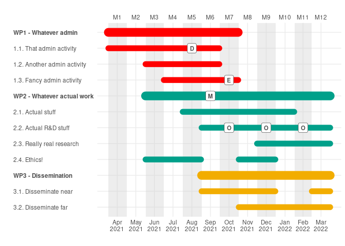
Month since the beginning of the project are used as reference in order to make it easier to change the date when the project starts without needing to change the timing of all activities.
If you prefer to include dates instead of month numbers, please see additional examples below.
library("ganttrify")
ganttrify(project = ganttrify::test_project,
project_start_date = "2021-03",
font_family = "Roboto Condensed")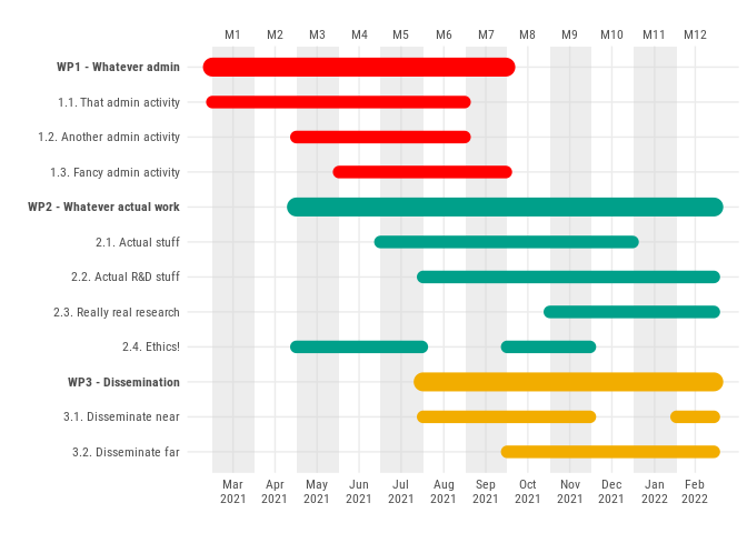 [all
examples in this page will use the
 Roboto condensed font; if it is not
installed, you can use the default sans. See the Troubleshooting
section at the bottom of this readme.]
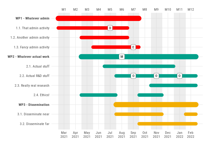
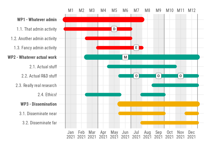
“But what if I wanted to add spot labels for events, deliverables, outputs, milestones, things like that?”, you asked.
Just put them in a table with these column names, and you will be served.
| activity | spot_type | spot_date |
|---|---|---|
| 1.1. That admin activity | D | 5 |
| 1.3. Fancy admin activity | E | 7 |
| 2.2. Actual R&D stuff | O | 7 |
| 2.2. Actual R&D stuff | O | 9 |
| 2.2. Actual R&D stuff | O | 11 |
| WP2 - Whatever actual work | M | 6 |
ganttrify(project = ganttrify::test_project,
          spots = ganttrify::test_spots,
          project_start_date = "2021-03",
          font_family = "Roboto Condensed")
“I can’t read the text, can I change the text size?”, I heard. “Also, is it possible to outline quarters?”
You’re welcome.
ganttrify(project = ganttrify::test_project,
          spots = ganttrify::test_spots,
          project_start_date = "2021-03",
          size_text_relative = 1.2,
          mark_quarters = TRUE,
          font_family = "Roboto Condensed")
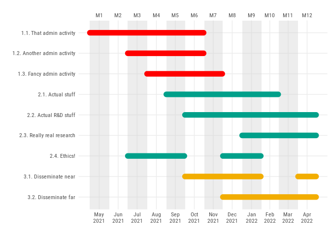
It appears that some of you don’t like having a line for the working package and are fine with just lines for activities. Did you mean it like this?
ganttrify(project = ganttrify::test_project,
          hide_wp = TRUE,
          font_family = "Roboto Condensed")
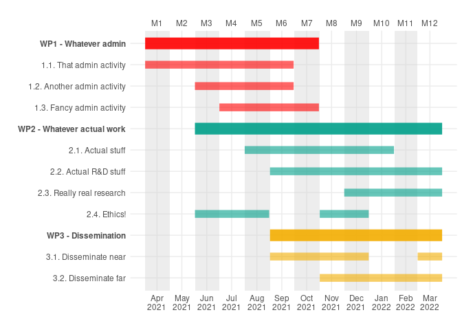
I thought we all liked rounded lines and full opacity, but it’s ok if you don’t:
ganttrify(project = ganttrify::test_project,
          project_start_date = "2021-04",
          alpha_wp = 0.9,
          alpha_activity = 0.6,
          line_end = "butt")
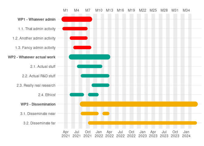
Some of us work on very long projects, and may need to declutter the chart to increase readability. So let’s show the month number only once every three months, and hide the thin vertical lines included by default.
test_36 <- ganttrify::test_project
test_36[11,4] <- 36

ganttrify(project = test_36,
          project_start_date = "2021-04",
          month_breaks = 3,
          show_vertical_lines = FALSE)
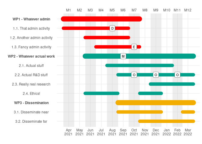
Does right-aligned text bother you
ganttrify(project = ganttrify::test_project,
          spots = ganttrify::test_spots,
          project_start_date = "2021-04",
axis_text_align = "left") ganttrify(project = ganttrify::test_project,
spots = ganttrify::test_spots,
project_start_date = "2021-04",
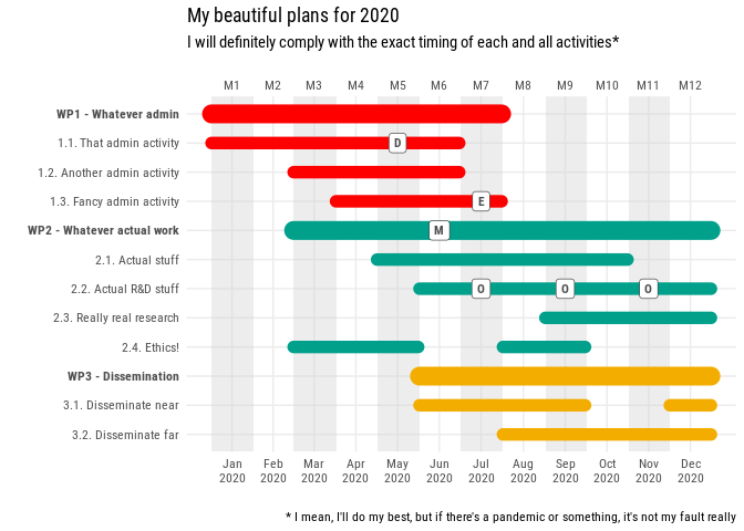
axis_text_align = "centre") Finally, keep in mind that ganttrify outputs ggplot objects. Some
theming options may not behave exactly as you expect, but for example
adding title, subtitle, and captions can be done as you would normally
do with any ggplot graphs.
ganttrify(project = ganttrify::test_project,
          spots = ganttrify::test_spots,
          project_start_date = "2020-01",
          font_family = "Roboto Condensed")+
  ggplot2::labs(title = "My beautiful plans for 2020",
                subtitle = "I will definitely comply with the exact timing of each and all activities*",
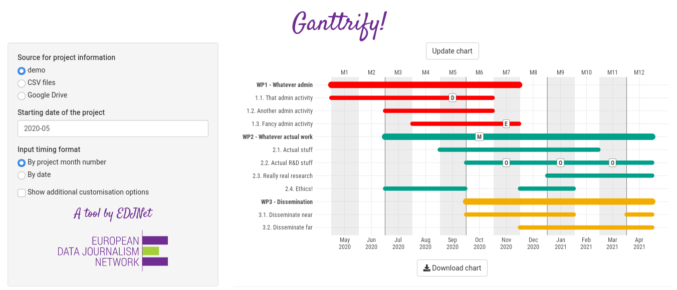
caption = "* I mean, I'll do my best, but if there's a pandemic or something, it's not my fault really")If you prefer interactive web interfaces to coding, you can still have a fancy ganttrified chart.
shiny_ganttrify()And there you go!
You can check it online with no further ado at the following link:
https://ganttrify.europeandatajournalism.eu/
(N.B.: not all features are exposed in the shiny app)
Alright, you don’t know like R, but you know how Docker works?
This is all you need to find yourself a nice web app on localhost
docker run -p 80:80 giocomai/ganttrify
You can of course build yourself the docker image using the Dockerfile included in this repo.
Alright, you prefer to use dates rather than month numbers from the
beginning of the project. You’re welcome: just format the date as
follows, and remember to include the month_number_label = FALSE
parameter. You can also use exact dates (e.g. 2021-01-01), but by
default they would still be converted to include the entire month were
that given day falls.
knitr::kable(ganttrify::test_project_date_month)| wp | activity | start_date | end_date |
|---|---|---|---|
| WP1 - Whatever admin | 1.1. That admin activity | 2021-01 | 2021-06 |
| WP1 - Whatever admin | 1.2. Another admin activity | 2021-03 | 2021-06 |
| WP1 - Whatever admin | 1.3. Fancy admin activity | 2021-04 | 2021-07 |
| WP2 - Whatever actual work | 2.1. Actual stuff | 2021-05 | 2021-10 |
| WP2 - Whatever actual work | 2.2. Actual R&D stuff | 2021-06 | 2021-12 |
| WP2 - Whatever actual work | 2.3. Really real research | 2021-09 | 2021-12 |
| WP2 - Whatever actual work | 2.4. Ethics! | 2021-03 | 2021-05 |
| WP2 - Whatever actual work | 2.4. Ethics! | 2021-08 | 2021-09 |
| WP3 - Dissemination | 3.1. Disseminate near | 2021-06 | 2021-09 |
| WP3 - Dissemination | 3.1. Disseminate near | 2021-12 | 2021-12 |
| WP3 - Dissemination | 3.2. Disseminate far | 2021-08 | 2021-12 |
ganttrify(project = ganttrify::test_project_date_month,
          spots = ganttrify::test_spots_date_month,
          by_date = TRUE,
          size_text_relative = 1.2,
          mark_quarters = TRUE,
          font_family = "Roboto Condensed")
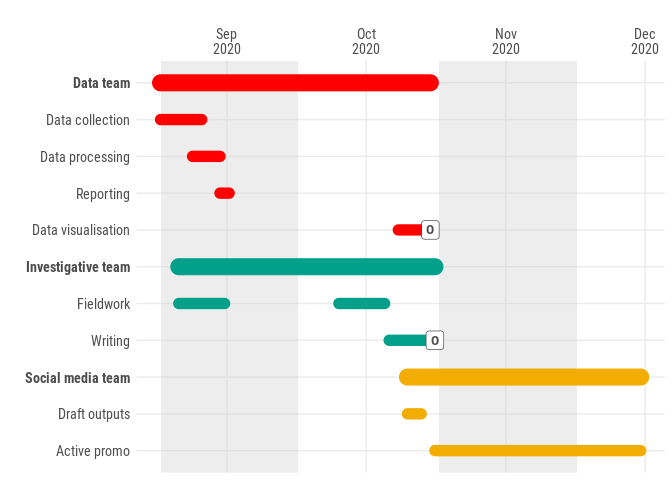
As it turns out, someone wants more detail: they’d like to be able to
input activities with an exact start and end date. I start to suspect
that ganttrify at this stage may not be exactly what you’re looking
for, but perhaps this works for you?
knitr::kable(ganttrify::test_project_date_day)| wp | activity | start_date | end_date |
|---|---|---|---|
| Data team | Data collection | 2020-09-01 | 2020-09-10 |
| Data team | Data processing | 2020-09-08 | 2020-09-14 |
| Data team | Reporting | 2020-09-14 | 2020-09-16 |
| Data team | Data visualisation | 2020-10-23 | 2020-10-30 |
| Investigative team | Fieldwork | 2020-09-05 | 2020-09-15 |
| Investigative team | Fieldwork | 2020-10-10 | 2020-10-20 |
| Investigative team | Writing | 2020-10-21 | 2020-10-31 |
| Social media team | Draft outputs | 2020-10-25 | 2020-10-28 |
| Social media team | Active promo | 2020-10-31 | 2020-12-15 |
ganttrify(project = ganttrify::test_project_date_day,
          spots = ganttrify::test_spots_date_day,
          by_date = TRUE,
          exact_date = TRUE,
          size_text_relative = 1.2,
          month_number_label = FALSE,
font_family = "Roboto Condensed")At this stage, the package has strong expectations about the input format, and does not provide meaningful error messages. If you see unexpected results, please consider that:
- no cell in the activity column must be empty
- an activity cannot be called the same as a wp
- activities in different wp should have different names (or at least add a space at the end or something so that they look different to the computer).
Some of this limitations should be dealt with in a future update.
By default, this package uses a generic sans font but it is recommended to use a narrow (or condensed font such as Roboto Condensed font - a free font that can be downloaded and installed on any desktop) as they make more efficient use of text space.
On Fedora, you can install it with sudo dnf install google-roboto-condensed-fonts
On Debian, you can install it with sudo apt-get install fonts-roboto-fontface
After installation, you should make sure the font is available to R by
installing the extrafont package, and running
extrafont::font_import().
You can check available fonts also with the package systemfonts and
the command systemfonts::system_fonts().
To reduce the number of dependencies, extrafont, as well as the
packages used by the Shiny app needed to import data (googlesheets4,
readxl) and to export the chart in svg (svglite) are only suggested.
You can install them independently (they’re all on CRAN), or together with this package with:
remotes::install_github("giocomai/ganttrify", dependencies = TRUE)
