English | 简体中文
import { tag, WeElement, h, render } from 'omi'

@tag('hello-world')
class HelloWorld extends WeElement {
  static css = 'p { color: red }'

  render(props) {
    return (
      <>
        <h1>Omi</h1>
        <p>Hello {props.msg}</p>
      </>
    )
  }
}

render(<hello-world msg='World' />, 'body')- Cross frameworks, components of omi are pure custom elements
- Tiny size and High performance
- One framework. Mobile & desktop & mini program
- Compliance with browser trend and API design
- Merge Web Components, JSX/TSX into one framework
- JSX/TSX is the best development experience (code intelligent completion and tip) UI Expression with least grammatical noise and it's turing complete(template engine is not, es template string is but grammatical noise is too loud)
- Look at Facebook React vs Web Components,Omi combines their advantages and gives developers the freedom to choose the way they like
- Shadow DOM or Light DOM merges with Virtual DOM, Omi uses both virtual DOM and real Shadow DOM to make view updates more accurate and faster
- Scoped CSS's best solution is Shadow DOM, the community churning out frameworks and libraries for Scoped CSS (using JS or JSON writing styles such as Radium, jsxstyle, react-style; binding to webpack using generated unique
classNamefilename-classname-hash, such as CSS Modules, Vue), are hack technologies; _and Shadow DOM Style is the perfect solution - Be friendly to custom elements, you can pass
falseattributes to elements through string'0'or string'false', you can passobjectattributes to elements through:prefix andOmi.$ - Enhanced CSS, rpx unit support base on 750 screen width
$ npx omi-cli init my-app     # init project
$ cd my-app
$ npm start           # develop
$ npm run build # release$ npx omi-cli init-component my-component # init project
$ cd my-app
$ npm start # develop
$ npm run build # release| Project | Description |
|---|---|
snake & → Touch the demo & → Touch the demo |
The Snake-Eating Game Based on MVP Architecture Written by Omi |
| custom-elements-everywhere | Making sure frameworks and custom elements can be BFFs 🍻 |
omi-piano |
Build piano with Omi and Omi Snippets, Enjoy now! |
| omi-devtools | Browser DevTools extension |
| omi-chart | Simple HTML5 Charts using chart-x tag. |
| md2site | Static Site Generator with markdown powered by Omio. |
| omi-30-seconds | Useful Omi snippets that you can understand in 30 seconds. |
| omi-canvas | Perfect fusion of web components, jsx and canvas. |
| omi-swiper | Omi + Swiper |
| omi-vscode | VSCode extension for omi, Install now! |
| omi-ex | Omi.js extension(TypeScript) |
| omi-transform | Omi / css3transform integration. Made css3 transform super easy in your Omi project. |
| omi-finger | Support touch and gesture events in your Omi project. |
| omi-touch | Smooth scrolling, rotation, pull to refresh and any motion for the web. |
| omi-i18n | Internationalization solution for omi.js using i18next ecosystem |
| omie | Build cross platform desktop apps with Omi.js and Electron.js |
| omi-cv | Create a front-end engineer curriculum vitae, Get Started! |
Define cross-frameworks button element with TypeScript:
import { tag, WeElement, h, extractClass } from 'omi'
import * as css from './index.scss'

interface Props {
  size?: 'medium' | 'small' | 'mini',
  type?: 'primary' | 'success' | 'warning' | 'danger' | 'info' | 'text'
  plain?: boolean,
  round?: boolean,
  circle?: boolean,
  loading?: boolean,
  disabled?: boolean,
  icon?: string,
  autofocus?: boolean,
  nativeType?: 'button' | 'submit' | 'reset',
  block?: boolean
  text?: string
}

@tag('o-button')
export default class Button extends WeElement<Props>{
  static css = css

  static defaultProps = {
    plain: false,
    round: false,
    circle: false,
    loading: false,
    disabled: false,
    autofocus: false,
    nativeType: 'button',
    block: false
  }

  static propTypes = {
    size: String,
    type: String,
    plain: Boolean,
    round: Boolean,
    circle: Boolean,
    loading: Boolean,
    disabled: Boolean,
    icon: String,
    autofocus: Boolean,
    nativeType: String,
    block: Boolean,
    text: String
  }

  render(props) {
    return <button disabled={props.disabled} {...extractClass(props, 'o-button', {
      ['o-button-' + props.type]: props.type,
      ['o-button-' + props.size]: props.size,
      'is-plain': props.plain,
      'is-round': props.round,
      'is-circle': props.circle,
      'is-disabled': props.disabled,
      'is-block': props.block
    })} type={props.nativeType} >
      {props.loading && <i class='icon-loading'></i>}
      {props.text}
      <slot></slot>
    </button>
  }
}import { h, WeElement, tag, classNames } from 'omi';
import * as styles from './_index.less';
interface ButtonProps {
href?: string,
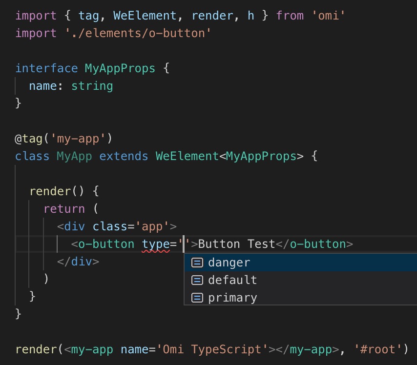
disabled?: boolean,
type?: 'default' | 'primary' | 'danger',
htmltype?: 'submit' | 'button' | 'reset',
onClick?: (e: any) => void
}
const TAG = 'o-button'
declare global {
namespace JSX {
interface IntrinsicElements {
[TAG]: Omi.Props & ButtonProps
}
}
}
@tag(TAG)
export default class oButton extends WeElement<ButtonProps> {
...
...
...Omi works in the latest two versions of all major browsers: Safari 10+, IE 11+, and the evergreen Chrome, Firefox, and Edge.
<script src="https://unpkg.com/@webcomponents/webcomponentsjs@2.0.0/webcomponents-bundle.js"></script>Any form of contribution is welcome. The above contributors have been officially released by Tencent.
We very much welcome developers to contribute to Tencent's open source, and we will also give them incentives to acknowledge and thank them. Here we provide an official description of Tencent's open source contribution. Specific contribution rules for each project are formulated by the project team. Developers can choose the appropriate project and participate according to the corresponding rules. The Tencent Project Management Committee will report regularly to qualified contributors and awards will be issued by the official contact.
Please contact us for any questions.
MIT © Tencent

