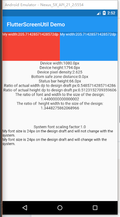
A flutter plugin for adapting screen and font size.Let your UI display a reasonable layout on different screen sizes!
Note: This plugin is still under development, and some APIs might not be available yet.
github: https://github.com/OpenFlutter/flutter_screenutil
Please check the latest version before installation.
dependencies:
  flutter:
    sdk: flutter
  # add flutter_ScreenUtil
  flutter_screenutil: ^0.5.2
import 'package:flutter_screenutil/flutter_screenutil.dart';
| Property | Type | Default Value | Description |
|---|---|---|---|
| width | double | 1080px | The width of the device in the design draft, in px |
| height | double | 1920px | The height of the device in the design draft, in px |
| allowFontScaling | bool | false | Sets whether the font size is scaled according to the system's "font size" assist option |
Initialize and set the fit size and font size to scale according to the system's "font size" accessibility option
Please set the width and height of the design draft before use, the width and height of the design draft (unit px). Be sure to set the page in the MaterialApp's home(ie the entry file, just set it once) to ensure that the fit size is set before each use:
//fill in the screen size of the device in the design
//default value : width : 1080px , height:1920px , allowFontScaling:false
ScreenUtil.instance = ScreenUtil.getInstance()..init(context);
//If the design is based on the size of the iPhone6 (iPhone6 750*1334)
ScreenUtil.instance = ScreenUtil(width: 750, height: 1334)..init(context);
//If you wang to set the font size is scaled according to the system's "font size" assist option
ScreenUtil.instance = ScreenUtil(width: 750, height: 1334, allowFontScaling: true)..init(context);
Pass the px size of the design draft:
Adapted to screen width: ScreenUtil.getInstance().setWidth(540),
Adapted to screen height: ScreenUtil.getInstance().setHeight(200),
You can also use ScreenUtil() instead of ScreenUtil.getInstance(),
for example:ScreenUtil().setHeight(200)
Note
Height is also adapted according to setWidth to ensure no deformation (when you want a square)
setHeight method is mainly adapted in height, you want to control the height and actuality of a screen on the UIUsed when the same is displayed.
//for example:
//rectangle
Container(
           width: ScreenUtil.getInstance().setWidth(375),
           height: ScreenUtil.getInstance().setHeight(200),
           ...
            ),

////If you want to display a square:
Container(
           width: ScreenUtil.getInstance().setWidth(300),
           height: ScreenUtil.getInstance().setWidth(300),
            ),
//Incoming font size,the unit is pixel, fonts will not scale to respect Text Size accessibility settings
//(AllowallowFontScaling when initializing ScreenUtil)
ScreenUtil.getInstance().setSp(28)

//Incoming font size,the unit is pixel,fonts will scale to respect Text Size accessibility settings
//(If somewhere does not follow the global allowFontScaling setting)
ScreenUtil(allowFontScaling: true).setSp(28)

//for example:

Column(
              crossAxisAlignment: CrossAxisAlignment.start,
              children: <Widget>[
                Text(
                    'My font size is 24px on the design draft and will not change with the system.',
                    style: TextStyle(
                      color: Colors.black,
                      fontSize: ScreenUtil.getInstance().setSp(24),
                    )),
                Text(
                    'My font size is 24px on the design draft and will change with the system.',
                    style: TextStyle(
                      color: Colors.black,
                      fontSize: ScreenUtil(allowFontScaling: true).setSp(24),
                    )),
              ],
            )
    ScreenUtil.pixelRatio       //Device pixel density
    ScreenUtil.screenWidth      //Device width
    ScreenUtil.screenHeight     //Device height
    ScreenUtil.bottomBarHeight  //Bottom safe zone distance, suitable for buttons with full screen
    ScreenUtil.statusBarHeight  //Status bar height , Notch will be higher Unit px
    ScreenUtil.textScaleFactory //System font scaling factor

    ScreenUtil.getInstance().scaleWidth //Ratio of actual width dp to design draft px
    ScreenUtil.getInstance().scaleHeight //Ratio of actual height dp to design draft px
//import
import 'package:flutter_screenutil/flutter_screenutil.dart';
...dart
@override
Widget build(BuildContext context) {
///Set the fit size (fill in the screen size of the device in the design) If the design is based on the size of the iPhone6 (iPhone6 750*1334)
ScreenUtil.instance = ScreenUtil(width: 750, height: 1334)..init(context);
print('Device width:${ScreenUtil.screenWidth}'); //Device width
print('Device height:${ScreenUtil.screenHeight}'); //Device height
print(
'Device pixel density:${ScreenUtil.pixelRatio}'); //Device pixel density
print(
'Bottom safe zone distance:${ScreenUtil.bottomBarHeight}'); //Bottom safe zone distance,suitable for buttons with full screen
print(
'Status bar height:${ScreenUtil.statusBarHeight}px'); //Status bar height , Notch will be higher Unit px
print(
'Ratio of actual width dp to design draft px:${ScreenUtil.getInstance().scaleWidth}');
print(
'Ratio of actual height dp to design draft px:${ScreenUtil.getInstance().scaleHeight}');
print(
'The ratio of font and width to the size of the design:${ScreenUtil.getInstance().scaleWidth * ScreenUtil.pixelRatio}');
print(
'The ratio of height width to the size of the design:${ScreenUtil.getInstance().scaleHeight * ScreenUtil.pixelRatio}');
return new Scaffold(
appBar: new AppBar(
title: new Text(widget.title),
),
body: new Center(
child: Column(
crossAxisAlignment: CrossAxisAlignment.center,
children: <Widget>[
Row(
children: <Widget>[
Container(
width: ScreenUtil.getInstance().setWidth(375),
height: ScreenUtil.getInstance().setHeight(200),
color: Colors.red,
child: Text(
'My width:${ScreenUtil.getInstance().setWidth(375)}dp',
style: TextStyle(
color: Colors.white,
fontSize: ScreenUtil.getInstance().setSp(12)),
),
),
Container(
width: ScreenUtil.getInstance().setWidth(375),
height: ScreenUtil.getInstance().setHeight(200),
color: Colors.blue,
child: Text('My width:${ScreenUtil.getInstance().setWidth(375)}dp',
style: TextStyle(
color: Colors.white,
fontSize: ScreenUtil.getInstance().setSp(12))),
),
],
),
Text('Device width:${ScreenUtil.screenWidth}px'),
Text('Device height:${ScreenUtil.screenHeight}px'),
Text('Device pixel density:${ScreenUtil.pixelRatio}'),
Text('Bottom safe zone distance:${ScreenUtil.bottomBarHeight}px'),
Text('Status bar height:${ScreenUtil.statusBarHeight}px'),
Text(
'Ratio of actual width dp to design draft px:${ScreenUtil.getInstance().scaleWidth}',
textAlign: TextAlign.center,
),
Text(
'Ratio of actual height dp to design draft px:${ScreenUtil.getInstance().scaleHeight}',
textAlign: TextAlign.center,
),
Text(
'The ratio of font and width to the size of the design:${ScreenUtil.getInstance().scaleWidth * ScreenUtil.pixelRatio}',
textAlign: TextAlign.center,
),
Text(
'The ratio of height width to the size of the design:${ScreenUtil.getInstance().scaleHeight * ScreenUtil.pixelRatio}',
textAlign: TextAlign.center,
),
SizedBox(
height: ScreenUtil.getInstance().setHeight(100),
),
Text('System font scaling factor:${ScreenUtil.textScaleFactory}'),
Column(
crossAxisAlignment: CrossAxisAlignment.start,
children: <Widget>[
Text(
'My font size is 14px on the design draft and will not change with the system.',
style: TextStyle(
color: Colors.black,
fontSize: ScreenUtil.getInstance().setSp(14),
)),
Text(
'My font size is 14px on the design draft and will change with the system.',
style: TextStyle(
color: Colors.black,
fontSize: ScreenUtil(allowFontScaling: true).setSp(24),
)),
],
)
],
),
),
);
}effect:

