Author: Fengyu Xu Date:2020.06
Some of the feature are not implemented yet, but I will update it in the following week.
LGBTQ is an initialism that stands for lesbian, gay, bisexual, transgender and queer. These groups of people were minorities in the last few centries. In this new era, the society start to accept and understand them. I hope through this web map, it can help the LGBTQ community to find the area that they are more welcomed to join and live at. Besides, it can also let other people to learn about the LGBTQ community.
Besides, I am trying to explore what's the factor that affect the LGBTQ community. So I added the race distribution to the map to see if I can find any pattern behind.
Here are some features I used in this web map:
| Feature | Impelmenting method |
|---|---|
| Info panel, legend, feature highlight | basic html, js, CSS |
| Basemap,thematic layer | Leaflet library, ajax |
| Button | Bootstrap library |
| Pie chart | C3 library |
Basemap
I choose to use leaflet, an open-source Javascript library, to load my map window for the website. As the most popular open-source mapping library, leaflet is simple, flexible and support many functions.
Leaflet JS provides various basemaps. The one I choose is Stadia_AlidadeSmooth. This map is in grey scale, the clean design of it is the best suitable for thematic layers and won't ditract users with additional road or infrustraction information.
L.tileLayer('https://tiles.stadiamaps.com/tiles/alidade_smooth/{z}/{x}/{y}{r}.png', {
maxZoom: 20,
attribution: '© <a href="https://stadiamaps.com/">Stadia Maps</a>, © <a href="https://openmaptiles.org/">OpenMapTiles</a> © <a href="http://openstreetmap.org">OpenStreetMap</a> contributors'
}).addTo(mymap);
Thematic layer
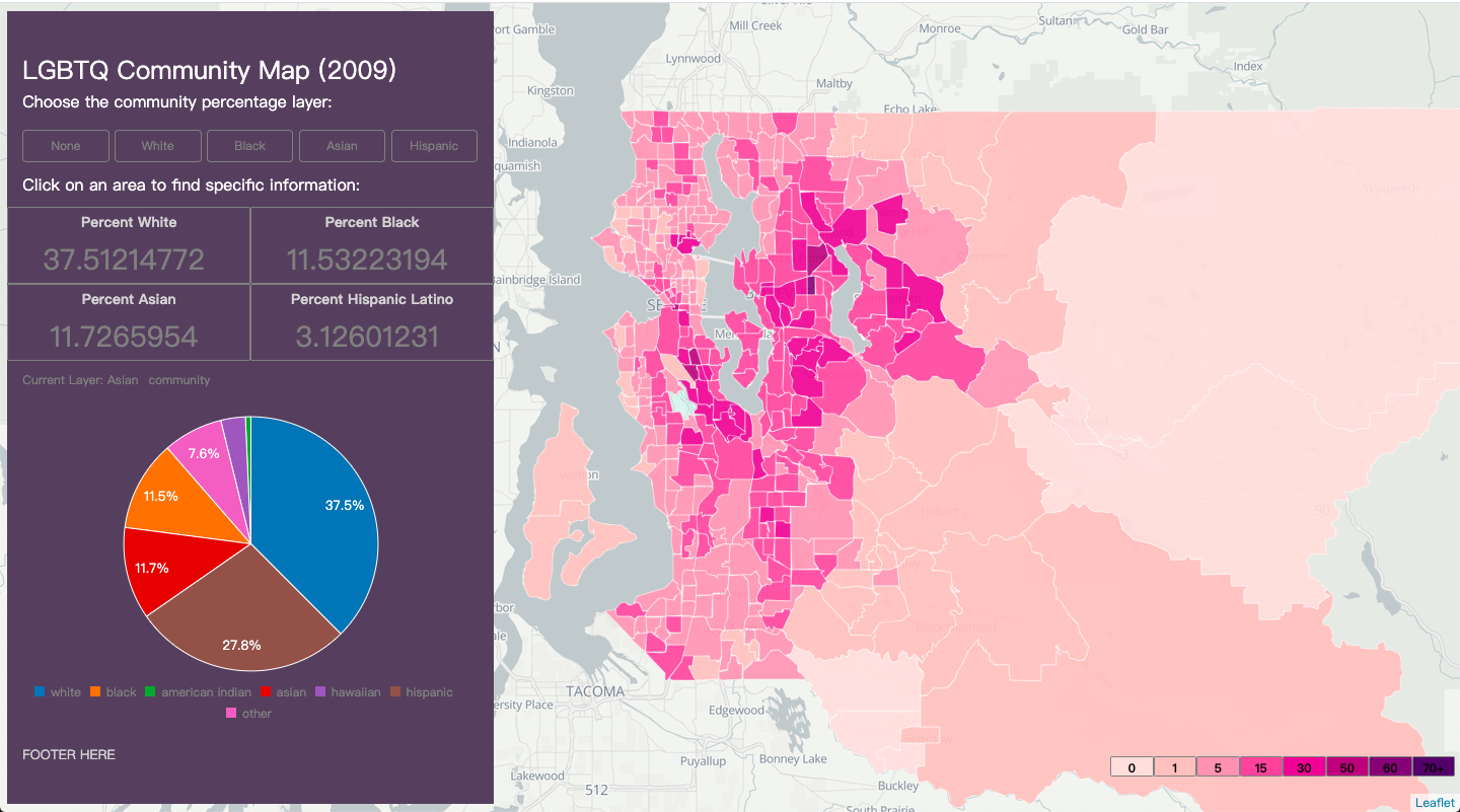
Above the basemap, there's a choropleth tile that shown different statistics about each area in king county. The dataset is obtained from King County GIS Open Data and contains many attributes like poverty, age, gender, race, speaking langugage. The attributes I focuse are the percentage of each race in the area.
I would like to enable users to switch among layers that's based on different race pertange data: white community, black community, asian community and hispanic community. Those are the top 4 largest in most area.
There are several ways to implement this feature. Initially, I tried to use new L.control.layers to enable the switch between layers. This method will create a menu at the top right corner that allow users to choose the layer they want. In order to do this I will need to four variables to store each layers and that could create redundency not only for the layer part but also the highlight feature part.
The highlight feature is when user's mouse hover on an area, the area will be highlighted and when the mouse move out, the style will be reset.The highlight part is easy to impelment through layer.setStyle(). However, to reset the highlight is a bit more complicated, this method takes a layer as example and set the selected area style to the same. In my case, I set the style of e.target to match the style of mylayer which is the layer I created use the function before.
Since I have multiple layers can user can choose and each layer contains different data. If I store those data in four different layers, I also need to write four different resetHighlight function to reset the style. Thus, I create a global variable mylayer and change the data of it when user want to switch to a different layer.
function resetHighlight(e) {mylayer.resetStyle(e.target);}
I wrote a function that takes a string paramter such as 'white', 'black'. First, I will check if the layer is already exists, I will delete it. Then I use switch to convert the paramter to the attributes in geoJSON and create a layer based on it.
function showLayer(community){
  if(mylayer){
    mylayer.remove();
  }
  switch (community) {
  case 'white':
      mylayer = L.geoJSON(false, {style:function (feature) {
      return {fillColor: classificationCN(feature.properties.PWNH),weight: 1, opacity: 1, color: 'white', fillOpacity: 0.85}},onEachFeature:onEachFeature});
      break;
  case 'black':
      mylayer = L.geoJSON(false, {style:function (feature) {
      return {fillColor: classificationCN(feature.properties.PWNH),weight: 1, opacity: 1, color: 'white', fillOpacity: 0.85}},onEachFeature:onEachFeature});
      break;
In this step, I set the first attribute of L.geoJSON to false since I am loading the data from URL but not local file. I quoted the URL for geoJSON under the API menu to load the geoJSON file to my tilelayer.
$.getJSON("https://opendata.arcgis.com/datasets/b4cf82cdfa2b437eb51ccbfe980aa39e_2549.geojson", function(data){mylayer.addData(data)});
LEGBTQ facilities data
This data is comming from the app gaycity. It contains the address, name, rate, reviews of each facility. In order to present the point on the map, I conver the origin json file to csv and add a latitude and logitude column. Then I did geocoding manually. I am looking for an easier way to convert all the data together.
Info panel
I created an info panel to display related information when user click on an area. Though I can also display information through popup window, the content can be includede is very limit and unorganized.
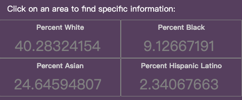
This info panel first shows the name of the ptoject then the source of data. Then it's the 4 statistics about the percentage of four different community in the area. Initially, the data is in form of N/A since no area is clicked. I was thinking about select an area to start with. However, in my dataset, it doesn't contain the name of each area, it only has the id.
Then it's five buttons that user can click on to switch the layers. One of those is "none" just in case user want to just look at the LGBTQ facility or find a specific place on map without the disturb of other layers. I use the bootstrap library to set the button function as well as the style.
I displayed the 4 statistics in two rows so it save some space for the following content. The css style is the key to create this layout. Every data is wrote in a
.card-deck {
  display: flex;
  flex-flow: row wrap;
  margin-right: -15px;
  margin-left: -15px;
}
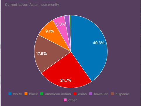
Then it's a pie chart to show the percent of each race in that area. Pie chart can give user a more direct impact of the proportion of each race rather than plain numbers. Here I use the c3 library to generate the diagram.
chart = c3.generate({
 data: {
   size: {
     height: 350,
     width: 460
   },
   // iris data from R
   columns: [
     ["white"],
     ["black"],
     ["american indian"],
     ["asian"],
     ["hawaiian"],
     ["hispanic"],
     ["other"]
   ],
   type : 'pie',
   onclick: function (d, i) { console.log("onclick", d, i); },
   onmouseover: function (d, i) { console.log("onmouseover", d, i); },
   onmouseout: function (d, i) { console.log("onmouseout", d, i); }
 },
 bindto: "#county-chart"
 });
All these statistics will be shown when there's a mouse click on the area.
For the LGBTQ community, they are represent by points on the map. When user hover on the point, the information will be shown through a pop-up window. The purpose for that is not mix the information with area race statistics and keep the info panel simple and clean. Since the purpose of the map is for user to learn the distribution of LGBTQ facilities, the most important information is the location of the facilities. So I try to keep the content of pop-up window as simple as possible. It will just include the name, address and the rate of the facility.
[picture example here]
Finally, it's the footer to include a brief description of this project and the source the data.
Layer Style
I set the opacity of the thematic layer to 0.35. since I cannot get the name for each area. It's import to show people the map view of the street so they can find the area they are interested in and click on it to learn more.
I designed one color scale that applied to all four layers. Since the data range is large, from 0 to 80, so I set 9 colors, found from online colorbrewer, in total to present each data range. A lengendis displayed at the lower right corner to show the specific color range.
Data
So far, this map's thematic layer is for kingcounty but the LGBTQ community is only in Seattle area. There's a large inbalance of two sets of data. That's one point I will improve in the future to add more LGBTQ facility data to the map.
Color scale
For the different race's layer, I use the same color scale to set the color for each area. However, since the data for each race are very different and has large gap, this color scale is not the best way to visualize the data. I am thinking maybe to create separate color scale for each layer. But then the legend also need to be redeisgned.
Area name
In the info panel I was not able to include the name of each area since it's not included in the dataset I am using. But there's an field in the dataset that the website indicate that it can be used to join other dataset. If I can find a related dataset with area name in the future. I would like to add the name of the area to the info panel so user will know clearly which area they are looking at.


