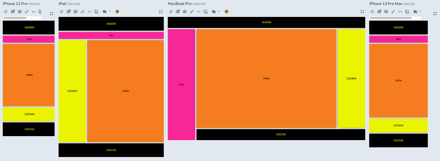
- feel free to use this as model, even the css file has a reset, and media queries mobile first.
If you want to see the final product, in the project directory, you can run:
- [Live 🔗]https://neongridnyc.netlify.app/
- Semantic HTML5 markup
- CSS Grid
REMEMBER THAT IF YOUR LAYOUT IS
DESKTOP FIRST: IN MEDIA QUERIES GO "max-width" ">"
MOBILE FIRST: IN MEDIA QUERIES GO "min-width" "<"
I'm a Junior full stack developer.
