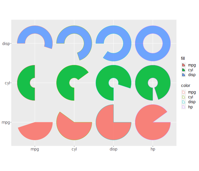
Some useful functions that can use ‘grid’ and ‘ggplot2’ to plot sectors and interact with ‘Seurat’ to plot gene expression percentages. Also, there are some examples of how to draw sectors in ‘ComplexHeatmap’.
Pengdong Yan
Get the released version from Cran:
install.packages("ggsector")Or the development version from github or gitee:
## install.packages("remotes")

## from github
# simple install
remotes::install_github("yanpd01/ggsector")
# with vignettes
remotes::install_github("yanpd01/ggsector", build_vignettes = TRUE)

## from gitee
# simple install
remotes::install_git("https://gitee.com/yanpd01/ggsector")
# with vignettes
remotes::install_git("https://gitee.com/yanpd01/ggsector", build_vignettes = TRUE)For more details, please refer to the online vignette.
The code of this R package refers to jjplot of JunJunLao and ggplot2 of Hadley.
The Description, vignette, and readme of this R package refer to clusterProfiler, ggfun, and treeio of Guangchuang YU.
Here, I would like to express my highest respect to thank the big guys for their open source spirit.


