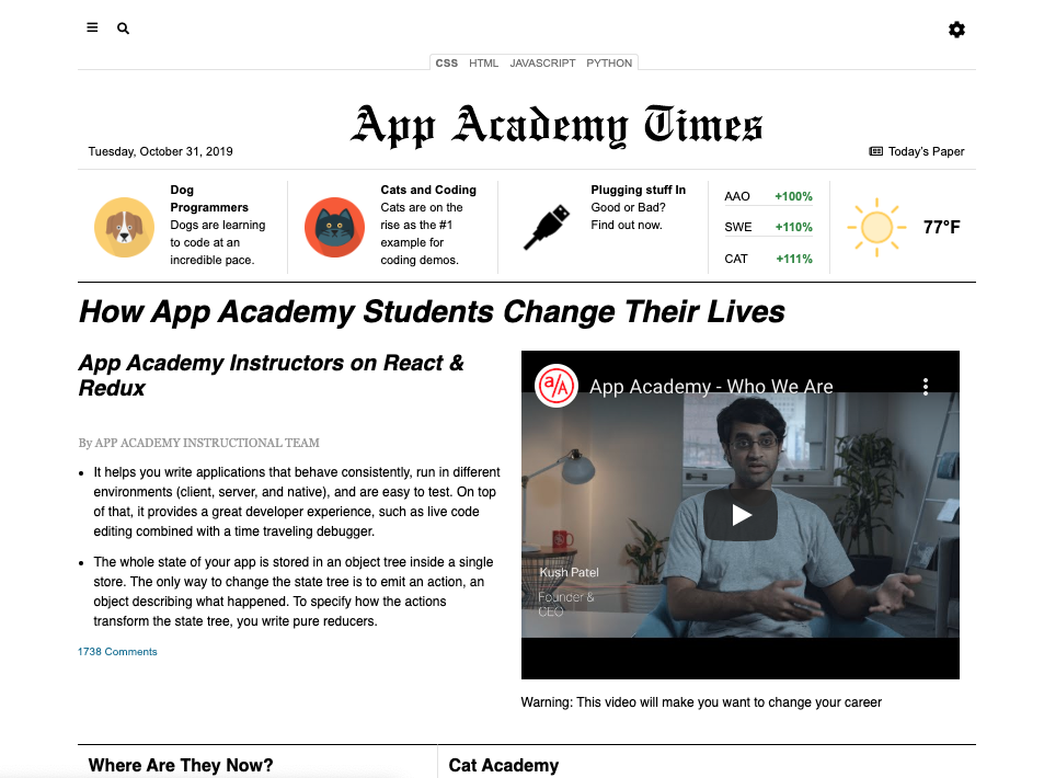
It's now time to use the responsive design content that you've learned this week to make a compelling and pleasing web page! Specifically, you will focus on using Grid, Flexbox, and Media Queries to meet project requirements.
You're going to get to build this from the ground up with the same type of input that you'd get in a real job. On each step, talk with your pair, decide now you want to attack the problem, and get coding!
When working as a full-stack developer, you'll often collaborate with a designer. Most likely they will provide you with a sequence of screenshots and specifications for you to convert into neat, maintainable HTML and CSS.
They will often provide you screenshots of what the website will look like at specific sizes as well. For example, below is what the website should look like at 1020px:
Here is a screenshot of an even narrower version of the site for windows less than 1020px wide:
This practice is similar to that experience, in that you will receive requirements for each section of the page. Then, it's up to you and your pair to write the HTML and CSS to make it do what you need it to do. Each step of the way will give you the requirements for the section that you'll work on. There will also be guidance and suggestions for you so that you can get some hints, if needed.
Though this is a big practice, you'll do it step-by-step. As a developer, that's what you do: take a big project and break it down into smaller pieces that you can accomplish piece-by-piece. There will be a lot of advice given during this practice so you can get a feel for how to go about doing each of the steps.
This practice is not about reproducing the mockups with each pixel perfectly matching the screenshots. It should be in the spirit of the specifications. So, don't stress out if it doesn't exactly match what you see. A little variation is ok.
On the job, your leads or managers will let you know whether or not you need to match the mockup exactly, or adapt it to make it work.
Clone the practice from the starter.
Each starter directory and file that contains content is noted in the following tree.
index.html
/images - Contains the images for the practice
/scripts
  └── event-handling.js - Event handling for the page
/specifications
  └── /text - Contains the text for the Web page
  └── /screenshots - Contains what each step looks like
/stylesheets
  └── global.css - Adds global styles
  └── main-styles.css - Puts together all the styles
  └── reset.css - Utility to "fix" browsers
  └── components - Separate files for each component
      ├── gear-dropdown.css
      ├── interest-links.css
      ├── main-content.css
      ├── main-nav.css
      ├── masthead.css
      └── search-modal.css
The following sections explain in more detail the purpose of each file.
This is where you will put the HTML that will define the content and structure
of the Web page. Right now, it's empty. In the first step, you'll use Emmet to
add standard HTML 5 structure to this file. Then, you'll add the most common
top-level structural elements, too: header, main, and footer.
This file will contain a JavaScript script that will drive some of the interactivity of the Web page. The script is filled out for you. You don't need to know how the script works. In later steps, you will be adding it to your HTML document to add interactivity to some of your HTML elements.
Do not make changes to this file.
Inside main-styles.css, there are a series of @import statements that load
the various CSS files in the practice. You do this so that you don't have to go
searching through a file that has thousands of lines of CSS in it. This way,
when you work on a section of content on your team, each person can work in
their own file, if need be, without causing a huge mess.
@import url("reset.css");
@import url("global.css");

@import url("components/gear-dropdown.css");
@import url("components/interest-links.css");
@import url("components/main-content.css");
@import url("components/main-nav.css");
@import url("components/masthead.css");
@import url("components/search-modal.css");
The order of the first two imports is very important. Those affect styles for the entire Web page and work in conjunction with one another, layering changes so you can have the correct basic palette with which to work.
You should be able to list the imports from the components subdirectory in any order that you like.
Quite often, you will want to use what's known as a "reset" file to remove all of the quirky, inconsistent default styles that browsers add to Web pages. If you performed a search for "CSS reset files", you will find many articles and versions of them. This practice already includes one for you.
Whenever you choose to use a CSS reset file, it is vitally important that you
include it as the first one of your @import statements. If you don't do that,
then all of the hard work that you put into making things look better can get
erased by the reset file if it comes after yours in the order of imports.
Remember that CSS specificity will always choose the last rule read for rules
that have the same specificity. So, it's important to have it first so that
your CSS comes after.
The specifications directory contains files similar to what you would get from a Web designer. Those files are organized into two subdirectories for you.
The screenshots subdirectory contains the screenshots of the entire practice that you saw at the beginning of this page. It also contains the screenshots that you will use in each of the steps of this practice so that you can have them locally.
The text subdirectory contains all of the text that you see on the Web page. This way, you can just copy and paste it into the HTML as you develop the page.
Also in the text directory is a Markdown file named styles.md. This file contains a list of the colors, external resources, font families, global styles, and measurements that you will use during this practice.
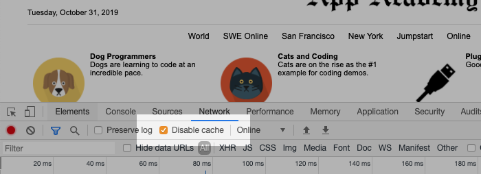
An important note: You may want to keep your DevTools open and the Disable Cache checkbox checked. This will guarantee that changes to your CSS files are loaded by the browser every time you refresh it. You can open your Chrome DevTools on Windows by pressing F12 or Control+Shift+I. You can open Chrome DevTools on macOS by pressing Command+Option+I. Then, go to the Network pane and make sure the "Disable cache" checkbox is checked. Keep your DevTools open!
Good luck! It's time to go to step 1!
Netlify is a popular hosting service for deploying static sites and front-ends for full-stack web applications. They have a free tier that allows developers to deploy small sites with low traffic at no cost. You'll use it now to deploy one of the projects you've constructed this week, and it will remain an excellent choice for your future projects.
At the end of this guide, you will have deployed your App Academy Times project to the internet with Netlify. You should be able to follow the same process to deploy any future front-end projects as well.
If you haven't already, make sure you've pushed your completed work to GitHub. If you've been keeping your garden green, you're already done with this step!
Navigate to Netlify and click the Sign Up button. Use your GitHub account to sign up. Otherwise, you'll just have to link it to Netlify later.
After completing the signup process, you'll be greeted with the dashboard. It will be empty at first.
Click the New Site from Git button. Click the GitHub button and follow the prompts to authorize the installation. Later on, you can see and modify this authorization from the Settings tab in your repository on GitHub.
You'll see a list of all of your repositories. Find the one you want, in this case the repository for App Academy Times, and click on it.
Under most circumstances, the default settings are fine. You'll want to confirm that the default team is your name. If you're a part of any teams on Netlify, those will show up here. This is how you would deploy for a company, instead of yourself.
Confirm that the branch selected is the branch you want to deploy from. It's fine to leave it as main/master for now, but remember that any change you push to this branch will immediately go live. Some organizations work under this expectation and only merge to main/master when they are ready for this. Others set up a separate branch for deployment and merge to that branch when ready to update the site.
You don't need these now, but the remaining settings can be used to run a command to build the site or change the directory the site is deployed from. You can also set up environment variables by clicking the Advanced button.
Click the Deploy Site button.
You should see a page showing a progress report as the site is built. There will also be links to set up a custom domain and HTTPS. You can skip those for now as you'll be learning about these steps in a different practice.
Instead, open the link at the top of the page in a new tab. It will be named something random, like hopeful-bell-3818be.netlify.app. Clicking the link should take you to your site, live and on the internet!
If something went wrong, don't panic. Google any error messages. Netlify is fairly simple, so most errors have plenty of help for what has gone wrong.
Check the site and make sure all the links work as expected. Now is when you'll first notice if you've accidentally put an absolute link to a file on your computer.
The names Netlify gives you are often clever and unique but don't tell anyone else what the site is or what it's for. It's best for your major portfolio projects to have their own registered domain, but it's ok to skip that step for smaller and less important ones.
However, you should change the name to something more recognizable.
Click on the Site Settings button from the Site Overview page. In the info panel on the right, click the Change site name button. Enter a new name. Keep in mind that this name must be one that no one else has used before, as this will be the new URL for the site.
Click the Save button and confirm that your-site-name.netlify.app works.
Now that you've deployed one site, now is a great time to deploy anything else you want to show off to your friends and family.
You now have the power to put stuff on the internet. Use it wisely!


