United States Geological Survey is responsible for providing scientific data about natural hazards, the health of our ecosystems and environment; and the impacts of climate and land-use change. Their scientists develop new methods and tools to supply timely, relevant, and useful information about the Earth and its processes.
The USGS provides earthquake data in a number of different formats, updated every 5 minutes. I've picked All Earthquakes from the Past 7 Days on the USGS GeoJSON Feed page. Then created a map using Leaflet that plots all of the earthquakes from your data set based on their longitude and latitude.
-
Markers reflect the magnitude of the earthquake in their size and color. Earthquakes with higher magnitudes appear larger and darker in color.
-
Popups provide additional information about the earthquake when a marker is clicked.
-
The legend provides context for the map data.
-
Plot a second data set on the map to illustrate the relationship between tectonic plates and seismic activity. Data on tectonic plates: https://github.com/fraxen/tectonicplates.
-
Plot a second data set on our map.
-
Add a number of base maps to choose from as well as separate out our two different data sets into overlays that can be turned on and off independently.
-
Add layer controls to our map.
-
Use a Leaflet plugin to visualize an earthquake as it takes place over a period of time.
-
Add another set of geospatial data that to show a new correlation or insight about the existing earthquake data.
-
Use additional plug-ins from the Leaflet Documentation to further visualize the data in a unique way.
-
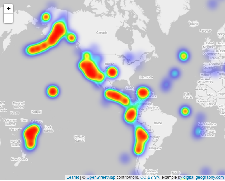
Heatmap
-
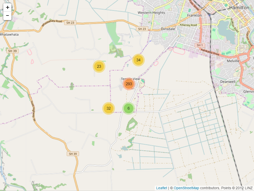
Data Clustering
-

