plot2
A lightweight extension of the base R plot function, with support for
automatic grouping and legend handling, and several other enhancements.
Installation
plot2 is not yet on CRAN, but can be installed from R-universe.
install.packages("plot2", repos = "https://grantmcdermott.r-universe.dev")Our goal is to submit to CRAN by the end of July/August 2023, once we have settled on some remaining design choices and features support. You can take a look at the open issues to see what’s currently under consideration. Please feel free to weigh on these if you have opinions. We want end users to have a say in determining the final product.
Motivation
R users are spoiled for choice when it comes to visualization frameworks. The options of course include ggplot2 (arguably the most important graphics system of the last decade) and lattice, not to mention a bewildering array of extensions built around, on top of, and in between these amazing packages.
It is perhaps not surprising, then, that the base R graphics system
sometimes gets short shrift. This is unfortunate, because base R offers
very powerful and flexible plotting facilities. Just type
demo(graphics) or demo(persp) into your R console to get an idea.
Or, take a look at
these
two
excellent tutorials. The downside of this power and flexibility is that
base R plotting can require a fair bit of manual tinkering. A case in
point is plotting grouped data with an appropriate legend. Doing so with
the generic plot() function can require several function calls or a
loop, fiddling with your plot regions, and then generating the legend
manually.
The plot2 package aims to remove this overhead. It provides a
lightweight extension of the base R plot system with various convenience
features, particularly for creating (2D) scatter and line plots using
grouped data. For example, the core plot2() function makes it easy to
plot different categories of a dataset in a single function call and
highlight these categories (groups) using modern colour palettes.
Coincident with this grouping support, plot2() also produces automatic
legends with scope for further customization. While the package offers
several other enhancements, it tries as far as possible to be a drop-in
replacement for the equivalent base plot function. Users should
generally be able to swap a valid plot() call with plot2() without
any changes to the expected output.
Examples
Let’s load the package then walk through some examples.
library(plot2)Similarity to plot()
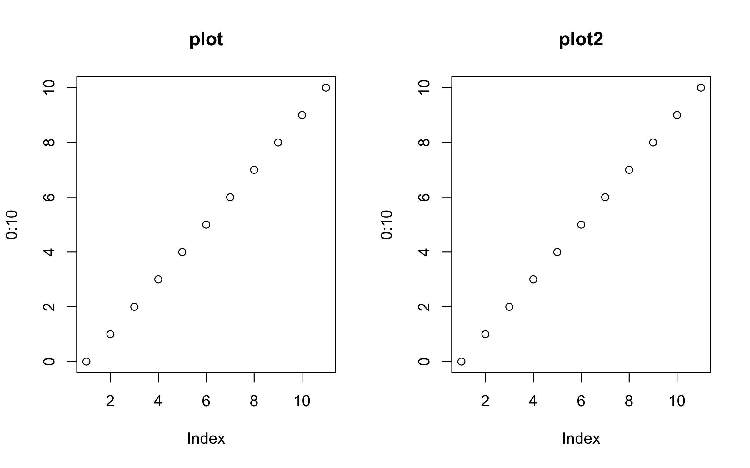
As far as possible, plot2 tries to be a drop-in replacement for
regular plot calls.
par(mfrow = c(1, 2))

plot(0:10, main = "plot")
plot2(0:10, main = "plot2")
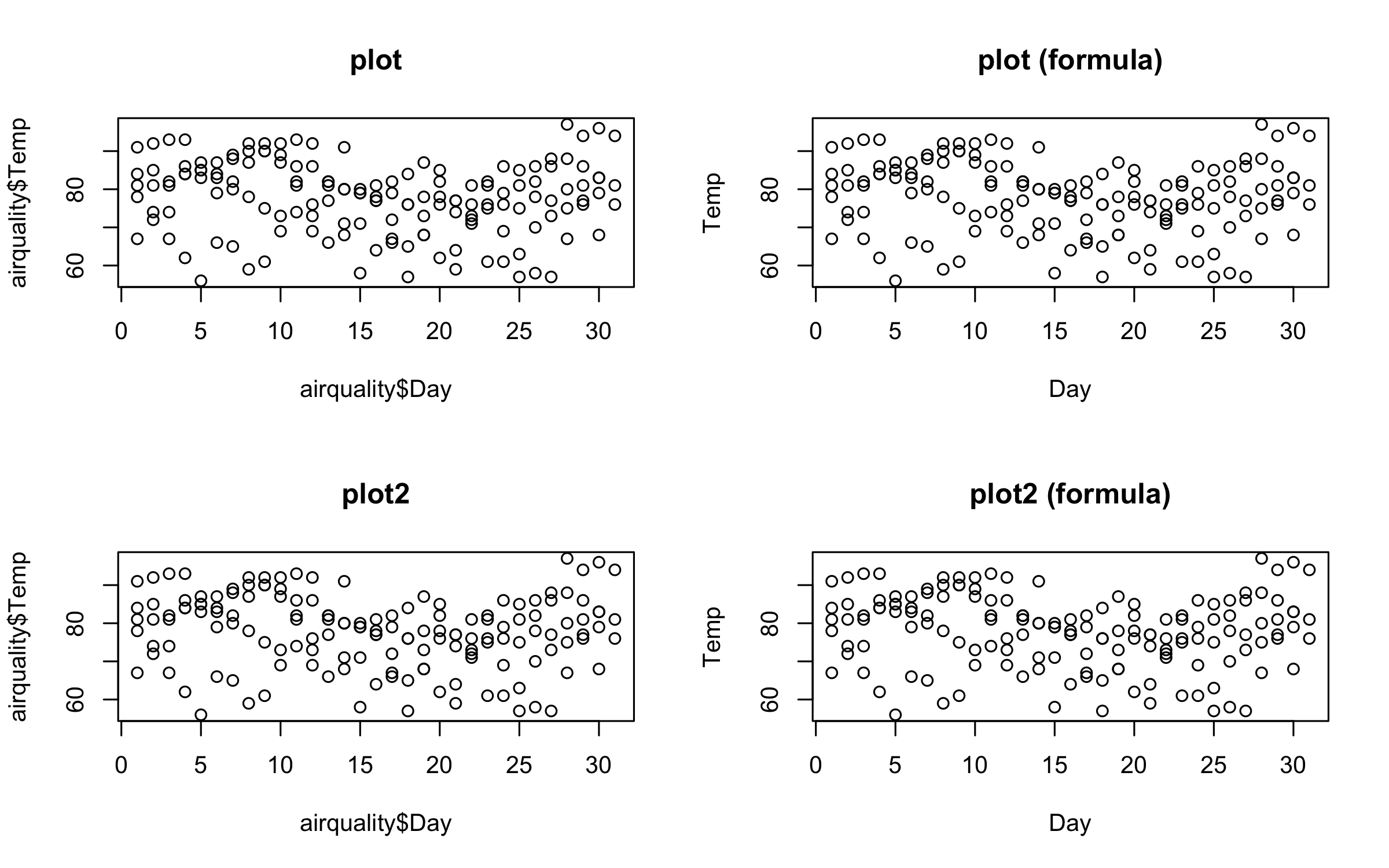
Similarly, we can plot elements from a data frame using either the atomic or formula methods.
par(mfrow = c(2, 2))

plot(airquality$Day, airquality$Temp, main = "plot")
plot(Temp ~ Day, data = airquality, main = "plot (formula)")
plot2(airquality$Day, airquality$Temp, main = "plot2")
plot2(Temp ~ Day, data = airquality, main = "plot2 (formula)")
dev.off() # reset to default (single) plot window
#> null device
#> 1Grouped data
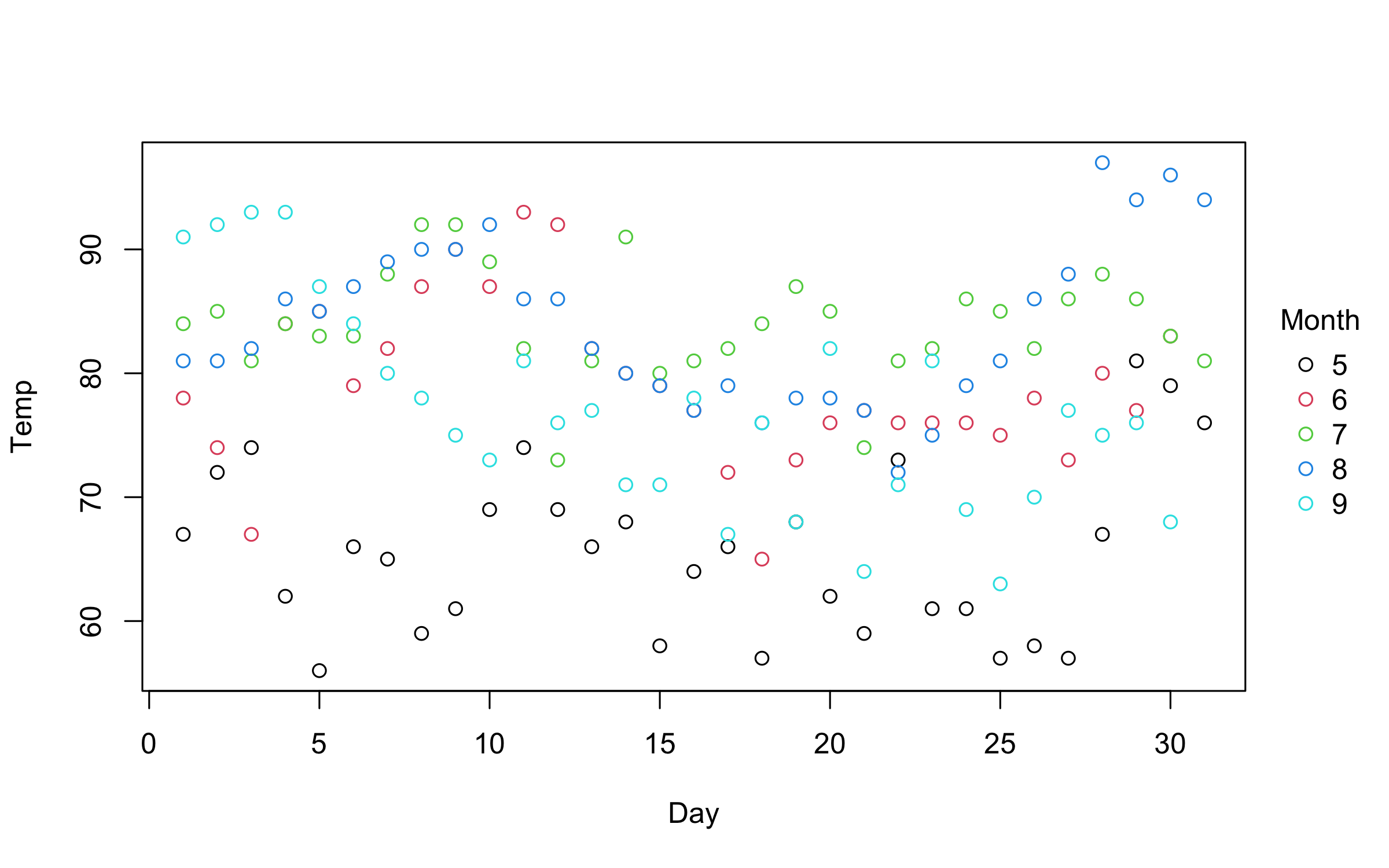
So far, so good. But where plot2 starts to diverge from its base
counterpart is with respect to grouped data. In particular, plot2
allows you to characterize groups using the by argument.1
# plot2(airquality$Day, airquality$Temp, by = airquality$Month) # same as below
with(airquality, plot2(Day, Temp, by = Month))
An even more convenient approach is to use the equivalent formula
syntax. Just place the grouping variable after a vertical bar (i.e.,
|).
plot2(Temp ~ Day | Month, data = airquality)You can use standard base plotting arguments to adjust features of your
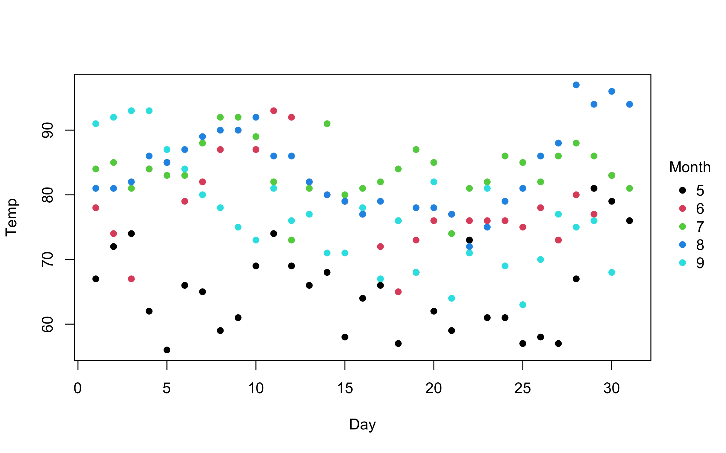
plot. For example, change pch (plot character) to get filled points.
plot2(
  Temp ~ Day | Month,
  data = airquality,
  pch = 16
)
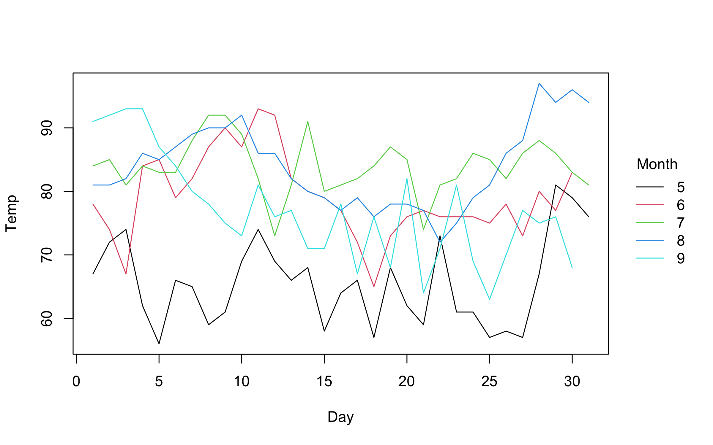
Similarly, converting to a grouped line plot is a simple matter of
adjusting the type argument.
plot2(
  Temp ~ Day | Month,
  data = airquality,
  type = "l"
)
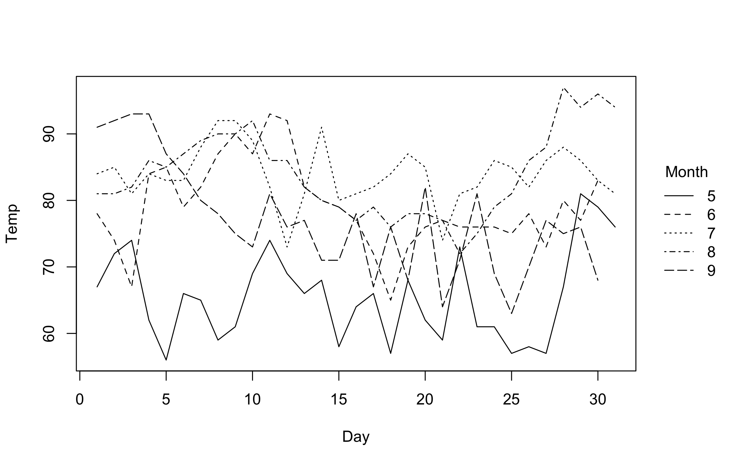
Note that we can automatically adjust both pch and lty by groups
using the "by" convenience keyword. This can be used in conjunction
with the default group colouring. Or, as a replacement for group
colouring—an option that may be particularly useful for contexts where
colour is expensive or prohibited (e.g., certain academic journals).
plot2(
  Temp ~ Day | Month,
  data = airquality,
  type = "l",
  col = "black", # override automatic group colours
  lty = "by"     # change line type by group instead
)
Colors
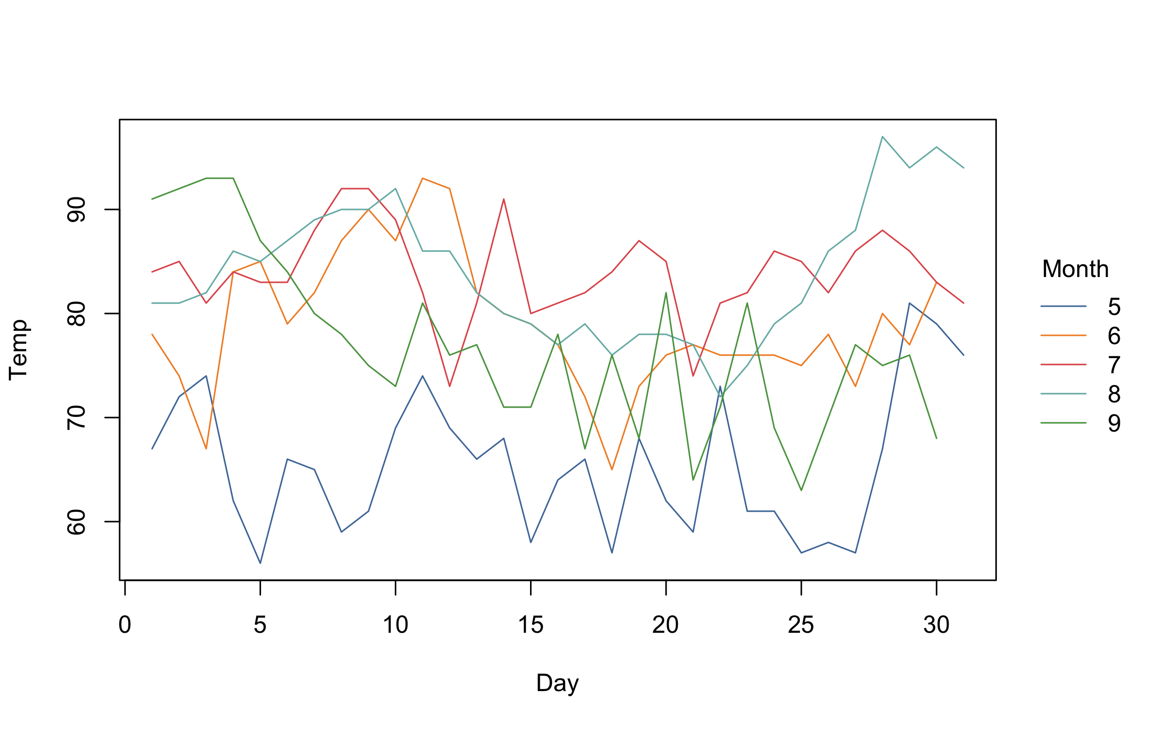
On the subject of group colours, these are easily customized via the
palette argument. The default group colours are inherited from either
the “R4” or “Viridis” palettes, depending on the number of groups.
However, all of the many palettes listed by palette.pals() and
hcl.pals() are supported as convenience strings.2 For example:
plot2(
  Temp ~ Day | Month,
  data = airquality,
  type = "l",
  palette = "Tableau 10" # or "ggplot2", "Okabe-Ito", "Set 2", "Harmonic", etc.
)
Beyond these convenience strings, users can also supply a valid palette-generating function for finer control over transparency, colour order, and so forth. We’ll see a demonstration of this further below.
Legend
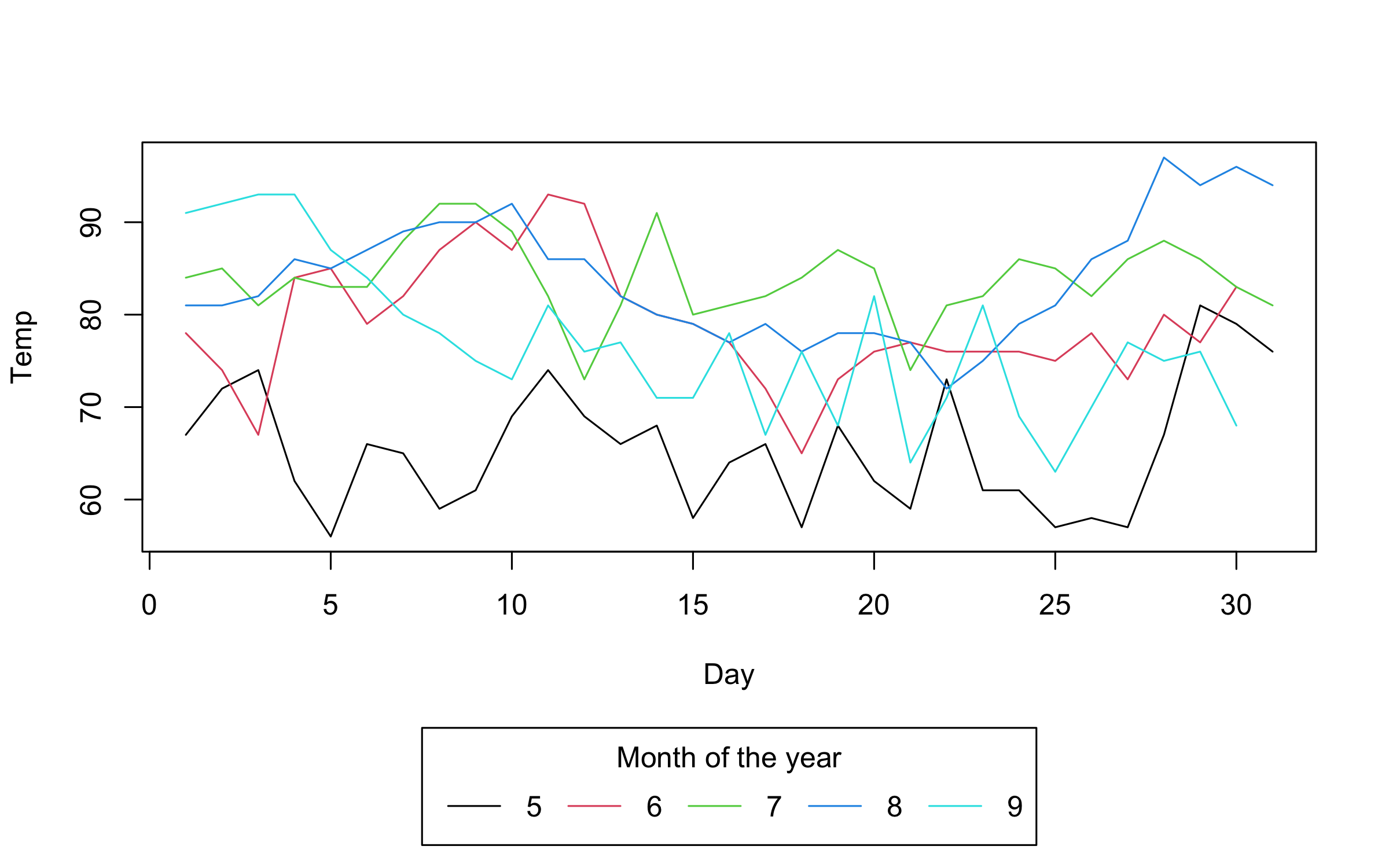
In all of the preceding plots, you will have noticed that we get an
automatic legend. The legend position and look can be customized using
appropriate arguments. You can change (or turn off) the legend title and
bounding box, switch the direction of the legend text, etc. Below, we
particularly draw your attention to the trailing “!” in the legend
position argument. This tells plot2 to place the legend outside the
plot area.
plot2(
  Temp ~ Day | Month,
  data = airquality,
  type = "l",
  legend = legend("bottom!", title = "Month of the year", bty = "o")
)
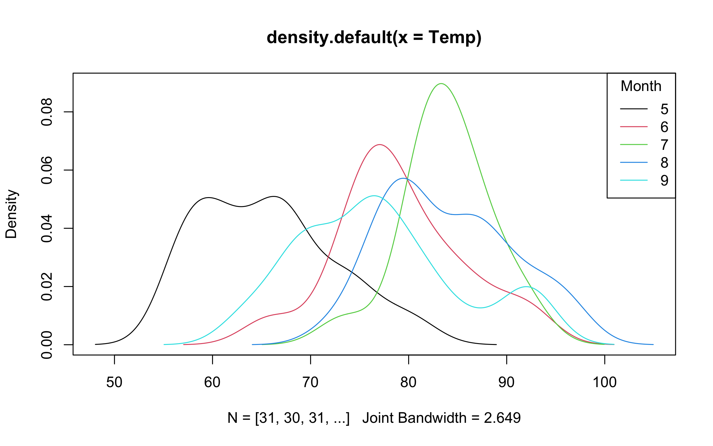
Note that legend position keywords without the exclamation point (i.e., for inside the plot area) should still as per normal. Grouped density plot example:
with(
  airquality,
  plot2(
    density(Temp),
    by = Month,
    legend = legend("topright", bty = "o")
  )
)
Point ranges, error bars, and ribbon plots
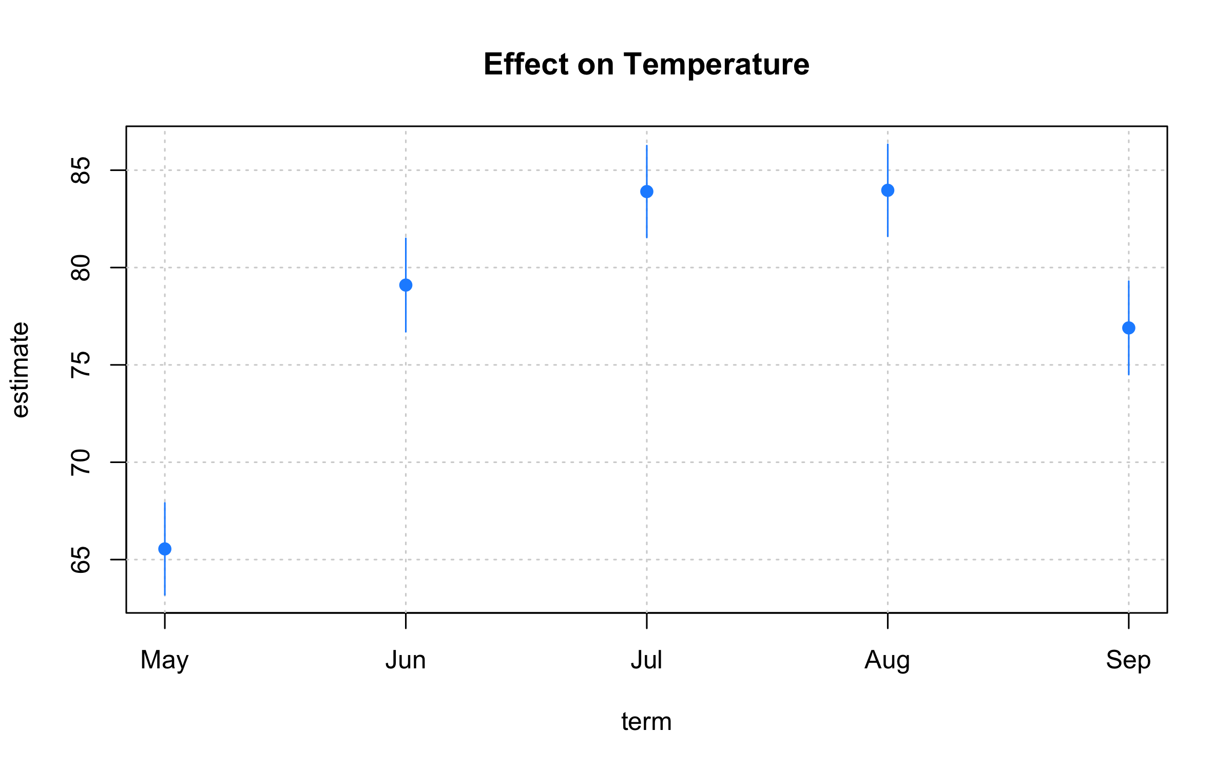
plot2 adds supports for uncertainty intervals via the "pointrange",
"errorbar", "ribbon" type arguments. An obvious use-case is for
regression coefficient plots.
aq = airquality
aq$mnth = factor(month.abb[aq$Month], levels = month.abb)
mod = lm(Temp ~ 0 + mnth, aq)
coeftab = data.frame(
  gsub("mnth", "", names(coef(mod))),
  coef(mod),
  confint(mod)
  ) |>
  setNames(c("term", "estimate", "ci_low", "ci_high"))

with(
  coeftab,
  plot2(
    x = term, y = estimate,
    ymin = ci_low, ymax = ci_high,
    type = "pointrange", # or: "errobar", "ribbon"
    pch = 19, col = "dodgerblue",
    grid = TRUE,
    main = "Effect on Temperature"
  )
)
Customization
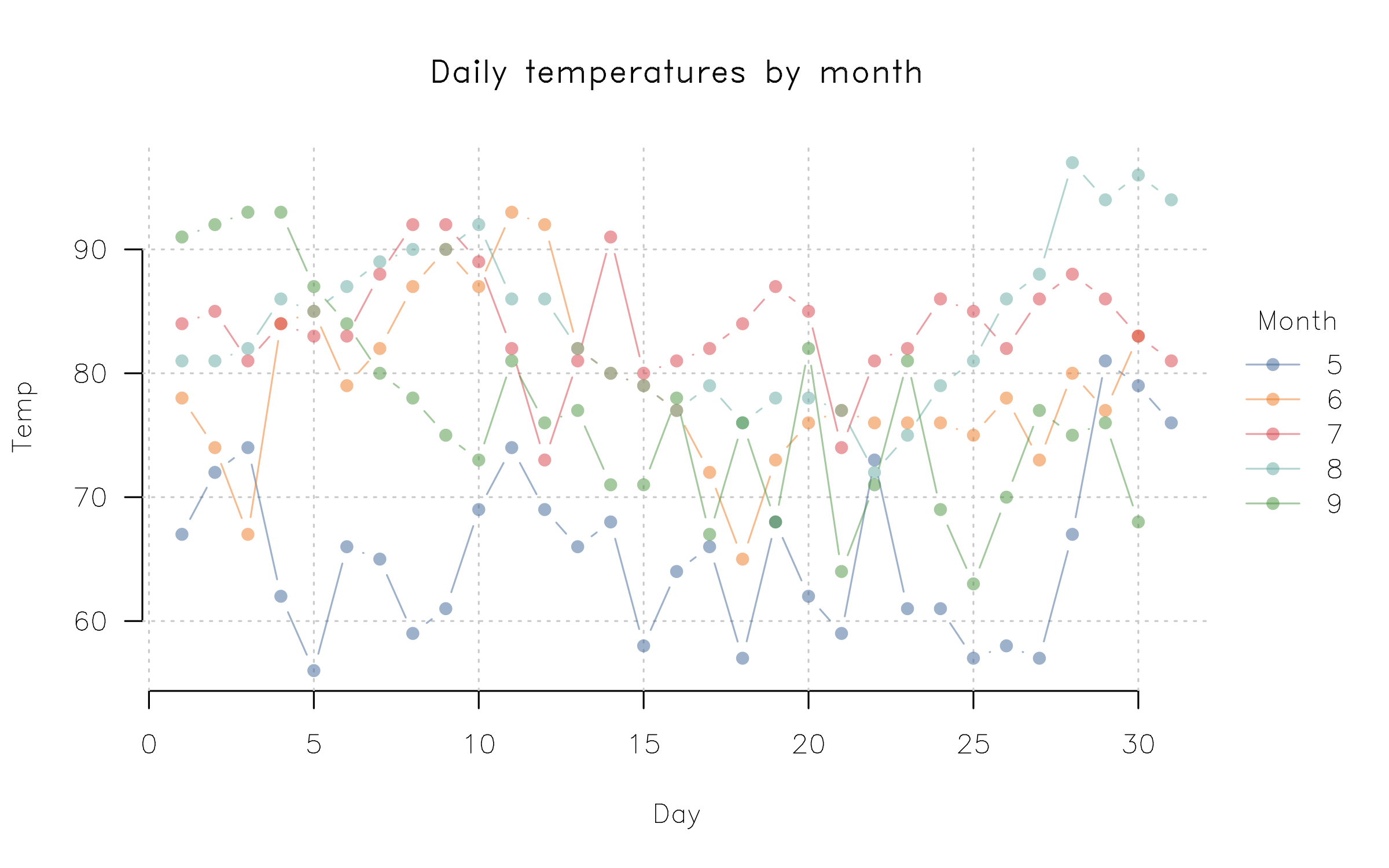
Customizing your plots further is straightforward, whether that is done
by changing global parameters (via par) or invoking plot2 arguments.
Here’s a quick penultimate example, where we change our point character,
tick labels, and font family globally, before adding some transparency
to our colour palette, and use Tufte-style floating axes with a
background panel grid.
par(
  pch    = 16,           # Filled points as default
  las    = 1,            # Horizontal axis tick labels
  family = "HersheySans" # Use a (built-in) Hershey font instead of Arial default
)

plot2(
  Temp ~ Day | Month,
  data = airquality,
  type = "b",
  palette = palette.colors(palette = "Tableau 10", alpha = 0.5),
  main = "Daily temperatures by month",
  frame = FALSE, grid = TRUE
)
At the risk of repeating ourselves, the use of par in the previous
example again underscores the correspondence with the base graphics
system. Because plot2 is effectively a convenience wrapper around base
plot, any global elements that you have set for the latter should
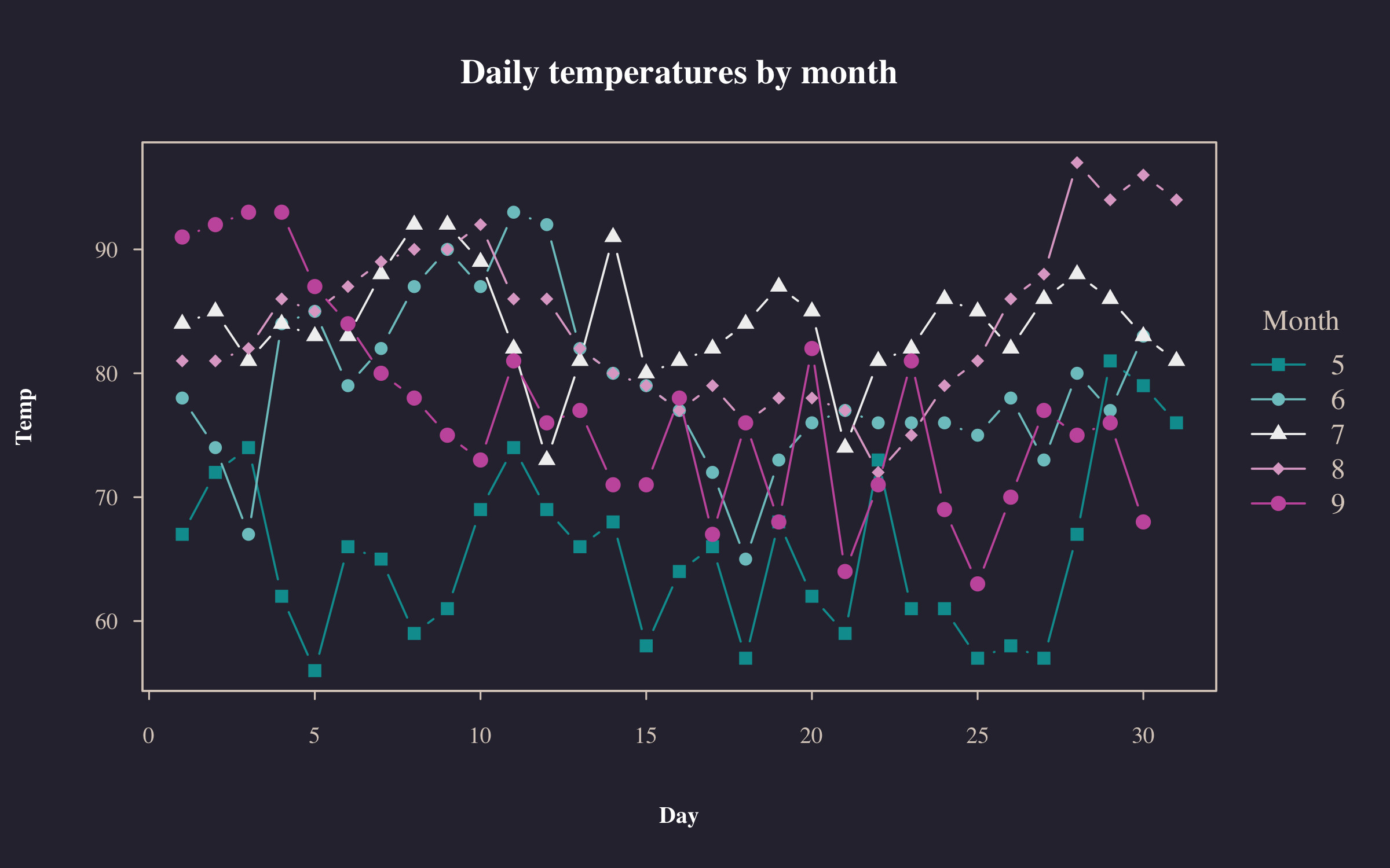
carry over to the former. For nice out-of-the-box themes, we recommend
the basetheme package.
par(pch = 15, las = 0, family = "") # change/revert global changes from above

library(basetheme)
basetheme("royal") # or "clean", "dark", "ink", "brutal", etc.

plot2(
  Temp ~ Day | Month,
  data = airquality,
  type = "b",
  pch = "by",
  palette = "Tropic",
  main = "Daily temperatures by month"
)basetheme(NULL) # back to default theme
dev.off()
#> null device
#> 1Conclusion
In summary, consider the plot2 package if you are looking for base R
plot functionality with some added convenience features. You can use
pretty much the same syntax and all of your theming elements should
carry over too. It has no dependencies other than base R itself and this
makes it an attractive option for situations where dependency management
is expensive (e.g., an R application running in a browser via
WebAssembly).
Footnotes
-
At this point, experienced base plot users might protest that you can colour by groups using the
colargument, e.g.with(airquality, plot(Day, Temp, col = Month)). This is true, but there are several limitations. First, you don’t get an automatic legend. Second, the baseplot.formulamethod doesn’t specify the grouping within the formula itself (not a deal-breaker, but not particularly consistent either). Third, and perhaps most importantly, this grouping doesn’t carry over to line plots (i.e., type=“l”). Instead, you have to transpose your data and usematplot. See this old StackOverflow thread for a longer discussion. ↩ -
See the accompanying help pages of those two functions for more details on the available palettes, or read the article by Achim Zeileis and Paul Murrell. ↩
