LayoutComposer provides methods to write the typical UIView layout patterns such as:
- place UIViews along the vertical/horizontal axis. (VBox/HBox Layout)
- place child UIViews at the top|bottom|left|right|center of the parent UIView. (Relative Layout)
- make a child UIView fit the size of its parent view. (Fit Layout)
Since each layout pattern is able to contain other layout patterns as child components, you can form complicated layouts. Auto Layout code written by LayoutComposer expresses the UIView hierarchy. It makes Auto Layout code very simple and intuitive.
let contentView: UIView = ...
let view1 = UIView()
let view2 = UIView()
let view3 = UIView()

contentView.applyLayout(VBox(), items: [
    $(view1, height: 50),
    $(view2, height: 100),
    $(view3, height: 75)
])
LayoutComposer extends UIView to add applyLayout method.
applyLayout adds UIViews as children by the specified layout.
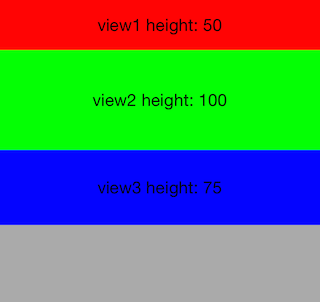
In the above example, contentView adds view1, view2 and view3 as child views and lays out them by VBox layout.
First parameter of the method is a instance of the Layout class, and items parameter is an array of LayoutComponent.
LayoutComponent is created by $(view, options...) expression. In the above example, LayoutComponents of
view1, view2 and view3 are created with the height option.
contentView.applyLayout(VBox(), items: [
    $(view1, height: 50),
    $(view2, height: 100),
    $(view3, flex: 1),
    $(view4, flex: 2)
])
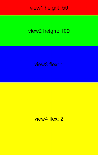
VBox places UIViews along the vertical axis. Each LayoutComponent can specify height in pixel or by using flex option.
The flex option set height of the LayoutComponent relative to each view having flex option.
In the above example, view4 is twice the height of view3.
LayoutComponents having the flex option divide the available area. If neither height or flex is specified, the intrinsic content size of the view is used.
contentView.applyLayout(VBox(), items: [
    $(view1, height: 50, marginTop: 10),
    $(view2, height: 100, marginTop: 10, marginLeft: 20, marginRight: 30),
    $(view3, height: 75, margins: (10, 30, 0, 20))
])
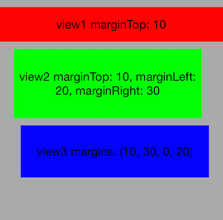
In VBox/HBox layout, margins of each LayoutComponent can be set by
margingTop, marginBottom, marginLeft, marginRight options.
margins option is also available for setting margins by 4-tuple (top-margin, left-margin, bottom-margin, right-margin).
contentView.applyLayout(VBox(defaultMargins: (10, 20, 0, 20)), items: [
    $(view1, height: 50),
    $(view2, height: 100),
    $(view3, height: 75)
])
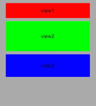
defaultMargins is also available for setting default margins of each LayoutComponent.
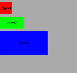
contentView.applyLayout(VBox(defaultMargins: (10, 0, 0, 0), align: .Start), items: [
    $(view1, width: 50, height: 50),
    $(view2, width: 100, height: 50),
    $(view3, width: 200, height: 100)
])
VBox can have align parameters. LayoutComponents are left-aligned in the container if .Start is set,
right-aligned if .End is set, and center-aligned if .Center is set.
If align is set to .Stretch, the widths of LayoutComponents are expanded to the width of the parent view.
The default alignment is .Stretch.
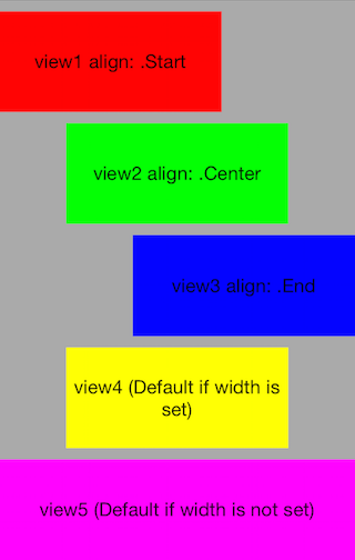
contentView.applyLayout(VBox(defaultMargins: (10, 0, 0, 0)), items: [
    $(view1, width: 200, flex: 1, align: .Start),
    $(view2, width: 200, flex: 1, align: .Center),
    $(view3, width: 200, flex: 1, align: .End),
    $(view4, width: 200, flex: 1),
    $(view5, flex: 1),
])
Alignment can be set individually by setting align option to each LayoutComponent.
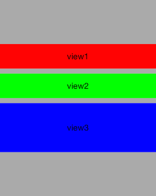
container.applyLayout(VBox(defaultMargins: (10, 0, 0, 0), pack: .Center), items: [
    $(view1, height: 50),
    $(view2, height: 50),
    $(view3, height: 100)
])
VBox can have pack parameters. LayoutComponents are top-aligned in the container if .Start is set,
bottom-aligned if .End is set, and center-aligned if .Center is set.
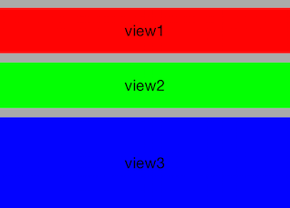
container.applyLayout(VBox(defaultMargins: (10, 0, 0, 0), pack: .Fit), items: [
    $(view1, height: 50),
    $(view2, height: 50),
    $(view3, height: 100)
])
If pack option is set to .Fit, the height of the parent view is adjusted to fit the child views.
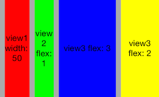
contentView.applyLayout(HBox(defaultMargins: (0, 10, 0, 0)), items: [
    $(view1, width: 50),
    $(view2, flex: 1),
    $(view3, flex: 3),
    $(view4, flex: 2)
])
HBox places UIViews along the horizontal axis.
HBox is the horizontal version of VBox.
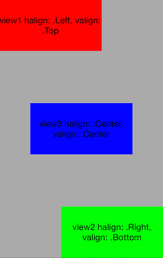
contentView.applyLayout(Relative(), items: [
   $(view1, halign: .Left, valign: .Top, width: 200, height: 100),
   $(view2, halign: .Right, valign: .Bottom, width: 200, height: 100),
   $(view3, halign: .Center, valign: .Center, width: 200, height: 100)
])
Relative layout places child components at the top, bottom, left, right or center of the parent view.
halign and valign options are available for setting alignments for each LayoutComponent.
Similar to VBox/HBox layout, margingTop, marginBottom, marginLeft, marginRight, and margins options are available for setting margins.
contentView.applyLayout(Fit(), item: $(view1))Fit makes a child component fit the size of its parent view.
Similar to VBox/HBox layout, margingTop, marginBottom, marginLeft, marginRight, and margins options are available for setting margins.
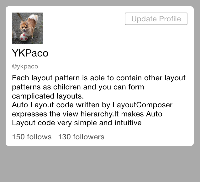
You can form more complicated layouts by nesting multiple layout patterns.
let profileContainer = UIView()
...
let icon = UIImageView(image: UIImage(named: "avatar.jpeg"))
...
let changeProfileBtn = UIButton.buttonWithType(.System) as! UIButton
changeProfileBtn.setTitle("Update Profile", forState: .Normal)
...
let nameLabel = UILabel()
nameLabel.text = "YKPaco"
...
let userIDLabel = UILabel()
userIDLabel.text = "@ykpaco"
...
let messageLabel = UILabel()
messageLabel.text = "Each layout pattern is able to contain other layout patterns ..."
...
let followLabel = UILabel()
followLabel.text = "150 follows"
...
let followerLabel = UILabel()
followerLabel.text = "130 followers"

contentView.applyLayout(VBox(), items: [
    $(profileContainer, margins: (10, 10, 10, 10), layout: VBox(pack: .Fit, defaultMargins: (0, 10, 0, 10)), items: [
        $(nil, height: 50, marginTop: 10, layout: Relative(), items: [
            $(icon, width: 50, height: 50, halign: .Left),
            $(changeProfileBtn, width: 100, height: 20, halign: .Right, valign: .Top)
        ]),
        $(nameLabel, marginTop: 5),
        $(userIDLabel, marginTop: 5),
        $(messageLabel, marginTop: 5),
        $(nil, height: 30, layout: HBox(), items: [
            $(followLabel),
            $(followerLabel, marginLeft: 10)
        ])
    ])
])
Each LayoutComponent is able to have layout option to make it a container of other LayoutComponents.
$(nil, ...) creates a new transparent UIView. It is convenient method to create a new container.
Using CocoaPods
LayoutComposer is available through CocoaPods. To install it, simply add the following line to your Podfile:
pod "LayoutComposer"- Download the source files in the Pod/Classes.
- Add the source files to your Xcode project.
The current release of LayoutComposer supports the following versions of iOS
- Xcode
- Language Support: Swift (2.0)
- If you use swift 1.2, checkout swift-1.2 baranch.
- iOS
- Minimum Deployment Target: iOS 7.0
- If you set the deployment target iOS 7.X, installation through CocoaPods is not available. You have to install LayoutComposer manually.
- Minimum Deployment Target: iOS 7.0
To run the example project, clone the repo, and run pod install from the Example directory first.
Yusuke Kawakami, kawakami.paco.yusuke@gmail.com
LayoutComposer is available under the MIT license. See the LICENSE file for more info.


