A simple subclass of android.widget.ProgressBar that contains title and subtitile in the center.
Copyright (C) 2013 Leon Cheng Licensed under the Apache License, Verision 2.0
Make sure you have attrs.xml, colors.xml, styles.xml
Include the xml in the layout.
<com.lylc.widget.circularprogressbar.example.CircularProgressBar
    android:id="@+id/circularprogressbar1"
	style="@style/Widget.ProgressBar.Holo.CircularProgressBar"
 	android:layout_width="120dip"
	android:layout_height="120dip"
	android:layout_marginTop="10dip"
	circular:subtitle="subtitle"
	circular:title="Title" />
There are 2 pre-defined styles to choose from, Widget.ProgressBar.Holo.CircularProgressBar, Widget.ProgressBar.CircularProgressBar in styles.xml
<style name="Widget.ProgressBar.CircularProgressBar" parent="Widget">
	...
</style>

<style name="Widget.ProgressBar.Holo.CircularProgressBar" parent="Widget.ProgressBar.CircularProgressBar">
	...
</style>
There are few attributes defined in the attrs.xml.
Inorder to set the circularProgressBar attribute from the xml, make sure your layout xml contains an additional namespace.
xmlns:circular="http://schemas.android.com/apk/res/your_package_name"
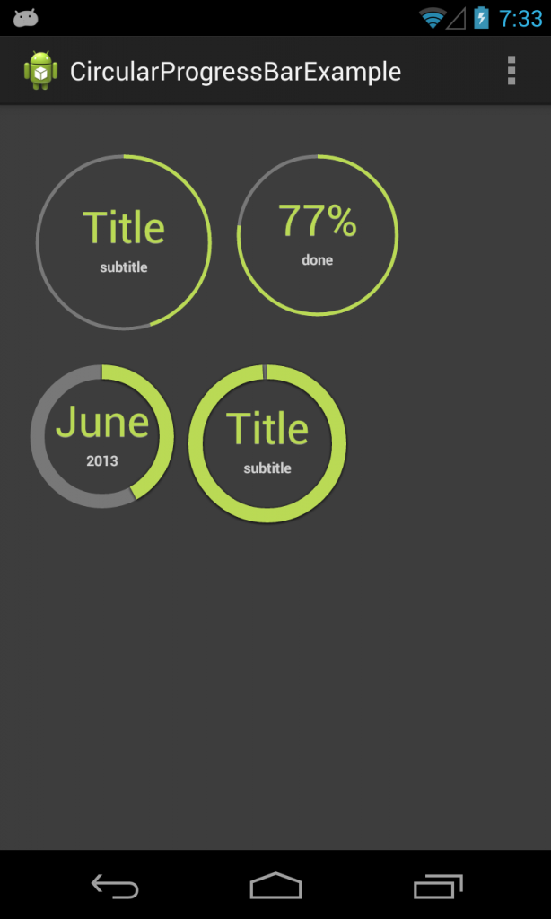
You can set the title, subtitle and the progress like so
CircularProgressBar c3 = (CircularProgressBar) findViewById(R.id.circularprogressbar3);
c3.setTitle("June");
c3.setSubTitle("2013");
c3.setProgress(42);
Note that it is not using TextView for displaying; therefore, currently, it is limited to only text color.
You can also animate the progress bar to a specific number by
c2.animateProgressTo(0, 77, new ProgressAnimationListener() {

		@Override
		public void onAnimationStart() {
		}

		@Override
		public void onAnimationProgress(int progress) {
			c2.setTitle(progress + "%");
		}

		@Override
		public void onAnimationFinish() {
			c2.setSubTitle("done");
		}
	});