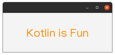
Label is a non-editable text control. A Label is useful for displaying text that is required to fit within a specific space, and thus may need to use an ellipsis or truncation to size the string to fit. Labels also are useful in that they can have mnemonics which, if used, will send focus to the Control listed as the target of the labelFor property.
| Extensions | Property | Description |
|---|---|---|
labelFor |
labelForProperty() |
... |
Example:
   class MainView: View() {
    override val root = borderpane {
        center {
            label("Kotlin is Fun").style {
                fontSize=40.px
                fontFamily="Manjari"
                textFill= Color.DARKORANGE
            }
        }
    }
}Note: I used style in the example, but you'll see more details later about style and css in tornadofx.
Output:
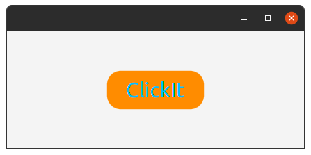
A simple button control. The button control can contain text and/or a graphic.
| Extensions | Property | Description |
|---|---|---|
isDefaultButton |
cancelButtonProperty() |
A default Button is the button that receives a keyboard VK_ENTER press, if no other node in the scene consumes it. |
isCancelButton |
defaultButtonProperty() |
A Cancel Button is the button that receives a keyboard VK_ESC press, if no other node in the scene consumes it. |
Example:
class MainView: View() {
    override val root = borderpane {
        center{
            button("Click_It"){
                style{
                    fontSize=30.px
                    fontFamily="Ubuntu"
                    textFill=Color.DEEPSKYBLUE
                    backgroundColor+=Color.DARKORANGE
                    backgroundRadius+= CssBox(20.px,20.px,20.px,20.px)
                }
                action {
                    this@MainView.close()
                }
            }
        }
    }
}Output:
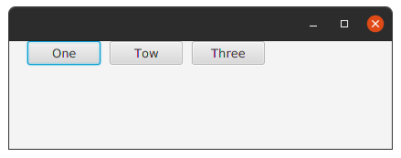
A ButtonBar is essentially a HBox, with the additional functionality for operating system specific button placement.
In other words, any Node may be annotated (via the setButtonData(Node, ButtonBar.ButtonData) method, placed inside a ButtonBar (via the getButtons() list),
and will then be positioned relative to all other nodes in the button list based on their annotations, as well as the overarching button order specified for the ButtonBar.
Uniform button sizing
| Extensions | Property | Description |
|---|---|---|
buttonMinWidth |
buttonMinWidthProperty() |
Returns the minimum width of all buttons placed in this button bar. |
buttonOrder |
buttonOrderProperty() |
Returns the current button order. |
buttons |
Yes | Returns: A list containing all buttons currently in the button bar, and allowing for further buttons to be added or removed. |
button() |
No | A Simple Button. |
Example:
class MainView: View() {
    override val root = pane{
        buttonbar(buttonOrder = BUTTON_ORDER_LINUX){
            buttonMinWidth = 80.0
            button("One")
            button("Tow")
            button("Three")
        }
    }
}
Output:
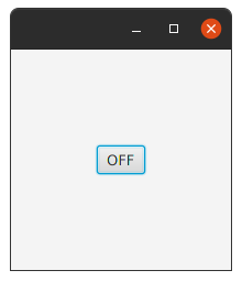
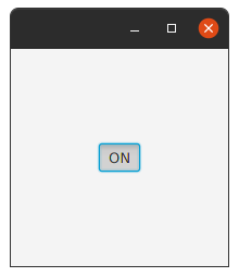
A ToggleButton is a button that expresses a true/false state depending on its selection state.
Example:
class MainView: View() {
    override val root = borderpane{
        setPrefSize(200.0,200.0)
        center = togglebutton {
            textProperty().bind(selectedProperty().stringBinding {
                if (it == true) "ON" else "OFF"
            })
        }
    }
}Output:
class which contains a reference to all Toggles whose selected variables should be managed such that only a single Toggle within the ToggleGroup may be selected at any one time. Generally ToggleGroups are managed automatically simply by specifying the name of a ToggleGroup on the Toggle, but in some situations it is desirable to explicitly manage which ToggleGroup is used by Toggles.
| Extensions | Property | Description |
|---|---|---|
properties |
Yes | Returns an observable map of properties on this node for use primarily by application developers. |
selectedToggle |
selectedToggleProperty() |
Returns:Toggle The selected toggle. |
toggles |
Yes | The list of toggles within the ToggleGroup. |
userData |
No | Returns a previously set Object property, or null if no such property has been set using the setUserData(Object) method. |
hasProperties() |
No | Returns:true if node has properties. |
selectToggle() |
No | Params:value – The Toggle that is to be selected. |
bind() |
No | ... |
| No | selectedValueProperty<>() |
... |
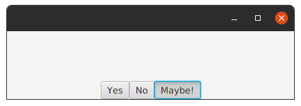
Example:
class MainView:View() {
    override val root = hbox {
        alignment = Pos.BOTTOM_CENTER
        togglegroup {
            togglebutton("Yes", this)
            togglebutton("No", this)
            togglebutton("Maybe!", this)
        }
    }
}Output:
The Text class defines a node that displays a text.
Paragraphs are separated by \n and the text is wrapped on paragraph boundaries.
| Extensions | Property | Description |
|---|---|---|
text |
textProperty() |
Defines text string that is to be displayed. |
textOrigin |
textOriginProperty() |
Defines the origin of text coordinate system in local coordinates. Note: in case multiple rows are rendered VPos.BASELINE and VPos.TOP define the origin of the top row while VPos.BOTTOM defines the origin of the bottom row. |
textAlignment |
textAlignmentProperty() |
Defines horizontal text alignment in the bounding box. The width of the bounding box is defined by the widest row. Note: In the case of a single line of text, where the width of the node is determined by the width of the text, the alignment setting has no effect. |
font |
fontProperty() |
Defines the font of text. |
fontSmoothingType |
fontSmoothingTypeProperty() |
Specifies a requested font smoothing type : gray or LCD. The width of the bounding box is defined by the widest row. Note: LCD mode doesn't apply in numerous cases, such as various compositing modes, where effects are applied and very large glyphs. |
boundsType |
boundsTypeProperty() |
Determines how the bounds of the text node are calculated. Logical bounds is a more appropriate default for text than the visual bounds. See TextBoundsType for more information. |
isStrikethrough |
strikethroughProperty() |
Defines if each line of text should have a line through it. |
isUnderline |
underlineProperty() |
Defines if each line of text should have a line below it. |
lineSpacing |
lineSpacingProperty() |
Defines the vertical space in pixel between lines. |
baselineOffset |
baselineOffsetProperty() |
The 'alphabetic' (or roman) baseline offset from the Text node's layoutBounds.minY location. The value typically corresponds to the max ascent of the font. |
wrappingWidth |
wrappingWidthProperty() |
Defines a width constraint for the text in user space coordinates, e.g. pixels, not glyph or character count. If the value is > 0 text will be line wrapped as needed to satisfy this constraint. |
x |
xProperty() |
Defines the X coordinate of text origin. |
y |
yProperty() |
Defines the Y coordinate of text origin. |
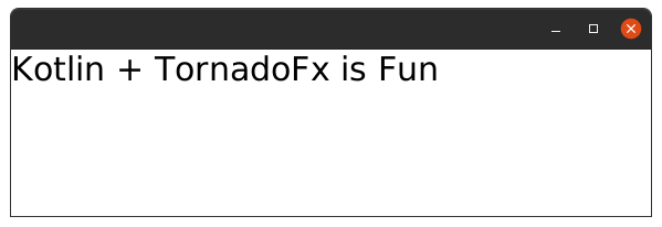
| Example: |
class MainView: View() {
    override val root = hbox {
        text {
            text = "Kotlin + TornadoFx is Fun"
            this.font = Font("Manjari", 30.0)
        }
    }
}Output:
TextFlow is special layout designed to lay out rich text.
It can be used to layout several Text nodes in a single text flow.
The TextFlow uses the text and the font of each Text node inside of it plus it own width and text alignment to determine the location for each child.
A single Text node can span over several lines due to wrapping and the visual location of Text node can differ from the logical location due to bidi reordering.
| Extensions | Property | Description |
|---|---|---|
lineSpacing |
lineSpacingProperty() |
Defines the vertical space in pixel between lines. |
textAlignment |
textAlignmentProperty() |
Defines horizontal text alignment |
Example:
class MainView:View() {
    override val root = pane {
        textflow {
            text("S").style{fontSize=33.px; fill= Color.LIGHTBLUE}
            text("omething ").style{fontSize=26.px; fill= Color.DARKORANGE}
            text("L").style{fontSize=33.px; fill= Color.LIGHTBLUE}
            text("ike this").style{fontSize=26.px; fill= Color.DARKORANGE}
        }
    }
}Output:
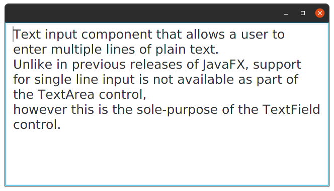
Text input component that allows a user to enter multiple lines of plain text. Unlike in previous releases of JavaFX, support for single line input is not available as part of the TextArea control, however this is the sole-purpose of the TextField control.
| Extensions | Property | Description |
|---|---|---|
isWrapText |
wrapTextProperty() |
If a run of text exceeds the width of the TextArea, then this variable indicates whether the text should wrap onto another line. |
paragraphs |
Yes | Returns an unmodifiable list of the character sequences that back the text area's content. |
prefColumnCount |
prefColumnCountProperty() |
The preferred number of text columns. This is used for calculating the TextArea's preferred width. |
prefRowCount |
prefRowCountProperty() |
The preferred number of text rows. This is used for calculating the TextArea's preferred height. |
scrollLeft |
scrollLeftProperty() |
The number of pixels by which the content is horizontally scrolled. |
scrollTop |
scrollTopProperty() |
The number of pixels by which the content is vertically scrolled. |
Example:
class MainView: View() {
    override val root = hbox {
        textarea(str) {
            isWrapText=true
            font = Font("Manjari",25.0)
        }
    }
}Output:
Text input component that allows a user to enter a single line of unformatted text. Unlike in previous releases of JavaFX, support for multi-line input is not available as part of the TextField control,
| Extensions | Property | Description |
|---|---|---|
alignment |
alignmentProperty() |
Specifies how the text should be aligned when there is empty space within the TextField. |
characters |
No | Returns the character sequence backing the text field's content. |
onAction |
onActionProperty() |
The action handler associated with this text field, or null if no action handler is assigned. The action handler is normally called when the user types the ENTER key. |
prefColumnCount |
prefColumnCountProperty() |
The preferred number of text columns. This is used for calculating the TextField's preferred width. |
Example:
class MainView: View() {
    override val root = borderpane {
        center = textfield {
            onAction= EventHandler { println(this.characters) }
        }
    }
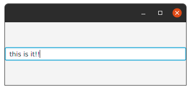
}Output:
And when you press Enter key will get in condole:
this is it!!
Text field that masks entered characters.
Example:
class MainView:View() {
    override val root = borderpane {
        center = passwordfield {
            onAction= EventHandler { println(this.characters) }
        }
    }
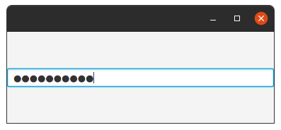
}Output:
And when you press Enter key will get in condole:
password!!
| Extensions | Property | Description |
|---|---|---|
text |
textProperty() |
|
form |
No | ... |
icon |
iconProperty() |
... |
inputGrow |
inputGrowProperty() |
Enumeration used to determine the grow (or shrink) priority of a given node's layout area when its region has more (or less) space available and multiple nodes are competing for that space. more detailes below |
labelPosition |
labelPositionProperty() |
Orientation: HORIZONTAL right <-> left orientation, VERTICAL top <-> bottom orientation |
legend |
legendProperty |
... |
see also:
Priority can be :
ALWAYSLayout area will always try to grow (or shrink), sharing the increase (or decrease) in space with other layout areas that have a grow (or shrink) of ALWAYS.SOMETIMESIf there are no other layout areas with grow (or shrink) set to ALWAYS or those layout areas didn't absorb all of the increased (or decreased) space, then will share the increase (or decrease) in space with other layout area's of SOMETIMES.NEVERLayout area will never grow (or shrink) when there is an increase (or decrease) in space available in the region.
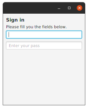
Example:
class MainView: View() {
    override val root = form {
        fieldset {
            text = "Sign in"
            this.legend = label("Please fill you the fields below.")
            field {
                textfield { promptText="Enter your name" }
            }
            field {
                passwordfield { promptText="Enter your pass" }
            }
        }
    }
}
Output:
An implementation of the ComboBoxBase abstract class for the most common form of ComboBox,
where a popup list is shown to users providing them with a choice that they may select from.
For more information around the general concepts and API of ComboBox, refer to the ComboBoxBase class documentation.
On top of ComboBoxBase, the ComboBox class introduces additional API.
Most importantly, it adds an items property that works in much the same way as the ListView items property.
In other words, it is the content of the items list that is displayed to users when they click on the ComboBox button.
The ComboBox exposes the valueProperty() from ComboBoxBase, but there are some important points of the value property that need to be understood in relation to ComboBox.
These include:
- The value property is not constrained to items contained within the items list - it can be anything as long as it is a valid value of type
T. - If the value property is set to a non-null object, and subsequently the items list is cleared, the value property is not nulled out.
- Clearing the selection in the selection model does not null the value property - it remains the same as before.
- It is valid for the selection model to have a selection set to a given index even if there are no items in the list (or less items in the list than the given index).
Once the items list is further populated, such that the list contains enough items to have an item in the given index,
both the selection model
SelectionModel.selectedItemProperty()and value property will be updated to have this value. This is inconsistent with other controls that use a selection model, but done intentionally forComboBox.
| Extensions | Property | Description |
|---|---|---|
buttonCell |
buttonCellProperty() |
The button cell is used to render what is shown in the ComboBox 'button' area. If a cell is set here. |
cellFactory |
cellFactoryProperty() |
Providing a custom cell factory allows for complete customization of the rendering of items in the ComboBox. Refer to the Cell javadoc for more information on cell factories. |
converter |
converterProperty() |
Converts the user-typed input (when the ComboBox is editable) to an object of type T, such that the input may be retrieved via the value property. |
editor |
editorProperty() |
The editor for the ComboBox. The editor is null if the ComboBox is not editable. |
items |
itemsProperty() |
The list of items to show within the ComboBox popup. |
placeholder |
placeholderProperty() |
This Node is shown to the user when the ComboBox has no content to show. The placeholder node is shown in the ComboBox popup area when the items list is null or empty. |
selectionModel |
selectionModelProperty() |
The selection model for the ComboBox. A ComboBox only supports single selection. |
visibleRowCount |
visibleRowCountProperty() |
The maximum number of rows to be visible in the ComboBox popup when it is showing. By default this value is 10. |
selectedItem |
No | Return the index of the item that selected. |
valueSelections |
No | ... |
asyncItems { } |
No | ... |
makeAutocompletable() |
No | ... |
cellFormat { } |
No | ... |
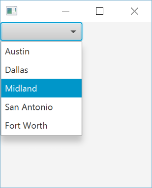
Example:
class MainView: View() {
    val list = listOf("Austin",
        "Dallas","Midland", "San Antonio","Fort Worth").observable()
    override val root = vbox {
        combobox<String> {
            items = list
        }
    }
}
Output:
A ListView displays a horizontal or vertical list of items from which the user may select,
or with which the user may interact.
A ListView is able to have its generic type set to represent the type of data in the backing model.
Doing this has the benefit of making various methods in the ListView, as well as the supporting classes (mentioned below), type-safe.
In addition, making use of the generic supports substantially simplifies development of applications making use of ListView,
as all modern IDEs are able to auto-complete far more successfully with the additional type information.
Populating a ListView
| Extensions | Property | Description |
|---|---|---|
cellFactory |
cellFactoryProperty() |
Sets a new cell factory to use in the ListView. This forces all old ListCell's to be thrown away, and new ListCell's created with the new cell factory. |
editingIndex |
editingIndexProperty() |
Returns the index of the item currently being edited in the ListView, or -1 if no item is being edited. |
edit() |
No | Instructs the ListView to begin editing the item in the given index, if the ListView is editable. Once this method is called, if the current cellFactoryProperty() is set up to support editing, the Cell will switch its visual state to enable for user input to take place. Params:itemIndex – The index of the item in the ListView that should be edited. |
fixedCellSize |
fixedCellSizeProperty() |
Returns the fixed cell size value. A value less than or equal to zero is used to represent that fixed cell size mode is disabled, and a value greater than zero represents the size of all cells in this control. |
focusModel |
focusModelProperty() |
Returns the currently installed FocusModel. |
isEditable |
editableProperty() |
Specifies whether this ListView is editable - only if the ListView and the ListCells within it are both editable will a ListCell be able to go into their editing state. |
items |
itemsProperty() |
Returns an ObservableList that contains the items currently being shown to the user. This may be null if setItems(ObservableList) has previously been called, however, by default it is an empty ObservableList. |
itemSelections |
No | ... |
onEditCancel |
onEditCancelProperty() |
Returns the EventHandler that will be called when the user cancels an edit. |
onEdit() |
No | ... |
onEditStart |
onEditStartProperty() |
Returns the EventHandler that will be called when the user begins an edit, Also setOnEditStart{}:Sets the EventHandler that will be called when the user begins an edit. |
onEditCommit |
onEditCommitProperty() |
Returns the EventHandler that will be called when the user commits an edit, Also setOnEditCommit{}:Sets the EventHandler that will be called when the user has completed their editing. |
onEditCancel |
onEditCancelProperty() |
Returns the EventHandler that will be called when the user cancels an edit, Also setOnEditCancel{}:Sets the EventHandler that will be called when the user cancels an edit. |
onScrollTo |
onScrollToProperty() |
Called when there's a request to scroll an index into view using scrollTo(int) or scrollTo(Object), Also setOnScrollTo{}:Sets the EventHandler that will be called when the user scrolling. |
scrollTo() |
No | Scrolls the ListView such that the item in the given index is visible to the end user, Params:index – The index that should be made visible to the user, assuming of course that it is greater than, or equal to 0, and less than the size of the items list contained within the given ListView. |
refresh() |
No | Calling refresh() forces the ListView control to recreate and repopulate the cells necessary to populate the visual bounds of the control. In other words, this forces the ListView to update what it is showing to the user. This is useful in cases where the underlying data source has changed in a way that is not observed by the ListView itself. |
selectedItem |
No | |
useCheckbox{} |
No | ... |
asyncItems{} |
No | ... |
bindSelected() |
No | ... |
cellCache{} |
No | ... |
cellFormat{} |
No | ... |
multiSelect() |
No | ... |
onUserDelete{} |
No | ... |
onUserSelect{} |
No | ... |
selectWhere{} |
No | ... |
Example:
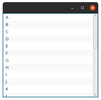
class MainView: View() {
    val cal = ('A'..'Z').toList().observable()
    override val root = vbox {
        listview<Char> {
            items = cal
        }
    }
}
Output:
| Extensions | Property | Description |
|---|---|---|
item{...} |
No | ... |
items |
Yes | ... |
activeItem |
activeItemProperty |
... |
theme |
themeProperty |
... |
graphicFixedSized |
graphicFixedSizeProperty |
... |
iconPosition |
iconPositionProperty |
... |
orientation |
orientationProperty |
... |
item() Extensions |
item() Property |
item() Description |
|---|---|---|
active |
activeProperty |
... |
graphic |
graphicProperty |
... |
text |
textProperty |
... |
needsLayout() |
No | ... |
whenSelected{} |
No | ... |
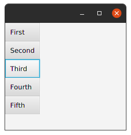
Example:
class MainView: View() {
    val str = listOf("First", "Second", "Third", "Fourth", "Fifth")
    override val root = vbox {
        listmenu {
            str.forEach {
                item(it) {
                    whenSelected {
                        println("$text is active now.")
                    }
                }
            }
        }
    }
}
Output:
when the item is selected the console output:
Third is active now.
A MenuBar control traditionally is placed at the very top of the user interface, and embedded within it are Menus.
To add a menu to a menubar, you add it to the menus ObservableList.
By default, for each menu added to the menubar, it will be represented as a button with the Menu text value displayed.
| Extensions | Property | Description |
|---|---|---|
isUseSystemMenuBar |
useSystemMenuBarProperty() |
Use the system menu bar if the current platform supports it. This should not be set on more than one MenuBar instance per Stage. If this property is set to true on more than one MenuBar in the same Stage, then the behavior is undefined. |
menus |
No | The menus to show within this MenuBar. If this ObservableList is modified at runtime, the MenuBar will update as expected. |
menu{...} |
No | ... |
menu() Extensions |
menu() Property |
menu() Description |
|---|---|---|
isShowing |
No | Indicates whether the ContextMenu is currently visible. |
items |
No | The items to show within this menu. If this ObservableList is modified at runtime, the Menu will update as expected. |
onHidden |
onHiddenProperty() |
Called just after the ContextMenu has been hidden, Also setOnHidden{} |
onHiding |
onHidingProperty() |
Called just prior to the ContextMenu being hidden, Also setOnHiding{} |
onShown |
onShownProperty() |
Called just after the ContextMenu is shown, Also setOnShown{} |
onShowing |
onShowingProperty() |
Called just prior to the ContextMenu being shown, even if the menu has no items to show. Note however that this won't be called if the menu does not have a valid anchor node, Also setOnShowing{} |
hide() |
No | Hides the ContextMenu if it was previously showing, and any showing submenus. If this menu is not showing, then invoking this function has no effect. |
show() |
No | If the Menu is not disabled and the ContextMenu is not already showing, then this will cause the ContextMenu to be shown. |
item(){...} |
No | ... |
checkmenuitem(){...} |
No | ... |
radiomenuitem() |
No | ... |
customitem() |
No | ... |
separator() |
No | ... |
item() Extensions |
item() Property |
item() Description |
|---|---|---|
accelerator |
acceleratorProperty() |
The accelerator property enables accessing the associated action in one keystroke. It is a convenience offered to perform quickly a given action. |
graphic |
graphicProperty() |
An optional graphic for the MenuItem. This will normally be an javafx.scene.image.ImageView node, but there is no requirement for this to be the case. |
isDisable |
disableProperty() |
Setting disable to true will cause this MenuItem to become disabled. |
disableWhen{} |
No | ... |
isMnemonicParsing |
mnemonicParsingProperty() |
MnemonicParsing property to enable/disable text parsing. If this is set to true, then the MenuItem text will be parsed to see if it contains the mnemonic parsing |
isVisible |
visibleProperty() |
Specifies whether this MenuItem should be rendered as part of the scene graph. |
visibleWhen{} |
No | ... |
onAction |
onActionProperty() |
The action, which is invoked whenever the MenuItem is fired. This may be due to the user clicking on the button with the mouse, or by a touch event, or by a key press, or if the developer programatically invokes the fire() method, Also setOnAction{} |
action{} |
No | ... |
actionEvents() |
No | ... |
addEventHandler() |
No | Registers an event handler to this MenuItem. The handler is called when the menu item receives an Event of the specified type during the bubbling phase of event delivery. |
onMenuValidation |
onMenuValidationProperty() |
The event handler that is associated with invocation of an accelerator for a MenuItem. This can happen when a key sequence for an accelerator is pressed. The event handler is also invoked when onShowing event handler is called, Also setOnMenuValidation{} |
enableWhen{} |
No | ... |
parentMenu |
parentMenuProperty() |
This is the Menu in which this MenuItem exists. It is possible for an instance of this class to not have a parentMenu - this means that this instance is either: Not yet associated with its parentMenu. A 'root' Menu (i.e. it is a context menu, attached directly to a MenuBar, MenuButton, or any of the other controls that use Menu internally. |
parentPopup |
parentPopupProperty() |
This is the ContextMenu in which this MenuItem exists. |
properties |
Yes | Returns an observable map of properties on this menu item for use primarily by application developers. Returns: an observable map of properties on this menu item for use primarily by application developers |
text |
textProperty() |
The text to display in the MenuItem. |
userData |
No | Returns a previously set Object property, or null if no such property has been set using the setUserData(Object) method. Returns: The Object that was previously set, or null if no property has been set or if null was set. Params: eventType – the type of the events to receive by the handler eventHandler – the handler to register |
fire() |
No | Fires a new ActionEvent. |
| No | styleProperty() |
A string representation of the CSS style associated with this specific MenuItem. This is analogous to the "style" attribute of an HTML element. |
command |
commandProperty |
... |
commandParameter |
commandParameterProperty |
... |
checkmenuitem() Extensions |
checkmenuitem() Property |
checkmenuitem() Description |
|---|---|---|
isSelected |
selectedProperty() |
Represents the current state of this CheckMenuItem. Bind to this to be informed whenever the user interacts with the CheckMenuItem (and causes the selected state to be toggled). |
customitem() Extensions |
customitem() Property |
customitem() Description |
|---|---|---|
content |
contentProperty() |
The node to display within this CustomMenuItem. |
isHideOnClick |
hideOnClickProperty() |
If true, this menu item, and all visible menus, will be hidden when this menu item is clicked on. |
separator() Extensions |
separator() Property |
separator() Description |
|---|---|---|
orientation |
orientationProperty() |
The orientation of the Separator can either be horizontal or vertical. |
halignment |
halignmentProperty() |
For vertical separators, specifies the horizontal position of the separator line within the separator control's space. Ignored for horizontal separators. |
valignment |
valignmentProperty() |
For horizontal separators, specifies the vertical alignment of the separator line within the separator control's space. Ignored for vertical separators. |
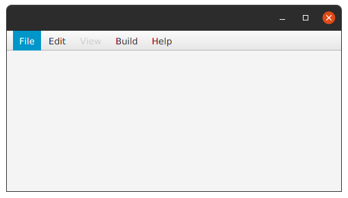
Example:
class MainView: View() {
    override val root = vbox {
        menubar {
            listOf("File", "Edit", "View", "Build", "Help").forEach {
                menu(it) {
                    when (it) {
                        "View" -> this.isDisable = true
                        "File" -> listOf("New", "Open", "Setting", "Save All", "Exit").forEach { item -> item(item) }
                        "Edit" -> listOf("Cut", "Copy", "Paste", "Delete", "Find").forEach { item -> item(item) }
                        "Build" -> listOf("Build P", "Build M", "Recompile", "Rebuild").forEach { item -> item(item) }
                        "Help" -> listOf("Help", "Check Update", "About").forEach { item -> item(item) }
                    }
                }
            }
        }
    }
}
Output:
A specialization of the ProgressIndicator which is represented as a horizontal bar.
ProgressBar sets focusTraversable to false.
Example:
class MainView: View() {
    override val root = borderpane {
        center = progressbar(0.7){
            this.useMaxWidth=true
        }
    }
}
Output:
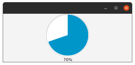
A circular control which is used for indicating progress, either infinite (aka indeterminate) or finite. Often used with the Task API for representing progress of background Tasks.
| Extensions | Property | Description |
|---|---|---|
isIndeterminate |
indeterminateProperty() |
A flag indicating whether it is possible to determine the progress of the ProgressIndicator. Typically indeterminate progress bars are rendered with some form of animation indicating potentially "infinite" progress. |
progress |
progressProperty() |
The actual progress of the ProgressIndicator. A negative value for progress indicates that the progress is indeterminate. A positive value between 0 and 1 indicates the percentage of progress where 0 is 0% and 1 is 100%. Any value greater than 1 is interpreted as 100%. |
Example:
class MainView: View() {
    override val root = borderpane {
        center = progressindicator {
            progress=0.7
        }
    }
}
Output:
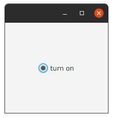
RadioButtons create a series of items where only one item can be selected.
RadioButtons are a specialized ToggleButton.
When a RadioButton is pressed and released a javafx.event.ActionEvent is sent.
Your application can perform some action based on this event by implementing an javafx.event.EventHandler to process the javafx.event.ActionEvent.
Example:
class MainView: View() {
    override val root = borderpane {
        center = radiobutton("turn on")
    }
}
Output:
radiobutton normally work with togglegroup
class MainView:View() {
    override val root = vbox {
        togglegroup {
            radiobutton("first",this)
            radiobutton("second",this)
            radiobutton("third",this)
        }
    }
}A tri-state selection Control typically skinned as a box with a checkmark or tick mark when checked.
| Extensions | Property | Description |
|---|---|---|
isAllowIndeterminate |
allowIndeterminateProperty() |
Determines whether the user toggling the CheckBox should cycle through all three states: checked, unchecked, and undefined. If true then all three states will be cycled through; if false then only checked and unchecked will be cycled. |
isIndeterminate |
indeterminateProperty() |
Determines whether the CheckBox is in the indeterminate state. |
isSelected |
selectedProperty() |
Indicates whether this CheckBox is checked. |
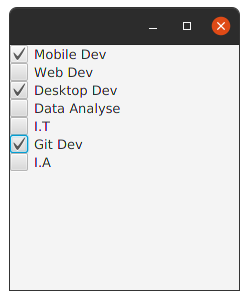
Example:
class MainView: View() {
    override val root = vbox {
        checkbox("Mobile Dev")
        checkbox("Web Dev")
        checkbox("Desktop Dev")
        checkbox("I.T")
        checkbox("Data Analyse")
        checkbox("Git Dev")
        checkbox("A.I")
    }
}
Output:
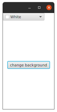
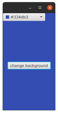
ColorPicker control allows the user to select a color from either a standard palette of colors with a simple one click selection OR define their own custom color.
| Extensions | Property | Description |
|---|---|---|
customColors |
Yes | Gets the list of custom colors added to the Color Palette by the user. |
validator() |
No | ... |
class MainView: View() {
    var color = ColorPicker()
    override val root = borderpane {
        top{
            color = colorpicker()
        }
        center {
            button("change background").action {
                this.style { backgroundColor.plusAssign(color.value) }
            }
        }
    }
}
Output:
The ChoiceBox is used for presenting the user with a relatively small set of predefined choices from which they may choose.
The ChoiceBox, when showing, will display to the user these choices and allow them to pick exactly one choice.
When not showing, the current choice is displayed.
| Extensions | Property | Description |
|---|---|---|
converter |
converterProperty() |
Allows a way to specify how to represent objects in the items list. When a StringConverter is set, the object toString method is not called and instead its toString(object T) is called, passing the objects in the items list. This is useful when using domain objects in a ChoiceBox as this property allows for customization of the representation. |
isShowing |
showingProperty() |
Indicates whether the drop down is displaying the list of choices to the user. This is a readonly property which should be manipulated by means of the #show and #hide methods. |
items |
itemsProperty() |
The items to display in the choice box. The selected item (as indicated in the selection model) must always be one of these items. |
onAction |
onActionProperty() |
The ChoiceBox action, which is invoked whenever the ChoiceBox value property is changed. This may be due to the value property being programmatically changed or when the user selects an item in a popup menu, Also setOnAction{} |
onHidden |
onHiddenProperty() |
Called just after the ChoiceBox popup has been hidden,Also setOnHidden{} |
onShowing |
onShowingProperty() |
Called just prior to the ChoiceBox popup being shown,Also setOnShowing{} |
onShown |
onShownProperty() |
Called just after the ChoiceBox popup is shown,Also setOnShown{} |
selectionModel |
selectionModelProperty() |
The selection model for the ChoiceBox. Only a single choice can be made, hence, the ChoiceBox supports only a SingleSelectionModel. Generally, the main interaction with the selection model is to explicitly set which item in the items list should be selected, or to listen to changes in the selection to know which item has been chosen. |
value |
valueProperty() |
The value of this ChoiceBox is defined as the selected item in the ChoiceBox selection model. The valueProperty is synchronized with the selectedItem. This property allows for bi-directional binding of external properties to the ChoiceBox and updates the selection model accordingly. |
hide() |
No | Closes the list of choices. |
show() |
No | Opens the list of choices. |
Example:
class MainView: View() {
    val list = (0..20).toList().observable()
    override val root = vbox {
        choicebox<Int> {
            items = list
        }
    }
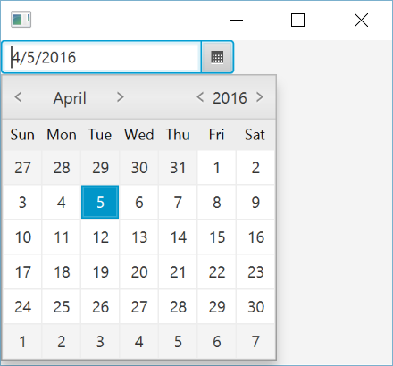
}The DatePicker control allows the user to enter a date as text or to select a date from a calendar popup.
The calendar is based on either the standard ISO-8601 chronology or any of the other chronology classes defined in the java.time.chrono package.
| Extensions | Property | Description |
|---|---|---|
chronology |
chronologyProperty() |
The calendar system used for parsing, displaying, and choosing dates in the DatePicker control. The default value is returned from a call to Chronology.ofLocale(Locale.getDefault(Locale.Category.FORMAT)). The default is usually IsoChronology unless provided explicitly in the Locale by use of a Locale calendar extension. |
converter |
converterProperty() |
Converts the input text to an object of type LocalDate and vice versa. If not set by the application, the DatePicker skin class will set a converter based on a java.time.format.DateTimeFormatter for the current Locale and chronology. This formatter is then used to parse and display the current date value. Setting the value to null will restore the default converter. |
dayCellFactory |
dayCellFactoryProperty() |
A custom cell factory can be provided to customize individual day cells in the DatePicker popup. Refer to DateCell and Cell for more information on cell factories, Also setDayCellFactory{} |
editor |
editorProperty() |
The editor for the DatePicker. |
isShowWeekNumbers |
showWeekNumbersProperty() |
Whether the DatePicker popup should display a column showing week numbers. The default value is specified in a resource bundle, and depends on the country of the current locale. |
...
        datepicker()
...
Output:
A Group node contains an ObservableList of children that are rendered in order whenever this node is rendered.
A Group will take on the collective bounds of its children and is not directly resizable.
Any transform, effect, or state applied to a Group will be applied to all children of that group.
Such transforms and effects will NOT be included in this Group's layout bounds, however if transforms and effects are set directly on children of this Group,
those will be included in this Group's layout bounds.
| Extensions | Property | Description |
|---|---|---|
isAutoSizeChildren |
autoSizeChildrenProperty() |
Controls whether or not this Group will automatically resize any managed resizable children to their preferred sizes during the layout pass. If set to false, then the application is responsible for setting the size of this Group's resizable children, otherwise such nodes may end up with a zero width/height and will not be visible. This variable has no effect on content nodes which are not resizable (Shape, Text, etc). |
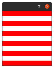
Example:
class MainView: View() {
    override val root = group {
        (0..5).forEach {
            rectangle {
                y = it * 40.0
                width = 200.0
                height = 20.0
                fill = Color.RED
            }
        }
    }
}
Output:
Canvas is an image that can be drawn on using a set of graphics commands provided by a GraphicsContext.
A Canvas node is constructed with a width and height that specifies the size of the image into which the canvas drawing commands are rendered.
All drawing operations are clipped to the bounds of that image.
| Extensions | Property | Description |
|---|---|---|
graphicsContext2D |
No | Returns the GraphicsContext associated with this Canvas. |
height |
heightProperty() |
Defines the height of the canvas. |
width |
widthProperty() |
Defines the width of the canvas. |
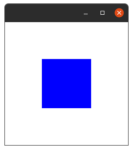
Example:
class MainView: View() {
    override val root = group {
        canvas(250.0, 250.0).graphicsContext2D.apply {
            fill = Color.BLUE
            fillRect(75.0, 75.0, 100.0, 100.0)
        }
    }
}
Output:
| Extensions | Property | Description |
|---|---|---|
cellCache |
cellCacheProperty |
... |
cellFactory |
cellFactoryProperty |
... |
cellFormat |
cellFormatProperty |
... |
cellFragment |
cellFragmentProperty |
... |
cellHeight |
cellHeightProperty |
... |
cellWidth |
cellWidthProperty |
... |
focusModel |
No | ... |
horizontalCellSpacing |
horizontalCellSpacingProperty |
... |
items |
itemsProperty |
... |
maxCellsInRow |
maxCellsInRowProperty |
... |
maxRows |
maxRowsProperty |
... |
multiSelect |
No | ... |
scope |
scopeProperty |
... |
selectedItem |
No | ... |
singleSelect |
No | ... |
selectionModel |
No | ... |
verticalCellSpacing |
verticalCellSpacingProperty |
... |
onUserSelect{} |
No | ... |
| Extensions | Property | Description |
|---|---|---|
buttonArea |
No | Return: [toolbar] |
contentArea |
No | ... |
contextMenu |
No | Return: [contextMenu] |
dockingSide |
dockingSideProperty |
isVertical Returns: true if this represents a vertical side of a rectangle, isHorizontal Returns: true if this represents a horizontal side of a rectangl. |
fixedContentSize |
fixedContentSizeProperty |
... |
floatingDrawers |
floatingDrawersProperty |
... |
items |
No | ... |
item{} |
No | Return: DrawerItem that had: drawer returns Drawer and expanded returns boolean and this last has expandedProperty(). |
maxContentSize |
maxContentSizeProperty() |
... |
multiselect |
multiselectProperty() |
... |
An HTML like label which can be a graphic and/or text which responds to rollovers and clicks.
When a hyperlink is clicked/pressed isVisited becomes true.
A Hyperlink behaves just like a Button.
When a hyperlink is pressed and released a ActionEvent is sent, and your application can perform some action based on this event.
| Extensions | Property | Description |
|---|---|---|
isVisited |
visitedProperty() |
Indicates whether this link has already been "visited". |
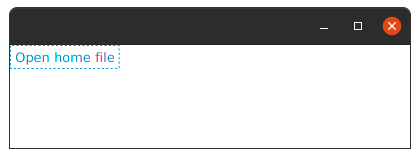
Example:
class MainView:View() {
    class MainView : View() {
        override val root = group {
            hyperlink("Open home file") {
                action {
                    Desktop.getDesktop().open(File(System.getProperty("user.home")))
                }
            }
        }
    }
}
Output:
The ImageView is a Node used for painting images loaded with Image class.
This c``lass allows resizing the displayed image (with or without preserving the original aspect ratio) and specifying a viewport into the source image for restricting the pixels displayed by this ImageView.
| Extensions | Property | Description |
|---|---|---|
fitHeight |
fitHeightProperty() |
The height of the bounding box within which the source image is resized as necessary to fit. If set to a value <= 0, then the intrinsic height of the image will be used as the fitHeight. |
fitWidth |
fitWidthProperty() |
The width of the bounding box within which the source image is resized as necessary to fit. If set to a value <= 0, then the intrinsic width of the image will be used as the fitWidth. |
image |
imageProperty() |
The Image to be painted by this ImageView. |
isPreserveRatio |
preserveRatioProperty() |
Indicates whether to preserve the aspect ratio of the source image when scaling to fit the image within the fitting bounding box. |
isSmooth |
smoothProperty() |
Indicates whether to use a better quality filtering algorithm, or a faster one when transforming or scaling the source image to fit within the bounding box provided by fitWidth and fitHeight. If set to true a better quality filtering will be used, if set to false a faster but lesser quality filtering will be used. |
viewport |
viewportProperty() |
The rectangular viewport into the image. The viewport is specified in the coordinates of the image, prior to scaling or any other transformations. |
x |
xProperty() |
The current x coordinate of the ImageView origin. |
y |
yProperty() |
The current y coordinate of the ImageView origin. |
image Extensions |
image Property |
image Description |
|---|---|---|
exception |
exceptionProperty() |
The exception which caused image loading to fail. Contains a non-null value only if the error property is set to true. |
height |
heightProperty() |
The image height or 0 if the image loading fails. While the image is being loaded it is set to 0. |
width |
widthProperty() |
The image width or 0 if the image loading fails. While the image is being loaded it is set to 0. |
isBackgroundLoading |
No | Indicates whether the image is being loaded in the background. Returns: true if the image is loaded in the background |
isPreserveRatio |
No | |
isError |
No | Indicates whether an error was detected while loading an image. |
isSmooth |
No | |
pixelReader |
No | This method returns a PixelReader that provides access to read the pixels of the image, if the image is readable. If this method returns null then this image does not support reading at this time. This method will return null if the image is being loaded from a source and is still incomplete {the progress is still < 1.0) or if there was an error. This method may also return null for some images in a format that is not supported for reading and writing pixels to. Returns: the PixelReader for reading the pixel data of the image |
progress |
This is package private only for the sake of testing. We need a way to feed fake progress values. It would be better if Image were refactored to be testable (for example, by allowing the test code to provide its own implementation of background loading), but this is a simpler and safer change for now. | |
requestedHeight |
No | Gets the height of the bounding box within which the source image is resized as necessary to fit. If set to a value <= 0, then the intrinsic height of the image will be used. |
requestedWidth |
No | Gets the width of the bounding box within which the source image is resized as necessary to fit. If set to a value <= 0, then the intrinsic width of the image will be used. |
cancel() |
No | Cancels the background loading of this image. Has no effect if this image isn't loaded in background or if loading has already completed. |
Example:
Normally it work by method like this:
imageview("Image.jpg")if not:
class MainView: View() {
    override val root = group {
        imageview(Paths.get("Tornado.jpg").toUri().toURL().toString())
    }
}
Output:
| Extensions | Property | Description |
|---|---|---|
rows |
Yes | ... |
row{...} |
No | ... |
unitSize |
unitSizeProperty |
... |
load() |
No | ... |
toJSON() |
No | ... |
toKeyboardLayoutEditorFormat() |
No | ... |
row{}.
| Extensions | Property | Description |
|---|---|---|
keyboard |
No | ... |
key() |
No | ... |
keys |
Yes | ... |
spacer() |
No | ... |
key().
| Extensions | Property | Description |
|---|---|---|
code |
codeProperty() |
... |
keyHeight |
keyHeightProperty() |
... |
keyWidth |
keyWidthProperty() |
... |
svg |
svgProperty() |
... |
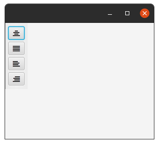
A ToolBar is a control which displays items horizontally or vertically. The most common items to place within a ToolBar are Buttons, ToggleButtons and Separators, but you are not restricted to just these, and can insert any Node into them.
If there are too many items to fit in the ToolBar an overflow button will appear. The overflow button allows you to select items that are not currently visible in the toolbar.
| Extensions | Property | Description |
|---|---|---|
items |
No | The items contained in the ToolBar. |
orientation |
orientationProperty() |
The orientation of the ToolBar - this can either be horizontal or vertical. |
Example:
class MainView: View() {
    private val fontAwesome = GlyphFontRegistry.font("FontAwesome")
    val list = listOf(
        "ALIGN_CENTER" to FontAwesome.Glyph.ALIGN_CENTER,
        "ALIGN_JUSTIFY" to FontAwesome.Glyph.ALIGN_JUSTIFY,
        "ALIGN_LEFT" to FontAwesome.Glyph.ALIGN_LEFT,
        "ALIGN_RIGHT" to FontAwesome.Glyph.ALIGN_RIGHT
    )
    override val root = vbox {
        toolbar {
            orientation= Orientation.VERTICAL
            list.forEach {
                button("", fontAwesome.create(it.second)) { }
            }
        }
    }
}
Output:
A popup control containing an ObservableList of menu items.
The items ObservableList allows for any MenuItem type to be inserted, including its subclasses Menu, MenuItem, RadioMenuItem, CheckMenuItem and CustomMenuItem.
If an arbitrary Node needs to be inserted into a menu, a CustomMenuItem can be used.
One exception to this general rule is that SeparatorMenuItem could be used for inserting a separator.
| Extensions | Property | Description |
|---|---|---|
items |
Yes | The menu items on the context menu. If this ObservableList is modified at runtime, the ContextMenu will update as expected. |
menu() |
see [MenuBar] | |
item(){...} |
No | ... |
checkmenuitem(){...} |
No | ... |
radiomenuitem() |
No | ... |
customitem() |
No | ... |
separator() |
No | ... |
onAction |
onActionProperty() |
Callback function to be informed when an item contained within this ContextMenu has been activated. The current implementation informs all parent menus as well, so that it is not necessary to listen to all sub menus for events, Also setOnAction{} |
show() |
No | ... |
isImpl_showRelativeToWindow |
impl_showRelativeToWindowProperty() |
Deprecated This is an internal API that is not intended for use and will be removed in the next version |
Example:
class MainView: View() {
    override val root = vbox {
        contextmenu {
            item("Show Context Action")
            item("Paste")
            separator()
            menu("Copy/Paste Special"){
                item("Copy Reference")
                item("Paste as Plain Text")
                item("Paste from History")
            }
            item("Column Selection Mode")
            separator()
            menu("Refactor"){
                item("Changing Signature..")
                separator()
                item("Move..")
                item("Copy..")
            }
            menu("Folding"){
                item("Expand")
                item("Expand Recursively")
                item("Expand All")
            }
            menu("Analyze"){
                item("Inspect Code..")
                item("Code Cleanup..")
                item("Slender Code Cleanup..")
            }

        }
    }
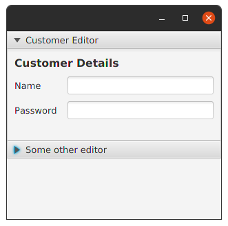
}JavaFX has an Accordion control that lets you group a set of TilePanes together to form an accordion of controls.
The JavaFX Accordion only lets you open a single accordion fold at a time, and it has some other shortcomings.
To solve this, TornadoFX comes with the SqueezeBox component that behaves and looks very similar to the Accordion, while providing some enhancements.
| Extensions | Property | Description |
|---|---|---|
fillHeight |
fillHeightProperty |
... |
multiselect |
multiselectProperty |
... |
Example:
class MainView: View() {
    override val root = vbox {
        squeezebox {
            fold("Customer Editor",true) {
                form {
                    fieldset("Customer Details") {
                        field("Name") { textfield() }
                        field("Password") { textfield() }
                    }
                }
            }
            fold("Some other editor",false) {
                stackpane {
                    label("Nothing here")
                }
            }
        }
    }
}
Output:
A control that allows for users to edit text, and apply styling to this text. The underlying data model is HTML, although this is not shown visually to the end-user.
| Extensions | Property | Description |
|---|---|---|
htmlText |
No | Returns the HTML content of the editor. |
print() |
No | Prints the content of the editor using the given printer job. This method does not modify the state of the job, nor does it call PrinterJob.endJob, so the job may be safely reused afterwards. Params: job – printer job used for printing |
Example:
class MainView: View() {
    override val root = htmleditor()
}[] [] [] []
