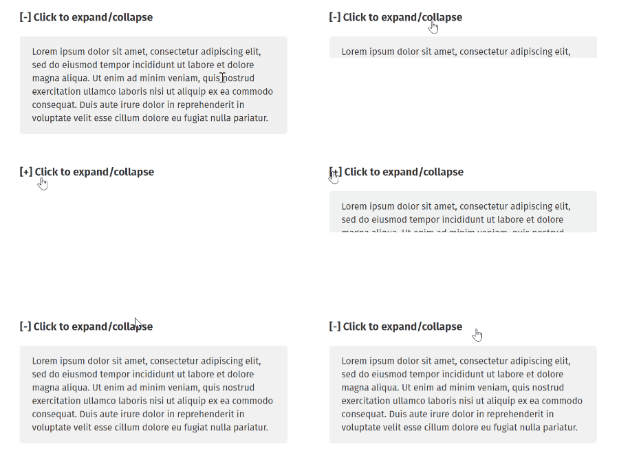
Vue component-based utility for showing/hiding an element with "sliding" effect

(based on David Walsh's Pure CSS Slide Up and Slide Down)

$ npm install @yst/vue-slidable$ yarn add @yst/vue-slidableImport and use it (as a plugin):
import Vue from 'vue';
import Slidable from '@yst/vue-slidable';

Vue.use(Slidable);

// Or, with options
Vue.use(Slidable, {
  /**
   * The globally registered name
   * @example
   * <slidable></slidable>
   */
  name: 'slidable'
});- type:
boolean - default:
false
The component's state (expanded/collapsed) based on CSS max-height property.
- type:
string - default:
div
- type:
number | string - default:
300(in milliseconds)
- type:
string - default:
easeOutQuart
For more easings see postcss-easings.
(⚠ Deprecated in favor of disableResizeUpdate).
- type:
boolean - default:
true
Recalculates the container's max-height on window.resize.
- type:
boolean - default:
false
Disables updating container's max-height on window.resize.
- type:
number|boolean - default:
400
Debounces the frequency of the component updates on data change.
- type:
boolean - default:
true
See passive event listener and how it could improve performance (on certain events).
{
  model: 'expanded',
  event: 'change'
}@expandedCalled when the containing component has opened/expanded (slides down).@collapsedCalled when the containing component has closed/collapsed (slides up).
<h3 @click="toggle">Click to expand/collapse</h3>

<slidable tag="ul" v-model="expanded">
  <li>first item</li>
  <li>second item</li>
  <li>third item</li>
</slidable>
export default {
data: () => ({
expanded: false
}),
methods: {
toggle() {
this.expanded = !this.expanded;
}
}
};