The missing multi-handle range slider widget for PyQt & PySide
The goal of this package is to provide a Range Slider (a slider with 2 or more
handles) that feels as "native" as possible. Styles should match the OS by
default, and the slider should behave like a standard
QSlider... but with multiple handles!
QRangeSliderinherits fromQSliderand attempts to match the Qt API as closely as possible- Uses platform-specific styles (for handle, groove, & ticks) but also supports QSS style sheets.
- Supports mouse wheel and keypress (soon) events
- Supports PyQt5, PyQt6, PySide2 and PySide6
- Supports more than 2 handles (e.g.
slider.setValue([0, 10, 60, 80]))
You can install QtRangeSlider via pip:
pip install qtrangeslider

# NOTE: you must also install a Qt Backend.
# PyQt5, PySide2, PyQt6, and PySide6 are supported
# As a convenience you can install them as extras:
pip install qtrangeslider[pyqt5]To create a slider:
from qtrangeslider import QRangeSlider

# as usual:
# you must create a QApplication before create a widget.
range_slider = QRangeSlider()
As QRangeSlider inherits from QtWidgets.QSlider, you can use all of the
same methods available in the QSlider API. The major difference is that value and sliderPosition are reimplemented as tuples of int (where the length of the tuple is equal to the number of handles in the slider.)
This property holds the current value of all handles in the slider.
The slider forces all values to be within the legal range:
minimum <= value <= maximum.
Changing the value also changes the sliderPosition.
range_slider.value() -> Tuple[int, ...]range_slider.setValue(val: Sequence[int]) -> NonevalueChanged(Tuple[int, ...])This property holds the current slider positions. It is a tuple with length equal to the number of handles.
If tracking is enabled (the default), this is identical to value.
range_slider.sliderPosition() -> Tuple[int, ...]range_slider.setSliderPosition(val: Sequence[int]) -> NonesliderMoved(Tuple[int, ...])These options are in addition to the Qt QSlider API, and control the behavior of the bar between handles.
| getter | setter | type | default | description |
|---|---|---|---|---|
barIsVisible |
setBarIsVisible hideBar / showBar |
bool |
True |
Whether the bar between handles is visible. |
barMovesAllHandles |
setBarMovesAllHandles |
bool |
True |
Whether clicking on the bar moves all handles or just the nearest |
barIsRigid |
setBarIsRigid |
bool |
True |
Whether bar length is constant or "elastic" when dragging the bar beyond min/max. |
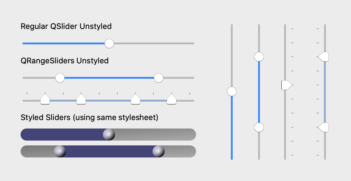
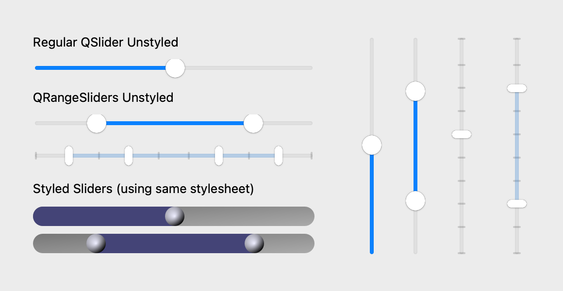
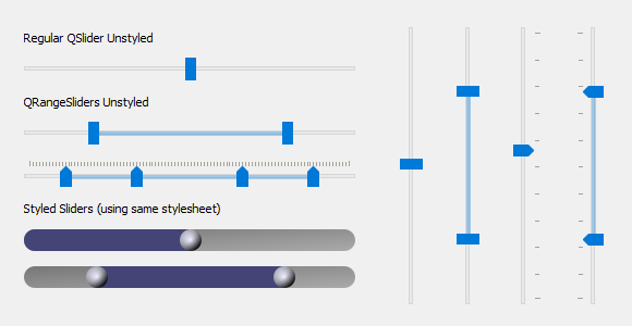
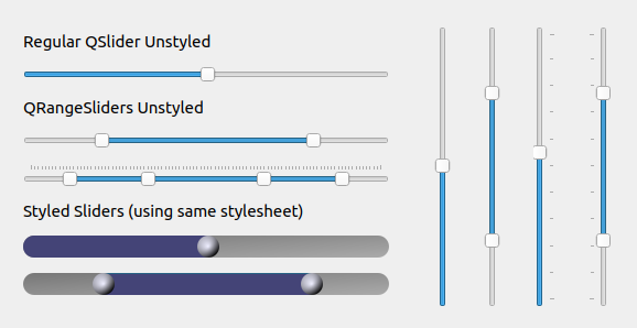
These screenshots show QRangeSlider (multiple handles) next to the native QSlider
(single handle). With no styles applied, QRangeSlider will match the native OS
style of QSlider – with or without tick marks. When styles have been applied
using Qt Style Sheets, then
QRangeSlider will inherit any styles applied to QSlider (since it inherits
from QSlider). If you'd like to style QRangeSlider differently than QSlider,
then you can also target it directly in your style sheet. The one "special"
property for QRangeSlider is qproperty-barColor, which sets the color of the
bar between the handles.
The code for these example widgets is here
See style sheet used for this example
/*
Because QRangeSlider inherits from QSlider, it will also inherit styles
*/
QSlider {
    min-height: 20px;
}

QSlider::groove:horizontal {
    border: 0px;
    background: qlineargradient(x1:0, y1:0, x2:1, y2:1,
                                stop:0 #777, stop:1 #aaa);
    height: 20px;
    border-radius: 10px;
}

QSlider::handle {
    background: qradialgradient(cx:0, cy:0, radius: 1.2, fx:0.5,
                                fy:0.5, stop:0 #eef, stop:1 #000);
    height: 20px;
    width: 20px;
    border-radius: 10px;
}

/*
"QSlider::sub-page" is the one exception ...
(it styles the area to the left of the QSlider handle)
*/
QSlider::sub-page:horizontal {
    background: #447;
    border-top-left-radius: 10px;
    border-bottom-left-radius: 10px;
}

/*
for QRangeSlider: use "qproperty-barColor".  "sub-page" will not work.
*/
QRangeSlider {
    qproperty-barColor: #447;
}This package also includes two "labeled" slider variants. One for QRangeSlider, and one for the native QSlider:
from qtrangeslider import QLabeledRangeSliderThis has the same API as QRangeSlider with the following additional options:
Where/whether labels are shown adjacent to slider handles.
type: QLabeledRangeSlider.LabelPosition
default: LabelPosition.LabelsAbove
options:
LabelPosition.NoLabel(no labels shown adjacent to handles)LabelPosition.LabelsAboveLabelPosition.LabelsBelowLabelPosition.LabelsRight(alias forLabelPosition.LabelsAbove)LabelPosition.LabelsLeft(alias forLabelPosition.LabelsBelow)
type: QLabeledRangeSlider.EdgeLabelMode
default: EdgeLabelMode.LabelIsRange
options:
EdgeLabelMode.NoLabel: no labels shown at slider extremesEdgeLabelMode.LabelIsRange: edge labels shown the min/max valuesEdgeLabelMode.LabelIsValue: edge labels shown the slider range
If you find that you need to fine tune the position of the handle labels:
QLabeledRangeSlider.label_shift_x: adjust horizontal label positionQLabeledRangeSlider.label_shift_y: adjust vertical label position
from qtrangeslider import QLabeledSlider(no additional options at this point)
If you encounter any problems, please file an issue along with a detailed description.


