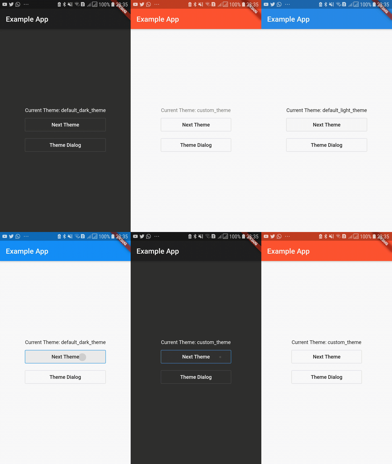
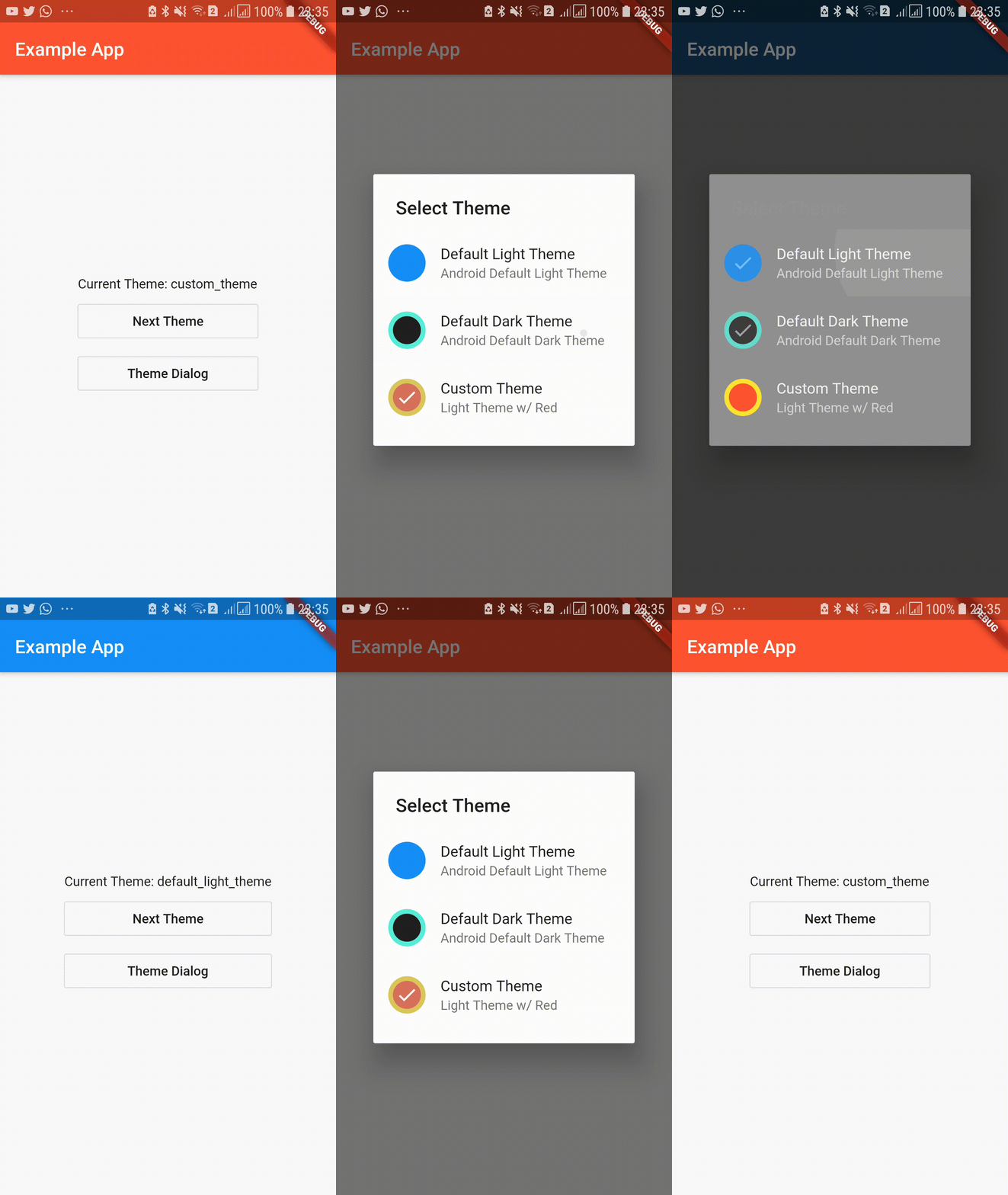
Easy to use, customizable Theme Provider. This provides app color schemes throughout the app and automatically rebuilds the UI dynamically. You can also persist your color theme as well. Easily store and retrieve user preference without hassle. This package also provides you with several widgets that can help you to easily add theme switching abilities. Additionally you can pass option classes to store and provide data which should be associated with the current theme.
Web demo is available in https://kdsuneraavinash.github.io/theme_provider
| Basic Usage | Dialog Box |
|---|---|
 |
 |
dependencies:
  theme_provider: <latest version>
run packages get and import it
import 'package:theme_provider/theme_provider.dart';Wrap your material app like this to use dark theme and light theme out of the box.
class MyApp extends StatelessWidget {
  @override
  Widget build(BuildContext context) {
    return ThemeProvider(
      child: ThemeConsumer(
        child: Builder(
          builder: (themeContext) => MaterialApp(
            theme: ThemeProvider.themeOf(themeContext).data,
            title: 'Material App',
            home: HomePage(),
          ),
        ),
      ),
    );
  }
}You may also provide additional themes using the themes parameter. Here you have to provide a theme id string and theme data value. (Make sure to provide unique theme ids)
class MyApp extends StatelessWidget {
  @override
  Widget build(BuildContext context) {
    return ThemeProvider(
      themes: [
        AppTheme.light(), // This is standard light theme (id is default_light_theme)
        AppTheme.dark(), // This is standard dark theme (id is default_dark_theme)
        AppTheme(
          id: "custom_theme", // Id(or name) of the theme(Has to be unique)
          description: "My Custom Theme", // Description of theme
          data: ThemeData(  // Real theme data
            primaryColor: Colors.black,
            accentColor: Colors.red,
          ),
        ),
      ],
      child: ThemeConsumer(
        child: Builder(
          builder: (themeContext) => MaterialApp(
            theme: ThemeProvider.themeOf(themeContext).data,
            title: 'Material App',
            home: HomePage(),
          ),
        ),
      ),
    );
  }
}You can use the theme id strings to change the current theme of the app.
 ThemeProvider.controllerOf(context).nextTheme();
 // Or
 ThemeProvider.controllerOf(context).setTheme(THEME_ID);
Access current AppTheme
ThemeProvider.themeOf(context)Access theme data:
 ThemeProvider.themeOf(context).data
 // or
Theme.of(context)If you provide the theme consumer on MaterialApp then you don't have to provide ThemeConsumer on routes. However that would disable the ability to use multiple theme controllers. Also a visible flickr may occur at the start of app when the saved theme is loaded.
This approach is much easier to integrate and works well with all other material components such as SearchDelegates and DialogBoxes without wrapping with ThemeConsumers.
However you could also wrap each route and dialog in ThemeConsumer instead of wrapping the whole material app.
This will give a more granular control and will not cause a visual flikr.
However, some integrations(eg: SearchDelegates) might not be trivial.
MaterialPageRoute(
  builder: (_) => ThemeConsumer(child: SecondPage()),
),If you want to change the StatusBarColor when the theme changes, you can provide a onThemeChanged callback to the ThemeProvider.
This can also be used to pass additional data associated with the theme. Use options to pass additional data that should be associated with the theme.
eg: If font color on a specific button changes according to the current theme, create a class to encapsulate the value.
Options classes must implement or extend AppThemeOptions.
  class MyThemeOptions implements AppThemeOptions{
    final Color specificButtonColor;
    MyThemeOptions(this.specificButtonColor);
  }
Then provide the options with the theme.
class MyApp extends StatelessWidget {
  @override
  Widget build(BuildContext context) {
    return ThemeProvider(
      themes: [
        AppTheme(
          id: "light_theme",
          description: "Light Theme",
          data: ThemeData.light(),
          options: MyThemeOptions(Colors.blue),
        ),
        AppTheme(
          id: "light_theme",
          description: "Light Theme 2",
          data: ThemeData.dark(),
          options: MyThemeOptions(Colors.red),
        ),
      ],
      // ....
    );
  }
}
Then the option can be retrieved as,
ThemeProvider.optionsOf<MyThemeOptions>(context).specificButtonColorTo persist themes, simply pass saveThemesOnChange as true.
This will ensure that the theme is saved to the disk.
class MyApp extends StatelessWidget {
  @override
  Widget build(BuildContext context) {
    return ThemeProvider(
      saveThemesOnChange: true,
      // ...
    );
  }
}
Or manually save the current theme by just using,
ThemeProvider.controllerOf(context).saveThemeToDisk();defaultThemeId will always be used to determine the initial theme. (If not provided the first theme you specify will be the default app theme.)
But you can manually load the previous(saved) theme by using:
ThemeProvider.controllerOf(context).loadThemeFromDisk();To load a previously saved theme pass loadThemeOnInit as true:
ThemeProvider(
  saveThemesOnChange: true,
  loadThemeOnInit: true,
  // ...
)
Or to load a theme/do some task at theme controller initialization use onInitCallback.
This will get called on the start.
For example, snippet below will load the previously saved theme from the disk. (if previosuly saved.)
ThemeProvider(
  defaultThemeId: "theme_1",
  themes: [
    AppTheme.light(id: "theme_1"),
    AppTheme.light(id: "theme_2"),
    AppTheme.light(id: "theme_3"),
  ],
  saveThemesOnChange: true,
  onInitCallback: (controller, previouslySavedThemeFuture) async {
    // Do some other task here if you need to
    String savedTheme = await previouslySavedThemeFuture;
    if (savedTheme != null) {
      controller.setTheme(savedTheme);
    }
  },
  // ...
)Themes can be dynamically added/removed via addTheme and removeTheme. Whether a theme id exists or not can be checked via hasTheme.
A theme can only be added if it is not added previously. Similarly, a theme can only be removed if it is previously added.
So the membership must be checked before adding/removing themes. (Whether a theme exists or not is decided via its theme id)
Note that the active theme cannot be removed.
// Add theme
if (ThemeController.of(context).hasTheme('new_theme')){
  ThemeController.of(context).addTheme(newAppTheme);
}

// Remove theme
if (ThemeController.of(context).hasTheme('new_theme')){
  if (ThemeController.of(context).theme.id != 'new_theme'){
    ThemeController.of(context).removeTheme('new_theme')
  }
}You can do this by simply checking for the system theme in onInitCallback callback. Following is an example usage.
In the following snippet, the theme will be set to the previously saved theme.
If there is no previously saved theme, it is set to light/dark depending on system theme.
You can use any kind of logic here to change the initialization callback.
Dynamically listening to theme changes is not yet available. The theme check is only possible on app start.
import 'package:flutter/scheduler.dart';


ThemeProvider(
  saveThemesOnChange: true, // Auto save any theme change we do
  loadThemeOnInit: false, // Do not load the saved theme(use onInitCallback callback)
  onInitCallback: (controller, previouslySavedThemeFuture) async {
    String savedTheme = await previouslySavedThemeFuture;

    if (savedTheme != null) {
      // If previous theme saved, use saved theme
      controller.setTheme(savedTheme);
    } else {
      // If previous theme not found, use platform default
      Brightness platformBrightness =
          SchedulerBinding.instance.window.platformBrightness;
      if (platformBrightness == Brightness.dark) {
        controller.setTheme('dark');
      } else {
        controller.setTheme('light');
      }
      // Forget the saved theme(which were saved just now by previous lines)
      controller.forgetSavedTheme();
    }
  },
  themes: <AppTheme>[
    AppTheme.light(id: 'light'),
    AppTheme.dark(id: 'dark'),
  ],
  child: ThemeConsumer(
    child: Builder(
      builder: (themeContext) => MaterialApp(
        theme: ThemeProvider.themeOf(themeContext).data,
        title: 'Material App',
        home: HomePage(),
      ),
    ),
  ),
);IconButton to be added to AppBar to cycle to next theme.
Scaffold(
  appBar: AppBar(
    title: Text("Example App"),
    actions: [CycleThemeIconButton()]
  ),
),SimpleDialog to let the user select the theme.
Many elements in this dialog is customizable.
Remember to wrap dialog is a ThemeConsumer.
showDialog(context: context, builder: (_) => ThemeConsumer(child: ThemeDialog()))- Add next theme command
- Add theme cycling widget
- Add theme selection by theme id
- Add theme select and preview widget
- Persist current selected theme
- Add unit tests and example
- Remove provider dependency
- Ids for theme_providers to allow multiple theme providers
- Add example to demostrate persistence
If you encounter any problems feel free to open an issue. Pull request are also welcome.
