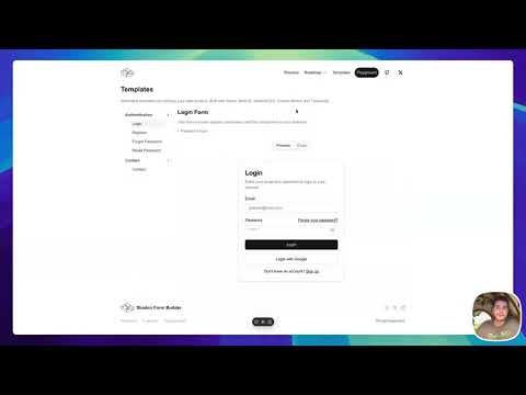
A dynamic form-building tool that allows users to create, customize, and validate forms seamlessly within web applications. Built with React, Next.js, and various other technologies, Form Builder provides an intuitive interface for developers and users alike.
- Dynamic Form Creation: Easily create forms with various input types including text, checkbox, radio buttons, and more.
- Real-Time Validation: Validate user inputs using the Zod library, ensuring data integrity and user-friendly feedback.
- Responsive Design: Built with Tailwind CSS, ensuring forms look great on all devices.
- Customizable Components: Leverage ShadCN components for a consistent and modern UI experience.
- Server-Side Rendering: Utilize Next.js for optimized performance and SEO.
Check out the live demo of the Form Builder here.
To get started with Form Builder, follow these steps:
-
Clone the repository:
git clone https://github.com/hasanharman/form-builder.git
-
Navigate into the project directory:
cd form-builder -
Install the necessary dependencies:
npm install
To start the development server, run:
npm run devOpen your browser and navigate to http://localhost:3000 to see the application in action.
- Access the Builder: Once the app is running, navigate to the form builder interface.
- Add Inputs: Use the toolbar to add different types of inputs.
- Customize Inputs: Click on any input field to configure properties such as label, placeholder, required validation, etc.
- Save & Preview: Once your form is built, save it and preview the output.
Form Builder consists of various reusable components:
- FormContainer: The main container for the form elements.
- InputField: A customizable input component.
- SelectField: Dropdown selection component.
- CheckboxField: A checkbox input component.
- Button: A styled button component for form submission.
Form Builder utilizes Zod for input validation. You can define schemas for your forms as follows:
import { z } from 'zod';

const formSchema = z.object({
  name: z.string().min(1, "Name is required"),
  email: z.string().email("Invalid email address"),
  age: z.number().min(18, "You must be at least 18 years old"),
});
This schema can be applied to your form to enforce validation rules.
Once your form is ready, you can handle submissions with a simple API call. Here’s an example of how to submit the form data:
const handleSubmit = async (data) => {
  try {
    const response = await fetch('/api/form-submit', {
      method: 'POST',
      body: JSON.stringify(data),
      headers: {
        'Content-Type': 'application/json',
      },
    });
    const result = await response.json();
    console.log('Form submitted successfully:', result);
  } catch (error) {
    console.error('Error submitting form:', error);
  }
};Contributions are welcome! If you would like to contribute to Form Builder, please follow these steps:
- Fork the Repository: Click on the “Fork” button at the top right corner of the repository page.
- Create a Branch:
git checkout -b feature/YourFeatureName
- Make Changes: Implement your feature or fix.
- Commit Changes:
git commit -m "Add a feature" - Push Changes:
git push origin feature/YourFeatureName
- Create a Pull Request: Go to the original repository and create a pull request.
This project is licensed under the MIT License.
- React - A JavaScript library for building user interfaces.
- Next.js - The React framework for production.
- Tailwind CSS - A utility-first CSS framework for creating custom designs.
- Zod - TypeScript-first schema declaration and validation.
