Collection of contributions to and resources for the first #30DayChartChallenge in April 2021.
Anyone is welcome to contribute, no matter which data source or tool you use.
If you share your contributions on Twitter, please use the hashtag #30DayChartChallenge and/or tag the @30DayChartCall account.
Collection of all contributions per day (shared on Twitter with the hashtag and/or mentioning @30DayChartChall account). For now just named images in a folder—hopefully going to clean it up once the challenge is over.
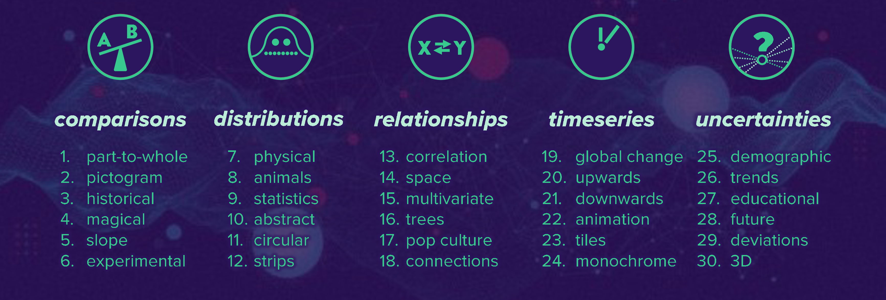
Comparisons:
- Day 1: Part-to-Whole
- Day 2: Pictorgram
- Day 3: Historical
- Day 4: Magical
- Day 5: Slope
- Day 6: Experimental
Distributions:
Relationships:
- Day 13: Correlation
- Day 14: Space
- Day 15: Multivariate
- Day 16: Trees
- Day 17: Pop Culture
- Day 18: Connections
Timeseries:
- Day 19: Global Change
- Day 20: Upwards
- Day 21: Downwards
- Day 22: Animation
- Day 23: Tiles
- Day 24: Monochrome
Uncertainties:
Further links:
We do not care what tool you use. Whatever works for you is fine! Programing, designing, crafting — pick what you prefer or try different things. An extensive list of tools can be found at Visualising Data.
You are free to pick whatever data you want—we do not provide any particular dataset for each challenge. Either use the same dataset for all or different datasets each day, as you like! Search the internet, collect your own, visualize daily experiences or funny stats. Nevertheless, we would like to provide a starter kit of possible data sources:
- Google dataset search
- data.world
- kaggle
- Data Is Plural
- OurWorldInData
- Eurostats
- UN Stats
- WHO
- OECD Stats
- Socioeconomic Data and Applications Center (NASA)
- MakeoverMonday
- TidyTuesday (search through old datasets here, here and here)
- IMDB datasets
- Free GIS data
- WorldClim — maps, graphs, tables, and data of the global climate
- Rdatasets — over 1300 datasets originally distributed in R packages
- List of R packages to import data
There are many great selection helpers out there, guiding you through the many different boxes you can fit the endless number of (sub)chart types in. Here is a non-exhaustive list:
- Chart Suggestions—A Thought-Starter by Andrew Abela — an all-time classic (latest version)
- Graphic Continuum by Jon Schwabish and Severino Ribecca — the main source for the five categories
- Visual Vocabulary by the Financial Times Visual Journalism — chart choice helpers with lots of further links
- From Data to Viz by Yan Holtz — interactive, with information and codes for each chart type
- DataVizProject by ferdio — interactive with lots of examples
- Visualization Universe by Adioma and Google News Lab
- How to Choose the Right Chart Type — another, very compact, decision tree to help you

