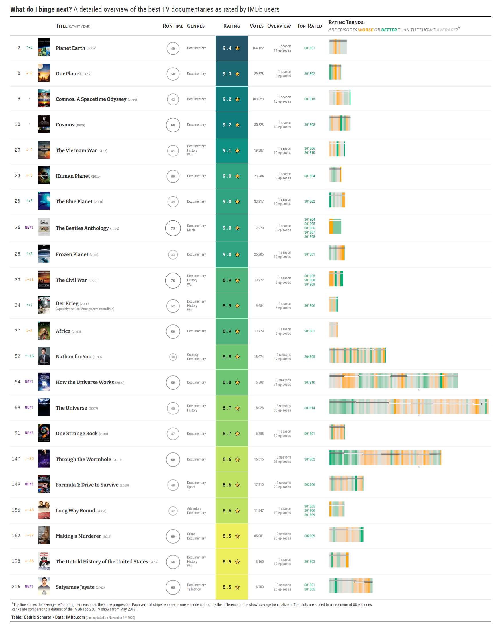
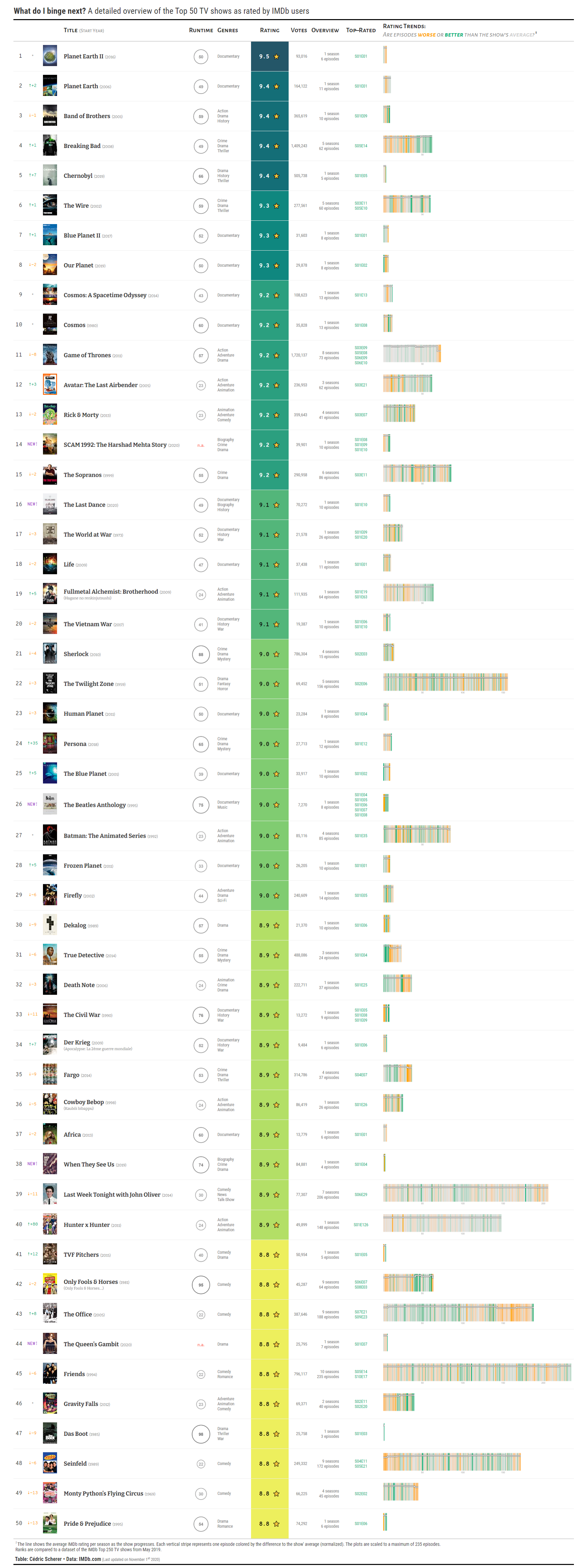
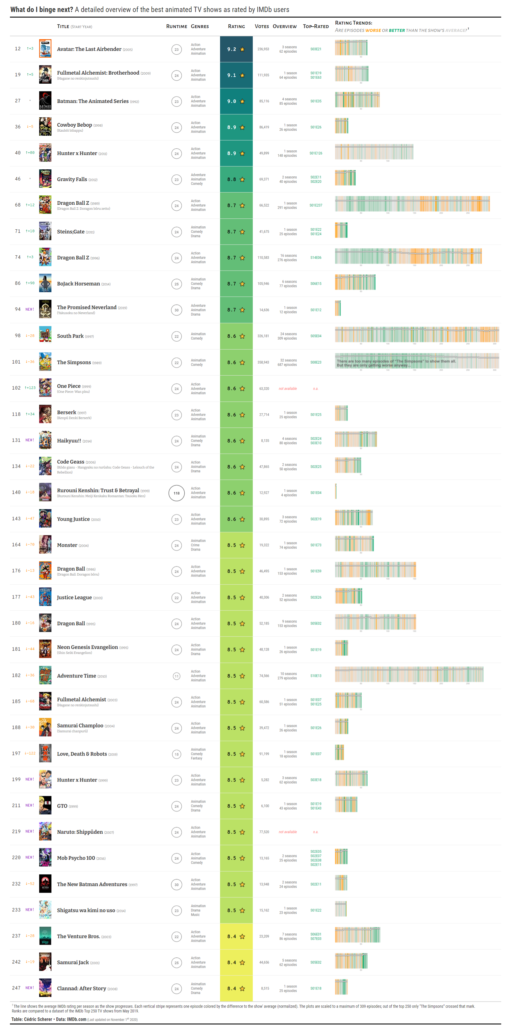
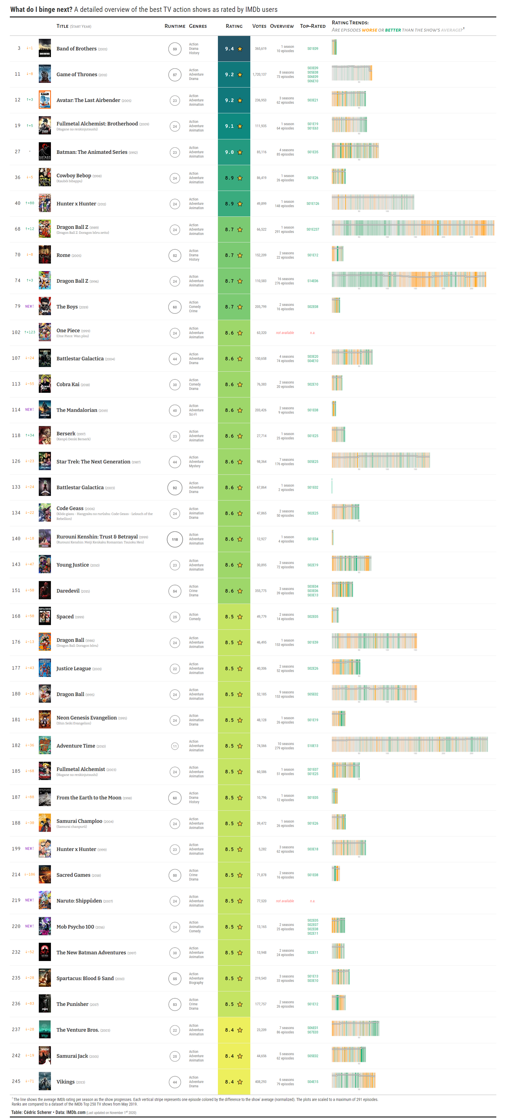
The table shows relevant details of the top 250 TV shows as rated by IMDb users. I focussed on displaying the details I and my friends care about: of course the ranking and overall rating but additionally the runtime per episode, genres, number of seasons and episodes, ID of the best episodes. But most importantly—the trend of ratings as the TV show progresses.
The table was highlighted as "honorable mention" by the jury 🎉
gt, reticulate, dplyr, tidyr, readr, magrittr, here, glue, pkgconfig
Visualizations: To visualize the runtime I decided to use a restrained, grey-toned, area-scaled circle. The normalized trends in episode ratings are visualized as stripes similar to the famous "warming stripes" by Ed Hawkins. In addition, a line indicates the average rating per season on a range from 1 to 10.
Data: The data is a mixture of scraped data using a modified Python script (ranks, ratings, votes, year) and data downloaded from the IMDb dataset interface (title basics: original title, genre, runtime). The data was cleaned (e.g. correct wrong runtimes, title spellings etc) and missing entries filled. (However, some series are returned as having 1 season only but have several actually and I didn't find a good workaround yet.)


