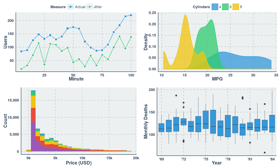
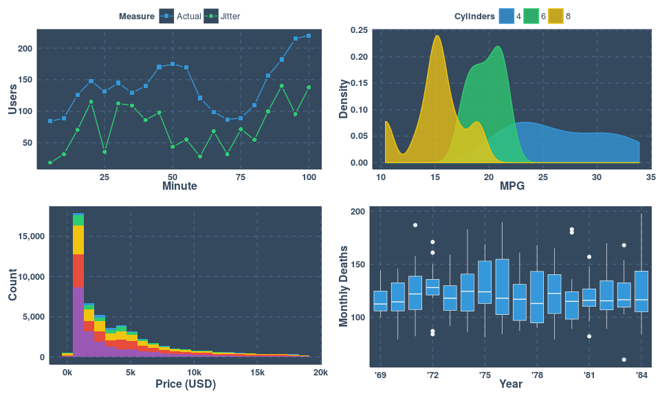
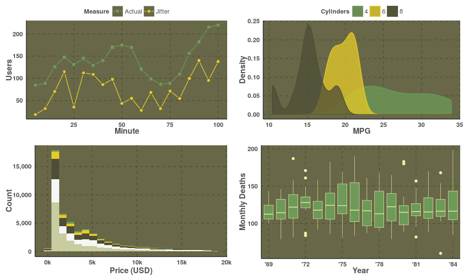
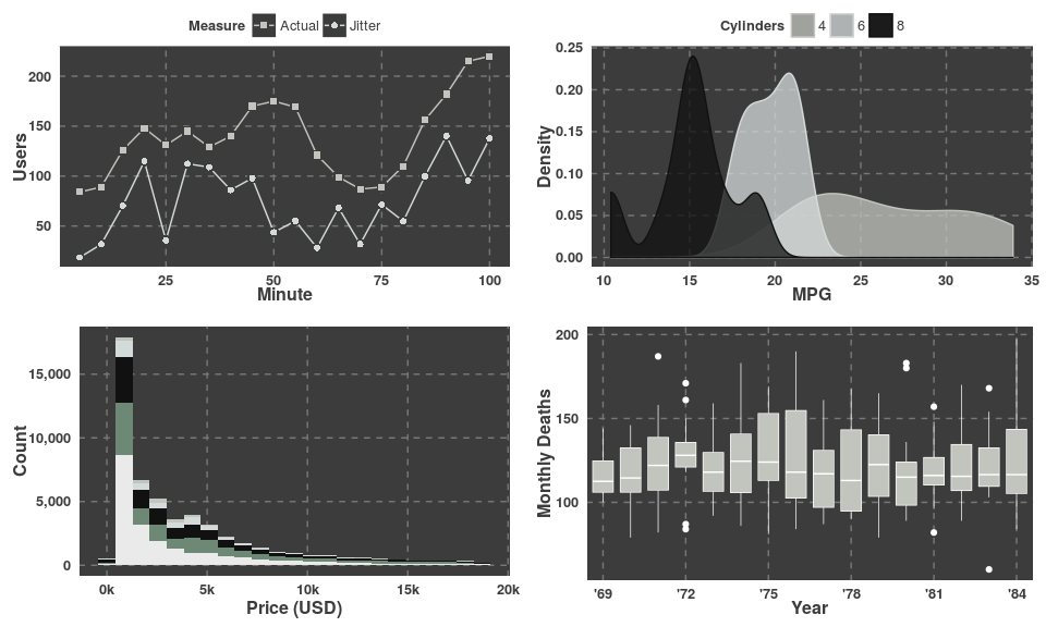
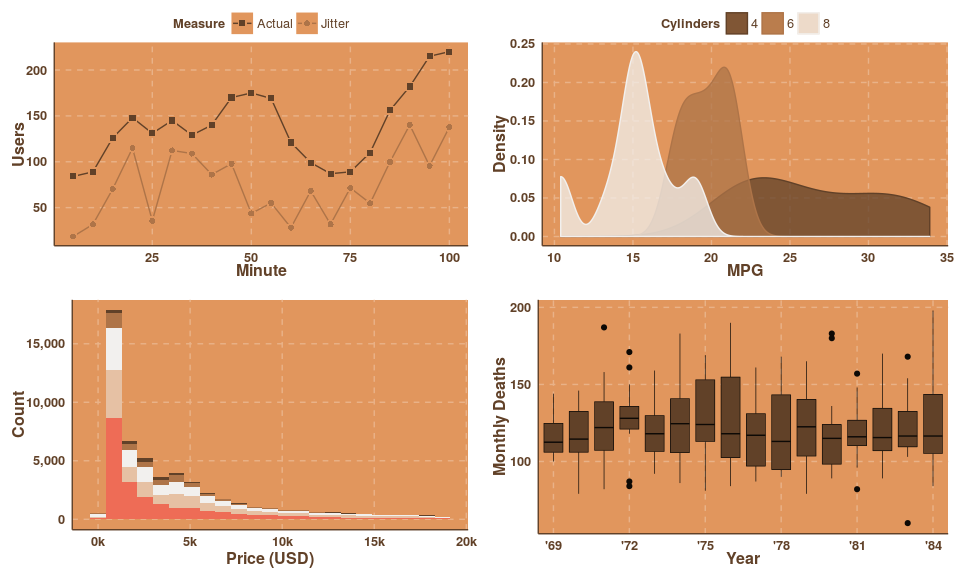
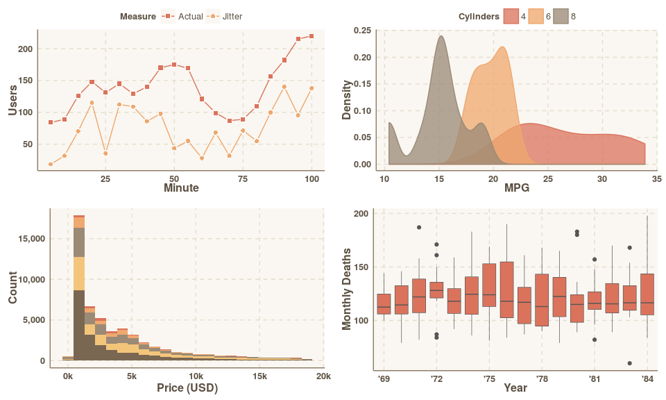
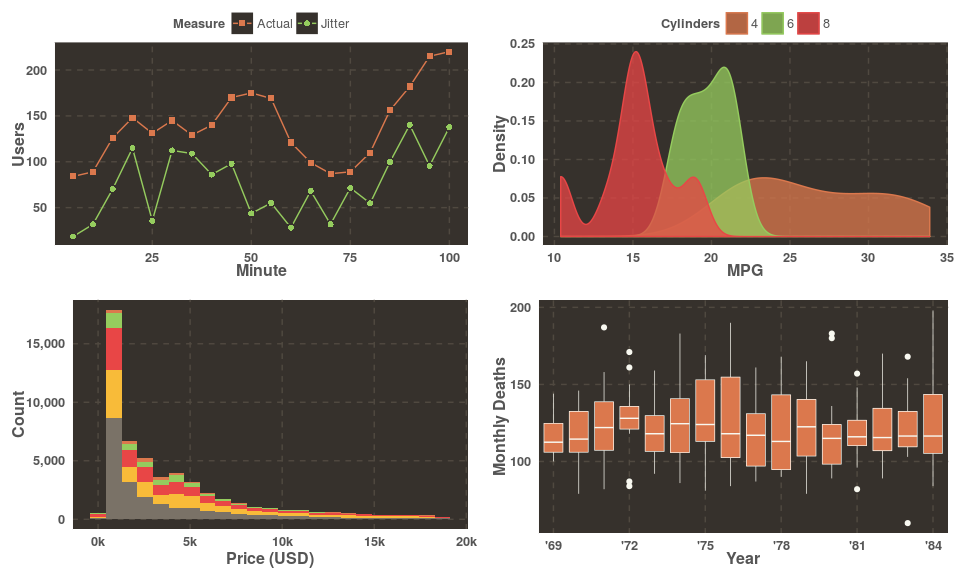
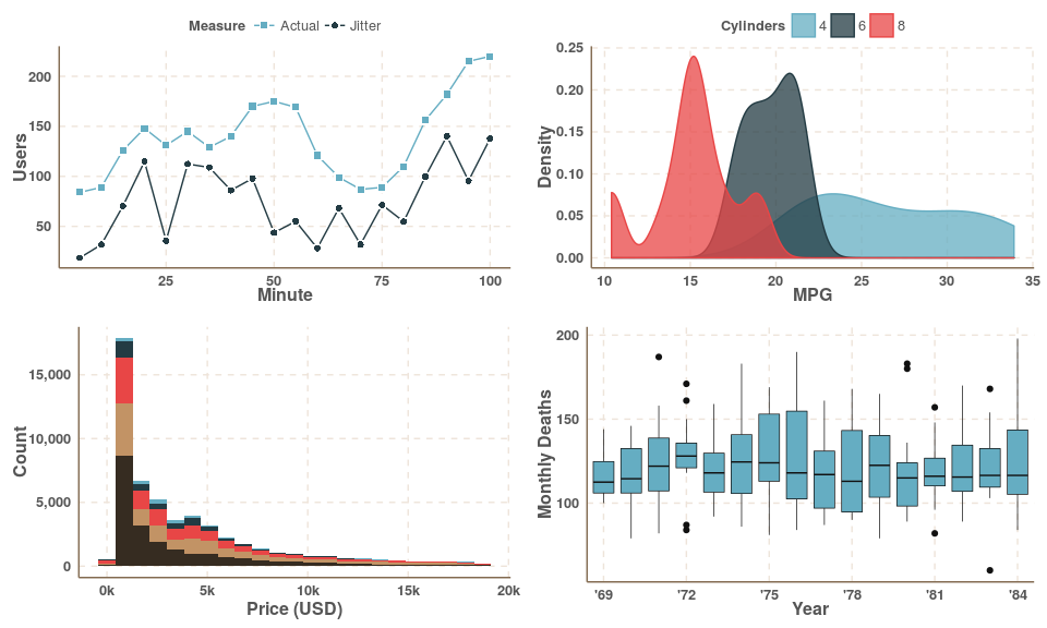
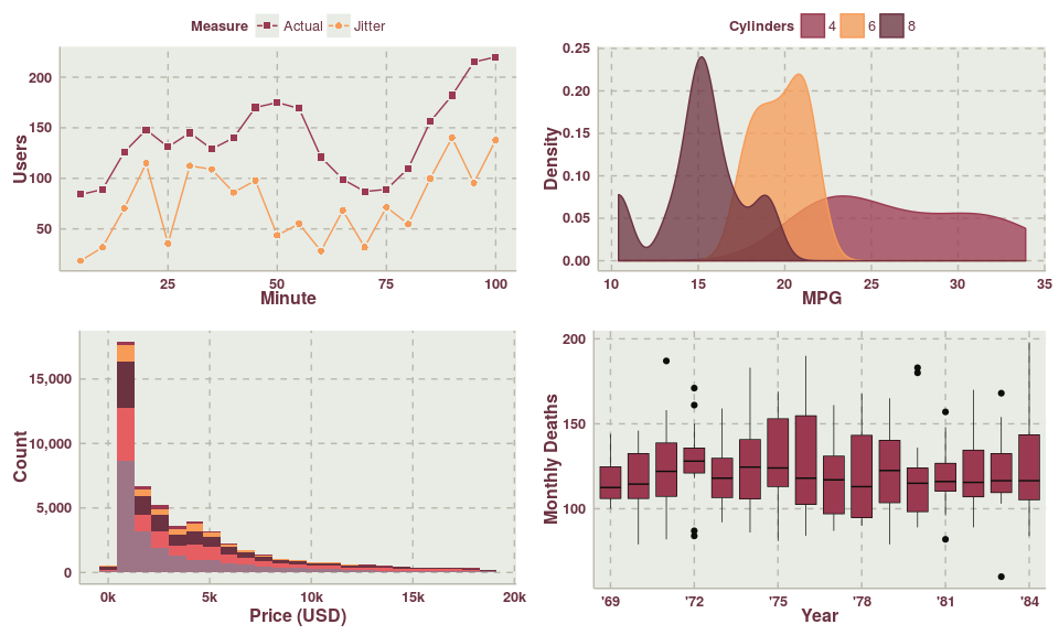
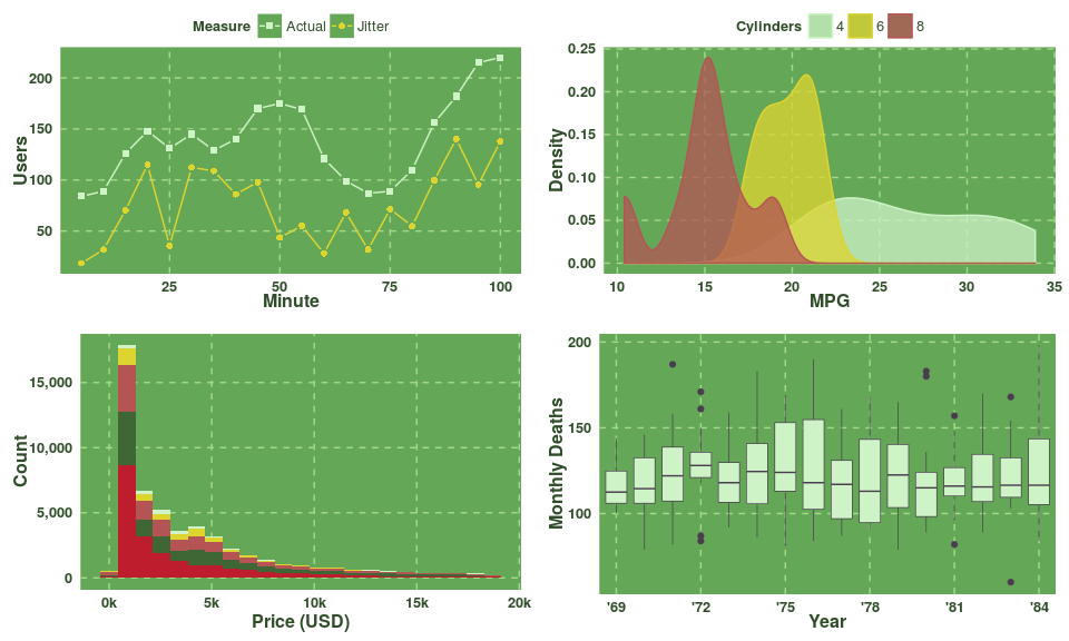
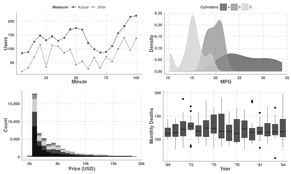
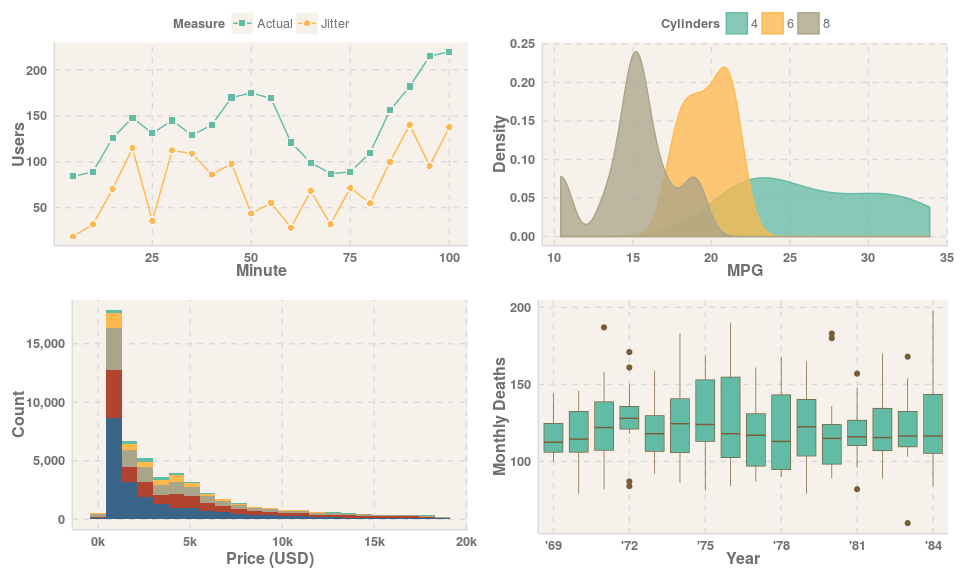
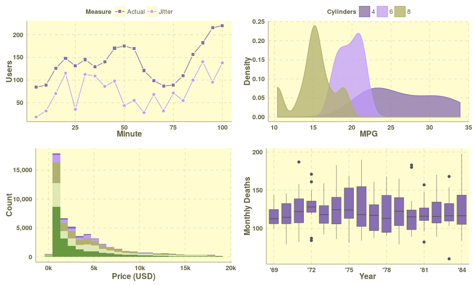
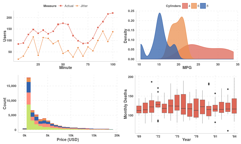
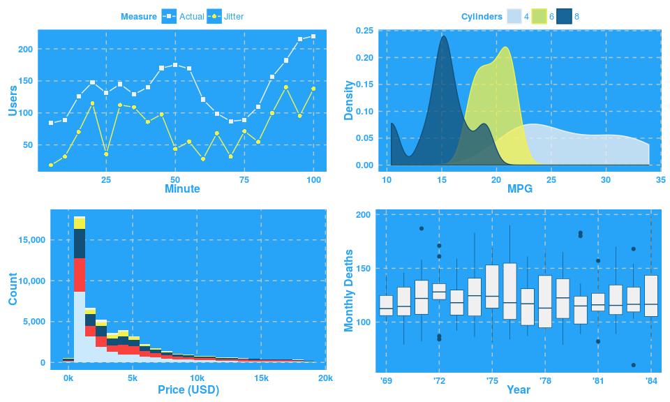
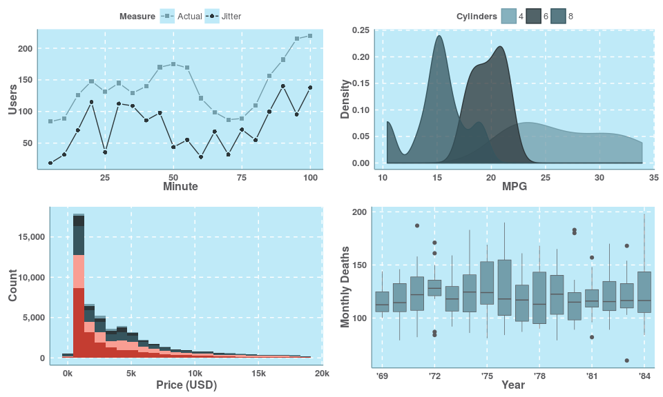
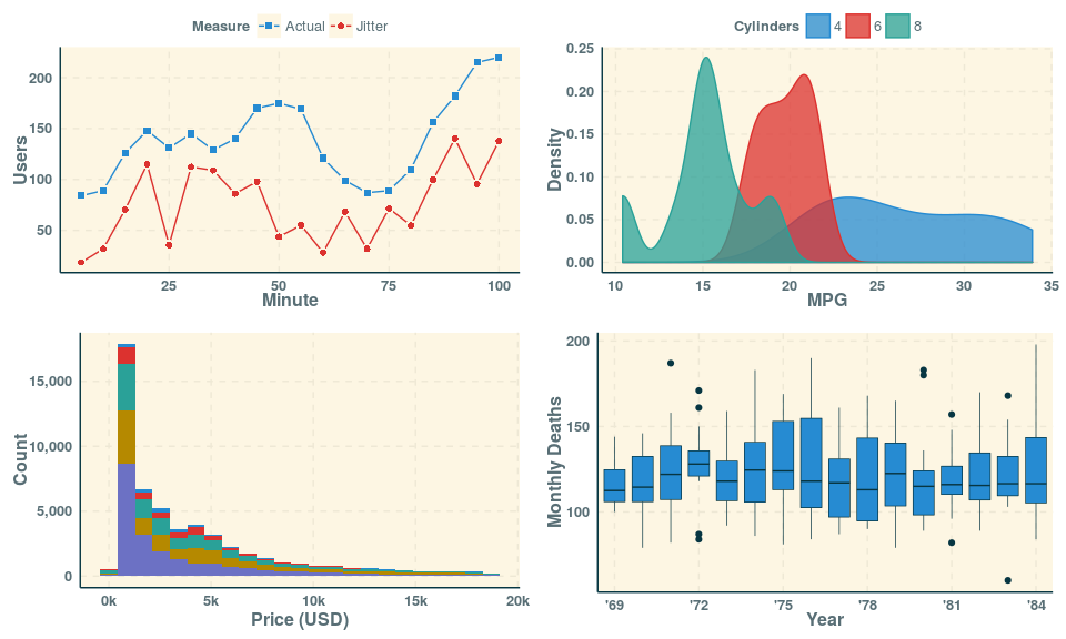
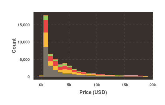
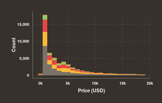
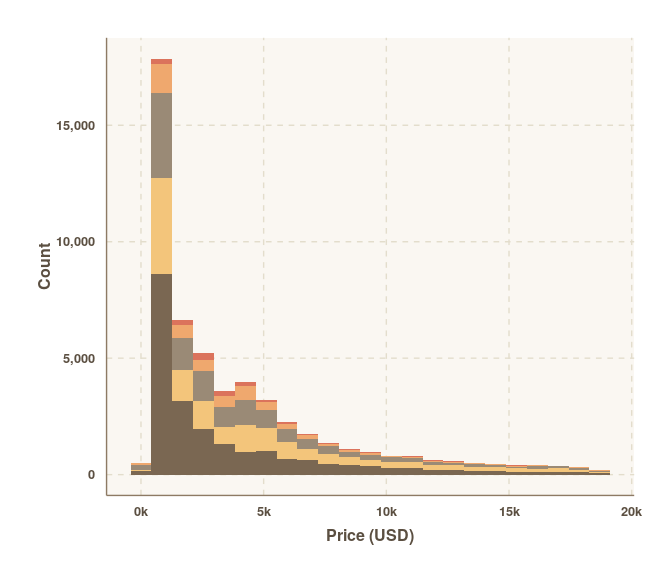
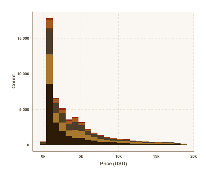
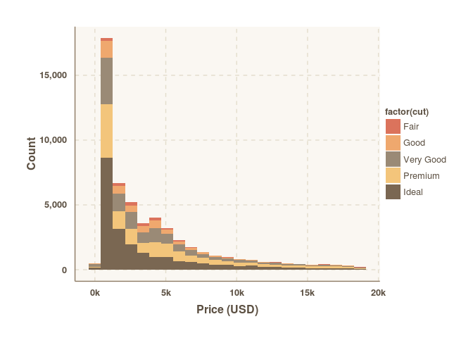
Themes for ggplot2. The idea of this package is that you can just set the theme and then forget about it. You shouldn't have to change any of your existing code. There are several parts to a theme:
- Colour palette for the background, axes, gridlines, text etc.
- Layout of axes lines and gridlines.
- Spacing around plot and between elements (i.e. axes titles to axes lines etc). You can set the spacing to determine how compact or spread out a plot is.
- Text size.
There are a number of preset palettes and layouts, and methods to create your own colour schemes.
This package is still under development, but can be installed using devtools.
devtools::install_github('cttobin/ggthemr')To just set the colour scheme:
ggthemr('dust')That's it. Any ggplot you create from then on will have the theme applied. You can clear the theme and return to ggplot2's default using:
ggthemr_reset()The palette determines the colours of everything in a plot including the background, layers, gridlines, title text, axes lines, axes text and axes titles. The swatch is the the name given to the set of colours strictly used in styling the geoms/layer elements (e.g. the points in geom_point(), bars in geom_bar() etc.). At least six colours have been supplied in each palette's swatch.
There are a wide variety of themes in this package (and more on the way). Some of them serious business... others are delibrately stylish and might not be that good for use in proper publications.
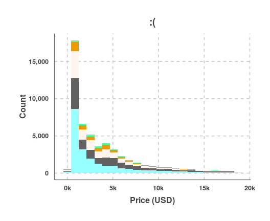
define_palette() lets you make your own themes that can be passed to ggthemr() just like any of the palettes above. Here's an example of a (probably ugly) palette using random colours:
# Random colours that aren't white.
set.seed(12345)
random_colours <- sample(colors()[-c(1, 253, 361)], 10L)

ugly <- define_palette(
  swatch = random_colours,
  gradient = c(lower = random_colours[1L], upper = random_colours[2L])
)

ggthemr(ugly)

example_plot + ggtitle(':(')
You can define all elements of a palette using define_palette() including colours for the background, text, axes lines, swatch and gradients.
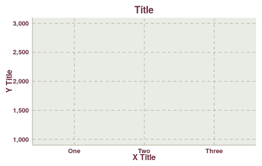
The layout of a theme controls the appearance and position of the axes, gridlines and text. Some folk prefer both major and minor gridlines, others prefer none or something in between.
Plot margins and space between axes titles and lines etc. is controlled with the spacing parameter. Lower values will make plots more compact, higher values will give them more padding. Compare the plots below where the spacing has been set to 0, 1 and 2 respectively.
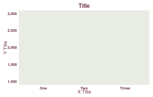
The type parameter can be set to either inner or outer. When inner, the background colour of a plot will not extend past the plot area. outer will colour the entire plot and background.
ggthemr('earth', type = 'inner')
example_plotggthemr('earth', type = 'outer')
example_plotSquinting at a chart? Low on printer ink? ggthemr includes some methods to tweak charts to make them lighter or darker. Here's a standard theme:
ggthemr('dust')
example_plot
Maybe that plot comes out a bit pale looking when you print it. Here's how you can add a bit more contrast to the swatch:
darken_swatch(amount = 0.3)
example_plot
The second parameter to darken_swatch() controls the degree to which the colours are made darker. Full list of methods with similar functionality:
darken_swatch()/lighten_swatch(): darker/lighter swatch colours.darken_gradient()/lighten_gradient(): darker/lighter gradient colours.darken_palette()/lighten_palette(): darker/lighter everything.
I'll add methods to darken/lighten the axes lines and text soon too.
Most of the time you'll probably just want to set the theme and not worry about it. There may be times though where you'll want to make some small adjustment, or manually change what items appear as what colour in a plot.
ggthemr('dust')
mpg_plot <- ggplot(mpg[mpg$drv != '4', ], aes(factor(cyl), cty, fill = drv)) +
  geom_boxplot() + labs(x = 'Cylinders', y = 'City MPG', fill = 'Drive Type') +
  theme(legend.position = 'bottom')
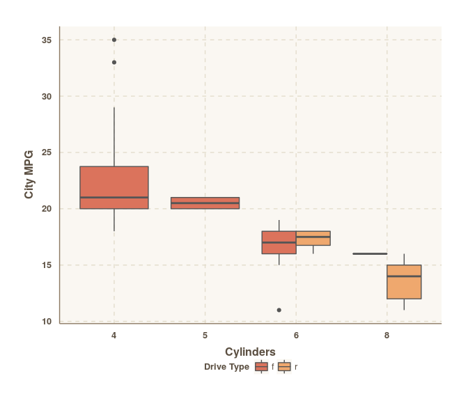
mpg_plot
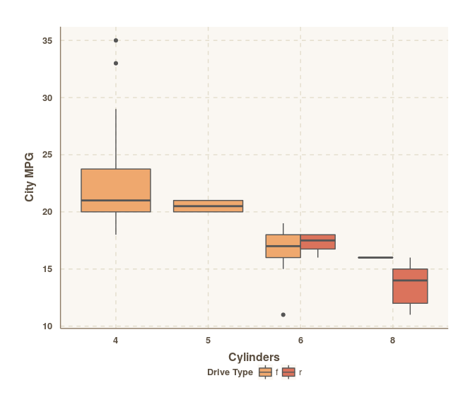
For some reason you decide you want to change those colours. Front-wheel drive vehicles should be orange. Rear-wheelers should be that red colour. You could change the order of the levels of your fill variable, but you shouldn't have to do that. You just want to switch those colours but you have no idea what they are. swatch() will give you the colours in the currently active ggthemr palette.
swatch()## [1] "#555555" "#db735c" "#EFA86E" "#9A8A76" "#F3C57B" "#7A6752" "#2A91A2"
## [8] "#87F28A" "#6EDCEF"
## attr(,"class")
## [1] "ggthemr_swatch"
So you can manually swap the two colours around.
to_swap <- swatch()[2:3]
mpg_plot + scale_fill_manual(values = rev(to_swap))
Note: the first colour in a swatch is a special one. It is reserved for outlining boxplots, text etc. So that's why the second and third colours were swapped.
ggthemr does three different things while setting a theme.
- It updates the default ggplot2 theme with the specified ggthemr theme by using the
ggplot2::theme_set()function. - It modifies the aesthetic defaults for all geoms using the
ggplot2::update_geom_defaults()function. - It creates functions for all the different scales in the global environment.
In case, if you do not want to set the theme this way, use the set_theme = FALSE option while using the ggthemr function. An example of setting theme, geom aesthetic defaults and scales manually:
ggthemr_reset()
dust_theme <- ggthemr('dust', set_theme = FALSE)
example_plot
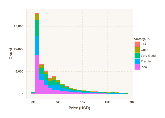
example_plot + dust_theme$themeexample_plot + dust_theme$theme + dust_theme$scales$scale_fill_discrete()do.call(what = ggplot2::update_geom_defaults, args = dust_theme$geom_defaults$bar)
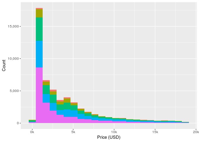
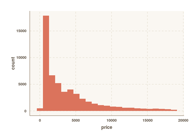
ggplot(diamonds, aes(price)) + geom_histogram(binwidth = 850) + dust_theme$themeReleased under GPL-3.
