Koyomi is a simple calendar view framework for iOS, written in Swift 📆


- Simple Calendar View 📆
- Easily usable 😎
- Customizable in any properties for appearance
- Selectable calender
- Support
@IBDesignableand@IBInspectable - Compatible with Carthage
- Support Swift 2.3.
- Support Swift 3.0
Please install swift2.3 branch.
pod 'Koyomi', :git => 'https://github.com/shoheiyokoyama/Koyomi', :branch => 'swift2.3'
Open Example/Koyomi.xcworkspace and run Koyomi-Example to see a simple demonstration.
Koyomi is designed to be easy to use 😎
    let frame = CGRect(x: 10, y : 20, width: 250, height: 300)
    let koyomi = Koyomi(frame: frame, sectionSpace: 1.5, cellSpace: 0.5, inset: .zero, weekCellHeight: 25)
    view.addSubview(koyomi)
Koyomi is available in Interface Builder.
Set custom class of UICollectionView to Koyomi
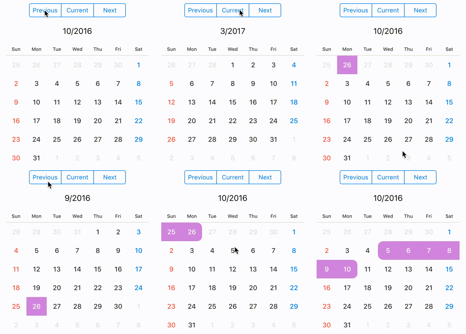
@IBOutlet weak var koyomi: Koyomi!If you want to change displayed month, call display(in: MonthType). MonthType is defined by three types.
    public enum MonthType { case previous, current, next }

    // change month
koyomi.display(in: .next) let currentDateString = koyomi.currentDateString()NOTE
If you want to change
dateFormatofcurrentDateString, set argument to format.currentDateString(withFormat: "MM/yyyy")
default
dateFormatofcurrentDateStringisM/yyyy
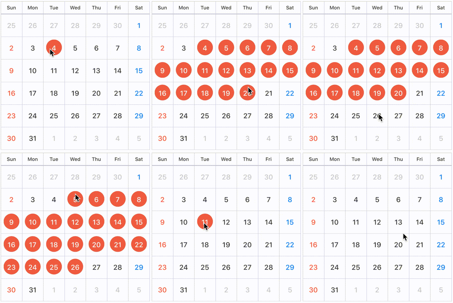
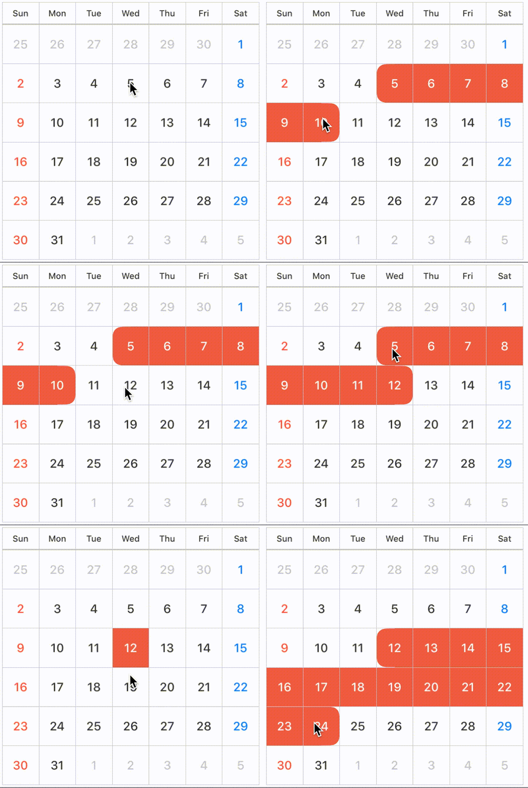
You can configure SelectionMode with style.
SelectionMode has nested enumerations type: SequenceStyle, Style.
    public enum SelectionMode {
        case single(style: Style), multiple(style: Style), sequence(style: SequenceStyle), none


        public enum SequenceStyle { case background, circle, semicircleEdge }
        public enum Style { case background, circle }
   }

    // default selectionMode is single, circle style
    public var selectionMode: SelectionMode = .single(style: .circle)

    // call selectionStyle
koyomi.selectionMode = .single(style: circle)| single | 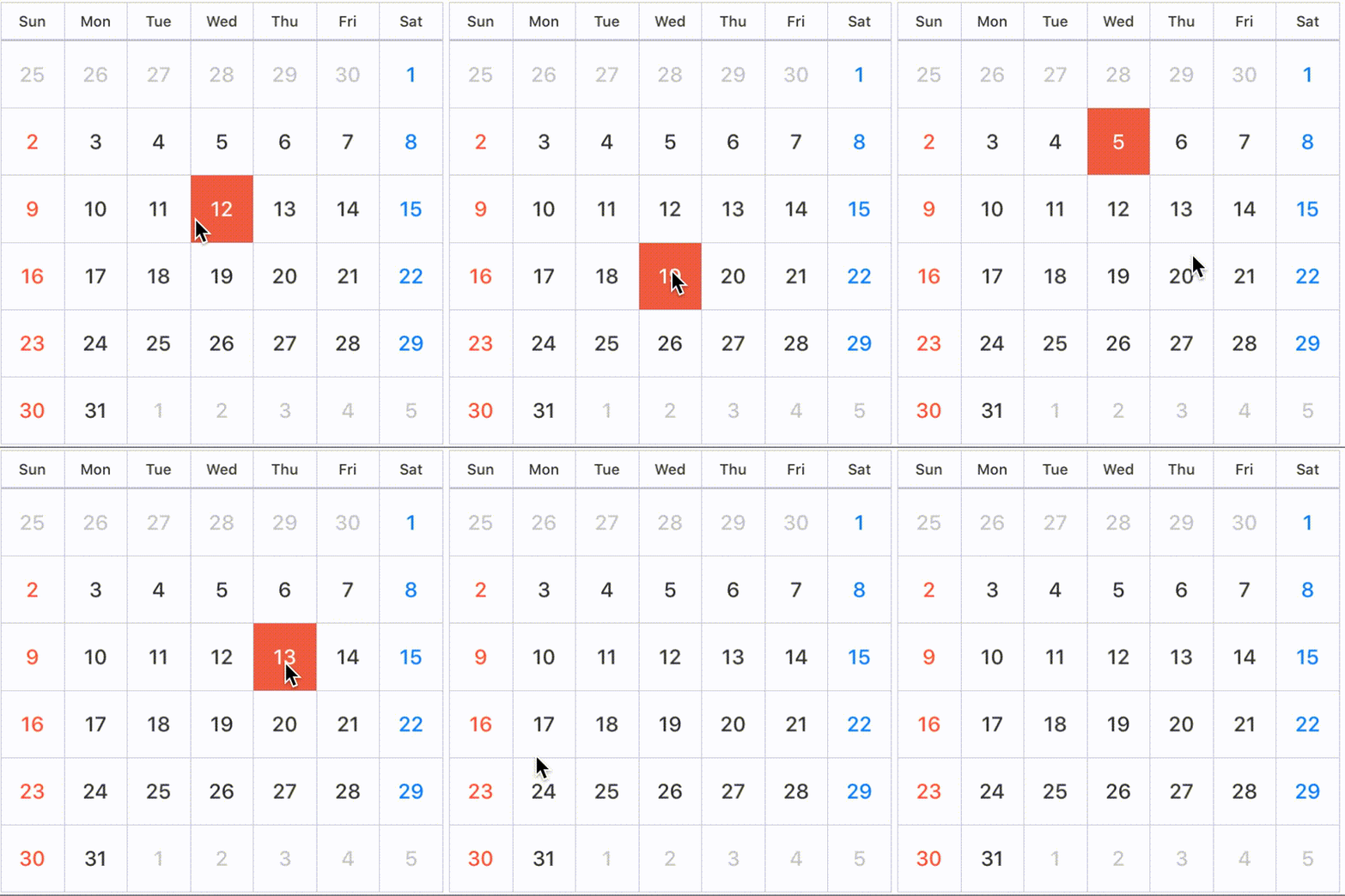 |
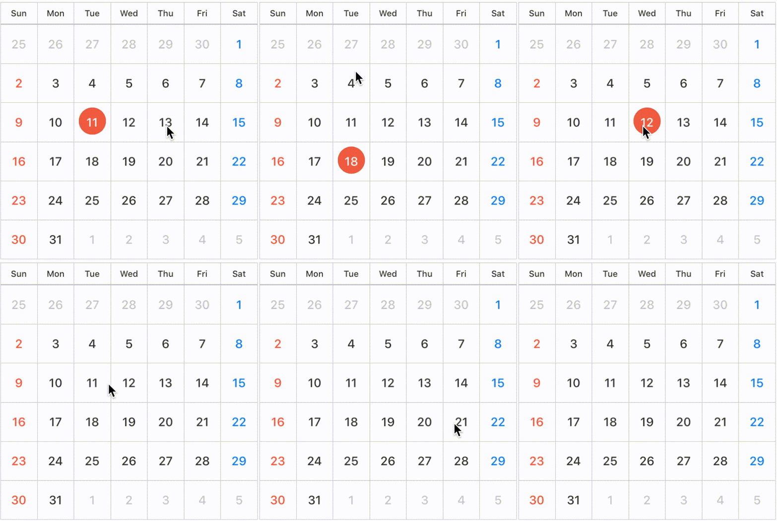 |
|---|---|---|
| SelectionMode | .single(style: .background) |
.single(style: .circle) |
| multiple | 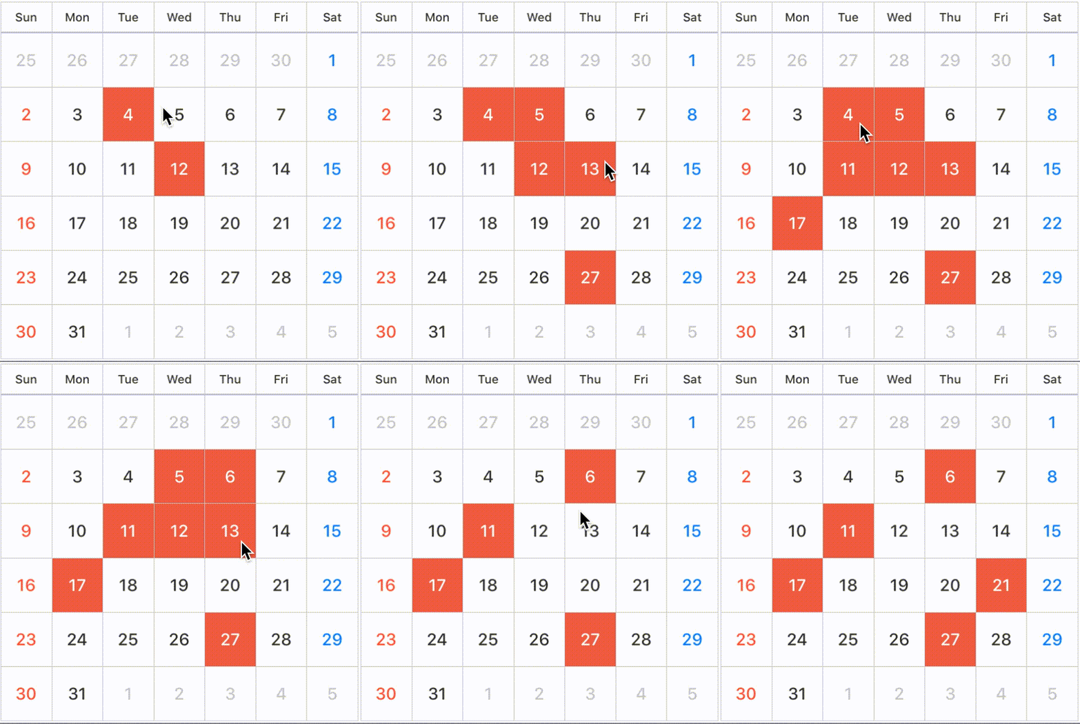 |
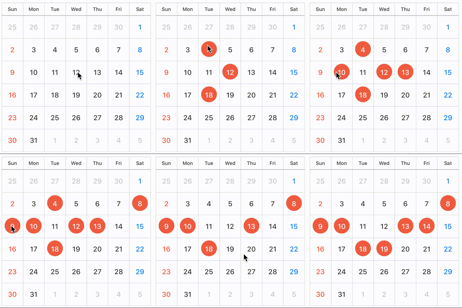 |
|---|---|---|
| SelectionMode | .multiple(style: .background) |
.multiple(style: .circle) |
| sequence | 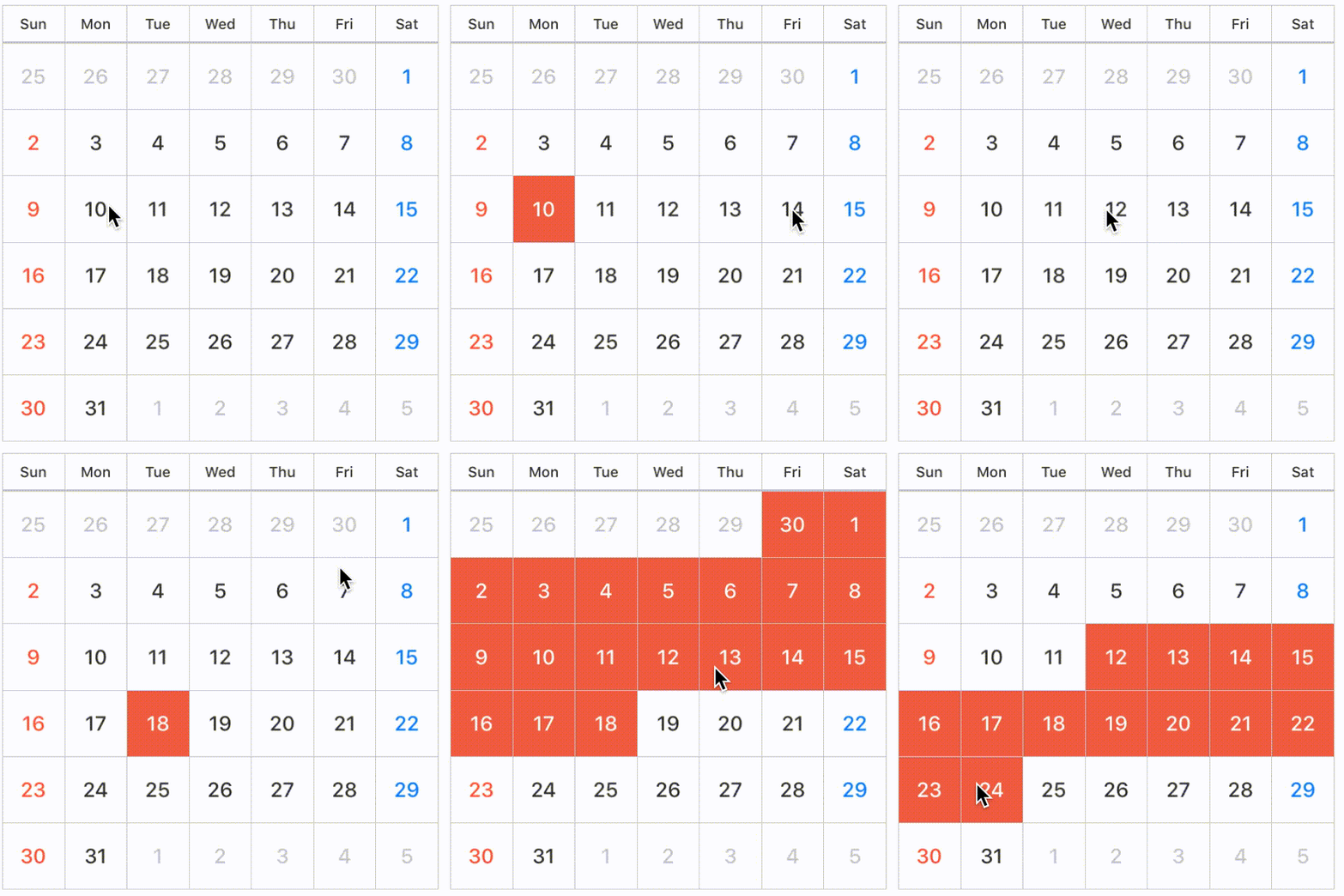 |
 |
 |
|---|---|---|---|
| SelectionMode | .sequence(style: .background) |
.sequence(style: .circle) |
.sequence(style: .semicircleEdge) |
NOTE
If you don't want to allow user to select date by user interaction, set
selectionModeto.none.
You can select specific date .
    let today = Date()
    let components = DateComponents()
    components.day = 7
    let weekLaterDay = Calendar.current.date(byAdding: components, toDate: today)
    koyomi.select(date: today, to: weekLaterDay)

    // If want to select only one day.
    call koyomi.select(date: today)
You can also unselect available.
    koyomi.unselect(today, to: weekLaterDay)
    // If want to unselect only one day.
    koyomi.unselect(today)

    // unselect all date
    koyomi.unselectAll()
You can configure day color in selected state.
    // Support @IBInspectable properties
    @IBInspectable public var selectedBackgroundColor: UIColor
@IBInspectable public var selectedTextColor: UIColorIf you want to use KoyomiDelegate, set calendarDelegate to target
koyomi.calendarDelegate = self optional func koyomi(_ koyomi: Koyomi, didSelect date: Date, forItemAt indexPath: IndexPath) Tells the delegate that the date at the specified index path was selected.
date: the date user selected, when tapped cell
   optional func koyomi(_ koyomi: Koyomi, currentDateString dateString: String)

    // if you want to change string format, use `currentDateFormat`
    koyomi.currentDateFormat = "M/yyyy"
Tells the delegate that the displayed month is changed.
currentDateString: the current month string, when changed month.
    optional func koyomi(_ koyomi: Koyomi, willSelectPeriod period: Int, forItemAt indexPath: IndexPath) -> Bool

    // control period user selected.
    func koyomi(_ koyomi: Koyomi, willSelectPeriod period: Int, forItemAt indexPath: IndexPath) -> Bool {
        if period > 90 {
            print("More than 90 days are invalid period.")
            return false
        }
        return true
    }
koyomi calls this method before select days as period only when selectionMode is sequence.
return value: true if the item should be selected or false if it should not.
    // Support @IBInspectable properties
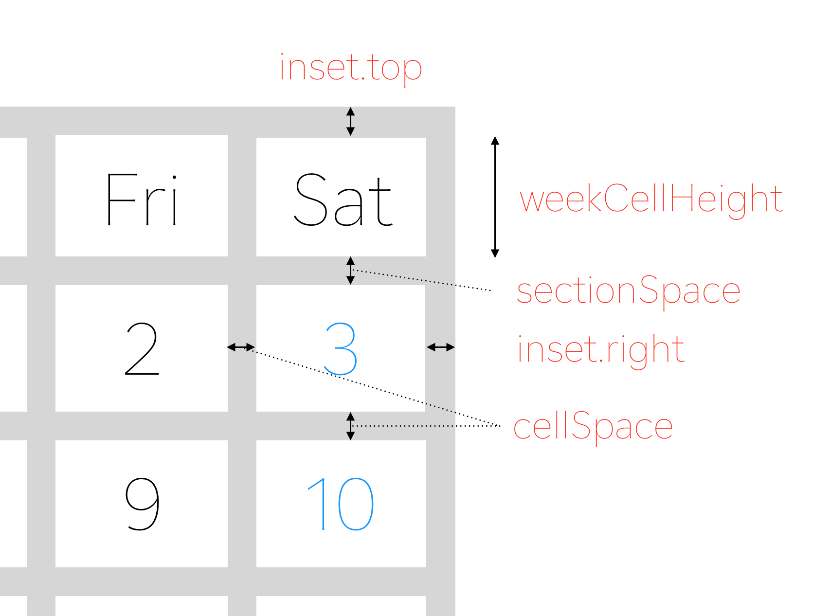
    @IBInspectable var sectionSpace: CGFloa
    @IBInspectable var cellSpace: CGFloat
    @IBInspectable var weekCellHeight: CGFloat
    // Public property
public var inset: UIEdgeInsets koyomi.inset = UIEdgeInsets(top: 0.5, left: 0.5, bottom: 0.5, right: 0.5)Set sectionSpace, cellSpace, weekCellHeight in initialization or Interface Builder.
    public enum ContentPosition {
        case topLeft, topCenter, topRight
        case left, center, right
        case bottomLeft, bottomCenter, bottomRight
        case custom(x: CGFloat, y: CGFloat)
    }
You can configure text postion.
    // default is .center
    koyomi.dayPosition = .topRight
    koyomi.weekPosition = .center

    // custom case
koyomi.dayPosition = .custom(x: 1.2, y: 2.3) // set Day and Week Label Font
koyomi
.setDayFont(size: 12)
.setWeekFont(size: 8)
// if want to change font name,
setDayFont(fontName: ".SFUIText-Medium", size: 12) koyomi.weeks = ["Sun", "Mon", "Tue", "Wed", "Thu", "Fri", "Sat"] // Support @IBInspectable properties
@IBInspectable public var sectionSeparatorColor: UIColor
@IBInspectable public var separatorColor: UIColor
@IBInspectable public var weekColor: UIColor
@IBInspectable public var weekdayColor: UIColor
@IBInspectable public var holidayColor: UIColor
@IBInspectable public var otherMonthColor: UIColor
@IBInspectable public var dayBackgrondColor: UIColor
@IBInspectable public var weekBackgrondColor: UIColor
@IBInspectable public var selectedBackgroundColor: UIColor
@IBInspectable public var selectedTextColor: UIColorYou can configure the lots of color properties for appearance 😩
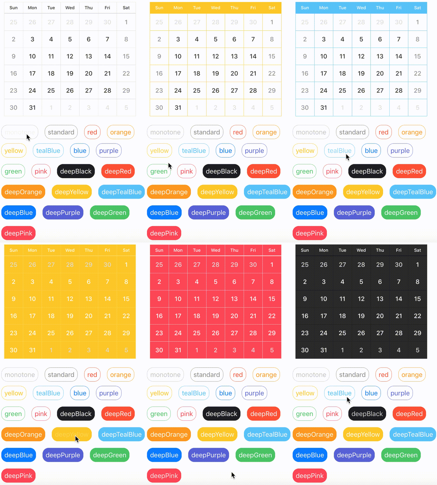
Don't worry 😝, you can easily configure appearance by using KoyomiStyle.
koyomi.style = .tealBlueKoyomiStyle is defined by 19 types.
used iOS Human Interface Guidelines as reference
    enum KoyomiStyle {
        // basic color style
        case monotone, standard, red, orange, yellow, tealBlue, blue, purple, green, pink
        // deep color style
        case deepBlack, deepRed, deepOrange, deepYellow, deepTealBlue, deepBlue, deepPurple, deepGreen, deepPink
}- iOS 8.0+
- Xcode 8.0+
- Swift 3.0+
Koyomi is available through CocoaPods.
To install it, simply add the following line to your Podfile:
pod "Koyomi"Add the following line to your Cartfile:
github "shoheiyokoyama/Koyomi"shoheiyokoyama, shohei.yok0602@gmail.com
Koyomi is available under the MIT license. See the LICENSE file for more info.
