Library made without DataBinding, RxJava and image loading libraries, to give you opportunity to use it without additional dependencies.
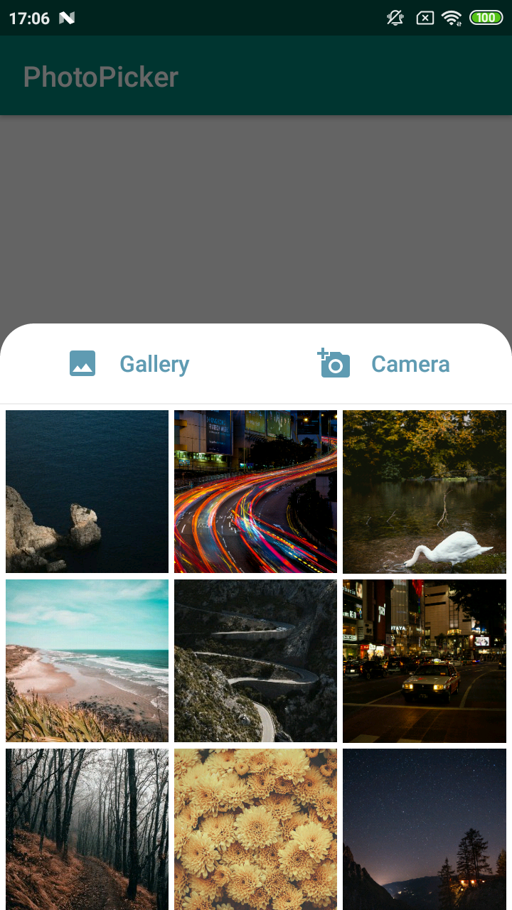
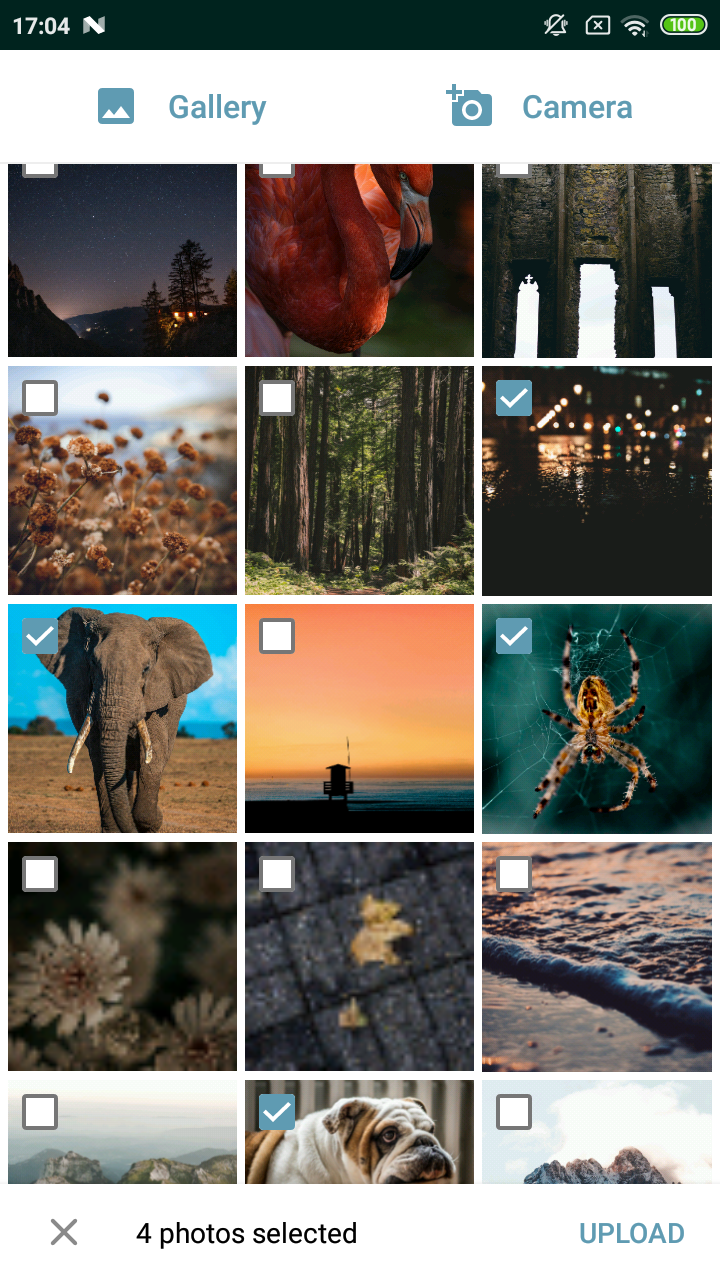
- Picker styled as bottom sheet dialog
- Could be used for single or multiple photos pick
- Allows to choose how images are loaded into ImageView
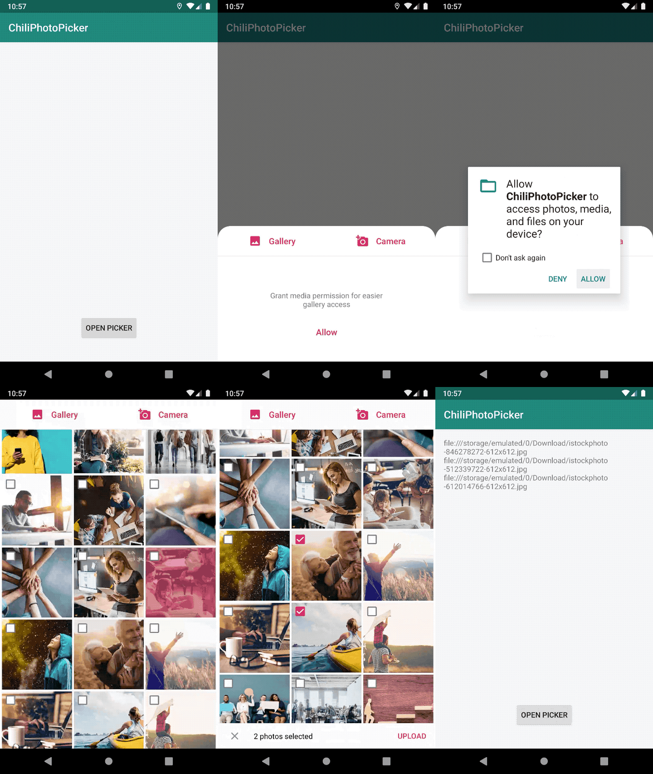
- Takes responsibility for all needed permissions
- Takes responsibility for fetching gallery/camera result
- Have two built-in themes - Light and Dark
- Easy custamizable
| No permission | Single choice | Multiple choice |
|---|---|---|
 |
 |
 |
Gradle:
Add Jitpack to your root build.gradle file:
allprojects {
    repositories {
        google()
        jcenter()
        maven { url "https://jitpack.io" }
    }
}
Add dependency to application build.gradle file, where x.y.z is the latest release version:
implementation "com.github.ChiliLabs:ChiliPhotoPicker:x.y.z"
- Create new instance of
ImagePickerFragment - Pass preferred
ImageLoaderimplementation (ready examples for Glide and Picasso are here) - Pass built-in or custom theme (by default
ChiliPhotoPicker.Lightis used) - Pass your file provider authority, so we can store temporary photo from camera
- Show as dialog
ImagePickerFragment.newInstance(multiple = true, allowCamera = true)
            .imageLoader(GlideImageLoader())
            .setTheme(R.style.ChiliPhotoPicker_Dark)
            .authority("com.example.your.fileprovider")
.show(supportFragmentManager, YOUR_TAG)We don't want to depend on many image loading libraries, so we have simple ImageLoader interface, which you can implement using your preferred library (Glide, Picasso, Coil, etc.)
We have two working examples of ImageLoader implementations - using Glide and Picasso. You can just copy one of them or write your own implementation
Picked photos URIs are returned via callbacks onImagesPicked function, so you just need to implement ImagePickerFragment.Callback interface in your activity or fragment
To customize picker you can use one of built-in themes or inherit it rewriting attributes you want (see example)
Attributes:
pickerBackgroundColor- background colorpickerPrimaryColor- primary picker color (no permission/empty texts, cancel icon)pickerSecondaryColor- secondary picker color (snackbar)pickerControlColor- color of buttons, icons, checkboxes, ripplepickerGalleryIcon- drawable for Gallery icon (to remove it use@nullas attribute value)pickerCameraIcon- drawable for Camera icon (to remove it use@nullas attribute value)pickerCornerRadius- background's corners radiuspickerDividerColor- color of line below Gallery/Camera buttons
Copyright 2019 Chili Labs

Licensed under the Apache License, Version 2.0 (the "License");
you may not use this file except in compliance with the License.
You may obtain a copy of the License at

   http://www.apache.org/licenses/LICENSE-2.0

Unless required by applicable law or agreed to in writing, software
distributed under the License is distributed on an "AS IS" BASIS,
WITHOUT WARRANTIES OR CONDITIONS OF ANY KIND, either express or implied.
See the License for the specific language governing permissions and
limitations under the License.
