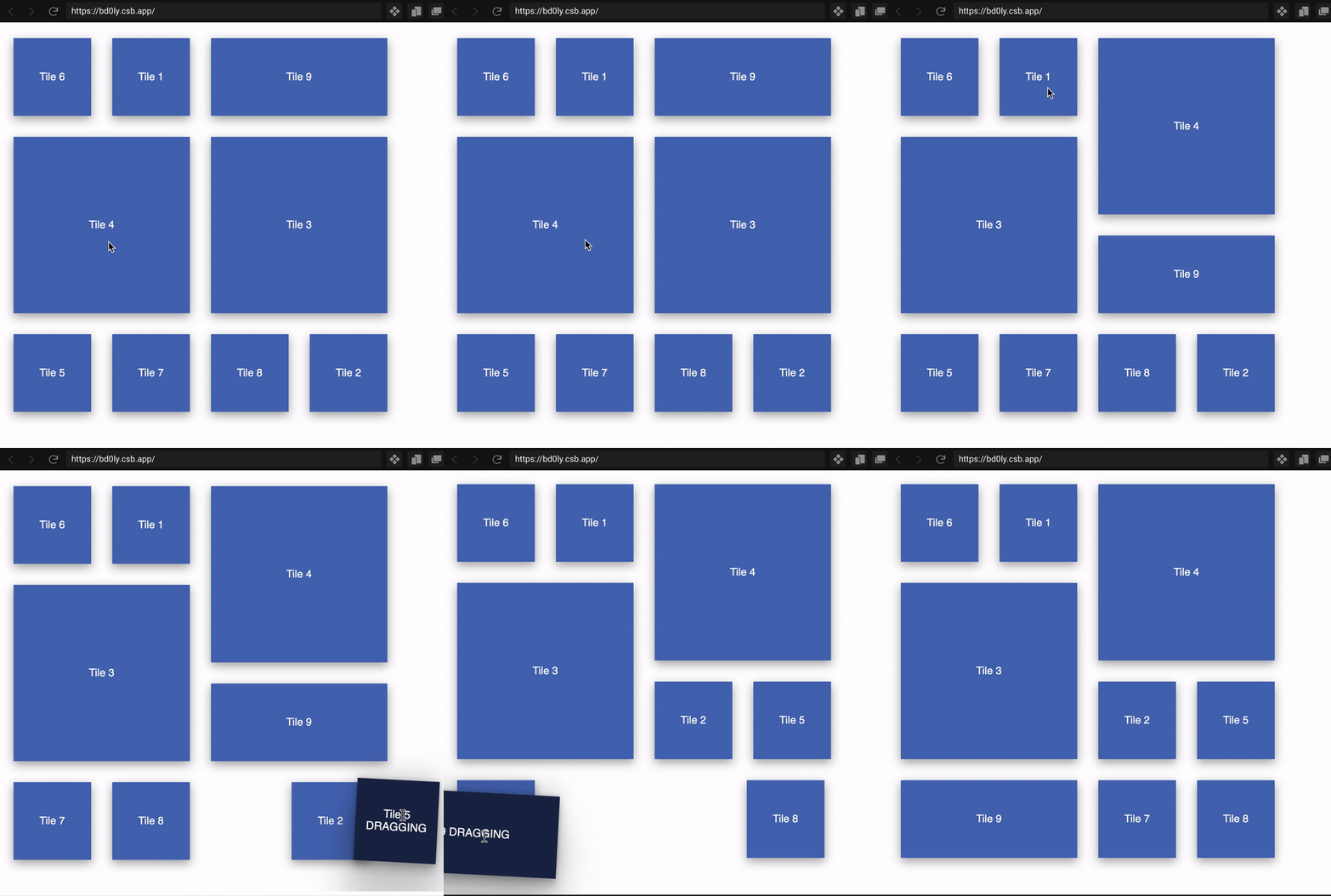
A tile manager for React that supports
- dynamic grid: if the viewport resizes, you can shrink the grid size or shrink the number of columns and rows
- tiles in multiple sizes: each tile can span an arbitrary number of columns and rows of the grid
- drag and drop, both for reorder and for dropping one tile in another
npm i -s react-tiles-dnd
To understand the use of the TilesContainer, we need first of all to understand the grid concept behind the component.
Remember: Every tile spans a number of grid columns and row
When a TilesContainer mounts, it will take all the width of the parent, its height will vary depending on the number of rows to display.
The number of columns of the grid can be:
- fixed: in this case if the container resize, each column will change its width. If you want to have a TilesContainer with a fixed number of columns, you must set the
columnsproperty in<TilesContainer>. TilesContainer will calculate the width of the column automatically. - variable: the number of columns is calculated dividing the container available space by the column pre-set width. If you want a variable number of columns and a fixed column size, you must set the
forceTileWidthproperty in<TilesContainer>to the number of pixels you desire. TilesContainer will calculate the number of columns automatically
As for columns, also row height can be
- fixed: the row height is pre-set by you. If you want to have a fixed row height, you shall set the
forceTileHeightproperty in<TilesContainer> - variable: the row height depends on the column width multiplied by a
ratio. It is irrelevant if columns are fixed or variable. In this case, you can set theratioproperty in<TilesContainer>and the component will calculate the row height accordingly. Example:<TilesContainer fixedColumnWidth={200} ratio={1.5} .../>will always produce a row height of 300px (200 _ 1.5).<div style={{width:500}}><TilesContainer columns={5} ratio={1.5} .../></div>will produce a row height of 150px ((parent container / number of columns) _ ratio)
A tile is the component that is placed on the grid. Every tile has a colspan and a rowspan. When the user starts to drag a tile, the TilesContainer will observe the movement to understand what the user is doing. If the drag operation hovers a hot area (top, bottom, left, right, center) of a cell, the TilesContainer will try to rearrange the grid.
- If the dragging cell comes from the top, only bottom, left, right are hot areas triggering a reflow.
- If the dragging cell comes from the bottom, only top, left, right are hot areas triggering a reflow.
- If the dragging cell comes from the left, only top, bottom, right are hot areas triggering a reflow.
- If the dragging cell comes from the right, only top, bottom, left are hot areas triggering a reflow.
The size of the hot areas (top, bottom, left, right) can be set by passing the activeBorderSize prop to `. If not passed, it is defaulted to 24.
The center hot area is only taken into account if the target cell can accept the source cell.
TilesContainer is a data-driven component. It accepts an array of data, and each element of the data represent a tile. Data is passed throught the property
data: T[];
Together with data, TilesContainer needs a couple of helper functions to understand what shall be rendered for each element of the data array:
tileSize?: (data: T) => { rowSpan: number; colSpan: number };
Given a data element, returns the number of rows and cols the tile spans. If not set, the TileContainer will assume each function is a tile of 1x1
onReorderTiles?: (reorderedData: T[]) => void;
Every time a drag-n-drop is completed, the TileContainer will call this function with the new array order.
acceptsDrop?: (source: T, target: T) => boolean;
This function is called during the drag and drop operations, when a source tile hovers another tile. If the response it true, TilesContainer assumes that the target tile can accept the source tile (similar to a folder).
onTileDrop?: (source: T, target: T) => boolean;
This function is called when a target tile is a valid target (acceptDrop returned true) and the user dropped the source tile in the center of the target tile.
renderTile: RenderTileFunction<T>;
The rendering function, called every time a re-render is needed.
TilesContainer invokes the rendering function whenever there are relevant tile changes during the drag-n-drop operation.
- whenever a tile starts to drag
- whenever a tile is identified as a drop target
- whenever a tile drag is over
The properties contain the data of the tile, its current position, size, and the flags isDragging, isDropTarget, isDroppable
export interface RenderTileProps<T> {
  data: T;
  id: string;
  row: number;
  col: number;
  rowSpan: number;
  colSpan: number;
  tileWidth: number;
  tileHeight: number;
  isDragging: boolean;
  isDropTarget: boolean;
  isDroppable: boolean;
}

export type RenderTileFunction<T> = (
  props: RenderTileProps<T>
) => React.ReactElement | null;
