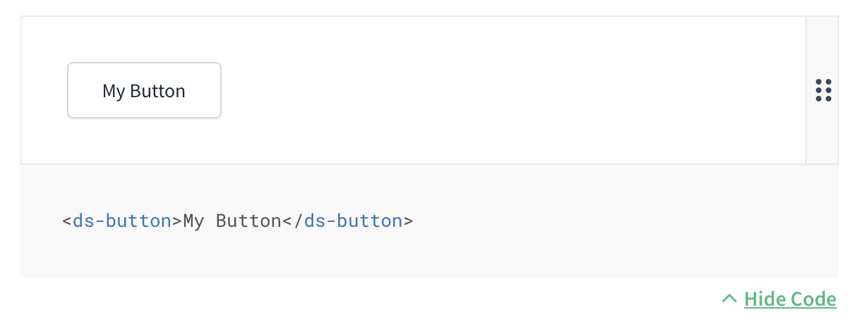
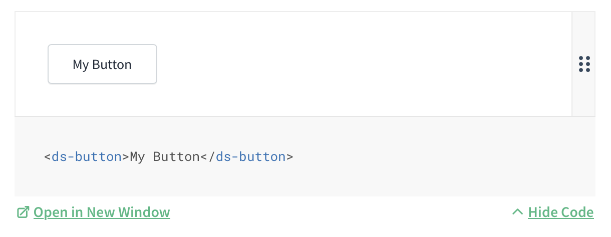
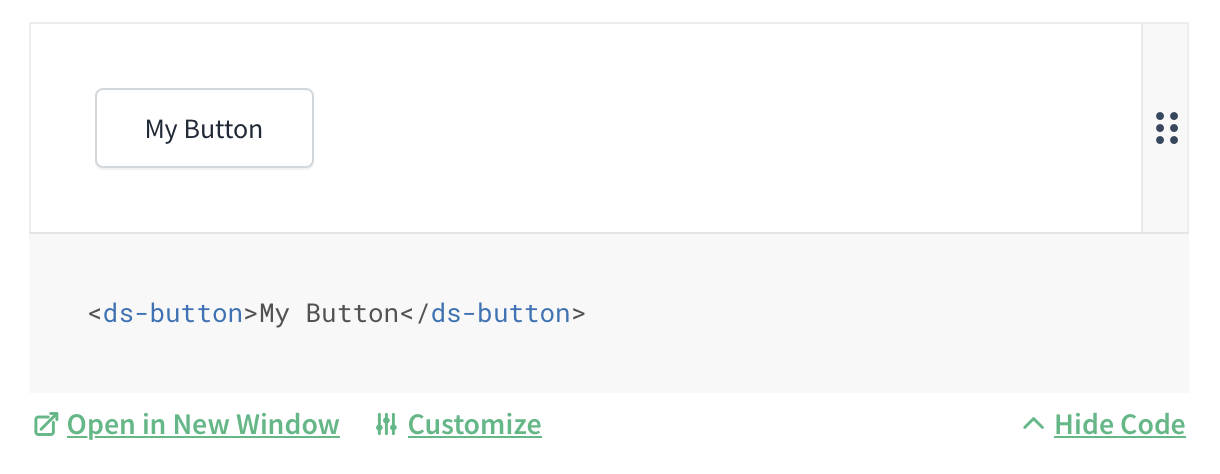
A Docsify plugin for previewing and customizing examples of Custom Elements (Web Components). See a live example of this plugin in use.
You must provide a Custom Elements Manifest (CEM) file in order to enable the Customization feature of this plugin. You can generate one for your project by incorporating the CEM Analyzer into your build process.
Refer to Docsify Breeze for a fully integrated example:
- CEM Analyzer config: custom-elements-manifest.config.js
- ESBuild script that runs
cem analyzeas part of the build process: build.js - Documentation example for a component: button.ts
<script>
  window.$docsify = {
    // ... (your existing Docsify config)
    componentDocs: {
      manifestPath: "/dist/custom-elements.json",
    },
  };
</script>
<script src="//cdn.jsdelivr.net/npm/docsify-web-component-viewer@1/dist/web-component-viewer.min.js"></script>
Default styles, which you can override or replace with your own:
<link
  rel="stylesheet"
  href="//cdn.jsdelivr.net/npm/docsify-web-component-viewer@1/dist/web-component-viewer.min.css"
/>This plugin works by replacing standard Markdown code blocks with
fully-functional examples when desired. Just add preview after
the language name for your code block:
```html preview
My Button
```
Add expanded if you'd like the code source to be displayed by default:
```html preview expanded
My Button
```
To enable viewing the preview in an isolated window, add any string that will serve as a slug for the link:
```html preview expanded mybutton
My Button
```
To enable the customization feature, which is inspired by Storybook's Controls
feature, add controls:[name-of-component] before the slug:
```html preview expanded controls:button mybutton
My Button
```
The slug must always be the last term provided to the code block.
💡 Protip: If your filename matches the name of your component
(e.g., button.md) then you can exclude the component name when enabling controls:
// button.md
```html preview expanded controls mybutton
My Button
```
- Type:
String - Default:
undefined
Required for Customization feature. The path to your Custom Elements Manifest file (see requirements).
- Type:
String - Default:
undefined
An optional standardized prefix used by all your components. For example, ds
if all your components are named such as ds-button and ds-card. Setting
this feature will allow you to exclude the prefix when specifying the component
name when enabling the customization feature.
You can see this plugin in use as part of Docsify Breeze (Live example, GitHub project).
You can test this project locally in a demo Docsify installation.
First, clone this repo:
git clone https://github.com/zolk/docsify-web-component-viewer.gitThen install dependencies (you'll need
Node installed and the
docsify command available):
npm install -g docsify-cli
npm install
Finally, boot the local dev server:
npm startBy default, the server will boot at http://localhost:3000.
This plugin was inspired by and builds upon work done for the Shoelace component library documentation by Cory LaViska.
This project was created by Kevin Zolkiewicz and is licensed under an MIT License.

This project is supported by 8th Light.


