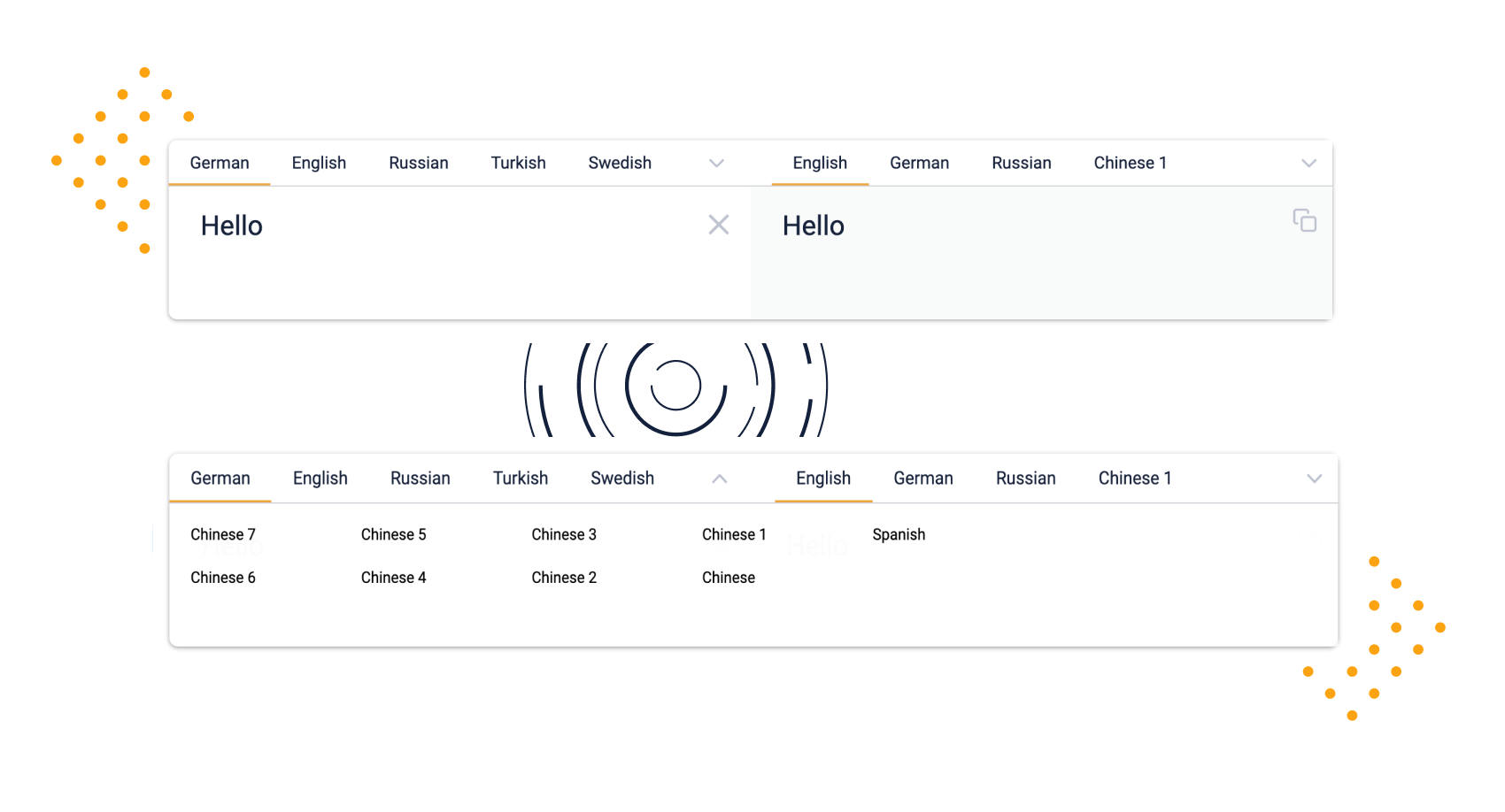
A simple React.js component that is like Google Translate
react-in-out-textarea is a highly customisable React component, for all of your input and output text needs.
Some of the unique features this component offers include:
- Textarea fields for input and output
- Customisable input and output labels
- Selection of input and output types
- Dropdown to show all your labels when they won't fit on one line
- Fully controllable
- Ability to copy the output text to your clipboard
- Minimalistic, visually pleasing style
- Variable content length
Install via NPM
npm install --save react-in-out-textarea
# You might want to install react-tooltip if you activate the max length option
npm install --save react-tooltip
Install via yarn
yarn add react-in-out-textarea
# You might want to install react-tooltip if you activate the max length option
yarn add react-tooltip| Name | Type | Required | Description |
|---|---|---|---|
| inValue | string | ✔️ | The value that is shown on the left-handed side. |
| outValue | string | ✔️ | The value that is shown on the right-handed side. |
| inOptions | array | ✔️ | An array of options filled with names marked true or false |
| onInInput | function | ✔️ | Called to listen to when the text on the left-hand side changes |
| onInOptionsUpdate | function | ✔️ | Updated with new options as the parameter when inOptions language clicked |
| outOptions | array | ✔️ | An array of options filled with names marked true or false and an activeClicked boolean |
| onOutOptionsUpdate | function | ✔️ | Updated with new options as the parameter when outOptions language clicked |
| maxContentLength | number | ❌ | Value that defines the maximum number of characters allowed in the text area. |
| maxContentLengthIndicator | Object | ❌ | An Object describing how the length indicator is shown. |
| onCopy | function | ❌ | A function that is called when you have copied the content of InOutTextarea. |
| autoCloseMenuOnOptionSelection | boolean | ❌ | Boolean that defines whether an option menu should self-close after selection. |
React + TypeScript
Code Example:
import React, { useState } from 'react';
import { InOutTextarea, InOptions, OutOptions } from 'react-in-out-textarea';

export const ExampleComponent = () => {
  const [inValue, setInValue] = useState<string>('');
  const [outValue, setOutValue] = useState<string>('');
  const [inOptions, setInOptions] = useState<InOptions>([
    {
      name: 'English',
      active: true,
    },
    {
      name: 'German',
      active: false,
    },
  ]);
  const [outOptions, setOutOptions] = useState<OutOptions>([
    {
      name: 'Chinese',
      active: true,
      activeClicked: false,
    },
  ]);

  return (
    <InOutTextarea
      inValue={inValue}
      outValue={outValue}
      onInInput={(newValue) => {
        setInValue(newValue);
        setOutValue(newValue);
      }}
      inOptions={inOptions}
      onInOptionsUpdate={(newInOptions) => {
        setInOptions(newInOptions);
      }}
      outOptions={outOptions}
      onOutOptionsUpdate={(newOutOptions) => {
        setOutOptions(newOutOptions);
      }}
    />
  );
};
React + Javascript
Code Example:
import React, { useState } from "react";
import { InOutTextarea } from "react-in-out-textarea";

export const ExampleComponent = () => {
  const [inValue, setInValue] = useState("");
  const [outValue, setOutValue] = useState("");
  const [inOptions, setInOptions] = useState([
    {
      name: "English",
      active: true
    },
    {
      name: "German",
      active: false
    }
  ]);
  const [outOptions, setOutOptions] = useState([
    {
      name: "Chinese",
      active: true,
      activeClicked: false
    }
  ]);

  return (
    <InOutTextarea
      inValue={inValue}
      outValue={outValue}
      onInInput={(newValue) => {
        setInValue(newValue);
        setOutValue(newValue);
      }}
      inOptions={inOptions}
      onInOptionsUpdate={(newInOptions) => {
        setInOptions(newInOptions);
      }}
      outOptions={outOptions}
      onOutOptionsUpdate={(newOutOptions) => {
        setOutOptions(newOutOptions);
      }}
    />
  );
};To start developing you need the following tools installed:
After installing all the tools, you can install all dependencies by using in your terminal
yarnAfter that just type:
yarn storybookAnd open http://localhost:6006/. That should give you the storybook preview.
Storybook is an open source tool for developing UI components in isolation for React, Vue, Angular, and more. It makes building stunning UIs organized and efficient.
Storybook is a tool used here for easy development of components for the web. Since this project uses React.js, the decision for storybook was kind of easy. It makes the development workflow seamless.
Our stories are saved under the ./stories directory. Feel free to have a look.
The code is licensed under MIT.
Thanks goes to these wonderful people (emoji key):
This project follows the all-contributors specification. Contributions of any kind welcome!


