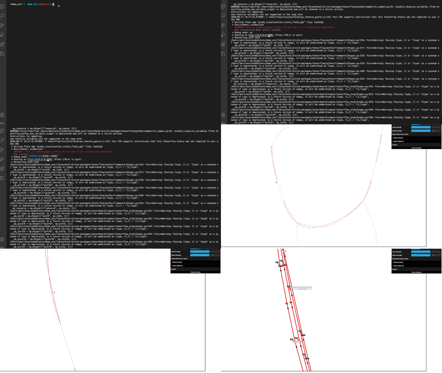
Dynamic Visualization tool for machine learning models that displays the models
pip install lt-model-visualizationpython -m graph_visualization.plot_graph \
--pb_graph_path=path_to_protobuf/protobuf.pbRequired Parameter:
--pb_graph_path (str, path to the protobuf file on the system)NOTE : ONLY PASS PROTOBUFS THAT ARE CONVERTED FROM TF
Optional Parameters :
--port (int, default port is 5000).

--pb_graph_type (str, currently only supports "tf" and is default. Other types like .onnx to be supported in future)
A graph is created from the protobuf file passed as a parameter and is served on the given port.
The nodes are interactive and can be moved around as per convenience.
Edges show name, port, dtype, and shape on hover.
Nodes show node types by default and hovering over nodes shows node name and ohter attribute info.
All the information in the graph is contained in graph.json file which can be accessed by going to the URL: localhost:port/graph.json
The search bar below the graph window provides a functionality to search for a particular node. The auto suggest drop down appears as you type to help you find the node quicker.
The search is activated after the 'Highlight Node' button is clicked. As the node is found, the window auto pans to the particular node being in the centre and it starts a pulse animation to disambiguate the searched node from the cluster.
Use the 'Shrink Node' button to stop the animation.
Double click on any node to highlight it's neighboring nodes and respective edges.
The control bar is present on the top right corner of the page. It can be minimized by clicking the close controls button at the bottom of the control bar. Once the graph becomes static (which is after interacting with a particular node/edge) "Link Distance", "Link Strength" and "Node Strength" features become unavaialable.
The following configurations can be changed from the control bar which makes live changes to the graph.
It specifies how far apart should 2 nodes be from each other. The value ranges from 0 to 400. It is better to have a higher value for huge complex graphs.
It specifies how strongly the link pulls the other nodes. The value ranges from 0 (repulsion) to 1 (pull).
Works similar to Link Strength. It specifies how strongly nodes pull each other. The value ranges from -500 (low pull value therefore higher repel) to -1 (Maximum pull).
Only the nodes whose current positions lie in the viewing window are loaded, other node information is known (present in the .json file) but no additional overhead is caused as none of these node or link related elements are shown.
While zooming out, if the zoom out reaches a value where the current window holds more than 500 nodes, the nodes are hidden but the links are visible. This is done to reduce the load.
Conversely, upon zooming in, if the viewing window has < 500 nodes, all the respective node and link elements are shown.
A functionality to turn off the node labelling.
A filter to visualize the nodes based on
- Error Values
- None (Same color to all nodes)
Restarts the given graph by reloading.
The graph visualization is based on Node JS and the visualization library D3.
git clone https://github.com/Lightelligence/LTModelVisualization.gitInstall Miniconda3 using these instructions
Create the virtual environment and activate it
conda env create -f environment.yml
conda activate lt-model-visBazel can be installed with Bazelisk. It downloads the appropriate bazel version for the current working directory.
BAZEL_BIN=/usr/local/bin/bazel # you may want a different path here
sudo ln -s $(which bazelisk) $BAZEL_BINbazel run //graph_visualization:plot_graph -- \
--pb_graph_path=/path/to/protobuf.pb \
--port=portIt is recommended to use an absolute path for pb_graph_path when running with Bazel.
