Shirin Taheri, Babak Naimi, Miguel B. Araujo
climetrics is an extensible and reproducible R package to spatially quantify and explore multiple dimensions of climate change. Six widely known metrics of climate change are implemented in the package including:
- Standardized local anomalies (sed);
- Changes in probability of local climate extremes (localExtreme);
- Change in area of analogous climates (aaClimate);
- Change in the distance to analogous climates (daClimate),
- Novel climates (novelClimate);
- Climate Change Velocity (ve; dVelocity; gVelocity).
In the case of climate change velocity, the climetrics package measures the velocity using three different algorithms including: a) distanced-based velocity (“dVe”); b) threshold-based velocity (“ve”); and c) gradient-based velocity (“gVe”).
The package also provides additional tools, e.g., to calculate monthly mean climate variable over a period of time (i.e., mean climate variable is calculated for each of 12 month); to quantify and map the temporal trend (slope) of a given climate parameter at the pixel level; and to classify and map Köppen-Geiger (KG) climate zones.
This document provides a quick demonstration on the functionality of the package, followed by some examples, that would be helpful to get a guick start with the package.
The complete manual will be available on https://github.com/shirintaheri/climetrics
climetrics package can be easily installed using the standard install.package function as:
install.package (“climetrics”)
or from GitHub:
devtools::install_github(“shirintaheri/climetrics”)
The climetrics package depends on some other packages including the rts (raster time series), terra, and (optionally) raster packages.
The package is followed by several monthly time series of climate variables, from 1991 to 2020 (360 layers), including minimum, maximum, and mean temperature, and precipitation. The datasets are cropped in part of Europe with a spatial resolution of 0.5 degree. The original data are downloaded from the Climate Research Unit’s database (http://www.cru.uea.ac.uk).
For the following examples, we considered the period of 1991-2000 as the baseline (time 1), and the period of 2010-2020 as the second period (time 2).
The package works with time series of climate variables that are defined as either Raster objects (through using ‘terra’ or ‘raster’ package) or raster time series objects (through using the ‘rts’ package).
Here, we just read multiple climate variables (precipitation, and minimun, maximum, and mean temperature) that are provided as example datasets with the package. Each variable is stored as a GeoTiff file which contains 360 raster layers corresponding to monthly climate data for the time period between 1991 and 2020. We use the package terra to read the raster files (it is possible to use the package raster, but terra is recommended as it is faster)
library(climetrics)
library(terra)
library(rts)
filePath <- system.file("external/", package="climetrics") # path to the dataset folder
pr <- rast(paste0(filePath,'/precip.tif')) # precipitation
tmin <- rast(paste0(filePath,'/tmin.tif')) # minimum_temperature
tmax <- rast(paste0(filePath,'/tmax.tif')) # maximum temperature
tmean <- rast(paste0(filePath,'/tmean.tif')) # mean temperature
#------------
pr## class : SpatRaster
## dimensions : 33, 54, 360 (nrow, ncol, nlyr)
## resolution : 0.5, 0.5 (x, y)
## extent : -10.5, 16.5, 47.5, 64 (xmin, xmax, ymin, ymax)
## coord. ref. : lon/lat WGS 84 (EPSG:4326)
## source : precip.tif
## names : X1991.01.16, X1991.02.15, X1991.03.16, X1991.04.16, X1991.05.16, X1991.06.16, ...
## min values : 5.600000, 9.800000, 12.300000, 8.800000, 1.700000, 49.600002, ...
## max values : 386.5, 199.9, 297.0, 337.6, 197.9, 244.4, ...
# color palette:
cl1 <- colorRampPalette (c("Maroon","Khaki","yellow","lightblue","blue","MidnightBlue"))

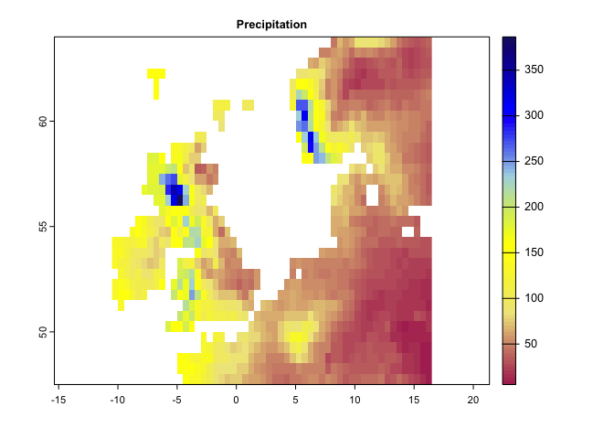
plot(pr[[1]], main='Precipitation',col=cl1(100))
# color palette:
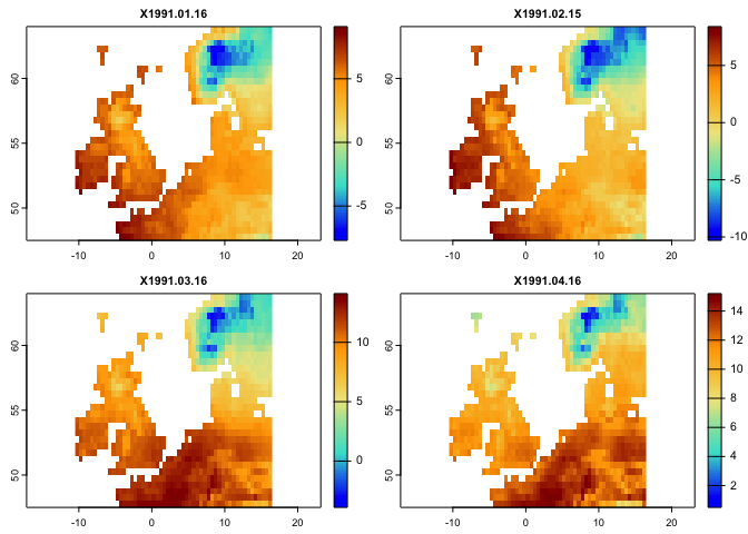
cl2 <- colorRampPalette (c("blue","Turquoise","Khaki","orange","darkred"))
plot(tmax[[1:4]],col=cl2(100))The climetrics works based on both raster or raster time series objects. It would, however, easier to use raster time series. Here, you can see how a raster time series can be created using the rts function in the rts package. To do so, we need a vector holding (Date/time) with the same length as the number of layers in the raster objects (i.e., the dates correspond to layers). The class of the object should be “Date” or “POCIXxx”. The corresponding dates to the above layers are already available in the package:
n <- readRDS(paste0(filePath,'/dates.rds'))

class(n)
## [1] "Date"
length(n)## [1] 360
head(n) # Dates corresponds to the layers in climate variables (pr, tmin, tmax, tmean)## [1] "1991-01-16" "1991-02-15" "1991-03-16" "1991-04-16" "1991-05-16"
## [6] "1991-06-16"
####################
# In case if you want to know, how these Dates are created, just check the followin code:
# head(names(pr)) # names of the raster layers contain Date information
# n <- names(pr)
# n <- substring(n,2,11)
# head(n)
# n <- as.Date(n,format = '%Y.%m.%d')
######################

# use rts function in the rts package to make a raster time series:

pr.t <- rts(pr,n)
tmin.t <- rts(tmin,n)
tmax.t <- rts(tmax,n)
tmean.t <- rts(tmean,n)
#------

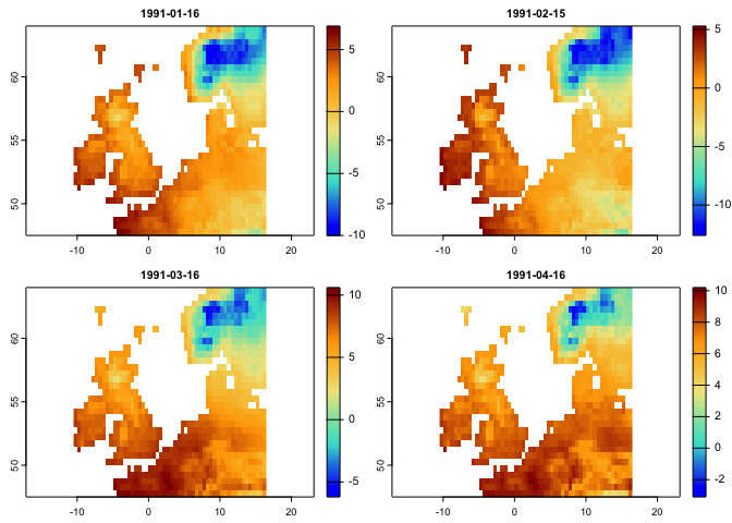
plot(tmean.t[[1:4]],col = cl2(100))
You can further explore the rts package by checking: https://github.com/babaknaimi/rts
Here, we demonstrate how each metric can be quantified using the climetrics R package. We use the raster time series data (loaded above) for precipitation, minimum, mean, and maximum temperature. We considered the years 1991-2000 as time 1 (t1), and 2010-2000 as time 2 (t2). Therefore, the metrics compare the changes of climate condition between time 2 and time 1.
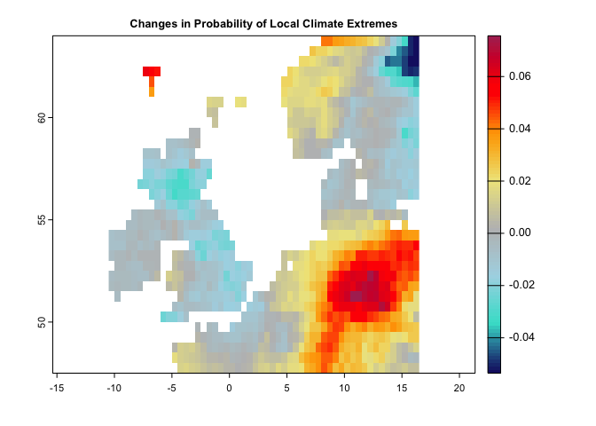
This metric can be quantified based on one or two climate variables. For each variable, we need to specify the percentile of extreme values. For example, this value can be 0.05 for precipitation, means the values below the percentile of 0.05 would be considered as extreme condition. It can be 0.95 for temperature, meaning that the values greater that the temperature corresponds to 0.95 percentile, represents extreme condition.
Here, we used the monthly raster time series data (as they were loaded in the above sections) for precipitation and maximum temperature:
Note: these calculations captured one single aspect of extreme climates (hot and dry), but other aspects could be calculated in a similar manner.
# This code generates a map of probability of extreme climate events.

lce <- localExtreme(tmean.t , pr.t,
                        t1 = '1991/2000',
                        t2 = '2010/2020',
                        extreme = c(0.95,0.05))

# as you can see from the code, when the input climate variables are raster time series,
# you can easily specify the range of time periods in t1 and t2

# Extreme is 95th and 5th percentiles corresponds to tmean.t, and pr.t (first and second arguments)


# let's first specify an appropriate color Pallete:
cl <- colorRampPalette(c("MidnightBlue","Turquoise","lightblue","gray","khaki","orange","red","Maroon"))


plot(lce,col=cl(100),main='Changes in Probability of Local Climate Extremes')The following code generates Novel climates between the baseline (1991-2000) and the second time period (2010-2020):
# This code generates a map of novel climates  1951-1980 and the second period is from 1981-2020

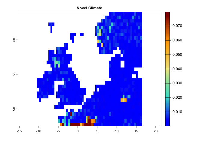
nc <- novelClimate(pr.t,tmin.t,tmax.t,t1='1991/2000',t2='2010/2020')

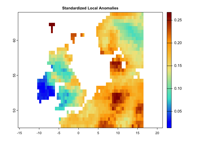
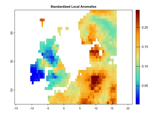
plot(nc,main='Novel Climate',col=cl2(100))This code generates a map for standardized local anomalies. The map quantifies local changes in magnitude. The temporal differences for each climate parameter were standardized using the local inter-annual (baseline 1951-1980) standard deviation for that parameter. High standardized local anomaly scores correspond to large changes in temperature and precipitation.
se <- sed(pr.t,tmin.t,tmax.t,t1='1991/2000',t2='2010/2020')

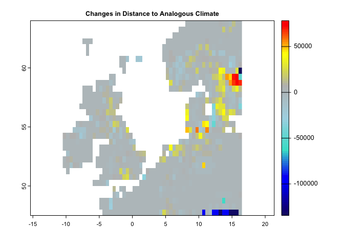
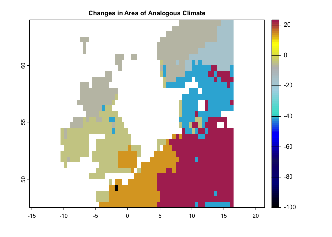
plot(se, col = cl2(100), main='Standardized Local Anomalies')There are two metrics that compare analogous climate between two times. One metric (aaClimate) measures changes in the area of, and the other metric (daClimate) measures the distance to analogous climate. So, for each cell, aaClimate measures what is the ratio (in percentage) of change in area of the given climate class in time 2 and time 1. The daClimate metric quantifies the distances to all cells with analogous climates in the time 1 period, i.e., belonging to the same climate class of the given cell. It also quantifies the distances to all cells that experience analogous climates in the time 2. Then, for each cell, it calculates the median of the great-circle distances (in km) below the 10th percentile of the distribution of all values, for both time 1 and time 2 periods, and maps the change over time. Negative values indicated a temporal decrease in distance, whereas positive values indicated an increase.
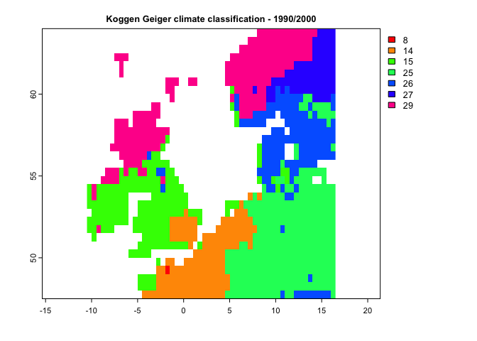
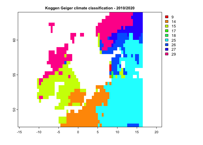
In order to calculate aaClimate and daClimate metrics, the input variables need to be in the form of climate classes (i.e., a categorical variable representing climate zones/classes). In the climerics package, the kgc function is implemented to classify the climate variables based on the Koggen-Geiger climate classification and identify that climate zones (the function generates climate). However, if the input data are provided as climate time series datasets (the same as those used for the above metrics), the functions, first generate Koggen-Geiger climate classes for time 1 and time 2, then measure the metrics.
Following is the example to use the time series of climate variables as the input:
da <- daClimate(precip = pr.t, tmin = tmin.t, tmax = tmax.t, tmean = tmean.t,
                t1='1991/2000',t2='2010/2020')

cl <- colorRampPalette(c("MidnightBlue","blue","Turquoise","lightblue","gray","yellow","red"))

plot(da,col=cl(100),main='Changes in Distance to Analogous Climate')#----------
aa <- aaClimate(precip = pr.t, tmin = tmin.t, tmax = tmax.t, tmean = tmean.t,
t1='1991/2000',t2='2010/2020')
cl <- colorRampPalette(c("black","darkblue","MidnightBlue","blue","Turquoise","lightblue","gray","yellow","Maroon"))
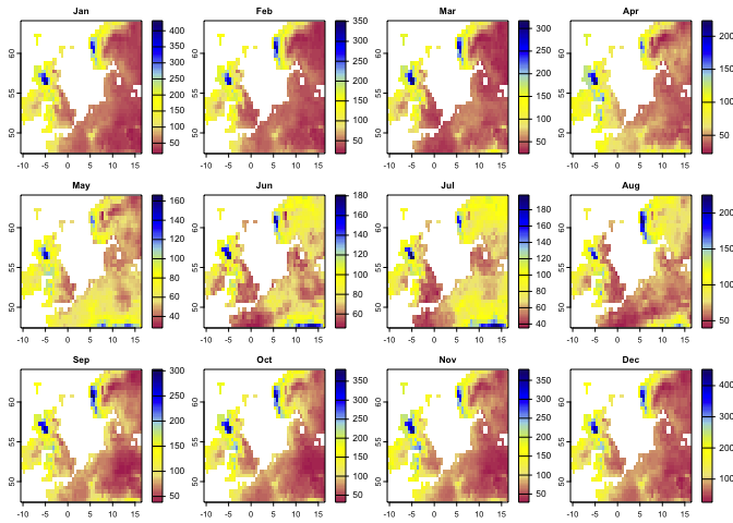
plot(aa,col=cl(100),main='Changes in Area of Analogous Climate')In the following example, we first use the kgc function to generate the Koggen-Geiger climate classes. kgc needs the mean climate variables taken over time series for different months, so for each month we need to take the mean separately (e.g., mean precipitation for January, February, etc.). To generate such dataset from the time series we have, we can use the apply.months function that apply any function (e.g., mean) over each month of the time series:
# Let's apply mean over the subset of precipitation time series for time1 and time2:
p12.1 <- apply.months(pr.t[['1991/2000']],'mean')
p12.2 <- apply.months(pr.t[['2010/2020']],'mean')

p12.1 # this is the the mean precipitation for 12 months (time 1)
## class : SpatRaster
## dimensions : 33, 54, 12 (nrow, ncol, nlyr)
## resolution : 0.5, 0.5 (x, y)
## extent : -10.5, 16.5, 47.5, 64 (xmin, xmax, ymin, ymax)
## coord. ref. : lon/lat WGS 84 (EPSG:4326)
## sources : memory
## memory
## memory
## ... and 9 more source(s)
## names : Jan, Feb, Mar, Apr, May, Jun, ...
## min values : 17.36, 17.57, 23.84, 22.25, 28.05, 45.86, ...
## max values : 431.37, 351.92, 317.03, 223.55, 166.21, 180.81, ...
plot(p12.1, col=cl1(100))#--
tmin12.1 <- apply.months(tmin.t[['1991/2000']],'mean')
tmin12.2 <- apply.months(tmin.t[['2010/2020']],'mean')
#--
tmax12.1 <- apply.months(tmax.t[['1991/2000']],'mean')
tmax12.2 <- apply.months(tmax.t[['2010/2020']],'mean')
#--
tmean12.1 <- apply.months(tmean.t[['1991/2000']],'mean')
tmean12.2 <- apply.months(tmean.t[['2010/2020']],'mean')After taking the mean climate variables for 12 months, we can use the kgc function to generate the Koggen-Geiger climate classes for time 1 (1990-2000) and time 2 (2010-2020):
k1 <- kgc(p=p12.1,tmin = tmin12.1,tmax=tmax12.1, tmean = tmean12.1)

k2 <- kgc(p=p12.2,tmin = tmin12.2,tmax=tmax12.2, tmean = tmean12.2)


plot(k1, type='classes', col=rainbow(10),
main= "Koggen Geiger climate classification - 1990/2000")plot(k2, type='classes', col=rainbow(10),
main= "Koggen Geiger climate classification - 2010/2020")By having climate classes, you can use aaClimateC or daClimateC functions to calculate the Area/Distance of/to Analogous Climate metrics:
aa <- aaClimateC(k1, k2)

cl <- colorRampPalette(c("black","darkblue","MidnightBlue","blue","Turquoise","lightblue","gray","yellow","Maroon"))

plot(aa,col=cl(100),main='Changes in Area of Analogous Climate')#----
da <- daClimateC(k1, k2)
cl <- colorRampPalette(c("MidnightBlue","blue","Turquoise","lightblue","gray","yellow","red"))
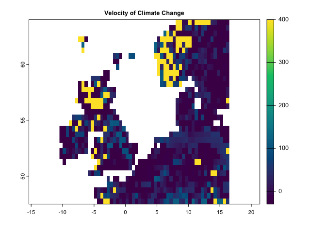
plot(da,col=cl(100),main='Changes in Distance to Analogous Climate')Several velocity metrics are implemented in climetrics, that are accessible through the functions of velocity, dVelocity, and gVelocity. Please check the help page of each function for the details about the method and the reference used to implement each function. Here, the following examples demonstrate how we can use each function.
This method works based on two climate variables. Let’s run it based on precipitation and mean temperature:
ve <- velocity(x1=pr.t,x2=tmean.t,t1='1991/2000',t2='2010/2020')

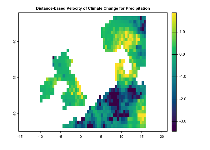
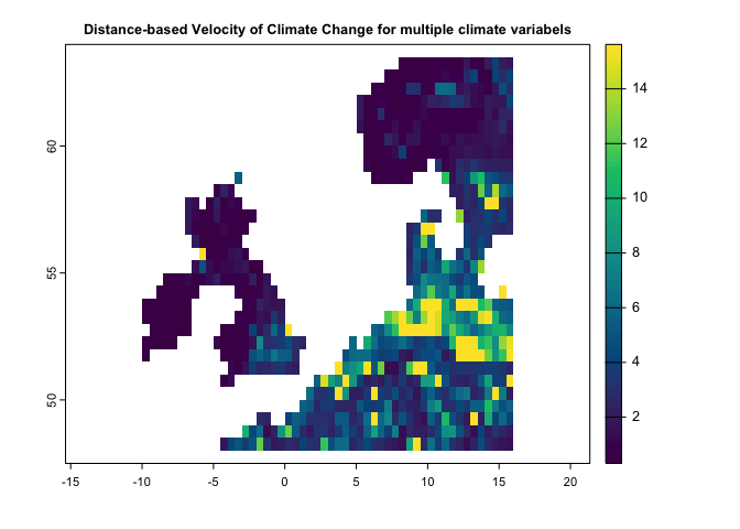
plot(ve, col=hcl.colors(100), main='Velocity of Climate Change')This method is a distance-based velocity that can be quantified based on one or multiple climate variables:
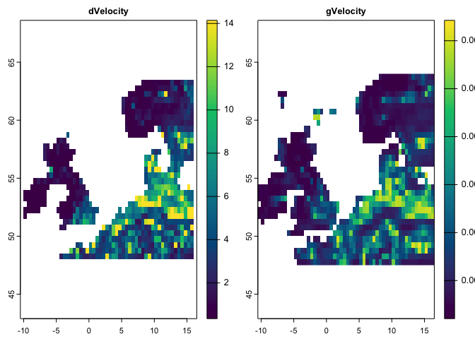
dv <- dVelocity(pr.t,t1='1991/2000',t2='2010/2020')
plot(dv,col=hcl.colors(100),
     main='Distance-based Velocity of Climate Change for Precipitation')
dv <- dVelocity(pr.t,tmin.t,tmax.t,t1='1991/2000',t2='2010/2020')
plot(dv,col=hcl.colors(100),
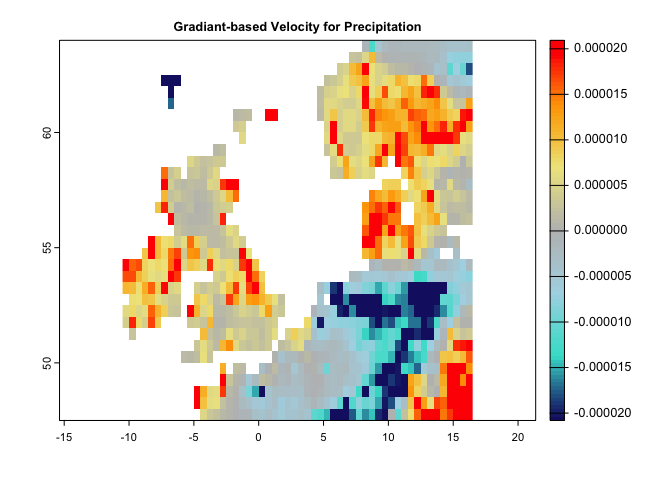
main='Distance-based Velocity of Climate Change for multiple climate variabels')This method is a gradiant-based velocity that can be quantified based on a single climate variable:
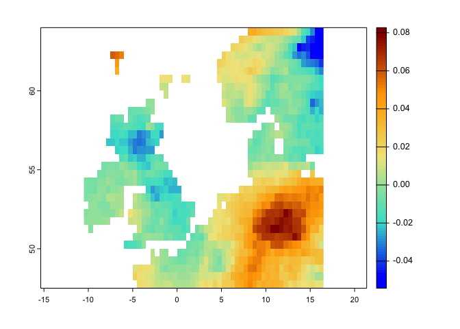
gv <- gVelocity(pr.t)

cl <- colorRampPalette(c("MidnightBlue","Turquoise","lightblue","gray","khaki","orange","red"))

plot(gv, col=cl(100), main='Gradiant-based Velocity for Precipitation')There is another function, ccm, that make it possible to quantify eaither (or several) of the metrics through a single function. You only need to provide any specific argument that is required for a certain metric to the function (e.g., extreme argument for the localExtreme metric)
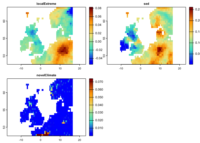
# Following code generates climate 3 metrics including:
# -------------- (localExtreme, Standardized Local Anomalies, and Novel Climate)
# just pay attention that the extreme argument is added for the lce metric
c3 <- ccm(pr.t,tmax.t,t1='1991/2000',t2='2010/2020',
          stat=c('lce','sed','nc'), extreme = c(0.05, 0.95))

plot(c3,col=cl2(100))
# Following code generates climate 2 velocity metrics:
ve <- ccm(pr.t,tmean.t,tmax.t,t1='1991/2000',t2='2010/2020',stat=c('dVe','gVe'))##
## gVelocity is calculated for a single climate variable. Since multiple variables are provided, average velocity is returned!
plot(ve,col=hcl.colors(100))In case if the time series is a raster object, you can use the functions without first generating the raster time series. The only thing is that you need to know which layers belong to time 1 and time 2 (by introducing a numeric vector that specifies the layer numbers):
# pr and tmax are SpatRaster object:

pr
## class : SpatRaster
## dimensions : 33, 54, 360 (nrow, ncol, nlyr)
## resolution : 0.5, 0.5 (x, y)
## extent : -10.5, 16.5, 47.5, 64 (xmin, xmax, ymin, ymax)
## coord. ref. : lon/lat WGS 84 (EPSG:4326)
## source : precip.tif
## names : X1991.01.16, X1991.02.15, X1991.03.16, X1991.04.16, X1991.05.16, X1991.06.16, ...
## min values : 5.600000, 9.800000, 12.300000, 8.800000, 1.700000, 49.600002, ...
## max values : 386.5, 199.9, 297.0, 337.6, 197.9, 244.4, ...
# we know that the layers of 1:120 corresponds to the period of 1991-2000,
# and the layers of 229:360 correspond to the period of 2010-2020

# so the following code works based on the Raster object (not raster time series):
le <- localExtreme(pr,tmax,t1=c(1:120),t2=c(229:360),extreme = c(0.05, 0.95))

plot(le,col=cl2(100))
In case if we have separate raster objects for time 1, and time 2, we can still use the climetrics package:
# Here, we just take layers for t1 and t2 as separate Raster objects to demonstrate an
# example where the datasets for t1 and t2 are separate:

pr1 <- pr[[1:120]] # precipitation for t1

pr2 <- pr[[229:360]] # precipitation for t2

tmax1 <- tmax[[1:120]]
tmax2 <- tmax[[229:360]]

# so now let's quantify the SED:
se <- sed(t1=list(pr1,tmax1),t2=list(pr2,tmax2))

plot(se, col = cl2(100), main='Standardized Local Anomalies')