New Interactive Features! ⭐
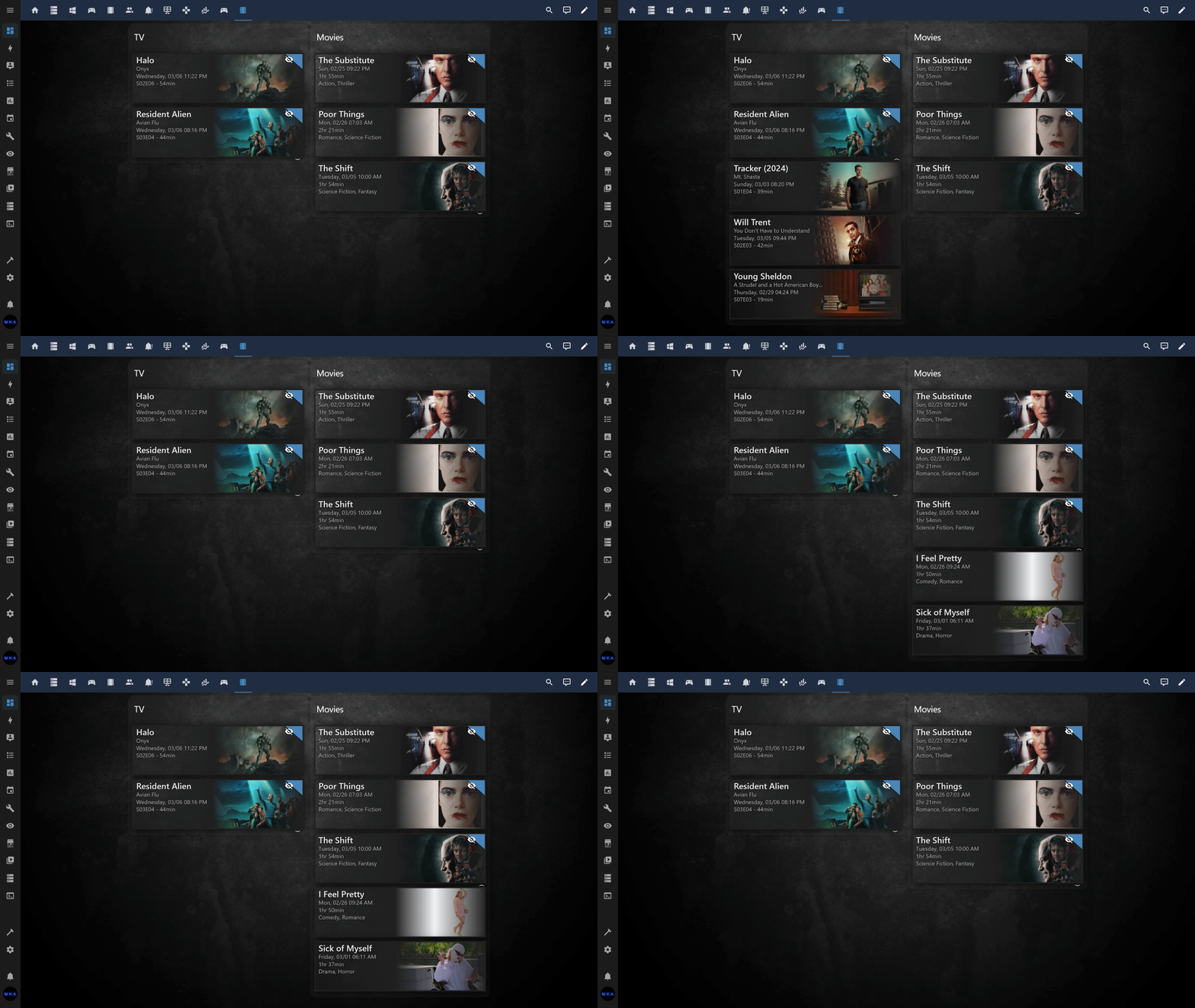
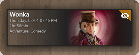
Group items with common attributes together, e.g., group Unwatched  items first. The rest of the items can be collapsed/expanded:
title: TV
type: custom:upcoming-media-card
entity: sensor.recently_added_tv
image_style: fanart
collapse: flag=true
sort_by: number
enable_tooltips: true
By setting collapse: flag=true, items not yet watched are prioritized and grouped at the top. You can expand/collapse the rest of the items. Alternatively, you can specify, I.E., collapse: 2 to collapse/expand everything after 2 items (regardless of what items are displayed).
Note: You can also leverage the new sort_by setting as a secondary sort method (season/episode) sort order.
Navigate directly to the respective TV episode, movie, game, etc. with a single click or touch! Made possible with the new deep_link attribute (supported in the following integrations): sensor.plex_recently_added, sensor.radarr_upcoming_media, sensor.sonarr_upcoming_media, steam-wishlist, epic_games.
We can finally sort items by any attribute. sort_by: airdate will sort media items by their respective airdates. You can also reverse the sort order using sort_ascending: false.
Filter items by partial or full attribute value. filter: flag=true. Similar to collapse: setting, except discards the rest of the items.
When using enable_trailers:true setting, any item with a trailer attribute value will playback the respective video trailer when clicked or touched. Trailer playback will take precedence over deep_link hyperlinks. Currently only plex_recently_added, sensor.sonarr_upcoming_media, radarr_upcoming_media and trakt integrations are compatible. These integrations have trailer attributes defined in their sensors. Note: Home Assistant Companion app requires you to enable "Autoplay videos" under Companion App settings.
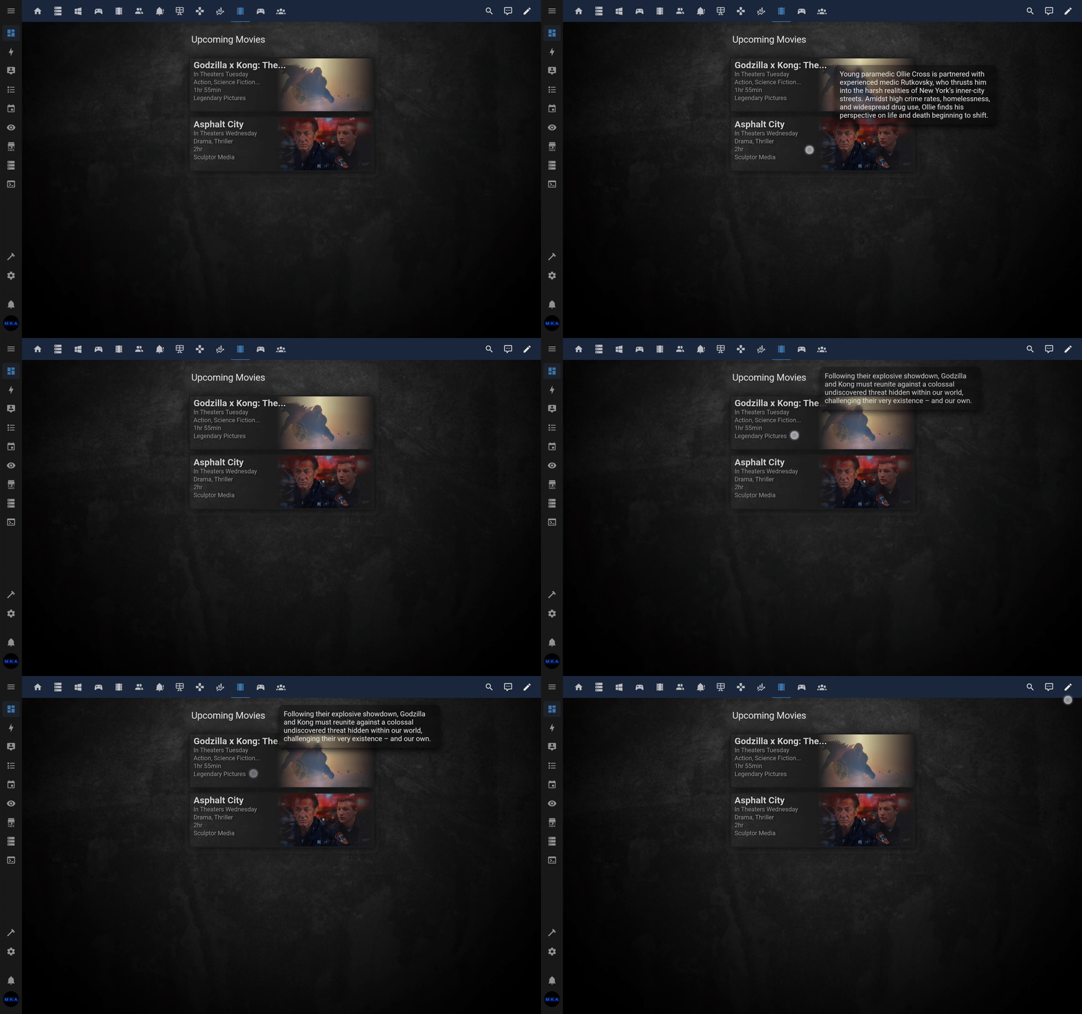
To enable tooltips, use enable_tooltips: true. To change the default delay, use I.E., tooltip_delay: 2000 (default 750ms). For touchscreens, hold your finger down to see the tooltip. This feature was possible with the new summary attribute (supported in the following integrations): sensor.plex_recently_added, sensor.radarr_upcoming_media, sensor.sonarr_upcoming_media.
Activate with enable_transparency: true for a transparent gradient effect instead of the default opaque gradient background.
| Poster View | Fan Art View |
|---|---|
 |
 |
Requires a custom-component:
This card will only work if you've installed one of the custom-component's below to feed it.
Read through these two resources before posting issues to GitHub or the forums.
- Install the custom component by following it's instructions.
- Install this card by copying
upcoming-media-card.jsto yourwww/custom-lovelace/folder. If you're copy/pasting the code always copy from raw files on github (button on top right when viewing code). - Include it in its own folder like so:
www/custom-lovelace/upcoming-media-card/upcoming-media-card.js
This goes into ui-lovelace.yaml under "resources:"
resources:
- url: /local/custom-lovelace/upcoming-media-card/upcoming-media-card.js?v=0.1.1
  type: js
This goes into one of your views under "cards:" in the same file
  - type: custom:upcoming-media-card
    entity: sensor.sonarr_upcoming_media
If you're not updating using tracker-card and/or custom-updater be sure that you are adding to a version number at the end of your lovelace resources when you update your cards, like so:
resources:
- url: /local/custom-lovelace/upcoming-media-card/upcoming-media-card.js?v=0.1.2
  type: js
You may need to have javascript_version: latest in your configuration.yaml under frontend:.
This card has many customization options, but none are required to use the card. The card is fully functional with minimal configuration, like the installation example above.
| NAME | TYPE | DEFAULT | DESCRIPTION |
|---|---|---|---|
| type | string | REQUIRED | custom:upcoming-media-card |
| entity | string | REQUIRED | The entity id of the custom component. Example sensor.sonarr_upcoming_media |
| title | string | optional | Title displayed at top of card. |
| date | string | ddmmyy | Format for displaying dates. Examples: date: mmdd, date: ddmmyy, date: yyddmm |
| clock | number | 12 | Display times as either 12 hour "clock: 12" or 24 hour "clock: 24" |
| max | number | 5 | Maximum number of items to show. |
| image_style | string | poster | There are currently two different styles for the card: poster and fanart. |
| hide_empty | boolean | false | Hide card when there are no episodes to show. |
| hide_flagged | boolean | false | Hide items that get an indicator flag. Useful to hide downloaded episodes for sonarr/radarr components. |
| hide_unflagged | boolean | false | Hide items that don't have an indicator flag. Useful to hide watched items for plex component. |
| flag | boolean | true | Display or hide indicator flag. |
| text_shadows | boolean | true | Display or hide shadows behind text. |
| box_shadows | boolean | true | Display or hide shadows behind objects. |
| all_shadows | boolean | no default | Turns both text and object shadows on or off. |
| enable_transparency | boolean | false | Turns on gradient transparency effect. |
| url | string | no default | Makes entire card clickable with specified hyperlink. |
| collapse | string | no default | Prioritize/group by attribute value (collapsing the rest of the items). Example: collapse: flag=true |
| collapse | number | no default | Collapses all items after the specified number of items. Example: collapse: 2 |
| filter | string | no default | Filter items by attribute value (including partial matches). Example: filter: flag=true. The rest of the items will be discarded. |
| sort_by | string | no default | Attribute used for sorting items. Example: sort_by: airdate sorts items by airdate. |
| sort_ascending | boolean | true | Sort order. Set to false for descending order. |
| enable_tooltips | boolean | false | Display respective summary of item (if supported by integration). |
| disable_hyperlinks | boolean | false | Prevents hyperlinks from being clickable (for items with deep_link attributes). |
| NAME | POSTER DEFAULTS | FANART DEFAULTS | DESCRIPTION |
|---|---|---|---|
| title_text line1_text line2_text line3_text line4_text |
Defalts set by component | Defaults set by component | The text contents for the line. More info below. |
| title_size line1_size line2_size line3_size line4_size |
large medium small small small |
large medium small small small |
Text size for each line. small, medium, or large |
| line_size | no default | no default | Text size of lines below title. More info below. |
| title_color line1_color line2_color line3_color line4_color |
var(--primary-text-color) var(--primary-text-color) var(--primary-text-color) var(--primary-text-color) var(--primary-text-color) |
'#fff' '#fff' '#fff' '#fff' '#fff' |
The color of each line. Any valid CSS color. Hex values must be in quotes. |
| line_color | no default | no default | Color of lines below title. Any valid CSS color. Hex values must be in quotes. More info below. |
| border_color | '#fff' | '#000' | Color of the outside border in fanart view and border around image in poster view. |
| accent_color | var(--primary-color) | '#000' | Color of the ribbon in poster view and background in fanart view. |
| flag_color | var(--primary-color) | var(--primary-color) | Changes the color of indicator flag. |
| icon | Default set by component | Default set by component | Changes the icon in the indicator flag, uses mdi icons. "icon: mdi:arrow-down"Set "icon: none" to hide. |
| icon_color | var(--primary-color) | var(--primary-color) | Changes the color of the icon in the indicator flag. |
Text color options can be any valid CSS value. This includes color names like red, rgb values like rgba(255, 0, 0, 0.6), variable names for HA like var(--primary-color), hex values like '#ff6347', you can even use transparent. If using hex values, encase in quotes. This is the only time quotes are required in the cards configuration.
There are 2 space saving configuration options: line_color and line_size. These two options affect all lines of text below the title. These options can be overwritten as well. For example: if you set line_color: white and line2_color: blue then lines 1 & 3 will be white while line 2 will be blue.
You can build your own strings for each line of text, including title by using keywords. Each keyword is replaced with its relevant content, listed below. Encase this option in quotes.
| KEYWORD | AVAILABILITY | DESCRIPTION |
|---|---|---|
| $title | All | Item's title |
| $release | All | A formatted version of the release time from the component. Particularly helpful for displaying different kinds of releases. Radarr for instance needs to distinguish between theater releases and physical releases. Radarr's release changes dynamically and is "In Theaters $day, $date" if theater release and more than a week away or "Available $day" if physical release and within a week. |
| $episode | TV Only | Episode Title |
| $number | TV Only | Season and episode number "S01E05" |
| $genres | All | List of genres |
| $rating | All | Rating of episode, source depends on component |
| $studio | All | Production Studio |
| $price | Games | Price of games meant for "Steam Wishlist UMC" and "Epic Games UMC" integrations |
| $day | All | Day of "release" (release date, download date, etc.) depending on component. This item changes from long form if within a week "Monday" to short form "Mon" if further than a week. |
| $date | All | Date of release or download, etc., depending on component. Formatted with "date" in config. |
| $time | All* | Time of release or download. * Movies generally dont have a time for release. |
| $aired | Plex | Date that the media item originally aired. |
| $album | Accomodate music-related integrations such as Lidarr Upcoming Media integration. | |
| $artist | Accomodate music-related integrations such as Lidarr Upcoming Media integration. | |
| $runtime | All | Displays runtime as either "01:23" for > an hour and "23 min" otherwise. |
| $empty | All | Displays line as empty space. Useful to create a break in the lines that can be sized. |
You can add in custom text to your string, only keywords are replaced. As an example you could add this to your config line1_text: 'Runtime: $runtime' to have line one display as "Runtime: 01:30". You can use as many keywords in your string as you like, you're only limited by what will fit. In some cases a keyword can return nothing, like when using radarr and a movie is in theaters. Occasionally not all info has been released yet, causing something like runtime to be empty. This isn't a problem when it's the only keyword in a line as the card just hides the line, but it can be an issue when you're using multiple keywords in a line. In this case you can use a hyphen to seperate the them. line1_text: 'Rating: $rating - Runtime: $runtime - $number' will display as "Rating: ★ 7.1 - Runtime: 01:23 - S01E09" when all are available or "Rating: ★ 7.1 - S01E09" if runtime is not.
If you'd like to make your own component to feed the upcoming media card:
- Component needs an attribute named "data" that contains a JSON string or OBJ.
- The first item in your JSON must contain these keys to set your defaults:
title_default,line1_default,line2_default,line3_default,line4_default, andicon. The default text contents are set exactly like the card's text content config and use the same keywords. The default icon takes an mdi iconmdi:arrow-down. - Each item must contain an 'airdate', if none exists the item is skipped. This and a poster image are the only required items.
- If an included item is null it needs to be an empty string in the JSON
''. - Items should be in descending order according to 'airdate'.
- Be aware that the card strips parentheses and anything contained in them. This is to remove things like (US). Since we can see the art for the show/movie there is no need for that info.
| KEY | DESCRIPTION |
|---|---|
| airdate | Must be UTC ISO 8601 format. Example 2018-10-25T01:00:00Z. This is how the card creates date, day, and time. Doesn't have to be air date, just a date associated with the item. It could be download date for example. |
| title | Item's title |
| release | This is a formatted version of the release time from the component. Particularly helpful for displaying different kinds of releases. Radarr for instance needs to distinguish between theater releases and physical releases, so 'release' is changed dynamically by the component and is "In Theaters $day, $date" if theater release and more than a week away or "Available $day" if physical release and within a week. |
| episode | Episode Title |
| number | Season and episode number "S01E05" |
| season_num | Season number only |
| episode_num | Episode number only |
| genres | List of genres |
| rating | Rating of item |
| studio | Producing Studio |
| aired | When media originally aired, useful for when airdate is set as download date etc. |
| runtime | Must be number of minutes as integer, the card then formats as needed. |
| poster | Direct link to items poster image |
| fanart | Direct link to items fanart image. If fanart is an empty string the card will zoom in and shift the poster image as a fallback. |
| flag | Display indicator or not, boolean. |
| deep_link | direct URL link to respective TV Episode or Movie on Plex, Radarr, Sonarr. |
[{"title_default": "$title", "line1_default": "$episode", "line2_default": "$release", "line3_default": "$rating - $runtime", "line4_default": "$number - $studio", "icon": "mdi:arrow-down-bold-circle"}, {"title": "Modern Family", "episode": "Good Grief", "flag": false, "airdate": "2018-10-25T01:00:00Z", "number": "S10E05", "runtime": 25, "studio": "ABC (US)", "rating": "\u2605 8.8", "release": "$day, $date $time", "poster": "https://www.thetvdb.com/banners/_cache/posters/5bb9375cb2c5e.jpg", "fanart": "https://www.thetvdb.com/banners/_cache/fanart/original/5b300bbae5cd2.jpg", "genres": "Comedy"}, {"title": "American Horror Story", "episode": "Traitor", "flag": false, "airdate": "2018-10-25T02:00:00Z", "number": "S08E07", "runtime": 45, "studio": "FX (US)", "rating": "\u2605 8.4", "release": "$day, $date $time", "poster": "https://www.thetvdb.com/banners/_cache/posters/5b9983440d320.jpg", "fanart": "https://www.thetvdb.com/banners/_cache/fanart/original/5b9f15a15a9c1.jpg", "genres": "Drama, Horror, Thriller"}, {"title": "It's Always Sunny in Philadelphia", "episode": "Charlie's Home Alone", "flag": false, "airdate": "2018-10-25T02:00:00Z", "number": "S13E08", "runtime": 25, "studio": "FXX", "rating": "\u2605 9.1", "release": "$day, $date $time", "poster": "https://www.thetvdb.com/banners/_cache/posters/5ba7c2b687091.jpg", "fanart": "https://www.thetvdb.com/banners/_cache/fanart/original/5b48ef958034c.jpg", "genres": "Comedy"}]
Please inform me if you create one and I'll add it to the list.
Include what your components defaults are in the components readme.
If you need special styling or edits to the card to accomidate your component, just ask or submit a PR.
Thanks!
