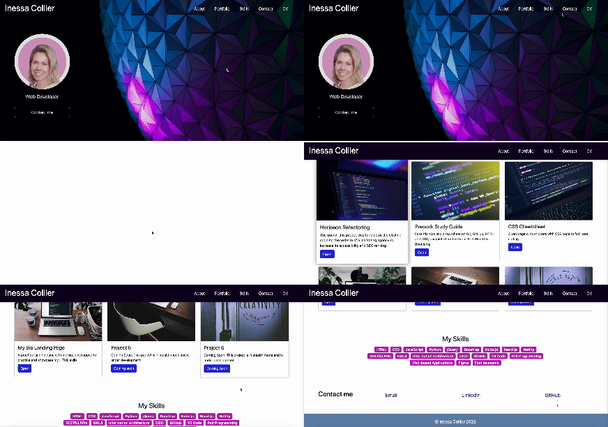
This is recreation of my portfolio webpage using Bootstrap.
Bootstrap Portfolio · GitHub repo · Previous WebpageTable of Contents
The goal of this project is re-create my portfolio webpage using Bootstrap as I continue to progress through the Front-End Web Development Bootcamp.
The webpage recreated with Bootstrap should have the following:
- A navigation bar with links connected to different sections on the page.
- A hero section (a jumbotron that includes my name, picture, and any other relevant information).
- A work section that displays my projects in grid.
- A card is used for each work projects and includes project description and a link to the deployed application.
- A section listing all the skills that I expect to learn from this bootcamp.
- A section with information about me.
- A section with my contact information, where the title of the section is on the same line as the links.
- A footer section where all hyperlinks have a hover effect and buttons display a box shadow effect upon hover.
- The Bootstrap solution should minimize the use of media queries.
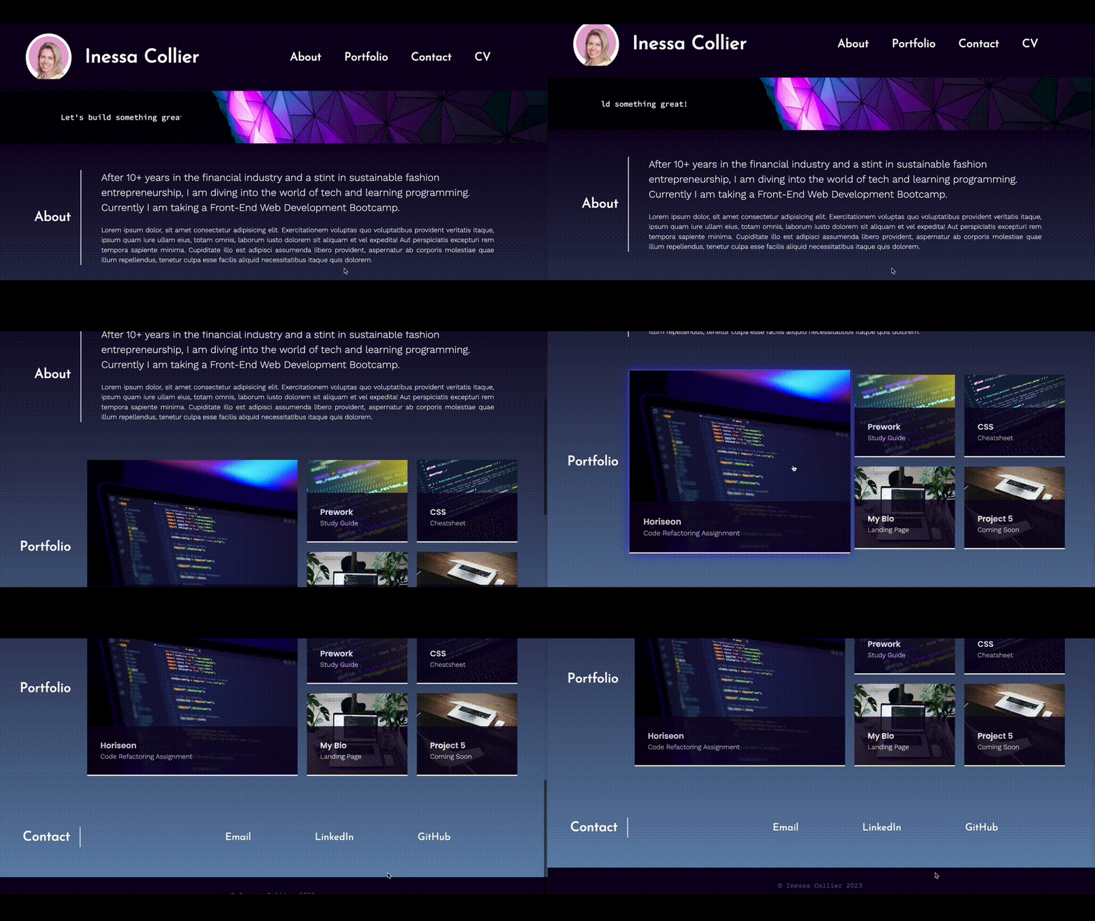
My previously deployed portfolio webpage looked like this:
You can see the previous portfolio webpage deployed here.
I used the following technologies when building this portfolio page:
As this is a re-build project, many design aspects were described in the previous webpage repo.
I also did not create a new wireframe as this was about recreating an existing webpage. However, the layout slightly changed from the previous version as there was no requirement to make one card larger than the others. I leveraged the flex layout in Bootstrap with rows and columns to arrange my project cards and make the layout responsive.
However, in general, using Figma is very beneficial when building a website as the service provides all the information I would need to create the layout and customize the design: margins, padding, colours, fonts, etc, which I can copy directly as css code in Figma.
I simplified the colour palette for the new webpage. The main goal is to create a clean page that guides the viewer to the desired CTA: to contact me (and hopefully start a collaboration).
As a result, I selected the following colours for the website:
- Main background colour: #0D0221
- Secondary background colour: #6688B0
- Main font colour: white
- Hover link: #C419BE
- Highlight font colour: #2628DD
These colours are set as global variables in the css file.
I sourced free photos from Unsplash. In addition to the images used on the previous webpage version, I used one more:
The development using Bootstrap was much faster and more streamlined compared to the regular build. One of the biggest time savers was positioning of elements using margin and padding classes, as well as the flex layout using rows and columns. Thanks to this layout I spent significantly less time on the page responsiveness.
However, in some cases I turned to the web to find instructions on how to achieve certain outcomes.
I was not sure how to make my navbar background turn dark when scrolling down the page. This video was very helpful.
Some of my project cards had longer description which caused the cards to have different heights. I found how to correct this here.
Although I had done this in my previous webpage, I still had to refresh my memory on the code required to achieve this nice effect.
Finally, I thought it would be nice to have underlining effect on hover for the navigation links. This video was very helpful.
During my previous project I had sourced icons from the web but was not entirely happy with their look. For this project I used Font Awesome icons.
Instead of downloading the whole kit, I used Font Awesome CDN and placed the corresponding link in the html head. Watching this video was very helpful in refreshing my memory on Font Awesome.
I ran into a problem with the JavaScript which caused the hamburger navbar (on small screens) not to have a dropdown menu with the navigation links.
After making sure I have the latest link to Bootstrap 5 and correct JS links in the bottom of the file, and checking my html code, I contacted a learning assistant via AskBCS (ticket ask-293001).
The assistant checked my code on their machine and was able to identify that the JS links were not working as supposed to. They recommended that I replace the JS links for Bootstrap 5 with links for Bootstrap 4 and jQuery.
I replaced the links, however, one problem remained - the links in the dropdown are aligned to the left, instead of being aligned to the right under the hamburger icon. As this is controlled in JS, I was not able to fix it.
Also a nice button that opened an additional 'Learn more' section stopped working with Bootstrap 4, so I had to block it out in the html code.
However, after discussing it with Laura, my teacher in the Bootcamp, she pointed out that I was missing bs in the data-bs-toggle and data-bs-target on line 28 of my html. Fixing these classes fixed the issue with the hamburger dropdown, and I was able to revert to my original webpage version.
In general, Bootstrap proved to be a valuable tool for creating a webpage. I found that I could still customize my design to make it my own, but the in-built classes sped up the work significantly. The biggest challenge lies in learning the different classes and how to combine them to achieve the desired effect. For that, I found it very helpful to watch various YouTube tutorial and code along line by line.
I feel that I still need to master Figma and Font Awesome properly to really benefit from their features.
I still had to use two media queries:
- to switch between text links and icon links in the Contact section when the webpage is displayed on a small screen size (less than 768px);
- to center the jumbotron card and to resize the project cards when displayed on extra-small screen (less than 576px) as Bootstrap 5 does not have an xs breakpoint.
The project is now live.
The deployed page looks like this:
You can find the current portfolio webpage, its corresponding code, and the previous portfolio webpage here:

