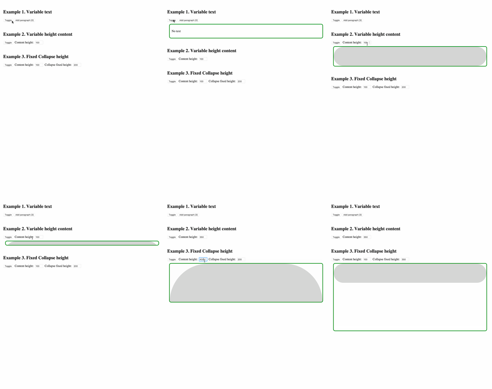
Component-wrapper for collapse animation with react-motion for elements with variable (and dynamic) height
npm install --save react react-motion react-height react-collapseDon't forget to manually install peer dependencies (react, react-motion, react-height) if you use npm@3.
bower install --save https://unpkg.com/react-collapse/bower.zipor in bower.json
{
  "dependencies": {
    "react-collapse": "https://unpkg.com/react-collapse/bower.zip"
  }
}
then include as
<script src="bower_components/react/react.js"></script>
<script src="bower_components/react-height/build/react-height.js"></script>
<script src="bower_components/react-motion/build/react-motion.js"></script>
<script src="bower_components/react-collapse/build/react-collapse.js"></script><script src="https://unpkg.com/react/dist/react.js"></script>
<script src="https://unpkg.com/react-height/build/react-height.js"></script>
<script src="https://unpkg.com/react-motion/build/react-motion.js"></script>
<script src="https://unpkg.com/react-collapse/build/react-collapse.js"></script>
(Module exposed as `ReactCollapse`)http://nkbt.github.io/react-collapse/example
http://codepen.io/nkbt/pen/MarzEg
<Collapse isOpened={true || false}>
  <div>Random content</div>
</Collapse>Expands or collapses content.
One or multiple children with static, variable or dynamic height.
<Collapse isOpened={true}>
  <p>Paragraph of text</p>
  <p>Another paragraph is also OK</p>
  <p>Images and any other content are ok too</p>
  <img src="nyancat.gif" />
</Collapse>If content's height is known ahead it is possible to bypass the process of content height calculation by passing optional fixedHeight prop with number of pixels.
<Collapse isOpened={true} fixedHeight={100}>
  <div>Animated container will always expand to 100px height</div>
</Collapse>Custom config {stiffness, damping, precision} passed to the spring function (see https://github.com/chenglou/react-motion#--spring-val-number-config-springhelperconfig--opaqueconfig)
import {presets} from 'react-motion';

<Collapse isOpened={true} springConfig={presets.wobbly}>
  <div>Wobbly animated container</div>
</Collapse><Collapse isOpened={true} springConfig={{stiffness: 100, damping: 20}}>
<div>Customly animated container</div>
</Collapse>By default ReactCollapse destroys content of collapsed element. setting keepCollapsedContent to true allows to keep content. ReactCollapse renders container with height: 0 and overflow: hidden (with all the content untouched) when closed instead of destroying it. See #18 for details.
Callback function for animation finished from react-motion. It can be used to trigger any function after animation is done.
<Collapse onRest={() => console.log(123)}>
  <div>Container text</div>
</Collapse>Callback function for changes in height as reported by react-height. As an example it can be used to implement auto-scroll if content expand below the fold.
All other props are applied to a container that is being resized. So it is possible to pass style or className, for example.
<Collapse isOpened={true}
  style={{width: 200, border: '1px solid red'}}
  className="collapse">

  <div>
    Animated container has red border, 200px width
    and has `class="collapse"`
  </div>
</Collapse>- initially opened Collapse elements will be statically rendered with no animation (see #19)
- it is possible to override
overflowandheightstyles for Collapse (see #16), and ReactCollapse may behave unexpectedly. Do it only when you definitely know you need it, otherwise, never overrideoverflowandheightstyles. - Due to the complexity of margins and their potentially collapsible nature, ReactCollapse does not support (vertical) margins on their children. It might lead to the animation "jumping" to its correct height at the end of expanding. To avoid this, use padding instead of margin. (see #101)
Currently is being developed and tested with the latest stable Node 6 on OSX and Windows.
Should be ok with Node 4, but not guaranteed.
To run example covering all ReactCollapse features, use npm start, which will compile src/example/Example.js
git clone git@github.com:nkbt/react-collapse.git
cd react-collapse
npm install
npm start

# then
open http://localhost:8080npm test
# to run tests in watch mode for development
npm run test:dev
# to generate test coverage (./reports/coverage)
npm run test:covMIT


