What do you do when you have to evacuate your house due to a wildfire? Obsessively check its progress, of course!
Accordingly, this is a quick project to map the progess of the Thomas Fire, using data from NASA's MODIS and VIIRS satellites.
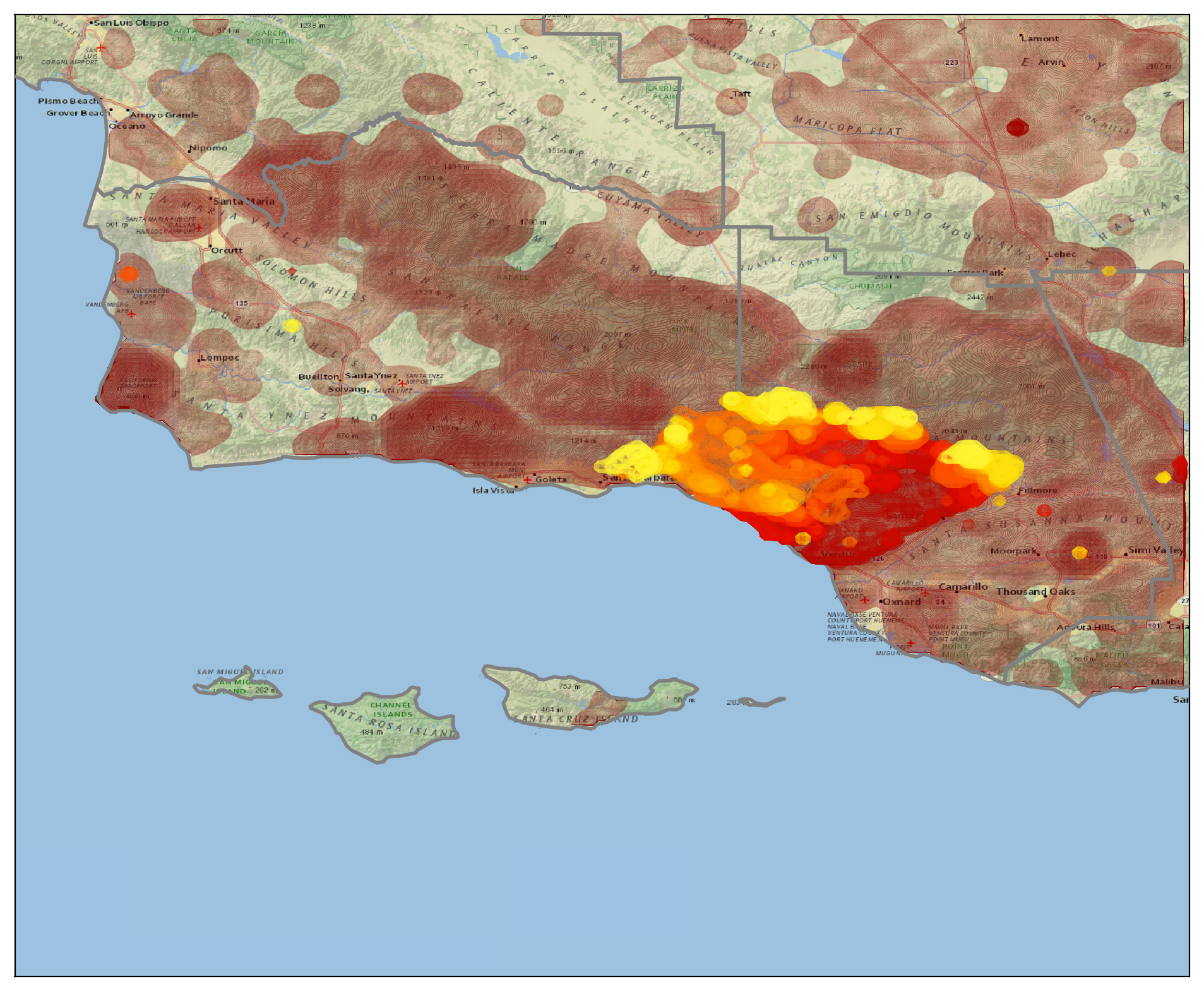
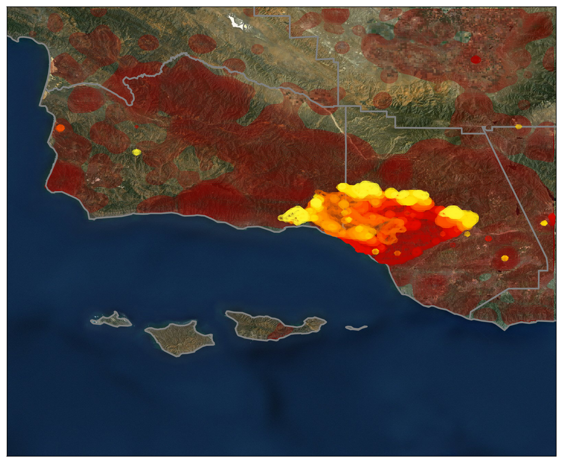
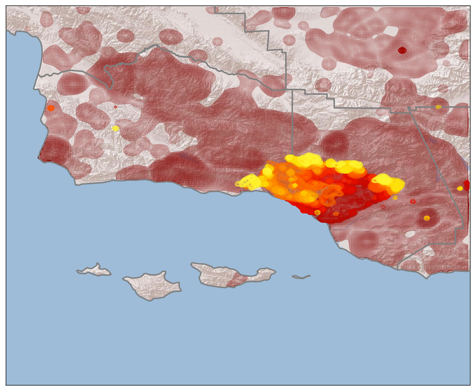
Color shows the progression of the fire, going from red to yellow. In dark red, I show all of the previous fires from the past decade or so. You can see that nearly the entire region has burned in the recent past; even so, the Thomas fire is unprecedented.
Here it is on the National Geographic map of the region:

on NASA's Blue Marble image of Earth:

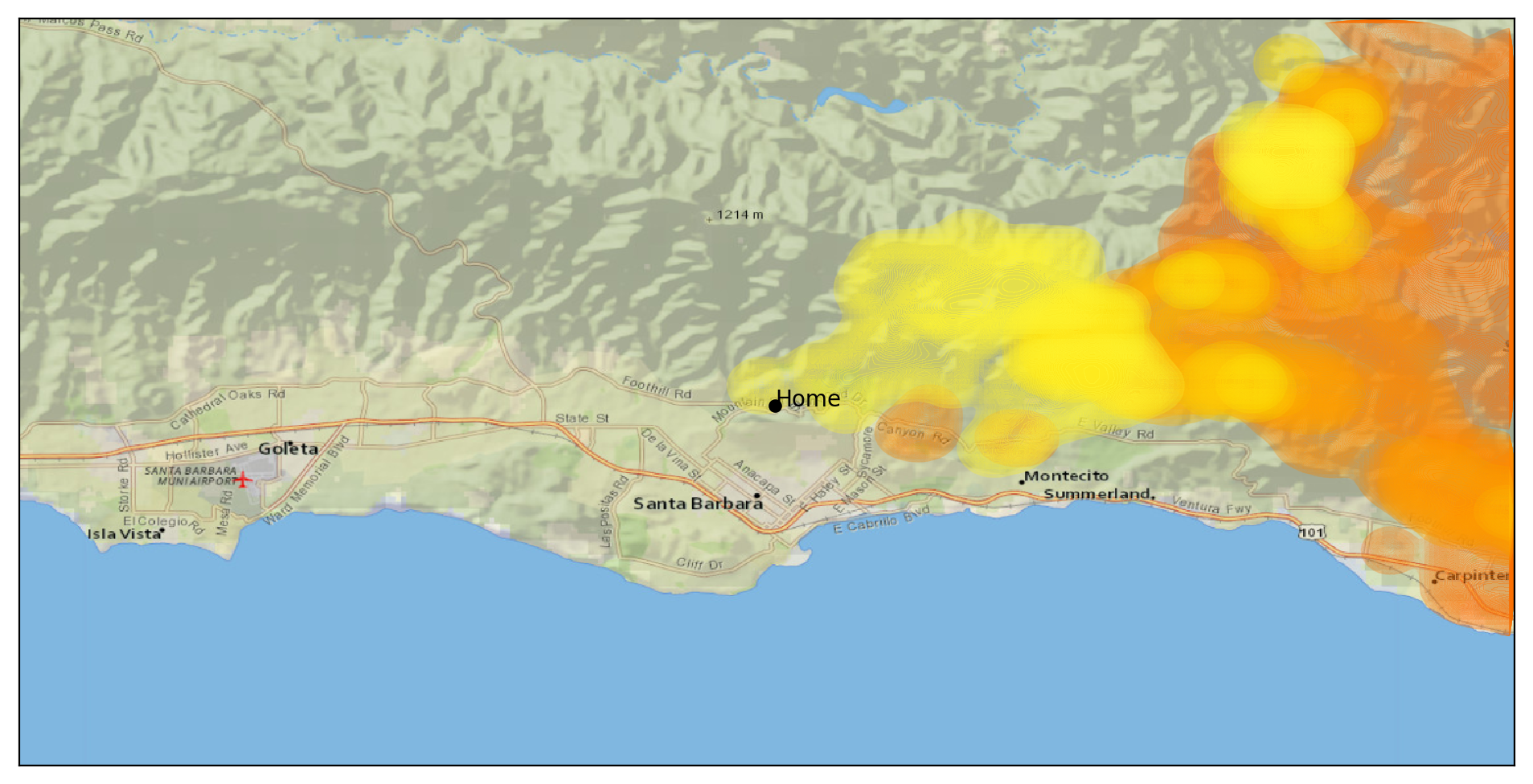
... and a zoom-in on where I live, as of 6pm on 12/16:

If you want to read the code, you can see it here.
Note: please don't use this for any kind of emergency planning or preparation! I'm using data from NASA's satellites, which can be 1-2 days old by the time it becomes available, and on top of that I'm only updating these maps ~once per day. My only aim is to show the scope of the fire; check your local fire department, sheriff's department, and news stations for up-to-date information.
