Erik Garrison, Julian Lucas, Giulio Formenti, Nadolina Brajuka
First presented at the HPRC annual meeting workshop, October 11, 2022.
Second iteration at Workshop on Genomics, Český Krumlov, May 20, 2023.
Third iteration at Workshop on Genomics, Český Krumlov, January 13, 2024.
This tutorial builds interactive understanding of the PanGenome Graph Builder (pggb) command line tool. We'll build some graphs and inspect them to understand how the method works and the effects of some of its key parameters.
In this exercise you learn how to
- build pangenome graphs using
pggb, - explore
pggb's results, - understand how parameters affect the built pangenome graphs.
There are other methods to build these graphs, like the minigraph-cactus pipeline. We're presenting pggb because of its easy interactive use and flexibility with diverse inputs of various scales.
Make sure you have pggb and its tools installed.
If you're at Evomics2024, this is true. You can skip this section!
The easiest way to set things up using docker.
docker pull ghcr.io/pangenome/pggb:latest
Also make sure you have checked out pggb repository:
git clone https://github.com/pangenome/pggb.git
Note that the Docker image is built for x86_64 and if you're on an M1 Mac or other platform you will need to use docker build --target binary -t ${USER}/pggb:latest . in the pggb repository to run the build build.
Now create a directory to work on for this tutorial:
mkdir hprc-workshop
cd hprc-workshop
cp -r ~/pggb/data .
Now we set up a docker interactive session, mounting this directory in our /root or $HOME.
# run docker with pggb's latest image
docker run -it -v $(pwd):/root \
    ghcr.io/pangenome/pggb:latest /bin/bash
cd /root # change into root's $HOME
ls data  # should show our pggb test data
We can look at the results from outside of the docker container. That tends to be easier as the image doesn't include things like image viewers.
In short, pangenome graphs are multiple alignments. They differ from multiple sequence alignments in that they are nonlinear, and can support any kind of variation that arises in DNA evolution---including inversions and segmental duplications---which form loops and other complex structures in the graph.
We begin with an alignment, with wfmash. This compares all sequences to each other and finds the best N mappings for each. It produces base-level alignments.
These base-level alignments are converted into a graph with seqwish. A filter is applied to remove short matches, which anchors the graph on confident longer exact matches.
To normalize the graph and harmonize the allele representation, we use smoothxg to apply a local MSA across all parts of the graph.
We also run gfaffix to remove redundant bifurcations in the graph (e.g. two paths diverge, but say the same thing).
We can do many things with these graphs. First, we get a number of diagnostic images out of the pipeline, based on the graphs. These give a human interface to the graph models that can help us to understand the alignments at a high level. We're also able to produce variant calls (in pggb), using vg deconstruct. The graphs from pggb can be used as reference systems for short read alignment with vg giraffe or long read alignment with GraphAligner. Using odgi we can use the graphs as reference systems to describe homology relationships between whole genomes.
First, change directory into the workshop data directory.
cd ~/workshop_materials/pangenomics
You should see HLA-zoo. That has our initial data for this workshop.
See if you can find where the sequence data is in this directory.
Let's get a web server running that will let us look at images generated very quickly:
python -m http.server 8899
You can access this by pointing your web browser at http://<your_ip>:8899/, where <your_ip> is the ip address of your instance.
The human leukocyte antigen (HLA) system is a complex of genes on chromosome 6 in humans which encode cell-surface proteins responsible for the regulation of the immune system.
Let's build a pangenome graph from a collection of sequences of the DRB1-3123 gene:
pggb -i HLA-zoo/seqs/DRB1-3123.fa -n 12 -t 8 -o DRB1_3123.1
Run pggb without parameters to get information on the meaning of each parameter:
pggb
Take a look at the files in the DRB1_3123.1 folder.
We get a graph in GFA (*.gfa) and odgi (*.og) formats. These can be used downstream in many methods, including those in vg, like vg giraffe. You can visualize the GFA format graph with BandageNG, and use odgi directly on the *.gfa or *.og output.
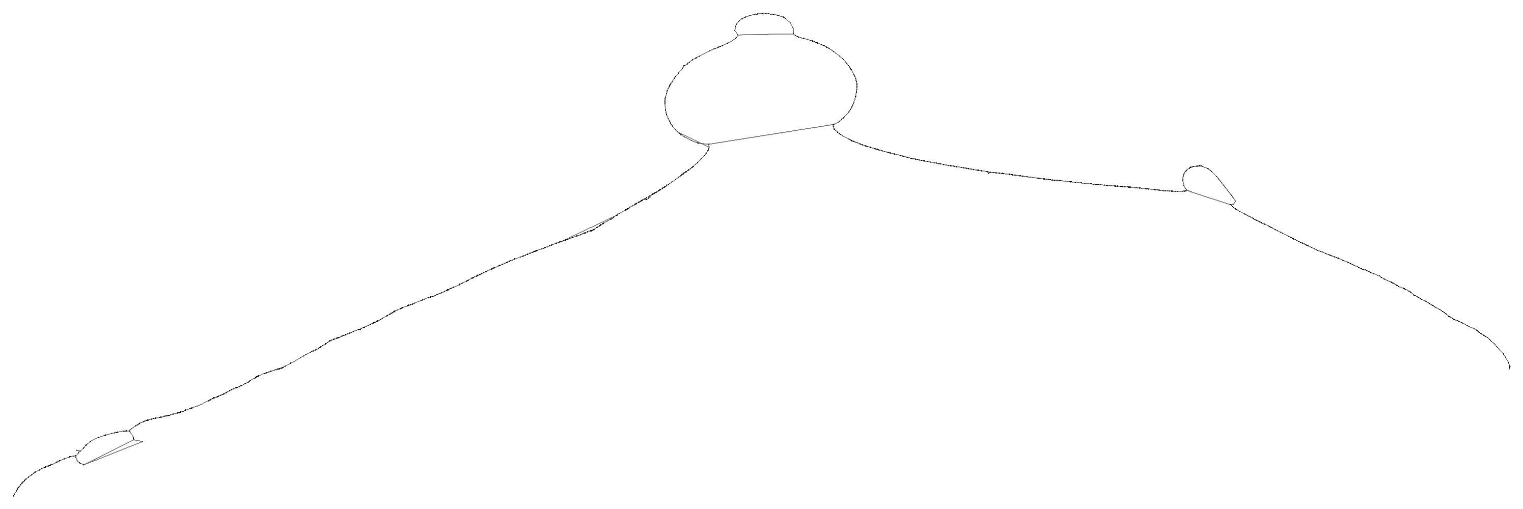
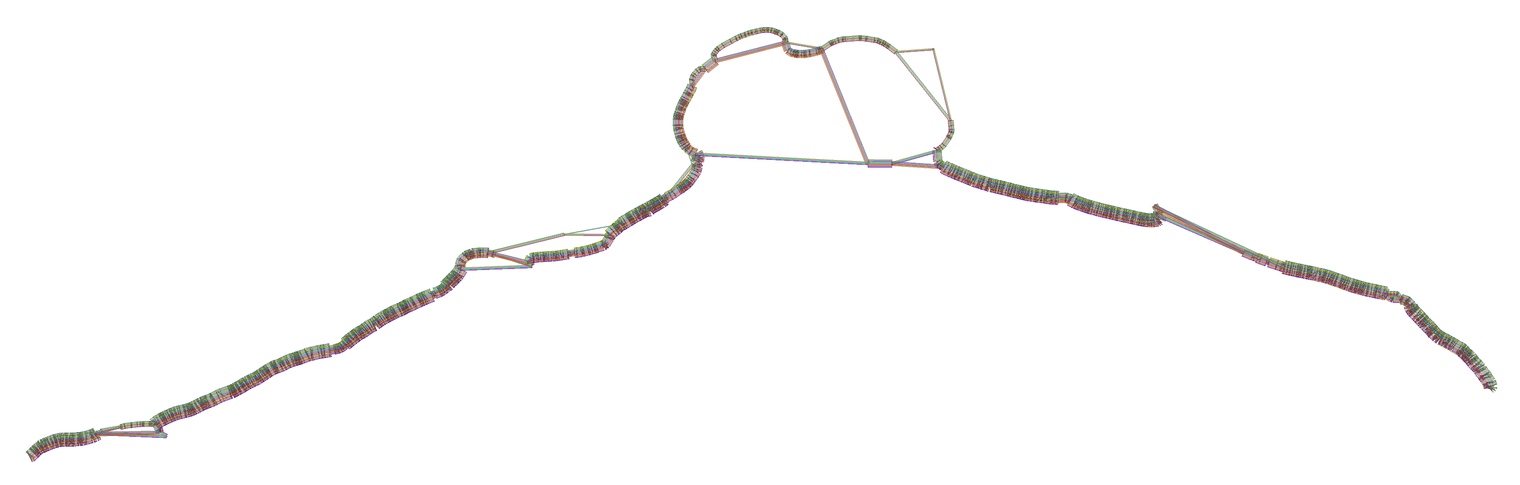
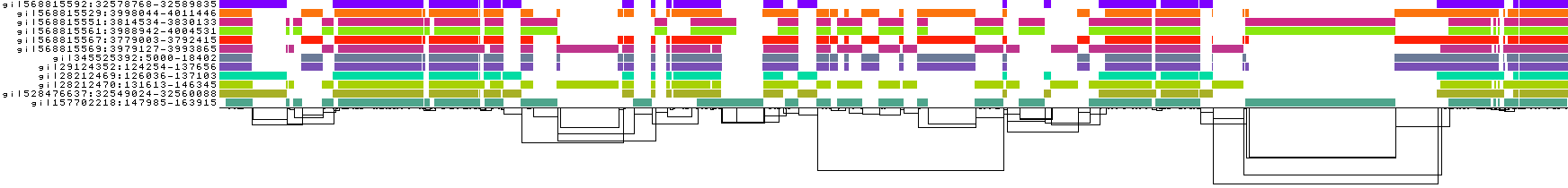
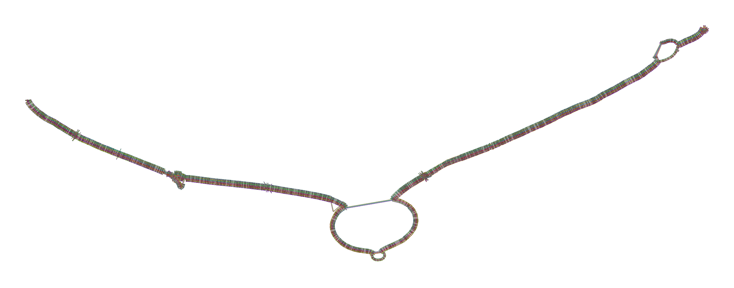
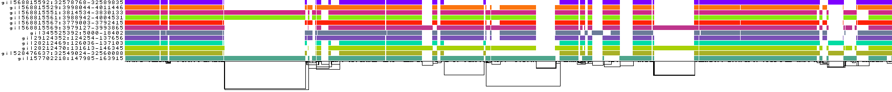
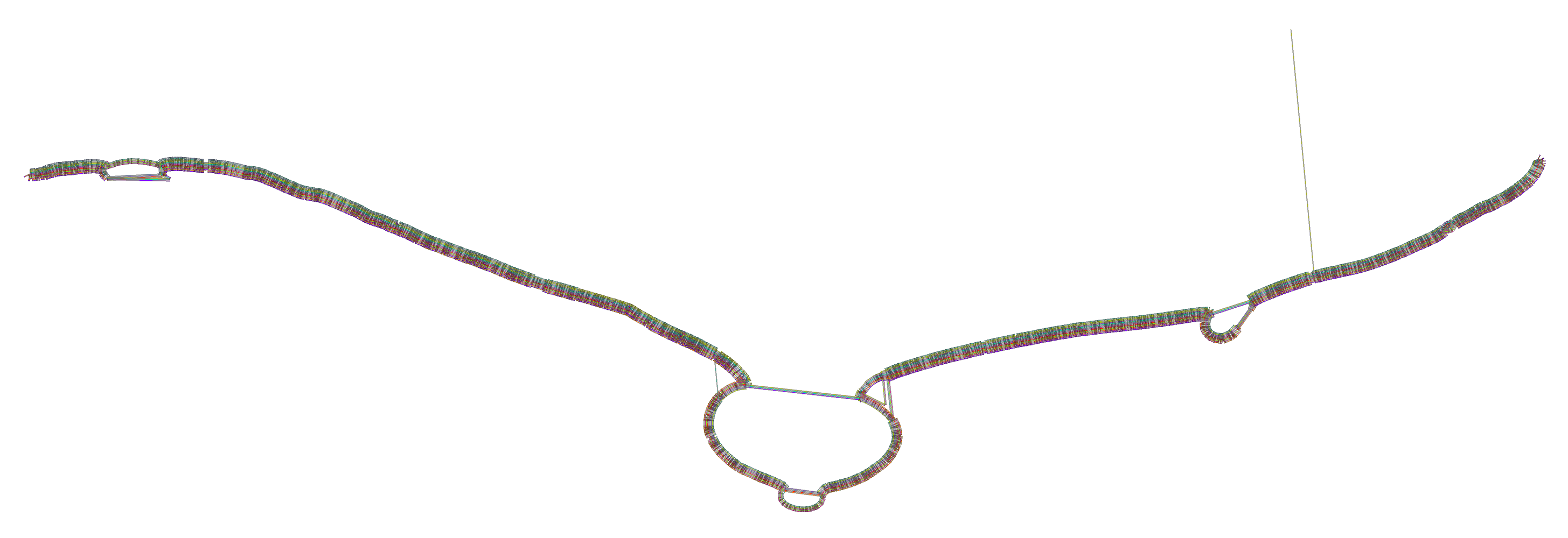
We obtain a series of diagnostic images that represent the pangenome alignment. These are created with odgi viz (1D matrix) and odgi layout with odgi draw (2D graph drawings).
First, the 2D layout gives us a view of the total alignment. For small graphs, we can look at the version that shows where specific paths go (*.draw_multiqc.png):
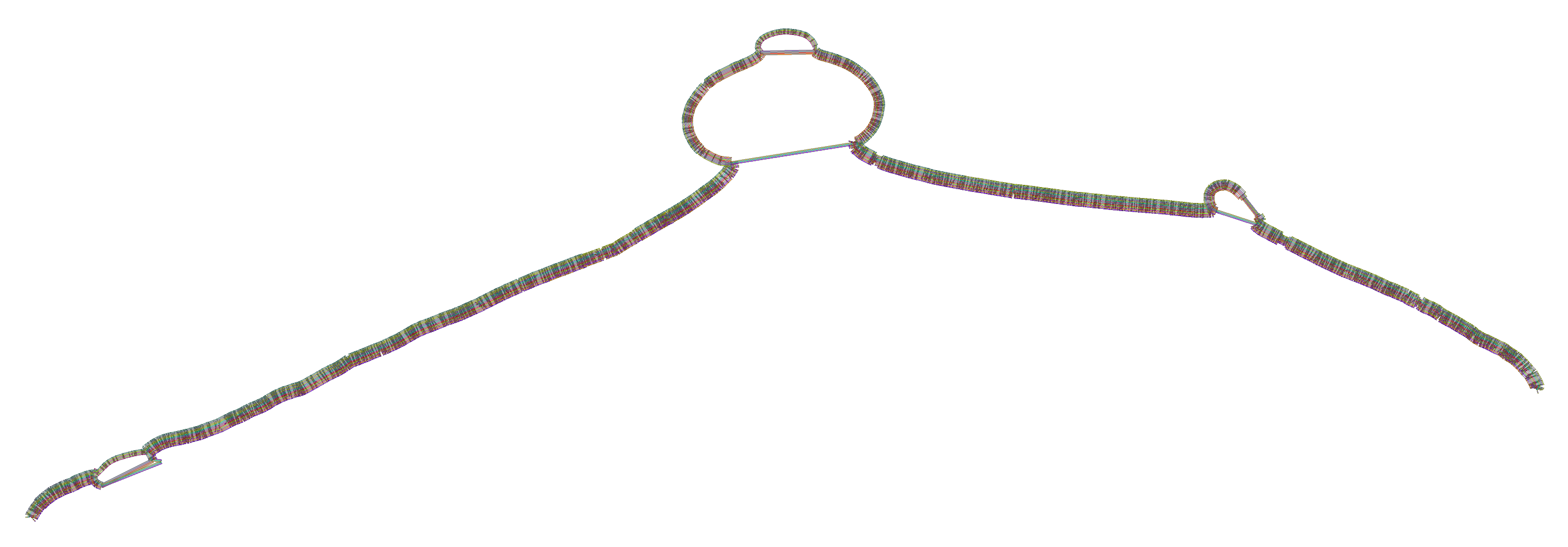
For larger ones, the *.draw.png result is usually more legible, but it lacks path information:
We also get some 1D visualizations. These present the graph as a kind of matrix. Across the x-axis we have nodes of the graph (scaled by length) and across the y-axis we have paths, or sequences, which have been embedded in the graph.
This layout is capable of representing several kinds of information using color.
The default associates a color with each path. This is stable across different runs of odgi viz:
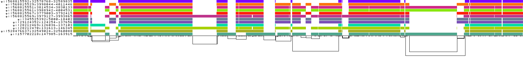
We also have a view that shows the "self depth" across the graph. In this case there are no looping paths, so the color is always gray=1x.
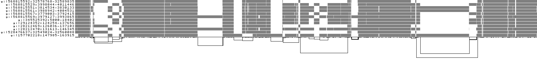
We can look at orientation of paths using two views.
One shows the "position" of each path relative to the graph. It runs light to dark from 0 to path length.
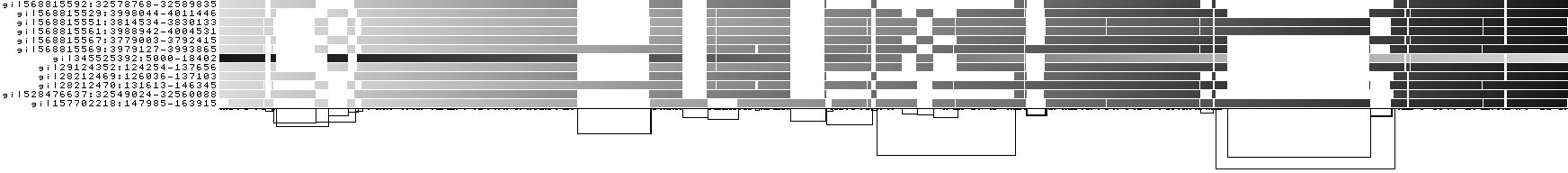
A similar view shows inverted regions of paths relative to the graph in red, while the forward orientation in black.
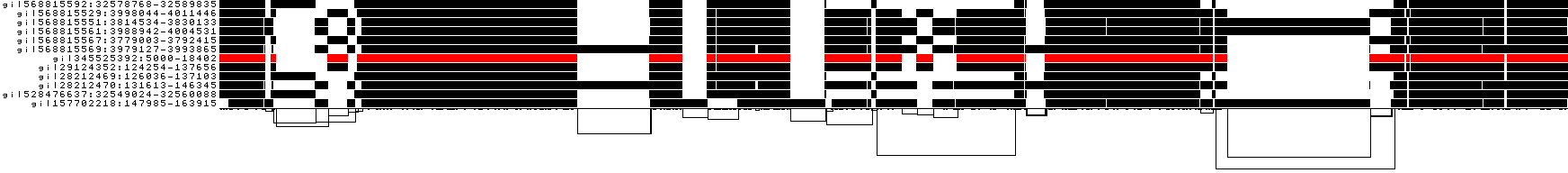
And finally, a compressed view shows coverage across the pangenome coordinate space of all paths. It's a kind of heatmap. This helps when we have a lot of paths to consider:

How many alignments were executed during the pairwise alignment (take a look at the PAF output)? Visualize the alignments:
pafplot -s 2000 DRB1_3123.1/DRB1-3123.fa.bf3285f.alignments.wfmash.paf
Now, from outside the container, use a file browser to open images produced by the process. (On ubuntu linux we can use eog to view the PNGs in a whole folder: eog DRB1_3123.1.)
Use odgi stats to obtain the graph length, and the number of nodes, edges, and paths.
odgi stats -i DRB1_3123.1/DRB1-3123.fa.bf3285f.eb0f3d3.9c6ea4f.smooth.final.og -S
Do you think the resulting pangenome graph represents the input sequences well? Check the length and the number of the input sequences to answer this question.
Another key parameter is -k, which affects the behavior of seqwish. This filter removes exact matches from alignments that are shorter than -k. Short matches occur in regions of high diversity. In practice, these short matches contribute little to the overall structure of the graph, and we remove them to further simplify the base graph structure.
Try setting a much higher -k than the default (-k 19):
pggb -i HLA-zoo/seqs/DRB1-3123.fa -n 12 -k 47 -t 8 -o DRB1_3123.2
The graph starts to become "braided". We might say that it is underaligned.
We can go lower (try -k 7 or -k 0) or higher (try -k 79).
pggb -i HLA-zoo/seqs/DRB1-3123.fa -n 12 -k 0 -t 8 -o DRB1_3123.3
Pangenome variation graphs built by pggb are based on homology mappings from MashMap3, as implemented in wfmash.
The homology maps are built using segments of a fixed size, rather than short k-mers for instance as in minimap2, which makes them suitable for quickly finding high-level patterns of homology.
(The precise base-level alignments are derived by applying a modification of the bidirectional wavefront algorithm, BiWFA, in wfmash.)
You can think of -s as a seed length for the mappings.
It defaults to 5kb, which testing has shown to provide a good tradeoff for computational efficiency, graph collinearity, and SV breakpoint detection.
Setting it much higher can start to reduce sensitivity to small homologies, which we can see in the current example:
pggb -i HLA-zoo/seqs/DRB1-3123.fa -n 12 -s 10k -t 8 -o DRB1_3123.4
Increasing -s results in a touch of "underalignment". One of the sequences is not completely aligned into the graph, resulting in the appearance of a new graph tip.
This is also visible in the 1D visualizations, to the right-hand side:
But, it's worth noting that when running with large eukaryotic genomes rather than this kind of focused example, we often set -s higher, sometimes up to 50k. This of course can result in problems like the one here, but it may make the graph construction much more tractable.
The -p setting affects the level of pairwise divergence that's accepted in the mapping step. This parameter is given to wfmash.
What happens if we set this higher than the default -p 90?
pggb -i HLA-zoo/seqs/DRB1-3123.fa -p 95 -n 12 -t 8 -o DRB1_3123.5
We lose mappings, as visible with pafplot:
And this is visible in the diagnostic plots, which show that the graph has been broken into isolated components formed by sets of sequences that have >95% pairwise identity:


Note that DRB1-3123 represents a very extreme situation in the human genome---these gene sequences are diverged by up to 20% and lie in the MHC class II region, which is a site of ongoing diversifying selection and frequent incomplete lineage sorting in the primate clade. Parameter settings for whole genomes and chromosomes often are more stringent than those we've tested here (e.g. -k 79 or even -k 311 helps to reduce complexity in human satellites).
Choose another HLA gene from the data folder and explore how the statistics of the resulting graph change as s, p, n change. Produce scatter plots where on the x-axis there are the tested values of one of the pggb parameters (s, p, or n) and on the y-axis one of the graph statistics (length, number of nodes, or number of edges). You can do that using the final graph and/or the intermediate ones.
For example:
pggb -i HLA-zoo/seqs/B-3106.fa -n 9 -t 8 -o B-3106.1
Or
pggb -i HLA-zoo/seqs/TAP2-6891.fa -n 11 -t 8 -o TAP2-6891.1
To set -n, count the lines in the .fai index files. This gives the number of sequences in the input:
wc -l HLA-zoo/ses/TAP2-6891.fa.fai
Now, let's scale up our pangenome building. To do so, we'll work with some of the first long-read based pangenome sequences, from Yue, JX., Li, J., Aigrain, L. et al. Contrasting evolutionary genome dynamics between domesticated and wild yeasts. Nat Genet 49, 913–924 (2017)..
To go quick, we can start with assemblies of chrV alone. Working with this will be practically interactive.
First, let's get assemblies of chrV.
wget http://hypervolu.me/~erik/yeast/cerevisiae.chrV.fa.gz
To work with these, we should generate a FASTA index (n.b. pggb will complain if you don't):
samtools faidx cerevisiae.chrV.fa.gz
How many genomes are represented here?
wc -l cerevisiae.chrV.fa.gz.fai
# 7 cerevisiae.chrV.fa.gz.fai
Note that we've used PanSN naming, which is a basic model for providing a hierarchical namespace for sequences in a pangenome. It's a bit like directory names, but we use # rather than /. Let's take a look at the names:
% column -t cerevisiae.chrV.fa.gz.fai
S288C#1#chrV        583092  14       60  61
DBVPG6765#1#chrV    576784  592843   60  61
UWOPS034614#1#chrV  555692  1179261  60  61
Y12#1#chrV          575802  1744227  60  61
YPS128#1#chrV       575962  2329641  60  61
SK1#1#chrV          589812  2915215  60  61
DBVPG6044#1#chrV    572248  3514876  60  61
The format is sample#hap#contig, where the haplotype is always 1 because these are haploid assemblies, and the contigs are all chrV because all these genomes have homologus versions of chrV.
Running pggb on these is very easy, because it detects the PanSN naming and can compute how many genomes are involved (7):
pggb -i cerevisiae.chrV.fa.gz -t 8 -o yeast.chrV.1
Test out the build, look at the outputs.
We can also generate a VCF file, using S288C as the reference genome:
pggb -i cerevisiae.chrV.fa.gz -t 8 -o yeast.chrV.2 -V S288C
The VCF file is written into the output directory.
You may see that some of the VCF records are very large.
These come from large variants.
For instance, if any genome has a deletion relative to the reference used in the VCF file, we'll need to represent all of the non-reference alleles which don't have the deletion by their complete sequence.
Smaller variation can reside "inside" of the top-level variable site.
To see these variants easily, we need to run a kind of normalization or decomposition process.
Because this decomposition is a standard step, pggb provides a way to do this easily by modifying the VCF output specification like so:
pggb -i cerevisiae.chrV.fa.gz -t 8 -o yeast.chrV.2 -V S288C:10000
Now variants greater than 10kb are "popped" and not represented in the output (with vcfbub).
We decompose variants that "nest" inside of them.
Variants shorter than 10kb are decomposed by realigning them to the reference allele using a tool in vcflib called vcfwave.
This uses BiWFA, which can scale to very large alignment pairs in O(score) memory.
Why do we need to do this? A few reasons:
- The VCF decomposition of the variation graph built by
vg deconstructwill represent structural variants in a base-accurate way. This leads to large structural variants being represented by sites with an alternate allele for approximately each haplotype crossing the locus, even if these are only very small differences. Why? Small variants distinguish each allele, leading to multiple representation. - SNPs and other small variants nested inside large variants are "lost" from the perspective of VCF records. But, we may want to work with these.
- The same loss and clumping confusion happens for indel SVs.
We can also replicate this process for the entire yeast genome:
wget http://hypervolu.me/~erik/yeast/cerevisiae.pan.fa.gz
Run pggb on the whole genome.
What's different about the output graph?
Can you see any rearrangements or translocations?
Lipoprotein(a) (LPA) is a low-density lipoprotein variant containing a protein called apolipoprotein(a). Genetic and epidemiological studies have identified lipoprotein(a) as a risk factor for atherosclerosis and related diseases, such as coronary heart disease and stroke.
Try to make LPA pangenome graphs. The input sequences are in ~/software/.source/pggb/data/LPA/LPA.fa.gz. Sequences in this locus have a peculiarity: which one? Hint: visualize the alignments and take a look at the graph layout (with Bandage and/or in the .draw_multiqc.png files).
Here's a hint:
pggb -i ~/software/.source/pggb/data/LPA/LPA.fa.gz -t 8 -o LPA.1
This results in a graph which has some underalignment in the key kringle domain repeat.
How might we fix this, to encourage the motif to collapse into a single representation in the graph?
(Hint: add -c 2 to increase mappings per sequence, decrease segment length to -s 2k, etc.)