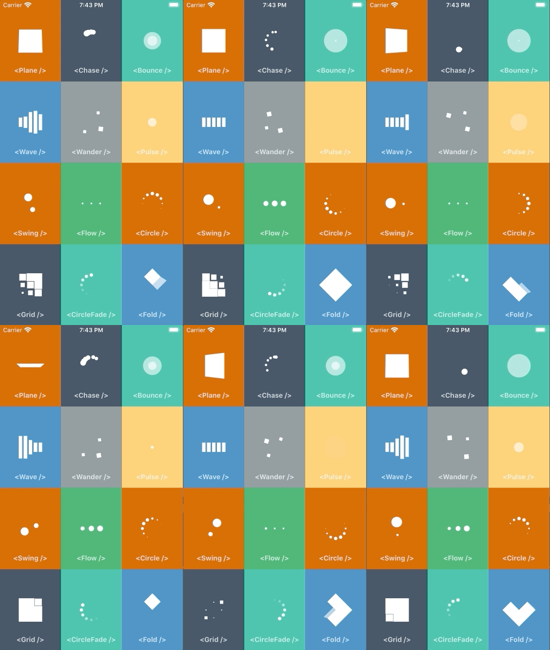
A pure JavaScript port of SpinKit for React Native.
The previous port of SpinKit for React Native (react-native-spinkit) is a native module so it requires extra native dependencies and can't be used in Expo projects without ejecting.
This library is a pure JavaScript port of SpinKit implemented with the Animated API, which means you can use it in any React Native project and the spinners will look identical on Android and iOS.
yarn add react-native-animated-spinkitor
npm install react-native-animated-spinkitimport { Plane } from 'react-native-animated-spinkit'
function App() {
return (
<View style={styles.container}>
<Plane size={48} color="#FFF" />
</View>
)
}Inherits View Props
number| defaults to48
Width and height of the spinner.
string| defaults to#000
Color of the spinner.
boolean| defaults totrue
Whether to show the indicator or hide it.
boolean| defaults totrue
Whether the indicator should hide when not animating.
All the spinners from SpinKit have been ported.
<Plane /><Chase /><Bounce /><Wave /><Pulse /><Flow /><Swing /><Circle /><CircleFade /><Grid /><Fold /><Wander />
To run the example project, follow these steps:
- Clone the repo
- Run these commands
yarn
cd example
yarn && yarn start
