This web interface is used to explore phylogenomic evidence of outbreaks and is the visualization component of PathoSPOT, the Pathogen Sequencing Phylogenomic Outbreak Toolkit.
For a live demo, please see the PathoSPOT website.
The pathoSPOT-compare pipeline must first be used to run the analyses that supply this web interface. Typically, you will want to run the parsnp, encounters, and epi tasks. Please refer to the pathoSPOT-compare documentation to get started.
If you use this software, please cite:
Berbel Caban A, Pak TR, Obla A et al. PathoSPOT genomic epidemiology reveals under-the-radar nosocomial outbreaks. Genome Medicine 2020 Nov 16;12(1):96. PMID:33198787 doi:10.1186/s13073-020-00798-3
Apache, PHP, and Python. Could be readily hosted in a Minerva www directory.
Python is required for running the contents of scripts/, which some of the PHP pages will need to do for each page request. They require two 3rd party modules: NumPy and ete3.
If you use Vagrant to create an environment for pathoSPOT-compare, this software and its requirements are automatically included as well, and Apache will automatically serve the website on port 80. However, there is no requirement to have the pipeline and this web interface on the same machine. They were designed so that the output files (listed below) could be easily moved to be served from a more convenient location, e.g. your lab's webserver, an Amazon EC2 instance, etc.
- Clone this repository into a web-accessible directory.
- Supply analysis outputted from pathoSPOT-compare by placing it in
data/. All the output files read by this package include a YYYY-MM-DD formatted date in the filename and have one of the following endings:.parsnp.heatmap.json→ produced by pathoSPOT-compareparsnptask.parsnp.vcfs.npz→ produced by pathoSPOT-compareparsnptask.encounters.tsv→ produced by pathoSPOT-compareencounterstask.epi.heatmap.json→ produced by pathoSPOT-compareepitask
- Access
heatmap.phpvia a web browser.
- Copy
php/example.include.phptophp/include.phpand edit the stubs to include extra HTML, CSS, or JS in the visualizations. This could be used to theme the pages or integrate them into another website.- Important: ensure
$PYTHONis set to your preferred Python interpreter.
- Important: ensure
- Copy
js/example.config.jstojs/config.jsand edit the variables there to change link destinations and other properties of the visualizations.
An index.php is included which by default shows the splash page from the PathoSPOT website, but you could replace this with whatever you like. Alternatively, you can link directly to various visualizations from your own website or internal dashboard using the URL parameters detailed below.
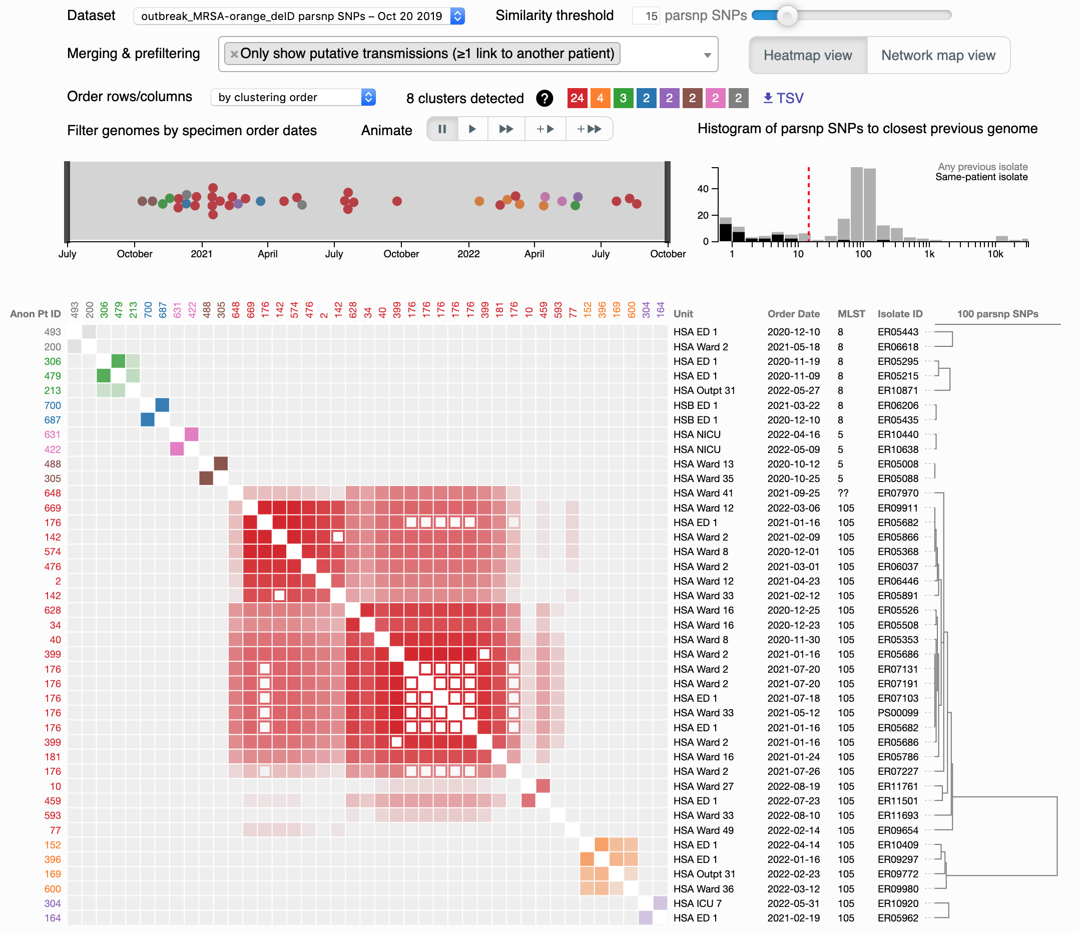
This visualization allows you to interactively create and explore clusters of genomes suspicious for transmission. Click the screenshot for an interactive demo.
The main area is a clustered heatmap of pairwise genome-to-genome distances. Any pairs falling underneath the similarity threshold (controlled by the slider at top right) light up as colored blocks along the diagonal. Colors are arbitrarily assigned (a color legend is seen next to 8 clusters detected), and these delineate clusters suspicious for transmission at your chosen threshold. Pairs of genomes from the same patient are depicted as open squares, while the remainder are filled. You can hover over a square to see details in a tooltip, and if you click, links are provided including Explore this cluster which takes you to the dendro-timeline.
To help empirically choose a threshold, a histogram of distances is provided above and to the right of the heatmap. These distances are separated into two categories: the lowest distance from each genome to any prior sampled genome (light gray bars) vs. the lowest distance to prior genomes from the same patient (black bars). In general, the former is a bimodal distribution, with the leftmost peak partially covered by the latter distribution. This leftmost peak represents genomes that are either from the same infection/colonization (same-patient distances), or, if from different patients, should be suspicious for transmission. A sensible threshold attempts to separate this peak from the right-side peak, with represents the genomic variation in the greater community. You can click on the histogram directly to change the threshold.
In our example, only genomes in a cluster with a different-patient isolate are shown, while the rest are hidden. This can be adjusted by changing the Merging & prefiltering settings, specifically "Only show putative transmissions." Another key setting here is "Merge similar specimens from the same patient," which can help simplify your visualization by removing open squares (which are not informative for finding transmissions).
To the left of the histogram is a beeswarm plot showing the distribution of sampled genomes over time. If you have decided to show them, unclustered genomes are light gray circles, while those in a cluster are shaded with that cluster's color. You can click and drag to filter the heatmap to a specific time period.
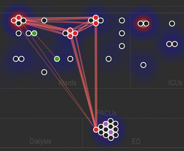
As an alternative to the heatmap, you can also use the "Network map view" which takes the nodes in the beeswarm and plots them spatially on a map, with red lines to depict genetic links within the similarity threshold. This can even be animated; click the above screenshot to see an example. Underneath the node-link diagram is a density plot of overall positive culture tests supplied by the rake epi task.
You can link directly to heatmap.php from external tools, in which case it may useful to supply query string parameters to preconfigure the view in a particular way. The following parameters are available:
db: which dataset to load. This is the name of the.parsnp.heatmap.jsonfile, minus the.heatmap.jsonsuffix.filter: which Merging & prefiltering rules to apply. An easy way to do this is to change this interactively, and it will update in the address bar.snps: the starting similarity threshold; should be a number from 1 to 100.order: how to sort rows and columns of the heatmap; the default isgroupOrderwhich attempts to arrange clusters along the diagonal.range: the range of the beeswarm timeline to select; specified as two float values ranging from 0.0 to 1.0, separated by the|character.mode: if set tonetwork, will start the visualization in the network map view.play: if provided, will animate the visualization in one of four modes; use an integer from 1 to 4.
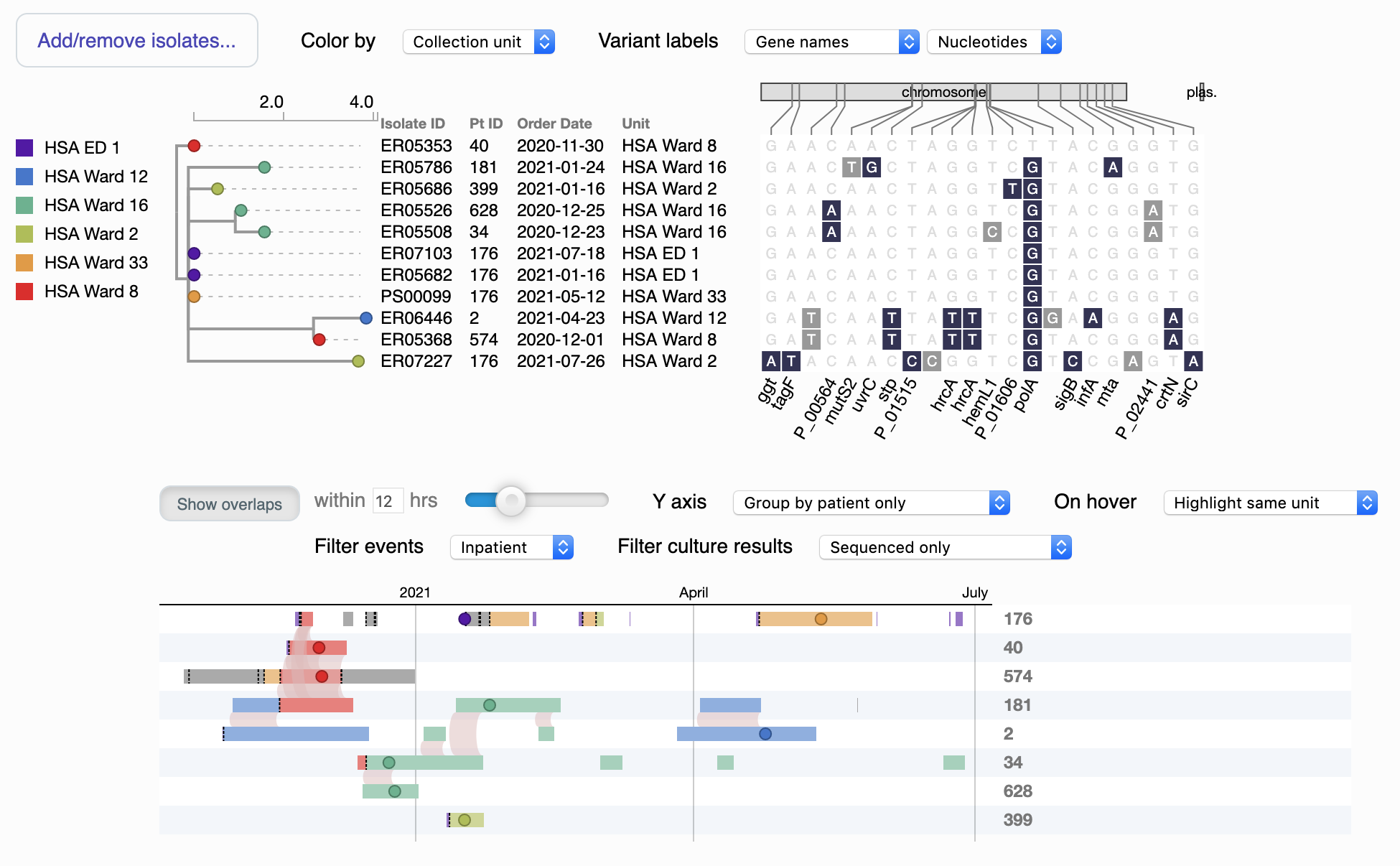
This visualization allows you to explore and compare the genetic and spatiotemporal relationships within a cluster, usually offering insight into the overlaps that facilitated transmission events. Click the screenshot for an interactive demo.
Starting from the upper left, the "tree" is a dendrogram depicting genetic relationships between the genomes. (If you arrive here from the heatmap, typically these are all of the genomes in a particular cluster, although you can add and remove isolates manually using the button in the upper left). You can change how the nodes are colored using the Color by dropdown; the default uses the location of collection, and a color legend is at far left. Distances are scaled to SNPs per Mbp of reference genome.
To the right of the dendrogram are details on each genome, including the date and location of collection and a diagram of SNPs that differentiate this genome from the others. You can alter the labels for these SNPs using the Variant labels dropdowns, including showing them as predicted amino acids (if within an annotated open reading frame). Synonymous substitutions are in light gray, while nonsynonymous substitutions are dark blue.
The bottom of the visualization is a timeline of patient movements with the genomes overplotted as filled circles. Colors correspond to either locations or times, same as for the dendrogram. You can hover over elements to see more details in a tooltip, and pan and zoom with your mouse and mousewheel (or two-finger scroll). Light red arcs show overlaps in location between different patients, within the threshold set by the slider (e.g. a patient leaving a unit X hours before the next one arrives still counts as an overlap).
You can filter location data by inpatient vs outpatient using Filter events. If available, results for unsequenced culture tests supplied in the .epi.heatmap.json file can be plotted as X's and unfilled circles using Filter culture results. You can change the layout of the Y axis using the Y axis dropdown.
Finally, you can help correlate particular genomes across the timeline and dendrogram by changing the symbol used; to do this, click the node on either part of the visualization, and it will update on both (more clicks will cycle through the symbols). You can alt- or option-click to reset it to the default of a small filled circle.
You can link directly to dendro-timeline.php from external tools, in which case it may useful to supply query string parameters to preconfigure the view in a particular way. The following parameters are available:
db: which dataset to load. This is the name of the.parsnp.heatmap.jsonfile, minus the.heatmap.jsonsuffix.assemblies: which genomes to show; these are the names separated by either+or%20.colorNodes: how to color the nodes; eithercollectionUnitfor location ororderedfor time.variantLabelsandvariantNtOrAa: how to label the SNP diagram.*showOverlaps: whether to draw the red arcs for spatiotemporal overlaps (set to 1) or not (set to 0).tolerance: the threshold for calling a spatiotemporal overlap.*filter: filters events in the timeline; eitherinpatient,outpatient, or leave blank to show both.isolateTests: how to plot the unsequenced culture tests.*timelineGrouping: how to arrange the Y axis of the timeline.*sort: the starting Y axis sort order for the timeline, which can be manually reordered by dragging rows; supplied as JSON compressed with JSONCrush.*
* For these parameters, it is likely easiest to derive your intended setting by interacting with the visualization and using the updated value in the address bar.
Software in this repository (not inclusive of library dependencies or software downloaded and installed alongside it when it is executed) is licensed under the standard MIT license, a permissive free software license. See the LICENSE.txt for more details.


