Children exposed to any level of lead may face serious, irreversible harm that has consequences throughout their lifetimes. Children under the age of six are at greatest risk for exposure because they explore the world through hand-to-mouth activity and because their bodies are rapidly growing and can more readily absorb lead. Elevated blood lead levels in children can result in behavioral changes, reduced educational attainment and hearing and speech delays.
In New York City, children are required to be tested for lead poisoning at around age 1 and age 2, and to be screened for risk of lead poisoning, and tested if at risk, up until age 6. NYC through the Department of Health and Mental Hygiene publishes open-source yearly data on lead levels in children under 6 years of age. These data are an indicator of children younger that 6 years of age tested in NYC in a given year with blood lead levels of 5 mcg/dL or greater, a threshold reference level set by the CDC.
To check trends in children with elevated Blood Lead Levels (BLL) overtime in different neighborhoods of NYC, and find out NYC neighborhoods having high proportions of children with elevated BLL.
Original data was downloaded as a CSV file from NYC OpenData website:
https://data.cityofnewyork.us/Health/Children-Under-6-yrs-with-Elevated-Blood-Lead-Leve/tnry-kwh5
Here is a brief description of what I did with the data:
- Created a Jupyter Notebook and read the csv file into a dataframe.
- Removed unnecessary columns from the dataframe and renamed a few of those.
- Explored data in a few columns by using Pandas value_counts() function.
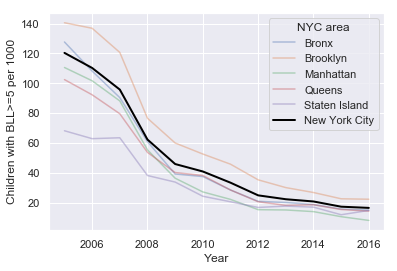
- Using matplotlib and Seaborn libraries, generated side-by-side line plots of children with BLL>=5, BLL>=10 and BLL>=15, for each NYC borough and all of NYC.
- Since Brooklyn showed the hightest BLL cases, generated line plots for different neighborhoods in Brooklyn and found that Greenpoint neighborhood in Brookyn had the most cases of high BLL in children.
- My findings matched well with the stories published in the media:
https://blogs.ei.columbia.edu/2017/10/09/many-backyards-in-brooklyn-neighborhood-are-contaminated-with-high-levels-of-lead/
https://www1.nyc.gov/assets/doh/downloads/pdf/lead/lead-2012report.pdf
# Author: Ved P Sharma
# Date: 02/23/2020

import numpy as np # linear algebra
import pandas as pd # data processing, CSV file I/O (e.g. pd.read_csv)
import matplotlib.pyplot as plt
import seaborn as sns
sns.set()
# Importing csv files and cleaning data by deleting unwanted columns and deleting rows with N/A values
folderName = 'd:/Users/ved/Data Science/NYC_BLL/'
fileName = 'NYC_Children_under_6_BLL.csv'
df = pd.read_csv(folderName+fileName)
#dfdf = df.iloc[:, :19]#dfold_colnames = df.columns.tolist()
new_colnames = old_colnames[:5] + ['BLL_5', 'BLL_5_notes', 'BLL_10', 'BLL_10_notes', 'BLL_15', 'BLL_15_notes',
'Tested', 'Tested_notes', 'BLL_5_per1000', 'BLL_5_per1000_notes',
'BLL_10_per1000', 'BLL_10_per1000_notes', 'BLL_15_per1000', 'BLL_15_per1000_notes']
print(new_colnames)
len(new_colnames)['geo_type', 'geo_area_id', 'geo_area_name', 'borough_id', 'time_period', 'BLL_5', 'BLL_5_notes', 'BLL_10', 'BLL_10_notes', 'BLL_15', 'BLL_15_notes', 'Tested', 'Tested_notes', 'BLL_5_per1000', 'BLL_5_per1000_notes', 'BLL_10_per1000', 'BLL_10_per1000_notes', 'BLL_15_per1000', 'BLL_15_per1000_notes']
19
df.columns = new_colnames
#dfdf['geo_type'].value_counts()Neighborhood (UHF 42) 504
Borough 60
Citywide 12
Name: geo_type, dtype: int64
df['geo_area_name'].value_counts()
#df['geo_area_name'].unique()
East Harlem 12
Union Square - Lower East Side 12
Staten Island 12
Sunset Park 12
Jamaica 12
Canarsie - Flatlands 12
Rockaways 12
Brooklyn 12
Bronx 12
Flushing - Clearview 12
Greenwich Village - SoHo 12
New York City 12
Washington Heights 12
East Flatbush - Flatbush 12
Bensonhurst - Bay Ridge 12
Port Richmond 12
Upper West Side 12
Downtown - Heights - Slope 12
Hunts Point - Mott Haven 12
Williamsburg - Bushwick 12
Greenpoint 12
Queens 12
Manhattan 12
Kingsbridge - Riverdale 12
Southeast Queens 12
Northeast Bronx 12
Upper East Side 12
Fordham - Bronx Pk 12
High Bridge - Morrisania 12
East New York 12
West Queens 12
Gramercy Park - Murray Hill 12
Pelham - Throgs Neck 12
Ridgewood - Forest Hills 12
Borough Park 12
Long Island City - Astoria 12
Stapleton - St. George 12
Coney Island - Sheepshead Bay 12
Southwest Queens 12
Chelsea - Clinton 12
Fresh Meadows 12
Lower Manhattan 12
Willowbrook 12
Central Harlem - Morningside Heights 12
Bedford Stuyvesant - Crown Heights 12
Bayside - Little Neck 12
Crotona -Tremont 12
South Beach - Tottenville 12
Name: geo_area_name, dtype: int64
df['time_period'].value_counts()2016 48
2015 48
2014 48
2013 48
2012 48
2011 48
2010 48
2009 48
2008 48
2007 48
2006 48
2005 48
Name: time_period, dtype: int64
df['borough_id'].value_counts()2.0 144
4.0 132
3.0 132
1.0 96
5.0 60
Name: borough_id, dtype: int64
fig, axes = plt.subplots(1,3,figsize=(20,6))
colors = ['red', "green", "blue", "DARKTURQUOISE", 'deeppink', "black"]
#sns.set_palette('husl')
all_areas = ['Bronx', 'Brooklyn', 'Manhattan', 'Queens', 'Staten Island', 'New York City']
with sns.color_palette(colors):
    sns.lineplot(x='time_period', y='BLL_5_per1000', data=df[df['geo_area_name'].isin(all_areas)], hue='geo_area_name', ax=axes[0])
    sns.lineplot(x='time_period', y='BLL_10_per1000', data=df[df['geo_area_name'].isin(all_areas)], hue='geo_area_name', ax=axes[1])
    sns.lineplot(x='time_period', y='BLL_15_per1000', data=df[df['geo_area_name'].isin(all_areas)], hue='geo_area_name', ax=axes[2])
#fig.tight_layout()
#demostration of highlighting a group among many and setting custom x, y labels and legend
sns.lineplot(x='time_period', y='BLL_5_per1000', data=df[df['geo_area_name'].isin(['Bronx'])], alpha=0.4)
sns.lineplot(x='time_period', y='BLL_5_per1000', data=df[df['geo_area_name'].isin(['Brooklyn'])], alpha=0.4)
sns.lineplot(x='time_period', y='BLL_5_per1000', data=df[df['geo_area_name'].isin(['Manhattan'])], alpha=0.4)
sns.lineplot(x='time_period', y='BLL_5_per1000', data=df[df['geo_area_name'].isin(['Queens'])], alpha=0.4)
sns.lineplot(x='time_period', y='BLL_5_per1000', data=df[df['geo_area_name'].isin(['Staten Island'])], alpha=0.4)
sns.lineplot(x='time_period', y='BLL_5_per1000', data=df[df['geo_area_name'].isin(['New York City'])], linewidth=2, color='black', linestyle='dashed')
plt.xlabel('Year'); plt.ylabel('Children with BLL>=5 per 1000');
plt.legend(title='NYC area', labels=all_areas);# plot for brooklyn neighborhoods
# subset to all Brooklyn areas
df2 = df[(df['borough_id']==2) & (df['geo_area_name']!='Brooklyn')]
fig, axes = plt.subplots(1,3,figsize=(20, 6))
sns.lineplot(x='time_period', y='BLL_5_per1000', data=df2, hue='geo_area_name', ax=axes[0], legend=None)
sns.lineplot(x='time_period', y='BLL_10_per1000', data=df2, hue='geo_area_name', ax=axes[1], legend=None)
sns.lineplot(x='time_period', y='BLL_15_per1000', data=df2, hue='geo_area_name', ax=axes[2])
plt.legend(bbox_to_anchor=(1.04,1), loc='upper left', title='Brooklyn area', labels=df2['geo_area_name'].unique());# trying a different color palette
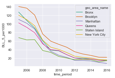
with sns.color_palette('Dark2'):
sns.lineplot(x='time_period', y='BLL_5_per1000', data=df[df['geo_area_name'].isin(all_areas)], hue='geo_area_name')The percentage of children with elevated BLL in NYC has dramtically come down over the years (2005-2016) in all boroughs of NYC. Brooklyn consistently showed the hightest BLL cases in children under the age of 6 years. In particular, Greenpoint neighborhood of Brooklyn had the most cases of high BLL in children. Interestingly, my findings were corroborated by articles published in the media:
https://www1.nyc.gov/assets/doh/downloads/pdf/lead/lead-2012report.pdf


