How many times you hoped to easily plot variants in your VCF files in order to operate a fast visual analysis on them?! It happened to me soo many times...and this is exactly why we created this R package for you! 😉
Let's take a brief look at how it works
Installing plotVCF is as simple as:
if (!require("devtools")) install.packages("devtools")
if (!require("BiocManager")) install.packages("BiocManager")
remotes::install_github(
    "cccnrc/plot-VCF",
    repos = BiocManager::repositories()
)
If you know a bit of R code (no worries, you don't really need to) you noticed that it only requires devtools and BiocManager.
The rest of dependencies you need will be installed directly with plotVCF: that's why installation will probably take a while (but you need to perform it only once 😉)
To use plotVCF you only need to point it to your VCF file.
Then just call the createVCFplot() funtion on them and you will get your Manhattan VCF plot out!
As example, if you are in the plot-VCF downloaded with this github repo, you can use our example VCF file:
library(plotVCF)

VCF <- './inst/extdata/exampleVCF.vcf.gz'

createVCFplot( VCF )
You can use both .vcf and bgzipped .vcf.gz files!
Let's have a look on how many different things you can achieve with this package!
First thing first: there are two main analysis (and plots) that you can run through plotVCF(). These are:
- variant Manhattan-style plots: visualize all/specific variants in your VCF file. You can plot subgroups based on position, sample, gene and/or exon (createVCFplot())
- chromosome summary plots: visualize plot of variants distribution across (selectable) chromosomes in your VCF file (chrAnalysis())
- gene summary plots: visualize plot of variants distribution across (selectable) genes in your VCF file (geneAnalysis())
The main focus of this plots is to visualize all/specific variants in your VCF file. You can plot subgroups based on position, sample, gene and/or exon. Let's take a look at its many different options!
All plots in examples below are generated from the same VCF file, that you can find (compressed) here.
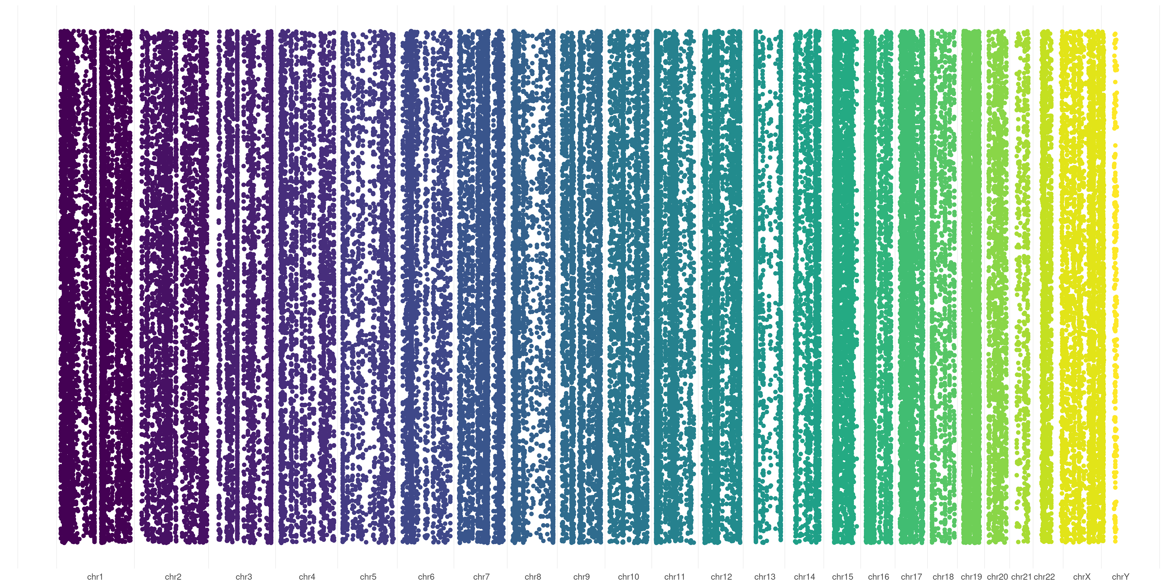
The default behavior of createVCFplot() is to allow visualization of variants position. It will create random Y-values for variants just to allow their visualization:
createVCFplot( VCF )
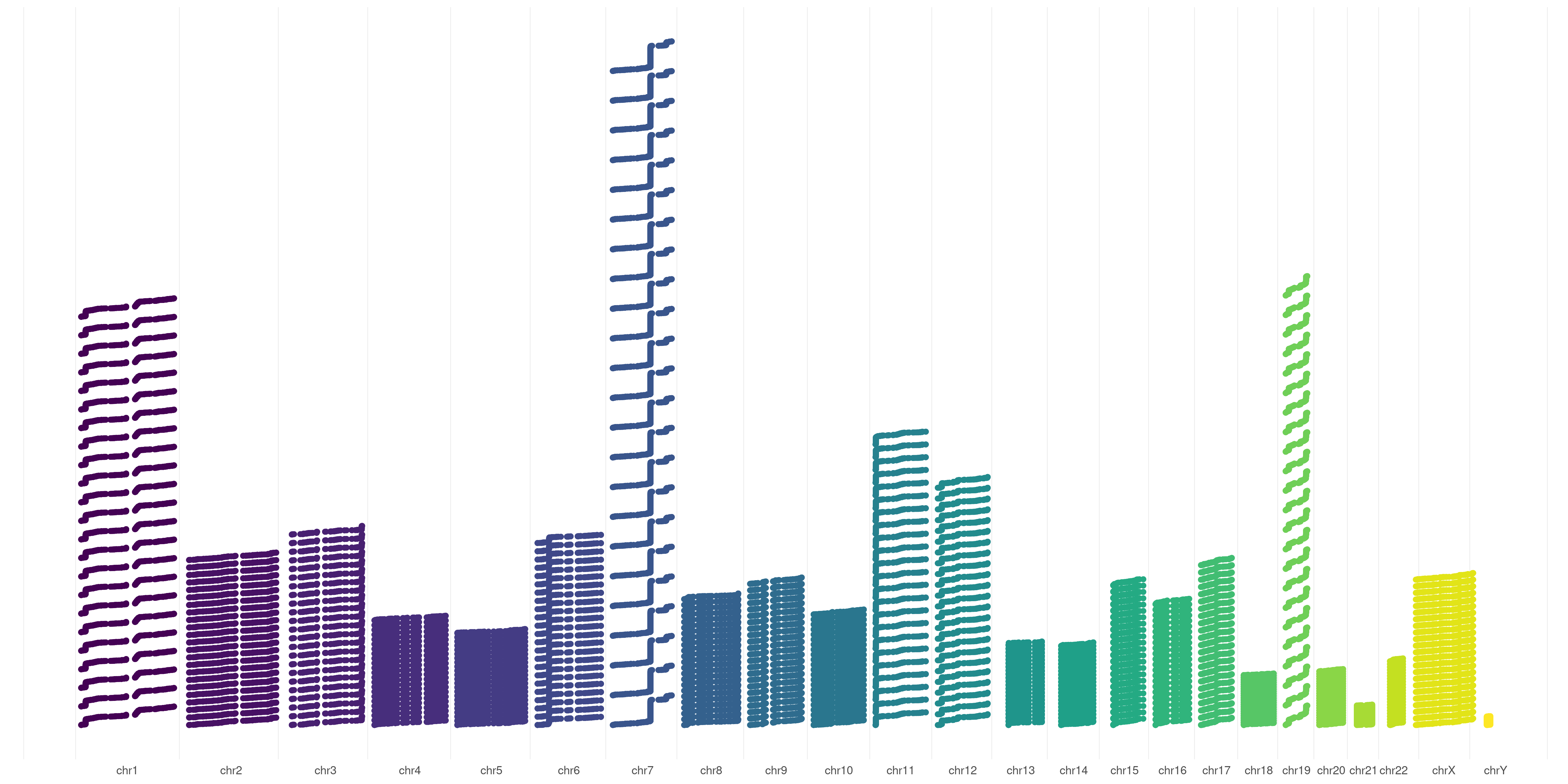
You can also choose to order your variants based on sample representation, this will allow you to graphically represent variant number differences across different chromosomes:
createVCFplot( VCF, ORDERED=TRUE )
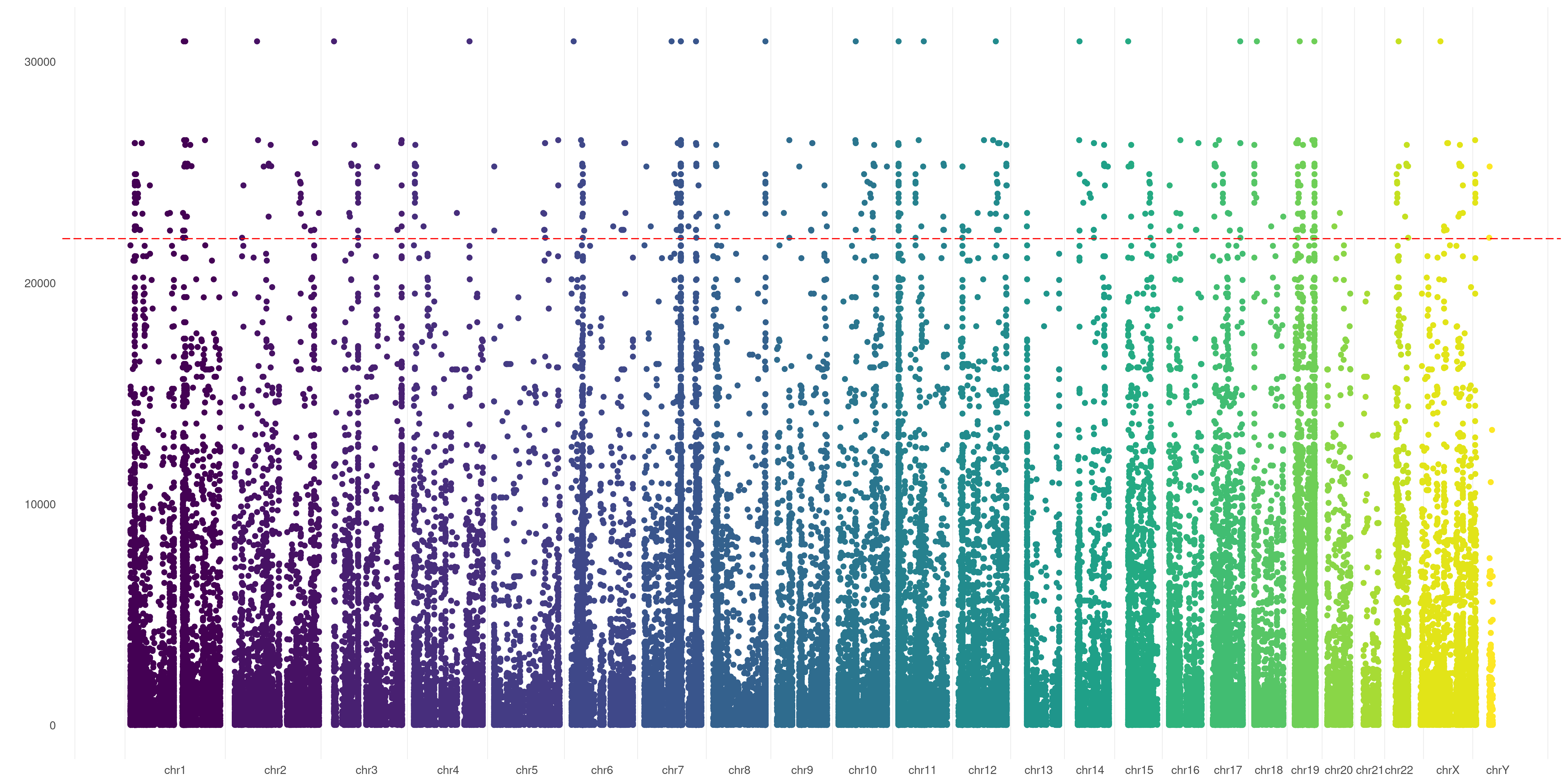
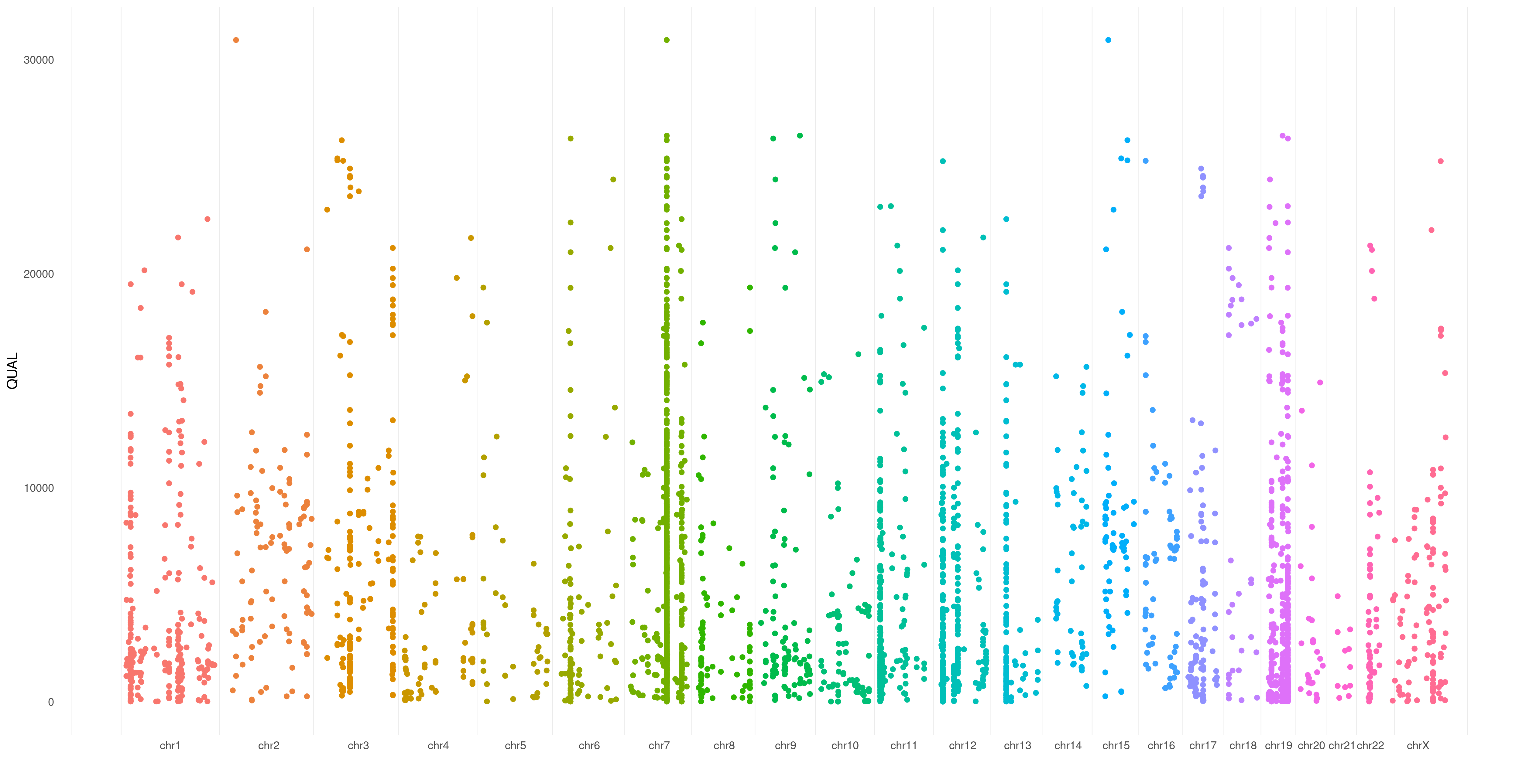
You can specify any numerical VCF variant flag (make sure you have that flag specified in your VCF header) to use as Y-axis in your plot. This creates a sort of Manhattan VCF plot, based on that value.
In this example, I used QUAL flag of my variants as Y-axis coordinate:
createVCFplot( VCF, VAR_FLAG="QUAL" )
 This can be of great utility! Let's say you're dealing with somatic variants. You surely would be happy to take a look at Variant Allele Fraction spanned over your samples/chromosomes (to rapidly identify regions/sample with a higher burden of mutations etc.). This is pretty easy: just specify
 AF in the VAR_FLAG option:
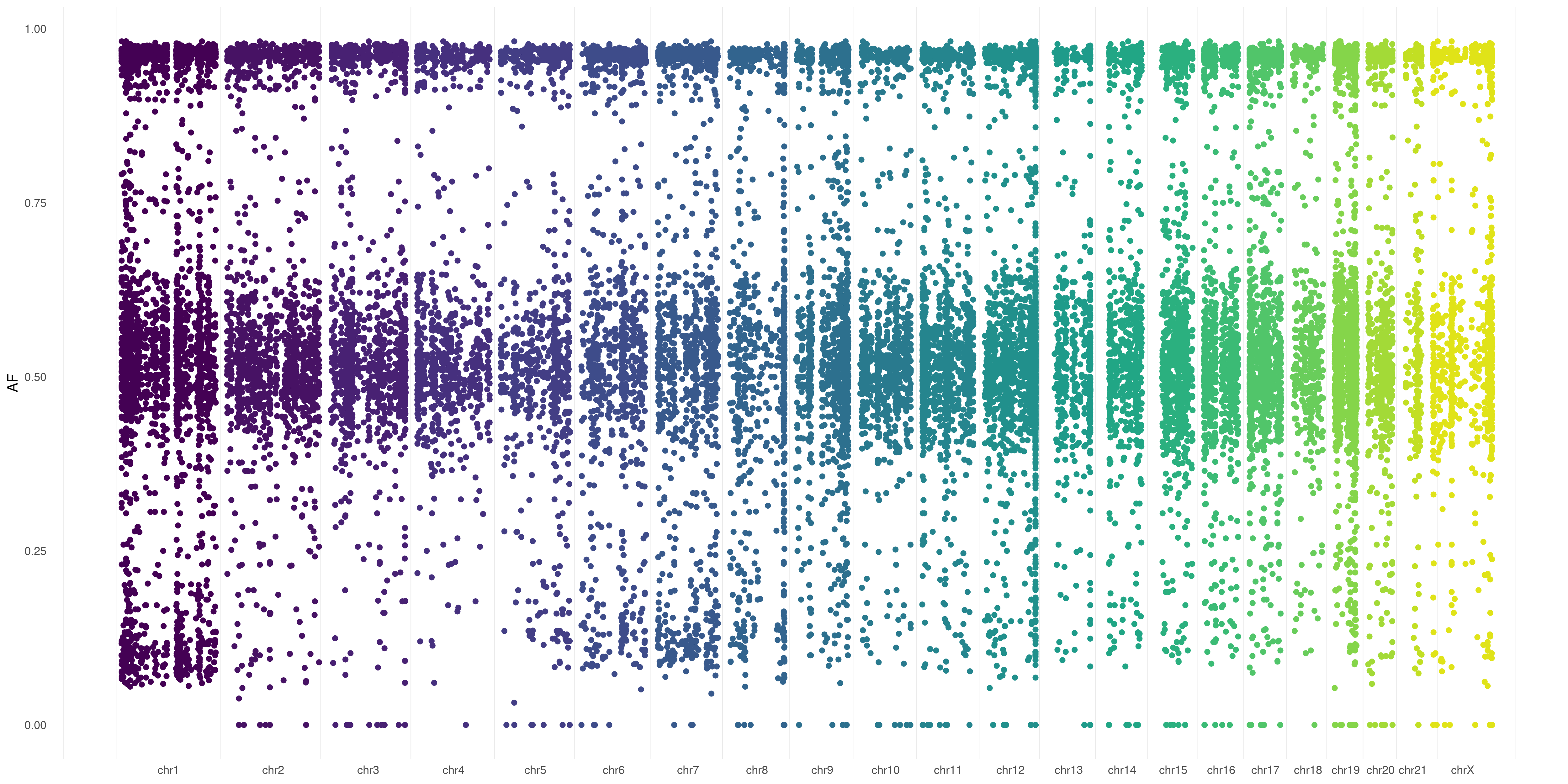 You can use this
 AF flag when dealing with germline variants as well: plotVCF() will calculate it for you (considering Alternate Allele Read Depth / Total Read Depth, that you generally have in .vcf files)
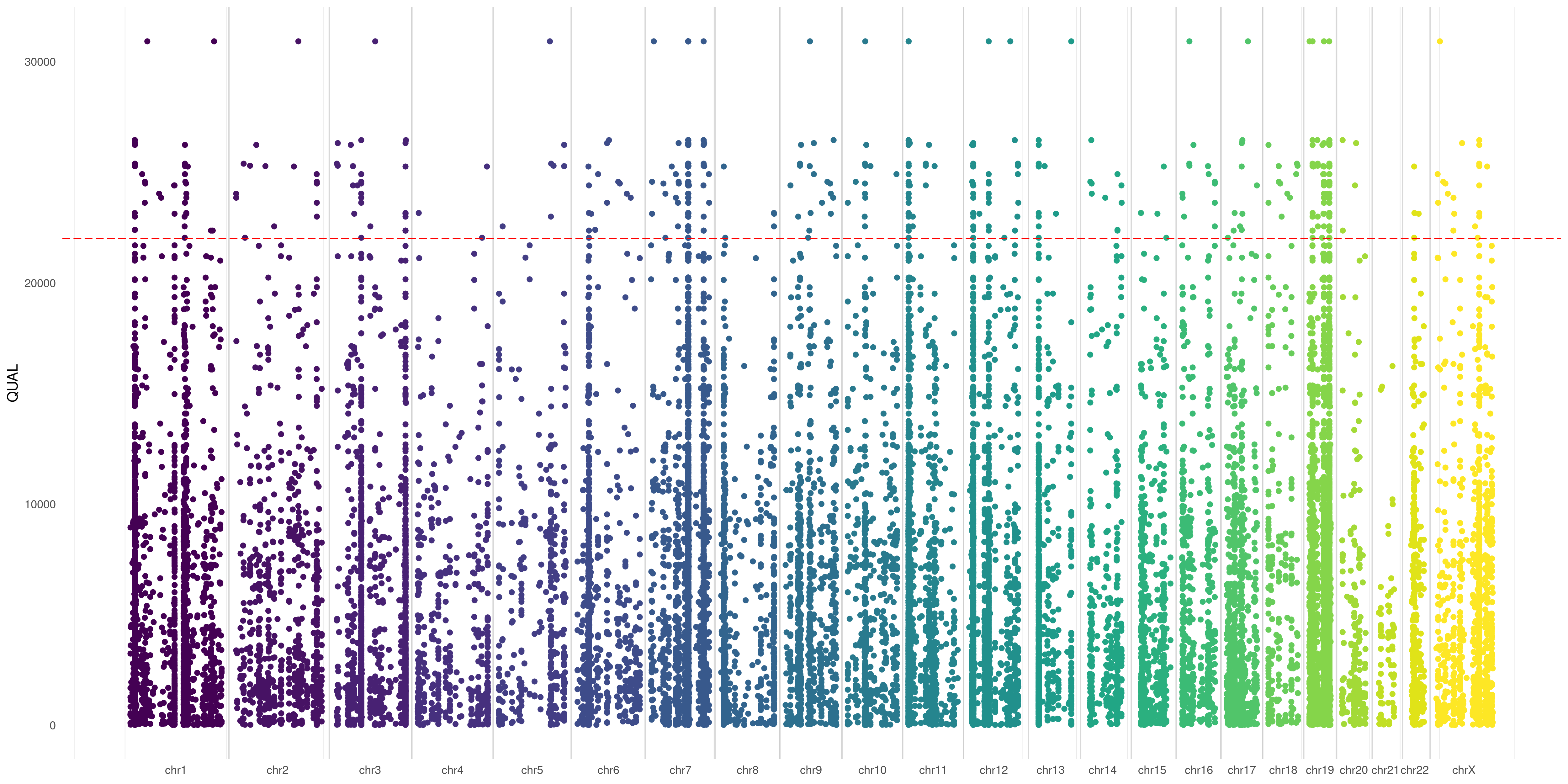
You can also put a line to separate each exact chromosome border. Just use SPACELINE option:
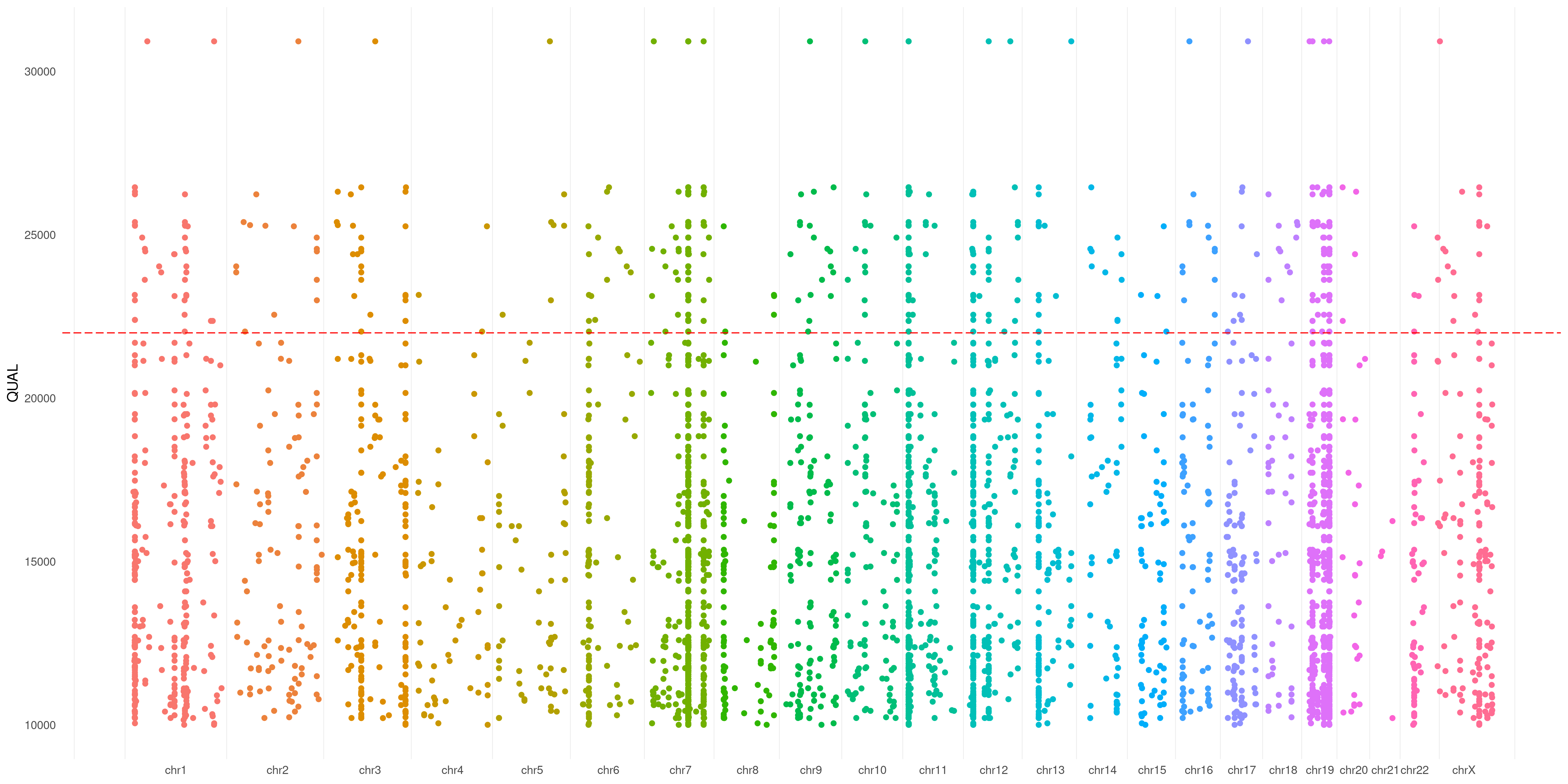
createVCFplot( VCF, VAR_FLAG="QUAL", THRESHOLD=22000, SPACELINE=TRUE )
You can also use a threshold that will be plotted on your Y-axis defined flag (such as you do with significance in a Manhattan plot):
createVCFplot( VCF, VAR_FLAG="QUAL", THRESHOLD=22000 )
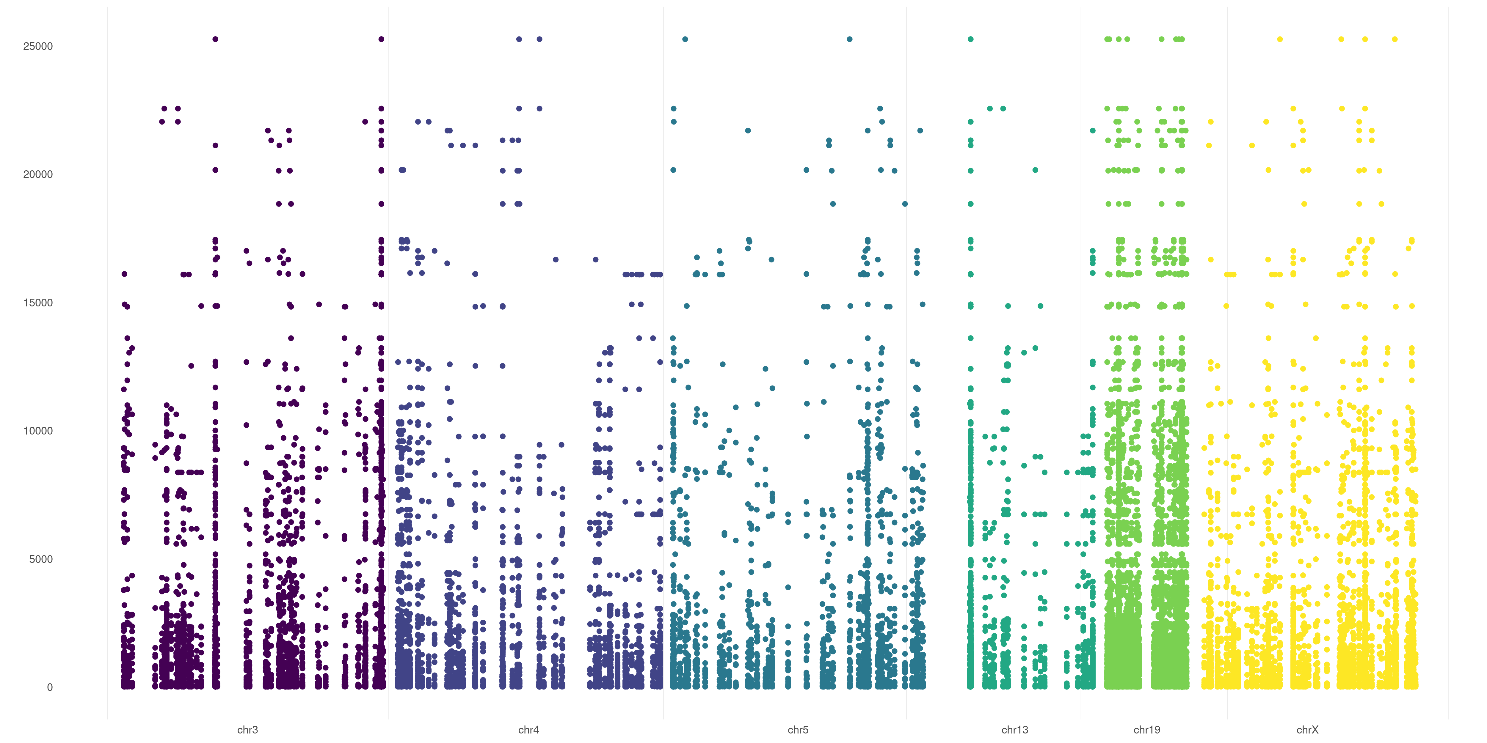
You can also use specify a threshold as Y-axis base. As example, in case you want to plot only positions >10000 QUAL:
createVCFplot( VCF, VAR_FLAG="QUAL", THRESHOLD=22000, XLIM=10000 )
If you wish to graphically analyze just some chromosomes, you can use CHR_NAMES flag:
createVCFplot( VCF, VAR_FLAG="QUAL", CHR_NAMES=c("chr3","chr4","chr5","chr13","chr19","chrX") )
You can also restrict your plot to some specific sample. Just use SAMPLE flag.
It takes both single samples (e.g. EX01) and multiple samples (e.g. c( 'EX01', 'EX02', 'EX05' )):
createVCFplot( VCF, VAR_FLAG="QUAL", SAMPLE=c( 'EX01', 'EX02', 'EX05' ) )
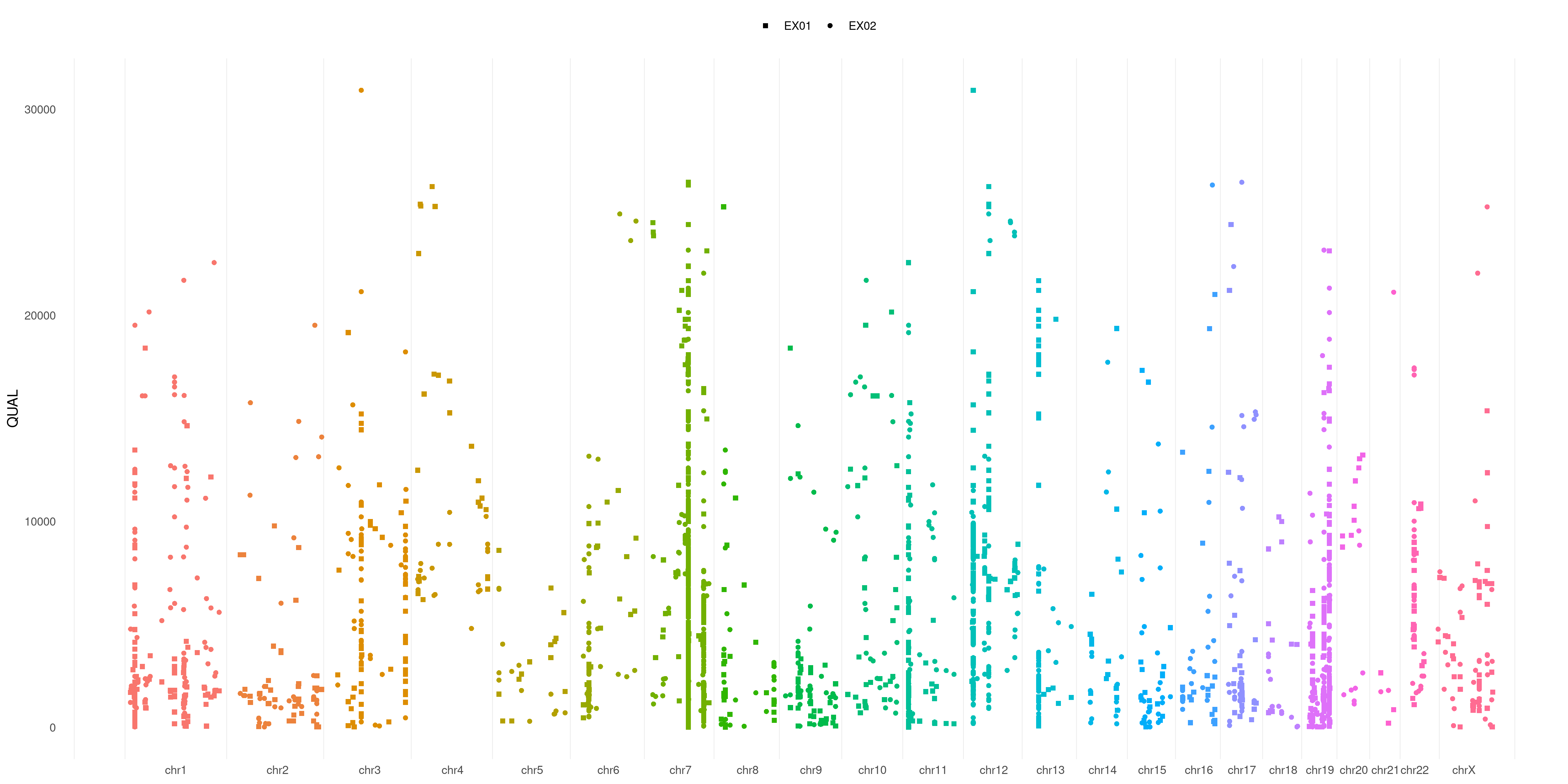
And what about if you want to differentiate each sample variant? Just use SHAPE option:
createVCFplot( VCF, VAR_FLAG="QUAL", SAMPLE=c( 'EX01', 'EX02', 'EX05' ), SHAPE=TRUE )
Is not that easy to separate each sample variant in the plot above. What about playing with colors to help us out?
You can pass a list to specify which sample pertains to which group (as example: cases vs. controls) and have different groups plotted in different colors!
Take a look at COLOR_SAMPLE magic option on our example VCF:
COLOR_SAMPLE <- list(
                    "groupA" = "EX01",
                    "groupB" = c( "EX02", "EX05" ),
                    "groupC" = c( "EX03", "EX04", "EX06" )
                    )

createVCFplot( VCF, VAR_FLAG="QUAL", COLOR_SAMPLE=COLOR_SAMPLE )
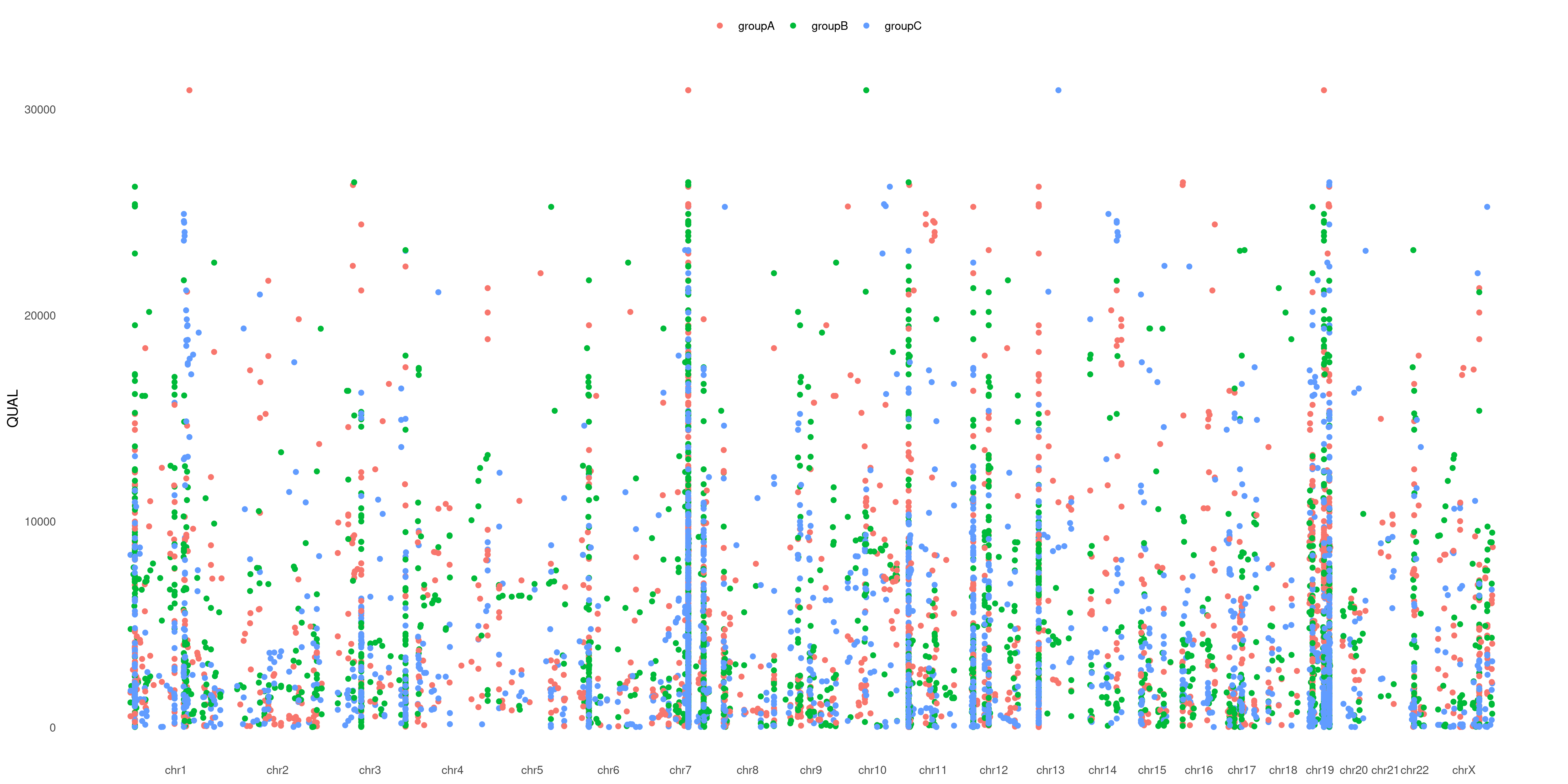 We love it! Hope you will too 😉
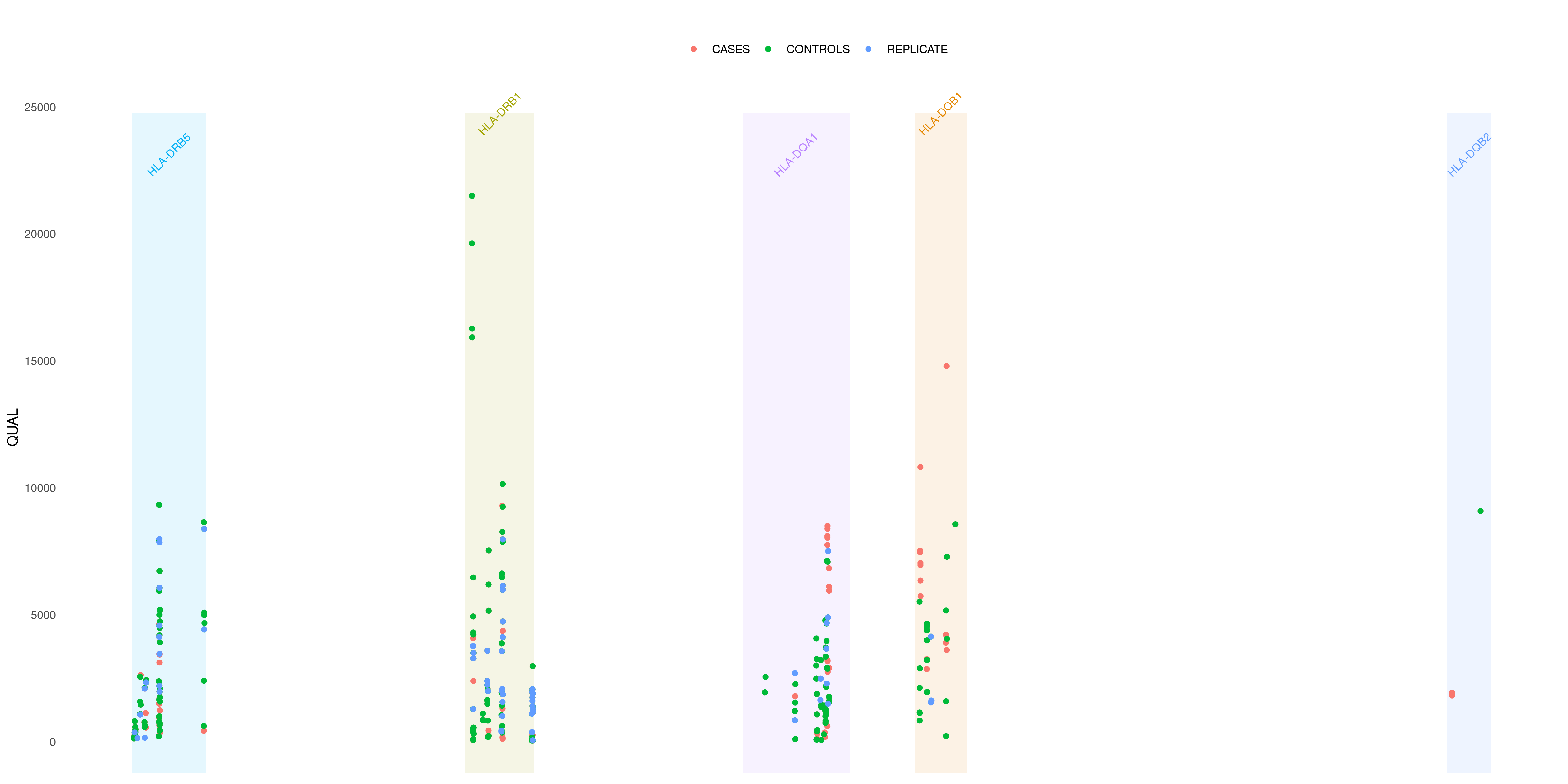
What if I want to investigate some specific gene in my VCF file? Let's say I want to take a look at HLA genes. I can plot these just variants relying in those genes just adding GENE option:
createVCFplot( VCF, VAR_FLAG="QUAL", GENE=c('HLA-DRB5', 'HLA-DRB1','HLA-DQA1','HLA-DQB1','HLA-DQB2', 'HLA-DQB2'), COLOR_SAMPLE=COLOR_SAMPLE )
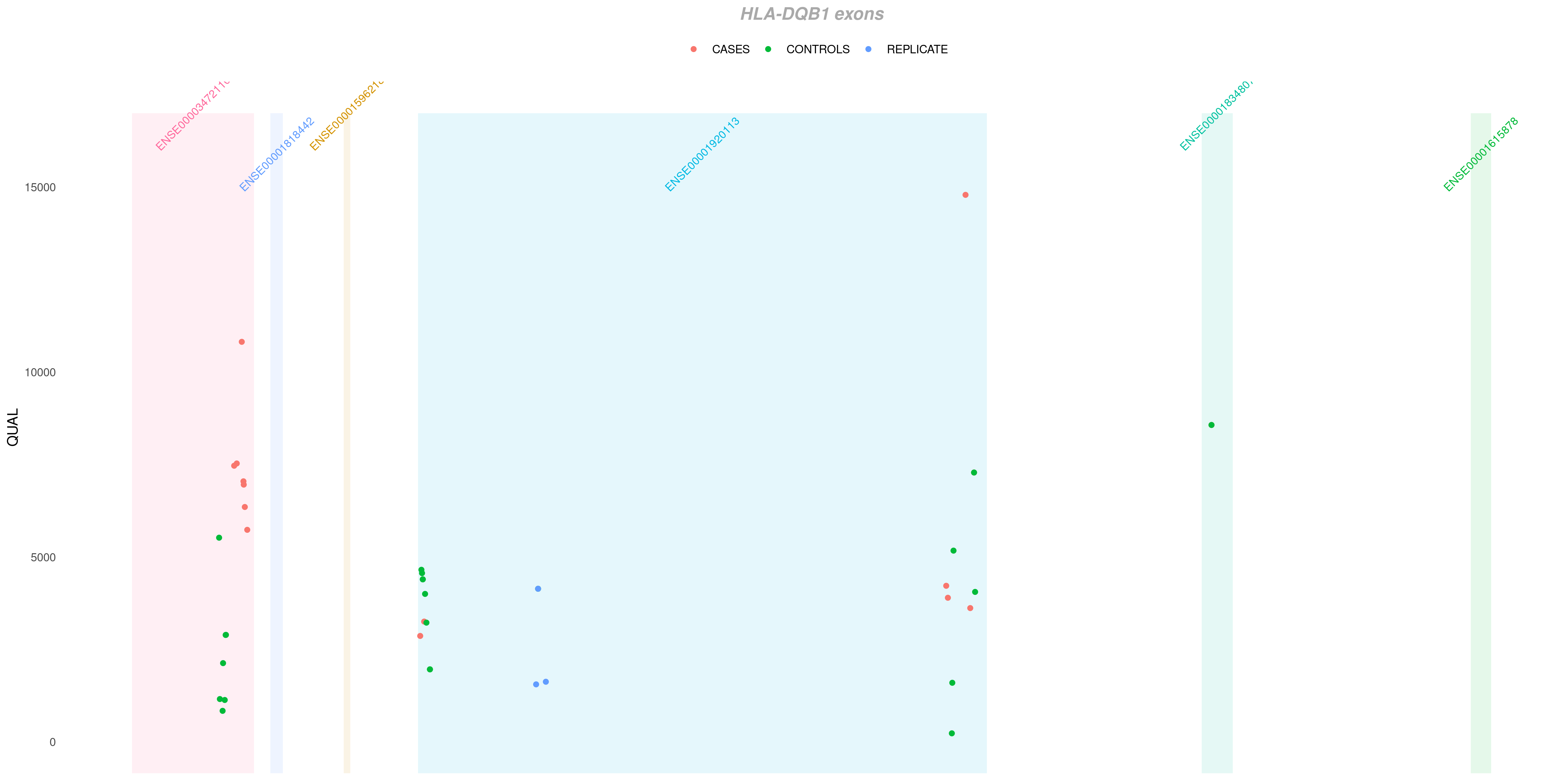
Sometimes you want to deepen even more your analysis inside some specific gene. As in the example above, I see that many of my variants falls into HLA-DQB1 gene. I can investigate which exon each of them pertains to with EXON option:
createVCFplot( VCF, VAR_FLAG="QUAL", COLOR_SAMPLE=COLOR_SAMPLE, GENE='HLA-DQB1', EXON=TRUE )
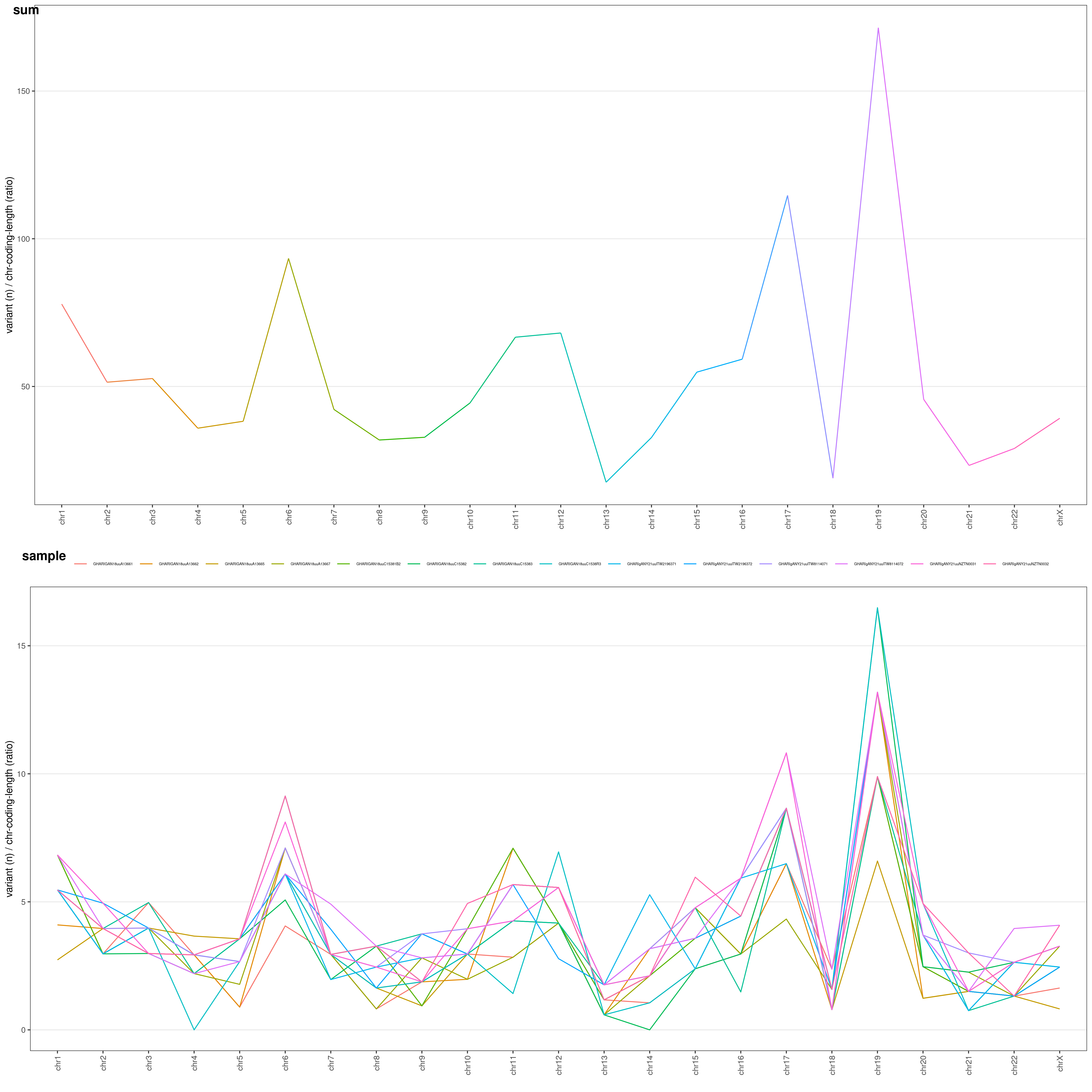
Let's perform an analysis about variant distribution across different chromosomes in your VCF file.
chrAnalysis() function returns both plots chrAnalysis( VCF )$PLOT and summary tables chrAnalysis( VCF )$TAB: take a look at them: you have both single-sample ($SAMPLE), grouped ($GROUP) and overall ($SUM) tables and plots! chrAnalysis() plots a merged plot with all the others plots in it: geneAnalysis( VCF )$PLOT$MERGED
Let's have a look at the chromosome summary plots
chrAnalysis( VCF )$PLOT$MERGED
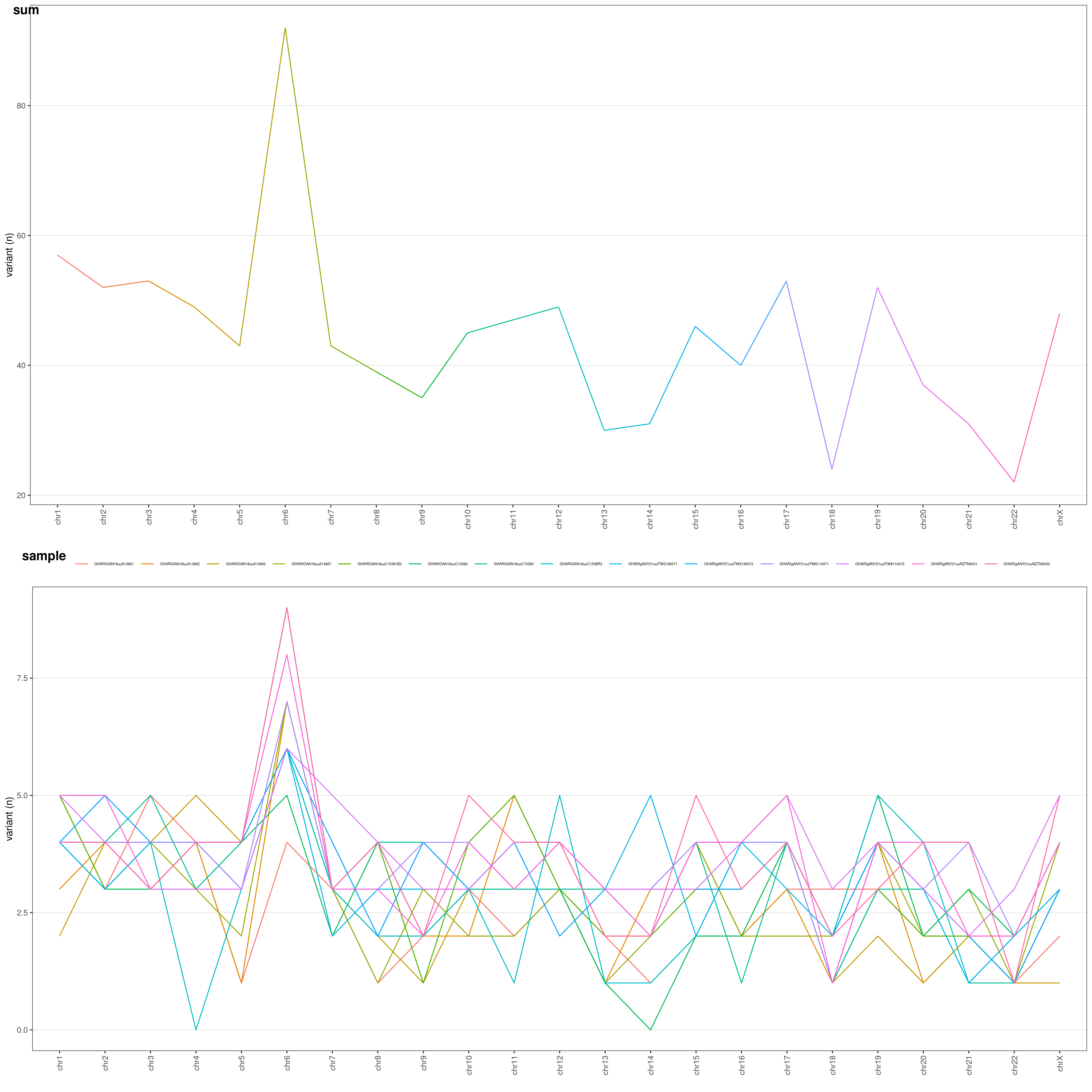 You can choose the Y-axis values through
 METHOD option:
RAW: raw number of variantsLEN: number of variants / chromosome length (ratio: each chromosome length is divided by the median chromosome length)COD: number of variants / chromosome coding regions overall length (ratio)LENCOD: number of variants / chromosome length (ratio) * chromosome coding regions overall length (ratio)
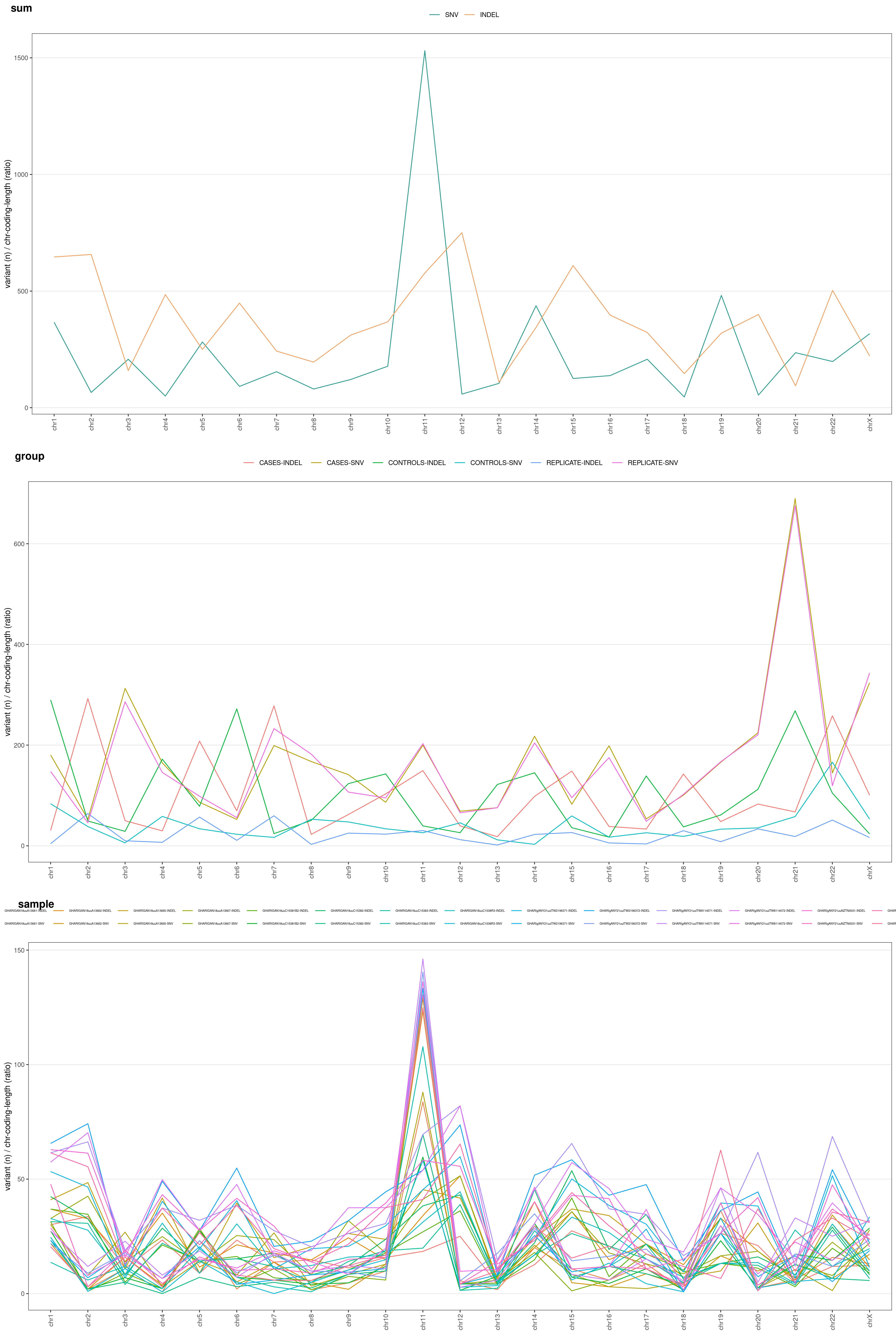
These different options allow you to normalize your variants and identify which chromosomes underwent a higher mutation rate:
chrAnalysis( VCF, METHOD = "LENCOD" )$PLOT$MERGED
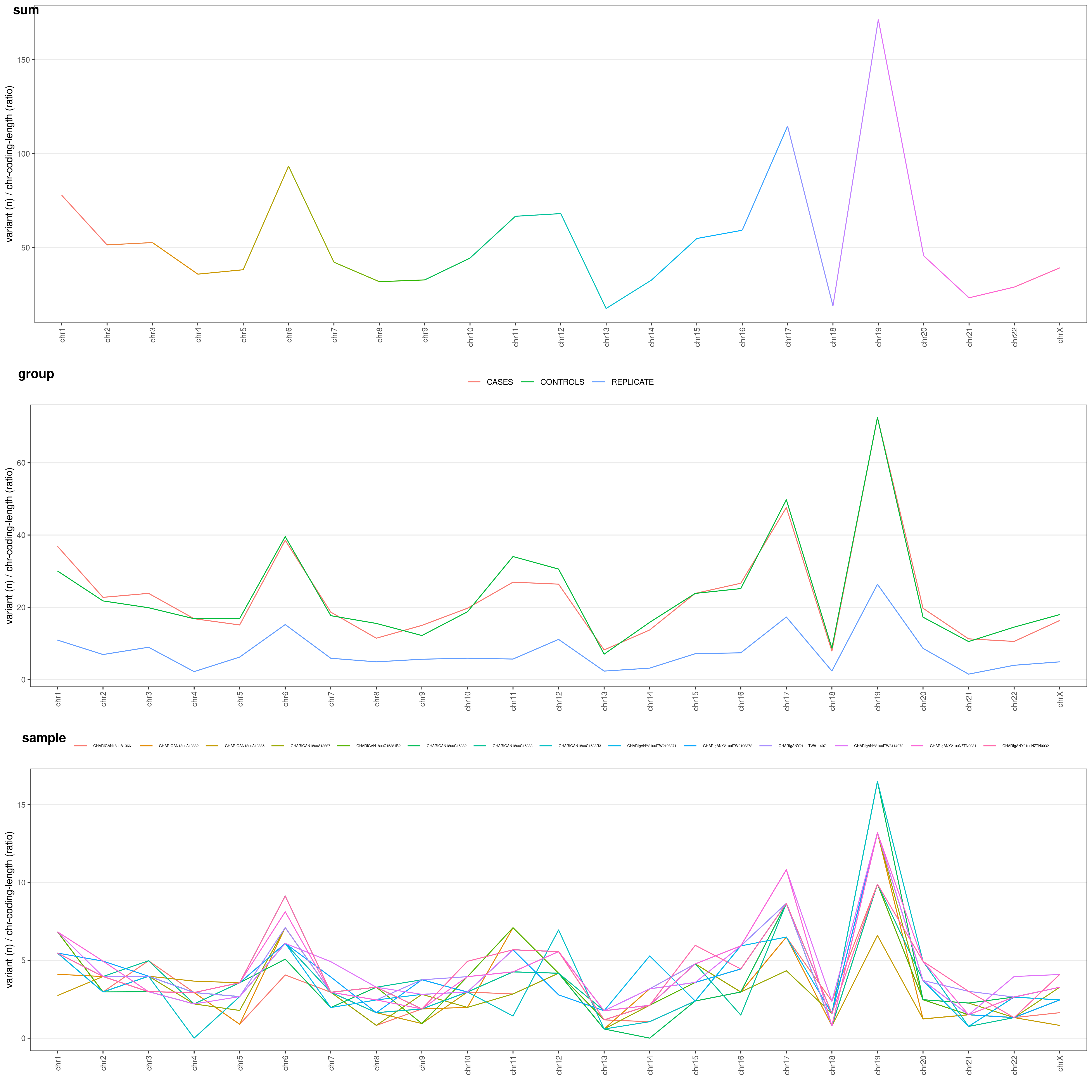
You might be very interested in visualize difference for grouped samples (e.g. cases vs. controls). Just add COLOR_SAMPLE option (same list() object explained above:
chrAnalysis( VCF_FILE, COLOR_SAMPLE = COLOR_SAMPLE, METHOD = "LENCOD" )$PLOT$MERGED
You can also divide your plot based on variant type: SNV vs. INDEL. Just add TYPE option to chrAnalysis():
chrAnalysis( VCF_FILE, COLOR_SAMPLE = COLOR_SAMPLE, METHOD = "LENCOD", TYPE = TRUE )$PLOT$MERGED
This is the function to use if you want to perform an analysis about variant distribution across different genes in your VCF file.
This function returns both plots geneAnalysis( VCF )$PLOT and summary tables geneAnalysis( VCF )$TAB: take a look at them: you have both single-sample ($SAMPLE), grouped ($GROUP) and overall ($SUM) tables and plots! geneAnalysis( VCF ) plots a merged plot with all the others plots in it: geneAnalysis( VCF )$PLOT$MERGED
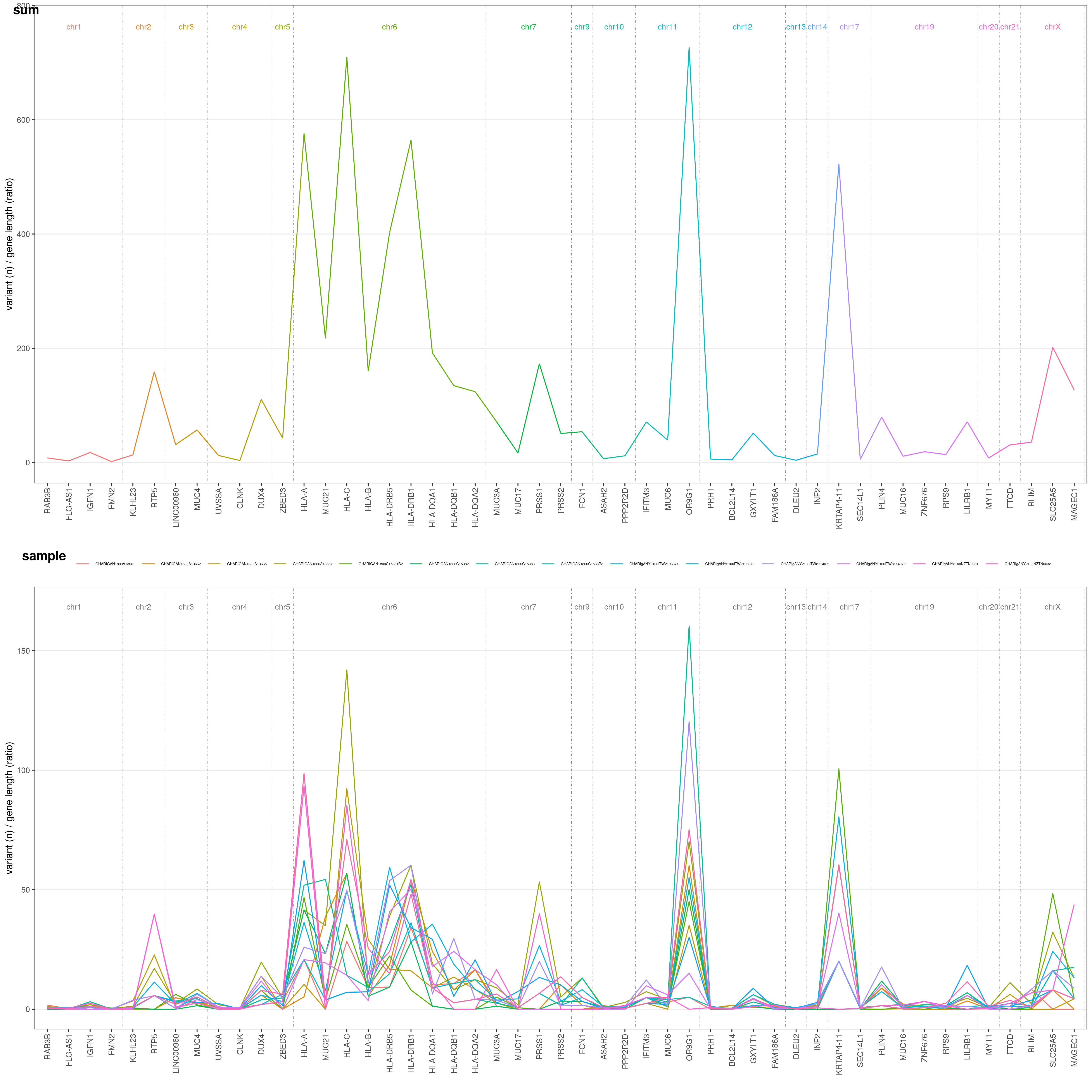
Let's say you want to know on which genes most of your variants are. You can easily plot this through geneAnalysis() function. It will plot for you each gene number of variants, both summarized over all samples (above) and for each single sample (below):
geneAnalysis( VCF )$PLOT$MERGED
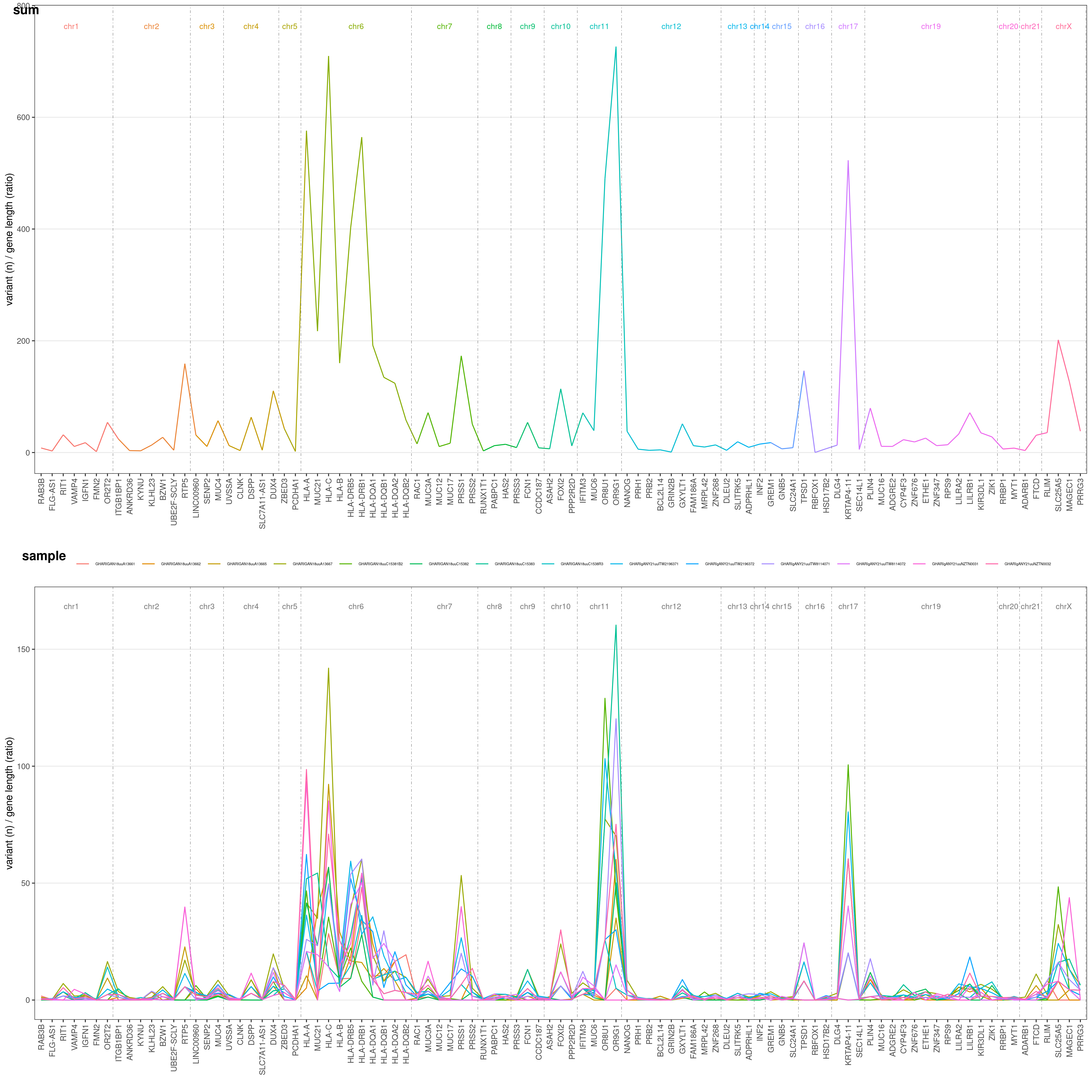 The Y-axis values are the number of variants for each gene in your VCF file, divided by a gene-length ratio to correct for gene length. This ratio is obtained dividing each gene length by the mean human gene length (which is ~24kbp). Thus, if all gene would suffer the same mutation rate, they would all have the same ratio in this plot!
Default threshold for genes to be plotted is 90° centile. Only genes with an overall number of variants >90° centile (based on your VCF data) are shown. You can freely choose this threshold with CENTILE option. Let's say we want to restrict the analysis to >95° centile:
geneAnalysis( VCF, CENTILE = 0.95 )$PLOT$MERGED
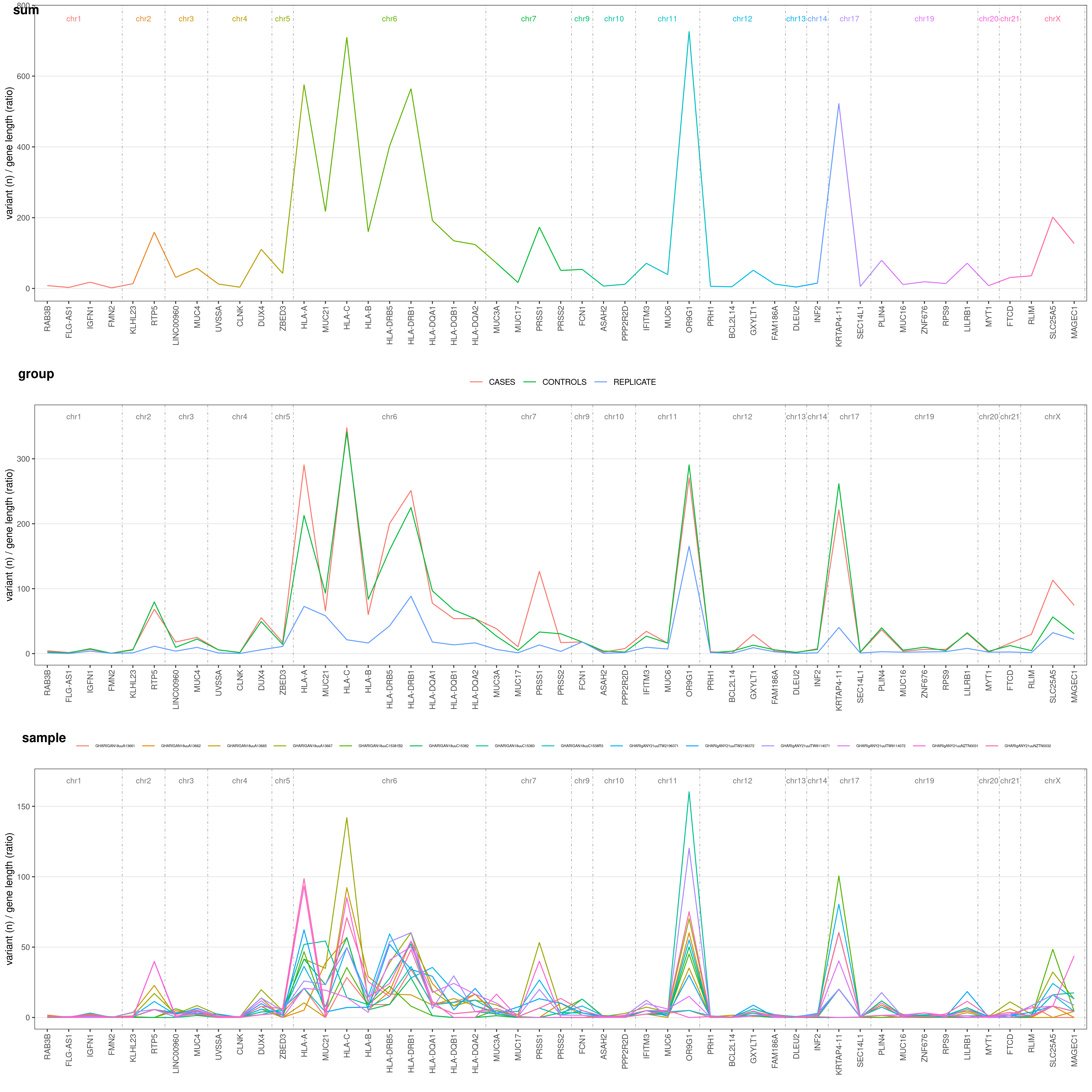
You might be very interested in visualize difference in mutation rate for each gene and samples grouped (e.g. cases vs. controls). Just add COLOR_SAMPLE option (same list() object explained above:
geneAnalysis( VCF_FILE, COLOR_SAMPLE = COLOR_SAMPLE, CENTILE = 0.95 )$PLOT$MERGED
There are many more combinations you can create with this package, explore all possible values with:
?createVCFplot
?geneAnalysis
and create your own plots!
Once you created your plot, you can save it with any R graphic function (png(),pdf(),tiff(), etc.).
Something I like:
VCF_PLOT <- createVCFplot( VCF )
PNG_FILE <- <path-to-your-PNG-output>

png( PNG_FILE,  width = 5000, height = 2500, res = 300 )
print(VCF_PLOT)
whatever <- dev.off()
but fell free to use what you wish!
To use plotVCF() with a different assembly than hg18 or GRCh37 you need a FASTA file to let the software know chromosome boundaries etc.
You need to use the same FASTA format on which your VCF was aligned to. If you are not sure what are we talking about you should find this information in your VCF header. In the examples below I used a hg38 aligned VCF, which is plotVCF() default assembly.
Important: make sure the chromosome names in your FASTA file exactly match chromosome names in your VCF file! (e.g. you can find VCF with chr1 name format while FASTA may have 1 name format or reversal. Those VCF and FASTA chromosome names must match!)
