Goal: I will be using Python to recreate some queries that imaginary stakeholders may request. Here we will learn how to connect a DB to Python and explore a few of the innumerable possibilities of this language.
For this set of examples, I am using Jupyter Notebook from Anaconda Distribution.
We will be using the dataset loaded into MySQL.
First, we must try the connection between Python and MySQL. For that, we need four libraries: pandas, getpass, pymysql, and sqlalchemy. I faced an issue with mysql being missing from the Anaconda distribution; please see this link that solved the problem.
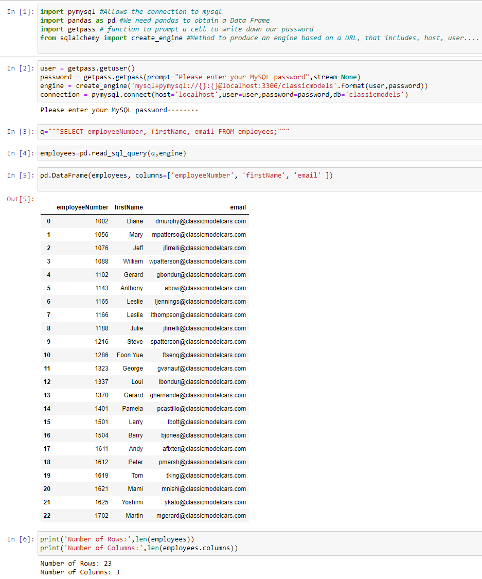 Fig. 1.
Imagine now that we want to print an Excel file for each of the tables:
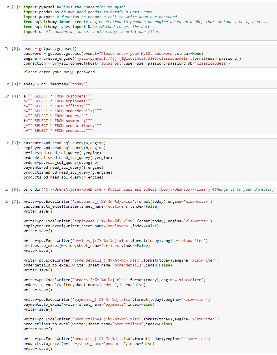 Fig. 2.
Now you have each table extracted into an Excel file.
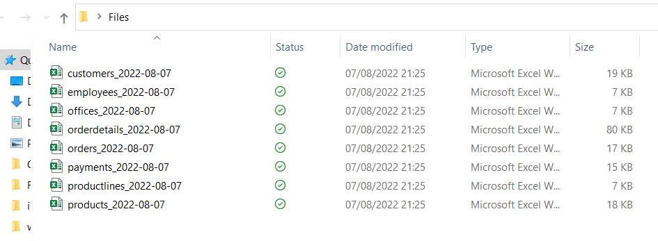 Fig. 3.
Add columns from an Excel file to a data frame pulled from SQL. We will be adding office city and phone to employee info. For that, we use a sort of "Vlookup" function that uses a unique identifier officeCode to bring the new columns in.
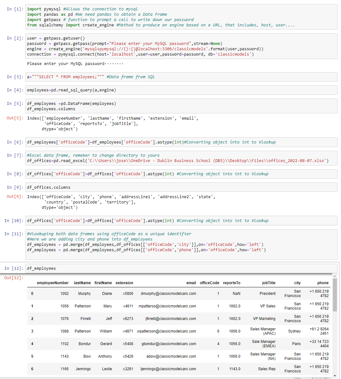 Fig. 4.
A Data Analyst spends most of their time cleaning datasets; dropping duplicates is a good example of it. As a data frame, I will be using the Excel file containing all employees. I purposely triplicated the number of employees from 23 to 69; now we are going to see how to reverse to 23 unique employees.
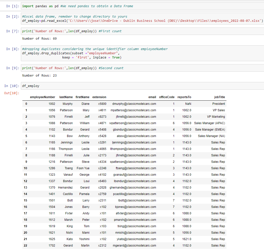 Fig. 5.
Mary, our General Sales Manager, wants to know the count of orders excluding the two biggest accounts. Customers 124 and 141 have placed 17 and 26 orders, respectively. The figure for Mary should be 283.
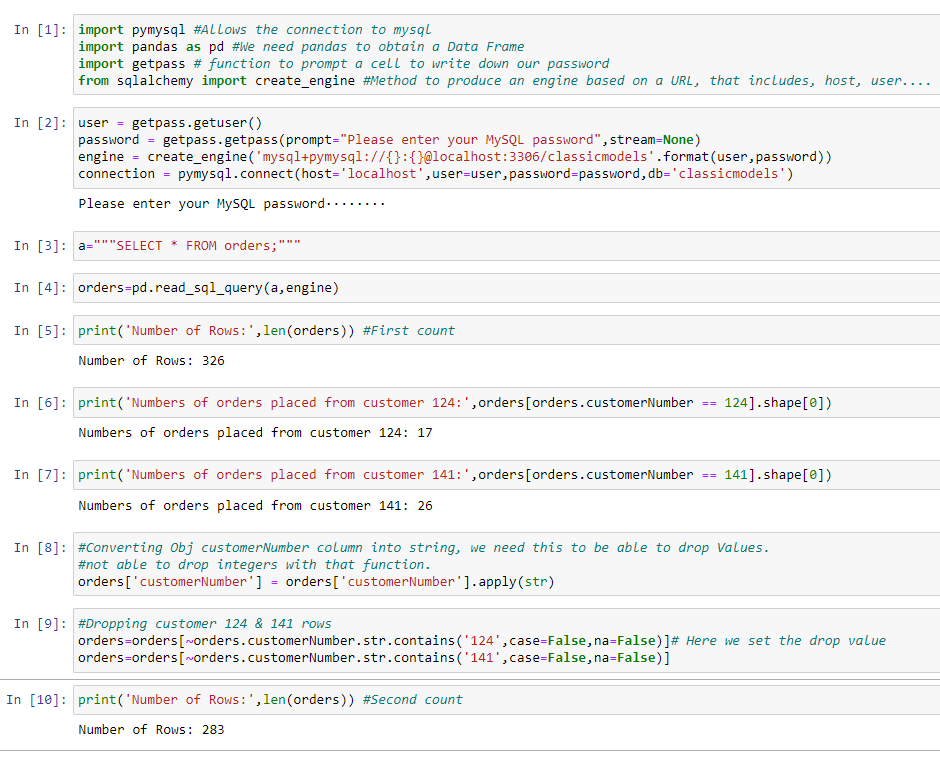 Fig. 6.
Now, from the package Pandas, we are going to use a vertical bar plot. Data shown is taken from MySQL scenario 1. We will get an ordered visual by table based on row count.
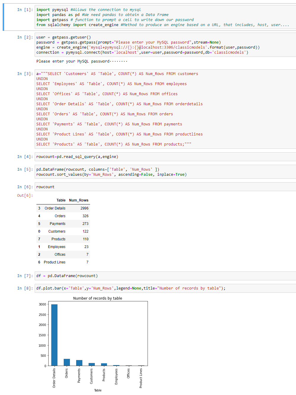 Fig. 7.
Another great library for visualizations is matplotlib. Now we want to create a plot for customers that exceed revenue of 130K.
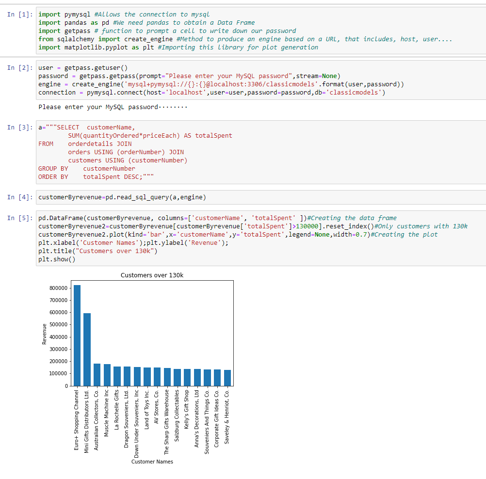 Fig. 8.
For this case, we want to create a pie chart displaying each of the products by percentage of revenue.
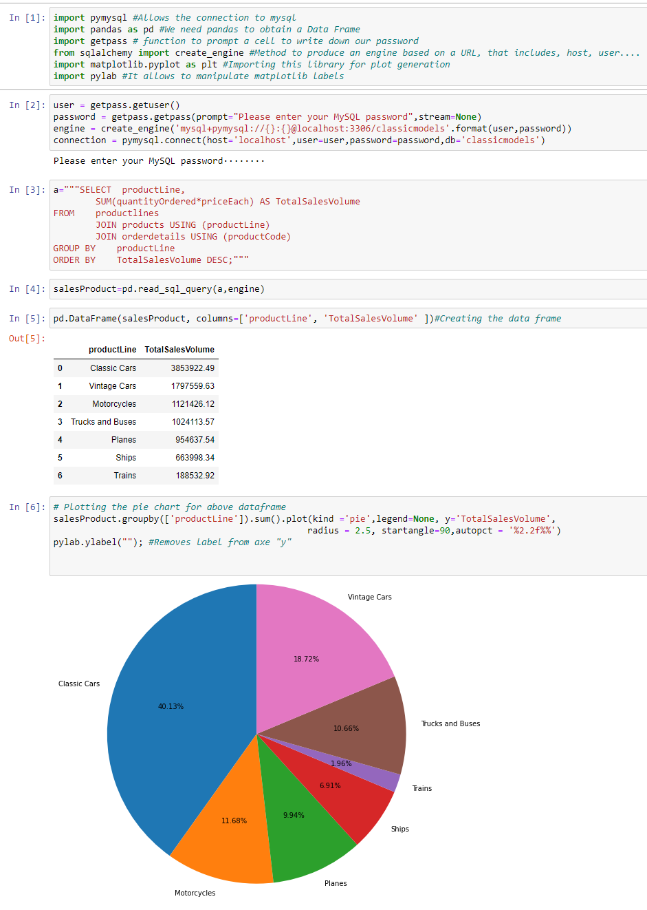 Fig. 9.
Use a scatter chart representing sales reps by revenue.
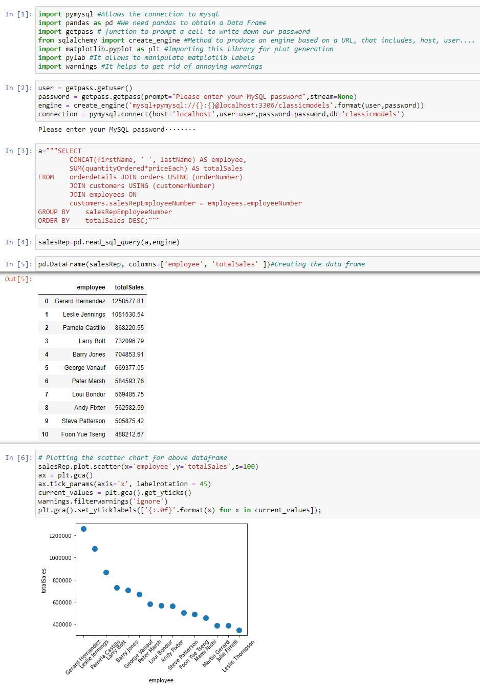 Fig. 10.
To wrap up the case scenarios, we are going to see the geopandas library, demonstrating that in Python you can manipulate maps. My colleague Oshimi is asking if we can turn Japan green because his grandmother used to exhibit an old picture of a green Japan. Apparently, he truly believes this action can ramp up sales revenue in Asia. Meanwhile, we will work this out for Oshimi.
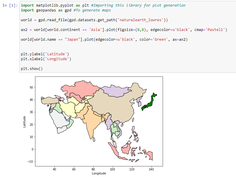 Fig. 11.
This is just a tiny bit of what you can do in Python. In case you are interested in replicating some of the scenarios, please find all Jupyter notebooks: Jupyter_Notebooks.
Copyright (c) 2024 josericodata. This project is made available under the MIT License - see the LICENSE file for more details.